

I came across this nice diagram with a useful lesson about what we should be doing in life (via Flowing Data).
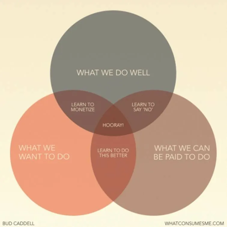
A neat concept, and the Venn diagram is the right framework to visualize it.
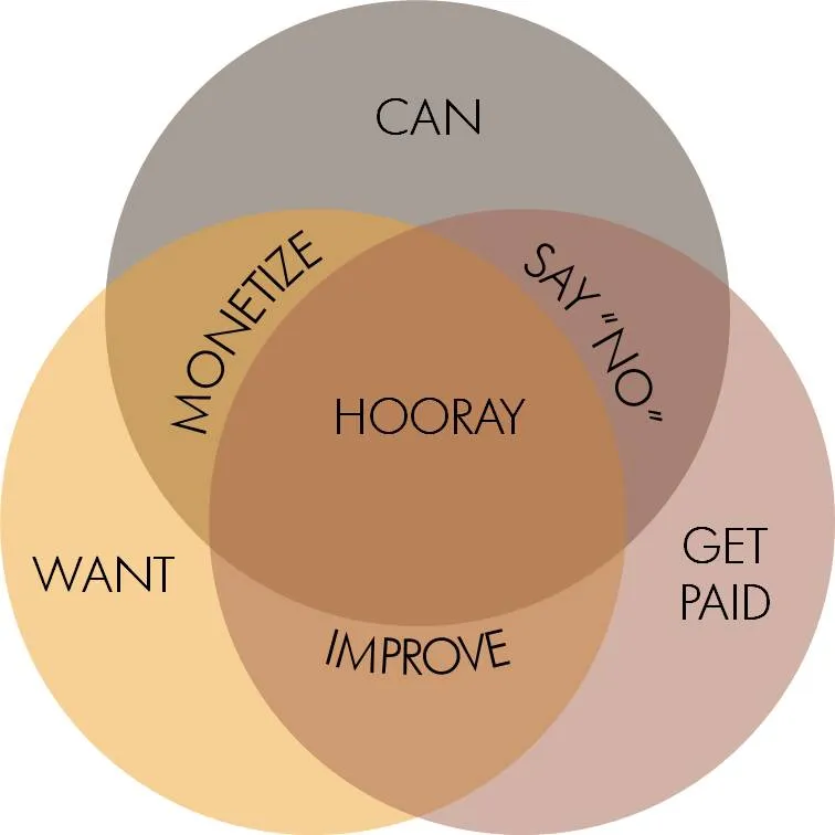
The chart is simple, but it actually takes the reader a few seconds to internalize it. If you want to use something like this in a stand-up presentation, some modifacations to the slides are required:
- Simpler words to express the ideas
- Create more visual space for the overlapping areas
- Animations (unfortunately, I cannot avoid it here) to introduce the circles, introduce the overlaps between 2 of them, introduce the overlap between all 3 of them.
Unfortunately, my slide does not look prettier than the original one, and standing on its own, it does a worse job in explaining the concept. On stage though, it will work better.