SlideMagic Blog

Frequent updates about all things presentations since 2008. Subscribe to never miss a post.

RSS
all posts

Search results for “web design”

·Creativity

Shutting down your brain

This post by Nancy Duarte about how taking long walks inspires her, resonated with me. She describes the experience of shutting down your brain to help you focus and be more creative. Almost all pleasures in life are someway or another about cutting out noise, worries, and random thoughts out of our mind.

Ancient oriental wisdom encourages us to focus deeper on the natural experiences of enjoying what we eat, making love, meditation. Artists try to create a disconnected world through a good story or beautiful craft. More brutal, unhealthy, and/or illegal ways to reach that stage of disconnection are alcohol and other banned substances. Mass media tries to achieve that same escapism through retail therapy, (loud) music, or bone-shaking visual effects in movies. Endurance sports fanatics can even get hooked to to beta endorphins that are released as the result of heavy exercise.

Nancy choses hiking, I use mountain biking as a way to shut down the brain. It is the perfect combination of being outdoors, doing a physical workout, but also requiring your brain to focus heavily on obstacles on the trail ahead of you and being aware of the balance and flow of your body at all times. There is literally no time to think of anything else.

·Data visualization

Micro economic charts

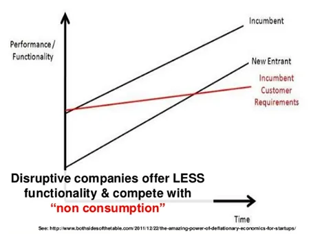
Line graphs with supply and demand shifts, pricing, are great for a round the table discussion of micro economics, but they are less suitable for presentations for large audiences. Take the example below. It takes time before you get the picture (what is on the axis, what do the crossing lines mean). Once you understand the framework you can have a great discussion about it. But in a big audience setting, not many people will get there, unless you build it up slowly, slowly one step at a time.

This image was taken from a presentation by Mark Suster, which in general was an excellent presentation. Not consistent in formatting, but I think the audience will forgive a busy VC harvesting charts from multiple sources, it is the content that matters.

·PowerPoint

DIY shapes

It is hard to get an arrow to point exactly right in PowerPoint. If the standard shapes fail, why not construct your own out of small individual bits. You can group the shape together, or create a new custom shape with one of the shape boolean functions (Windows instructions here, on a Mac: select 2 shapes, right click, go in the grouping menu).

·Data visualization

Put things in perspective

I just returned from a camping and hiking trip in Israel’s southern desert (the Negev) and came home with some beautiful pictures.

It is very hard to capture the sheer size of a landscape in a photo, and one trick to do this is the make sure to have an object in your frame that the viewer knows the size of. In the example below you see that the perspective greatly diminishes when I Photoshop my friends out.

The same is true with data in presentations. Putting the stunning image with the word “53 million” on it does not put the size of the number in perspective. Relate it to something instead.

Where is the money?

Most business presentations address the financials of an idea at some stage. Resist the temptation of using a cartoonesk clip art image to introduce the topic. Financials are serious stuff and you are not asking for your weekly candy allowance from investors or corporate decision makers.

·Keynote

In NYC at the end of April

I will be in New York at the end of April. Let me know if you would like to connect in person.

·Art

Table with fat lines

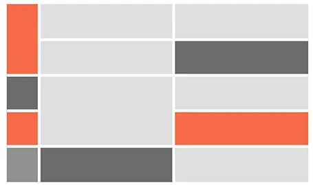
For boxy charts, I find it very convenient to use tables as the basic organising structure. Use big fat lines to separate the cells. In this way, it is easy to add, delete cells, combine, and split them. The Mondriaan look.

·Colors

Too cute for investors

Unfortunately, in 2013 most investors are still male. Coming in with a cute deck (curly flower background, pastel colours, retro-chique font, etc.) is not going to get you points. Even if your product itself has to be cute (a cosmetics line for teenage girls for example) you can still separate things in your investor deck. Use more macho graphics for the serious business stuff, leaving the cute graphics for the product show case pages.

·Concepts

It is that simple

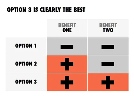
Sometimes, the story is just really simple, hence a simple chart.

·Data visualization

Waterfall chart with negatives

My post about

how to create a McKinsey-style waterfall chart

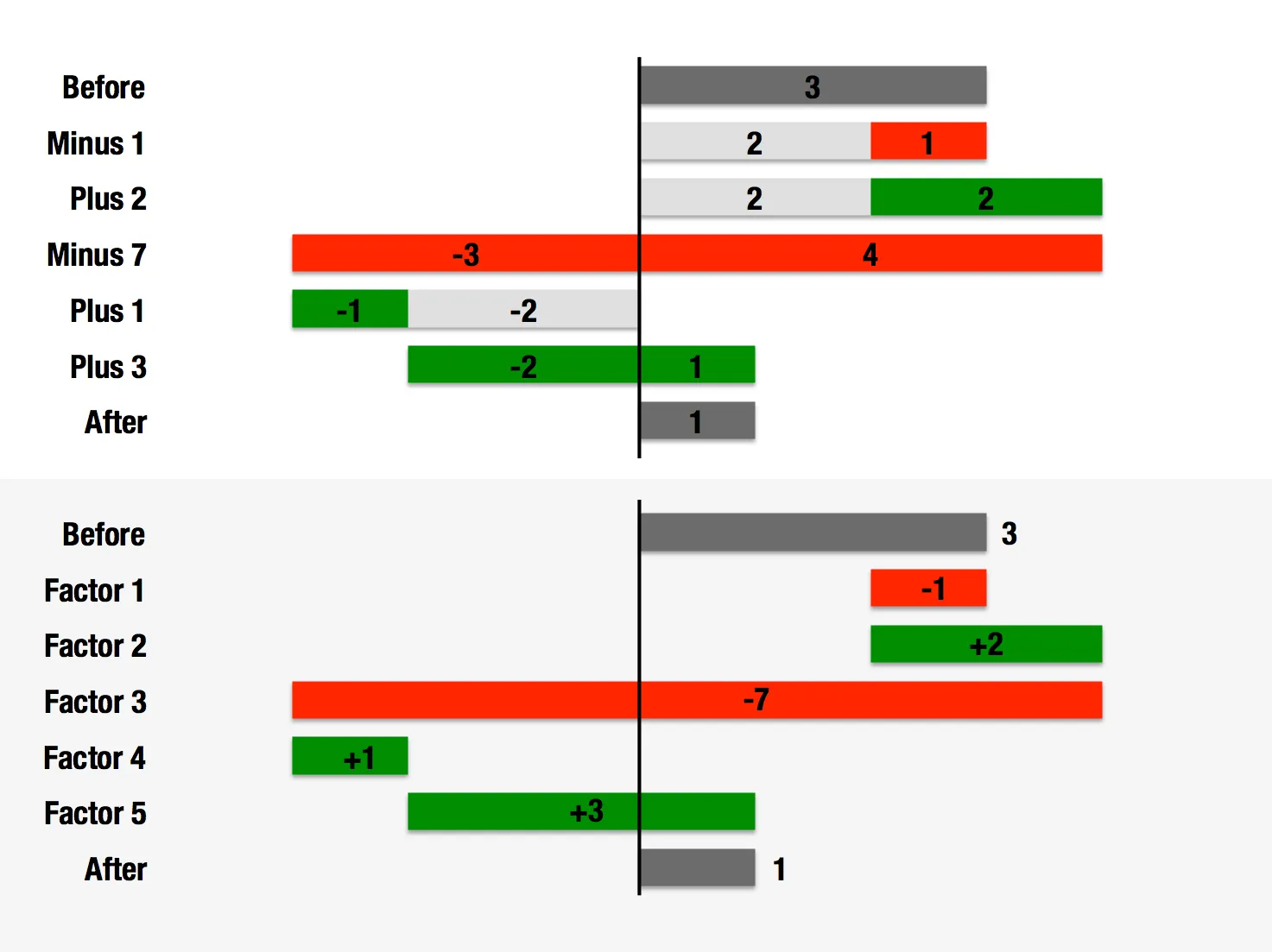
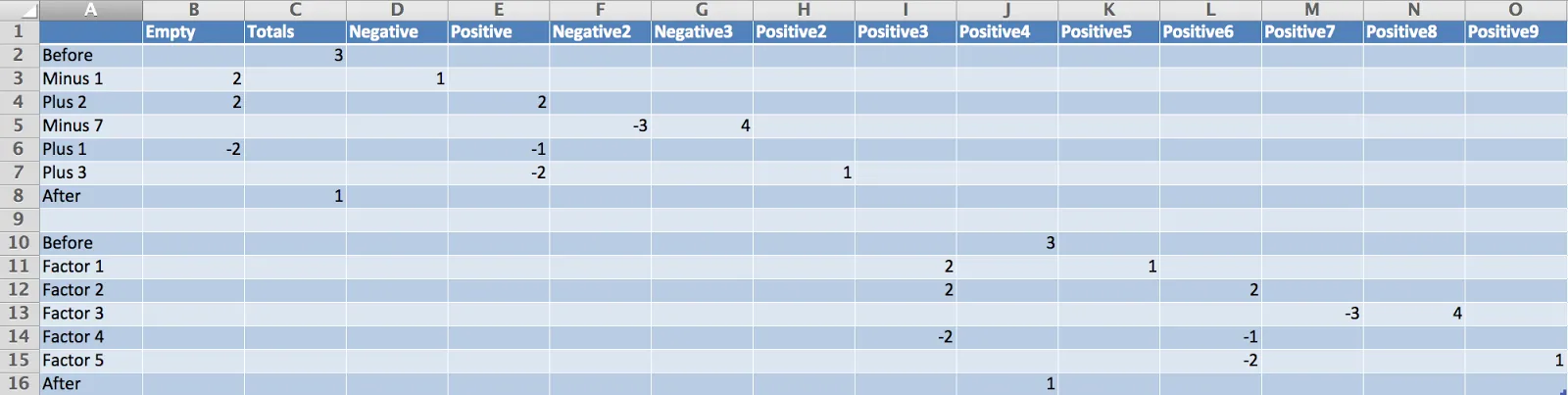
is one of the most read on this blog. The method I showed breaks down when there are many negative numbers involved. The solution is a manual one, sketch your waterfall on a piece of paper, fill in all the numbers, and fiddle with colours until you get it right. Remove the automated data labels and put text boxes with the values instead. See the example below.