

Line graphs with supply and demand shifts, pricing, are great for a round the table discussion of micro economics, but they are less suitable for presentations for large audiences. Take the example below. It takes time before you get the picture (what is on the axis, what do the crossing lines mean). Once you understand the framework you can have a great discussion about it. But in a big audience setting, not many people will get there, unless you build it up slowly, slowly one step at a time.
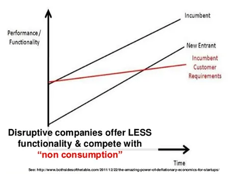
This image was taken from a presentation by Mark Suster, which in general was an excellent presentation. Not consistent in formatting, but I think the audience will forgive a busy VC harvesting charts from multiple sources, it is the content that matters.