SlideMagic Blog

Frequent updates about all things presentations since 2008. Subscribe to never miss a post.

RSS
all posts

Search results for “web design”

·Cartoons

Not reality, not a cartoon

Have a look at these great images (on Fubiz) in the series “Enlightened Souls” by French photographer Fabrice Wittner. He uses images of people with a stencil-like effect and puts them on a background of a real photo.

This effect might be very useful in presentation design. It is very hard to a series of images with a consistent look and feel on either stock photo sites, or Flickr. Moreover, I find that using images with real people not working very well in slides. It is too personal. This slight distortion of the characters might just solve these 2 problems in one go.

·Images

Projecting black

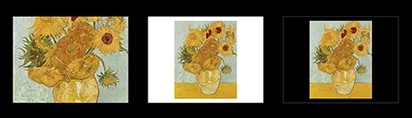
When a screen projector projects the color black, it projects nothing. Think about this when designing slides. If you have an image with an aspect ratio that is different from a regular slide (4:3, 16:9) and it is not possible to crop it without damaging its visual impact, make the bits of the slide that are not covered black instead of the default slide background color you are using. Once on screen, the black border will blend in with the area outside of the projection screen.

·Art

Diagonal lines

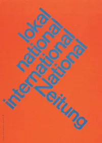
I do not understand why I have not used diagonal lines in presentation slides more, they work great together with simple shapes and colors. The Swiss graphic designers from the 50s and 60s were masters in this. The poster on the left is for the National Zeitung, designed by Karl Gerstner in 1960. On this page, you will find a few more posters that use diagonal lines combined with simple clean typography.

·Delivery

Teaching teenagers (2)

Last week I did my presentation design workshop to this year’s class of MEET (more details in an earlier post) in Jerusalem. I used grown-up stuff for these 15-16 year olds, a slightly modified version of my deck about investor and sales presentations designed for a senior managers. The results surprised me.

Despite being a 09:30am speaker (teenagers do not get a lot of sleep when they stay away from home in a large group), 95% of eyes were hooked on me (5% were deeply a sleep). In my usual audiences I rarely find someone really sleeping, but there are a lot more people distracted, even if your story is interesting.

Afterwards, I coached the students in the design of the pitch presentation of their ideas. It was interesting to see how these kids were sponges of ideas: the presentations were stitched together over the course of 3 hours and often looked better than finalized version 1s of pitch decks that clients sent me at the start of a project. The new generation has not been programmed by overhead transparencies and Microsoft PowerPoint bullet point templates, but is ready to try a fresh approach to design.

Teaching to present your ideas should be introduced in education much earlier than it is today.

·Books

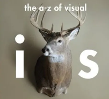
Book: The a-z of visual ideas

An A-Z of Visual Ideas: How to Solve Any Creative Brief (affiliate link) by John Ingledew, aims to help you solve visual creative deadlock. Organized in 26 sections following the letters of the alphabet, it introduces a number of concepts that you can use as the basis of your design. Examples: counter-intuition, eyes, juxtaposition, and zeitgeist.

It is written more with advertising or poster design in mind, but still it can help you broaden your creative mind with the concepts provided in the book, or by encouraging to think out of the (visual) box yourself.

·Art

Screaming colors

I just re-designed my Twitter avatar with a dash of fluorescent paint to stand out in the noise of social media. It is interesting how computer screens work. A really bright color is not yellow or orange, but rather the ones that sit on the edges between 2 colors. Mine is in between yellow and green. It is as if our eyes are being teased by interfering light waves that are just a bit off in terms of wave length.

Other examples of interfering colors are on the border of pink and blue, or green and blue. I blogged earlier about how great classical painters manage to create rich colors through a combination of color mixing, patterns, texture.

·Investor presentation

The Zynga IPO presentation

The Zynga IPO presentation is in the public domain, you can watch the video here. I watched the first 15 minutes of the presentation. Some comments.

Overall it is a pretty good presentation. The slides are organized, decently formated, the speakers are clear. And I guess this is what you have to do for a video-ed delivery about an investment opportunity that is aired for everyone to see on the Internet.

But what could be improved?

I think the presentation was taped with a tele-prompter as the only audience. The pace of speaking is constant. The result could have been better to put in a small live audience in the camera room, to make the delivery more real, more emotional.

Zynga must have many highly skilled graphics designers. I would shed the red border around the slides, get rid of the clouds in the title, but ad more game props and other graphics inside the slides to get the Zynga cartoon-like graphic style in the slides. The team slide with the cartoon characters and the logos of the previous employers is a good example.

The opening slide with the bullet points is an example how bullet do not stick. The slide gets put up. We look at the speaker, try to figure him out. We look at the background, the globe, the dog, start reading the points and note that the speaker is sticking exactly to the bullets. The content of the bullets does not sink in. The bullet slide could have been shortened and instead the opening shot could be focussed on just one message: we have Amazon in shopping, Google in search, Facebook in social, and now there will be Zynga in gaming for the next decade. If you want to invest in social gaming, there is no alternative but to invest in us.


Continue reading →
·PowerPoint

Focus!

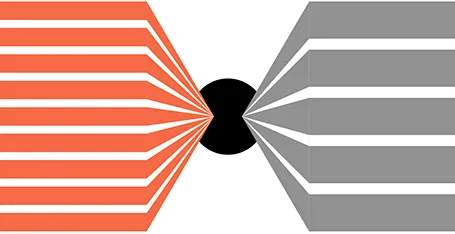
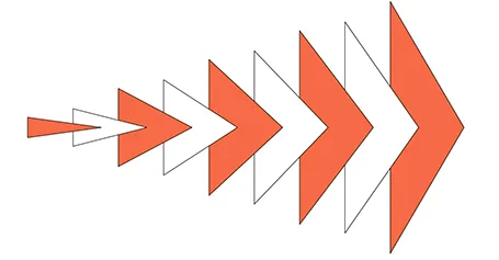
Here is a shape that I recently constructed to highlight that a company was doing lots and lots of things and all of it got focussed on just one area of expertise. The chart was not designed to read out the individual bits, but rather show that there are many, many, many aspects. Later, the presentation elaborates them one by one. You can see that I created the shape through a number of aligned triangles, alternating between the foreground color and white. Make sure that the biggest one is in the back, the smallest one at the front.

·Layout

Text columns in PowerPoint

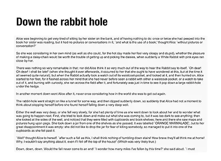
Sometimes, you need to fill a PowerPoint slide with text. These slides are obviously not meant to be presented on a big screen. Still, I make them now and then; a legal disclaimer on page 1 of an investor presentation, detailed bios of the management team in the back, or a page of text in a PowerPoint document that is meant for reading rather than supporting a live presentation.

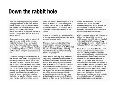
It is difficult for the eye to follow very long lines of text, because when the eye has reached the far right end of the sentence it has to move all the way back and find the start of the line below it. This gets hard with long lines. Also, long lines of text look ugly. Print designers discovered all this centuries ago, and invented the text column.

If you right click a text box in PowerPoint and select format text, you see that one of the options you can choose is columns (Mac). Play around with the number of columns and the white space in between them to get the desired effect. As an example, below are the opening paragraphs of Alice in Wonderland.

·Hacks

An iCloud-style cloud in PowerPoint

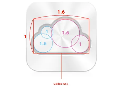
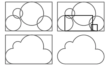
I often need a cloud shape in PowerPoint to draw a network diagram. The standard PowerPoint cloud is not very pretty. Here is a way to construct a new cloud shape in the style of the logo of the iCloud service by Apple.

Takamasa Matsumoto originally discovered how the iCloud logo is infused with golden ratios. If you use these proportions to draw some basic shapes in PowerPoint, you can combine them using the shape union command (on the Mac right click the selected shapes, go into grouping and select union). You see that I use 2 extra rectangles to fill up the shape.

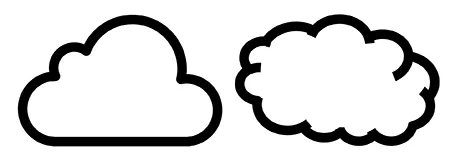
Here is the final result compared to the standard PowerPoint cloud shape, with heavier lines around the shape.