How to write your memoir using AI
A friend asked me advice on how to use AI to write a memoir. His challenge: how to make the book and get the real emotion in. A (human) ghost writer had only partly be successful. My hunch was a double approach. First, use AI to get your dry fact base right. What happened when, backed up by files, urls, etc. Then ask someone to interview you and upload that audio to provide emotional context.
When I asked AI, it came up with a similar solution. It went further, have AI interview you, not a human. Anyway, I am adding the whole result below, since it contains many useful points about how to set up your file system, where to use AI, where to use a ghostwriter, and where to do things yourself.
This mirrors what I suggest people do when writing a pitch or presentation. After having battled the content for a few weeks, take a step back, record yourself giving the elevator version of your story (no slides), and listen back to the result. What sequence did you use? What points did you emphasize. Where were you really missing a slide. The best way how to capture how a story comes natural to you.
🤖 AI-generated — the rest of this post was written by AI.
From Shoebox to Book
A complete method for writing your memoir with AI — using the machine where it helps, and staying human where it matters
An iCloud-style cloud in PowerPoint
I often need a cloud shape in PowerPoint to draw a network diagram. The standard PowerPoint cloud is not very pretty. Here is a way to construct a new cloud shape in the style of the logo of the iCloud service by Apple.
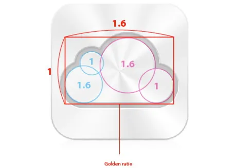
Takamasa Matsumoto originally discovered how the iCloud logo is infused with golden ratios. If you use these proportions to draw some basic shapes in PowerPoint, you can combine them using the shape union command (on the Mac right click the selected shapes, go into grouping and select union). You see that I use 2 extra rectangles to fill up the shape.
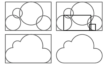
Here is the final result compared to the standard PowerPoint cloud shape, with heavier lines around the shape.

Brilliant: image cut outs in PowerPoint
PowerPoint does not have the rich image clipping and cropping tools that PhotoShop has. To take the background out of an image, you can set its background color to transparent and hope that the image edge come out reasonably clean.
Jose Arriaga recently started blogging about presentations on PowerPoint Symphony. He discusses an original alternative method: drawing a shape similar to an image and then fill it with the source picture as a background. Full details in his post here.
Google Docs as an alternative to YouSendIt
File sizes are getting out of control. YouSendIt is a tool to overcome size limitations on email attachments, but it has one big drawbacks though: confidentiality. If you do not sign up for the premium version, anyone who gets her hands on the file link can download it.
One solution is Google Docs. Recently, Google updated the service and it is now possible to upload and download files that are not in Google’s propriety format. Plugins such as OffiSync create a seamless integration between Microsoft Office and Google Docs. The advantages:
- Tighter security
- The ability to maintain one master document that you iterate, rather than emailing multiple versions of the same presentation around.
PPT hack - custom chart templates
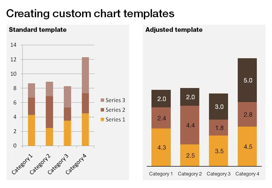
The standard PowerPoint templates do not look very good. The standard slide layout invites people to write presentations through endless lists of bullet points. But even more time-consuming to change are the standard templates for data charts.
This earlier post with a make-over of a column chart in a presentation by Skype shows some of the pain a presentation designer has to go through over and over again to create decent data charts. It took me around 17 years to discover the option to create your own templates. Let’s save you this time, right now.
If you click a chart in PowerPoint 2007, you can find the “save as template” button in the “design” ribbon of the chart. (Confusingly, two “design” ribbons pop up when you have a chart open, one for the chart, one for the slide). Give your template a name and PowerPoint 2007 will save it in the appropriate directory (with a “.CRTX” extension, but you do not need to worry about that).
The next time you select “insert chart”, a folder appears at the top of the standard PowerPoint options, open it to create a data chart using your own customer templates.