SlideMagic Blog

Frequent updates about all things presentations since 2008. Subscribe to never miss a post.

RSS
all posts

Category Typography

·Advertising

Subtle light effects in fonts

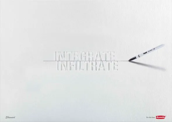
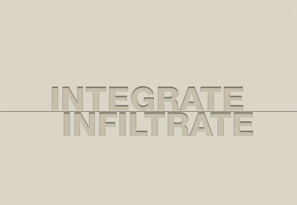
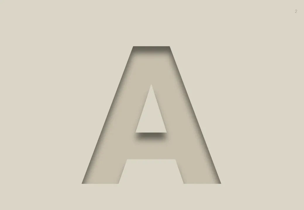
Inspired by this ad, here is how to create the effect of fonts that seem sunk below the surface in PowerPoint 2007 (as shown in the last 2 images).

  1. Choose a background color
  2. Enter text, preferably in a fat font (I used Helvetica Neue Heavy in this example)
  3. Select the text, go to format, text effects, shadows, and pick inner shadow with light from the top
  4. In text effects, pick a text fill that is just slightly darker than the background

Via Ads of the World

·Design

Motion graphics going analogue

A cute video clip designed by David Pino full of analogue motion graphics: characters held up by wires and movement because of a camera actually changes location.

Found via Fubiz

·Design

An unusual take on typographic color...

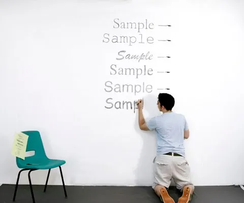
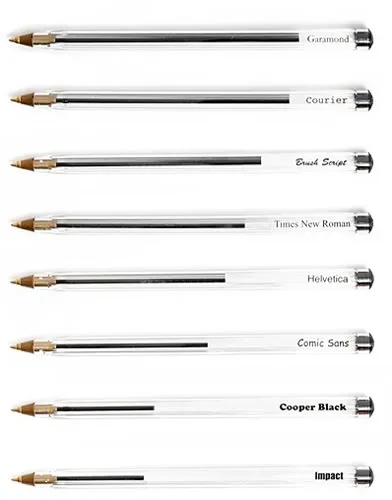
Typographic color is the apparent level of black (or color) that appears to you when looking at a block of text.

Matt Robinson engineered an interesting experiment to test it. Take low-cost, transparent ball points, use them to write the same text in different fonts on a a wall, and see how much ink is left in them afterwards. A quantification of typographic color use (and/or) waste of ink.

Courier comes out really environmentally friendly in this test. It might be true in terms of ink, but this is definitely not the case of you measure the amount of paper used.

I am a bit late to discover this via Ministry of Type.

·Design

Grunge fonts

I must admit, I am ignoring my own earlier assertions about not using non-standard fonts in presentations. PCs do not come with Helvetica installed, and I love it. In most cases, embedding the font inside the PowerPoint presentation makes sure that people can use it on other computers as well.

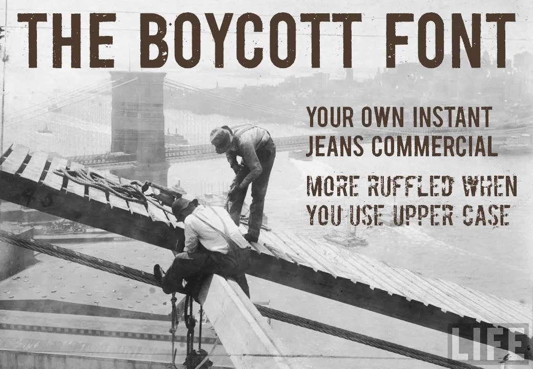
Helvetica is a relatively tame font. Selectively you can go a bit wilder. The image below (taken from the excellent Google LIFE image archive) mixed together with the Boycott font gives that instant jeans commercial effect. Here is an example of a presentation that uses something similar. Obviously, these type of fonts are only to be used for big image/huge font presentations, and probably not in every presentation you make.

·Design

Don't underline

Don’t underline, ever. It does not look good. There are other ways to emphasize a word. Make it bold, change the word’s color. Love these tiny blog posts.

·Advertising

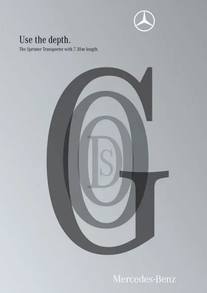
Here is a new way to look at 3D typography

This ad uses 3D typography in a way that is obvious, but only after you have seen it. The letters are positioned and sized in such a way that it creates a sense of depth, semi-transparent fills add to the effect. Very well done. It works best for short words that have lots of “open” characters in it, for example “goods”. Via Ads of the World.

·Art

Finding font inspiration in Bauhaus architecture

More presentation design and art today. I had a very clear policy on the use of fonts and typography:

Until now. I just finished a presentation:

  • Set in ALLCAPS
  • Using the Futura Bk font
  • 90% of the slides are set in bold (yes, ALLCAPS bold)

The Futura font family is to blame. The history of the font go back to the 1930s and its design is heavily influenced by the Bauhaus movement. Clean geometrical shapes, look at these o’s, almost perfectly round.

Maybe being located in Tel Aviv, a city that has one of the world’s most extensive collection of Bauhaus architecture, had something to do with it. The picture below is an example of a Bauhaus-style building in Tel Aviv, the “Bait ha’Onia” or “Ship house” on 56 Levandah Street, designed by architect Arieh Cohen and built in 1934-1935. To make the side track complete, if you are interested in Tel Aviv Bauhaus architecture, make sure to get your hands on this book (text both in French and in English).
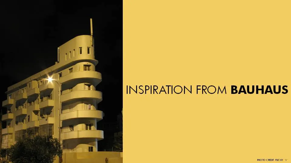
Back to presentation design. In particular I like two font variations of Futura. The Light version (Futura Lt) for thin, elegant, sentences in sentence case, and the Book version (Futura Bk) for all caps. The allcaps look especially impressive in fat bold (look at the font in the image). Obviously, some of my old font design principles still hold. Allcaps bold fonts should only be used in presentation that contain a few words per slide.


Continue reading →
·Advertising

Keep your text trapped in its box

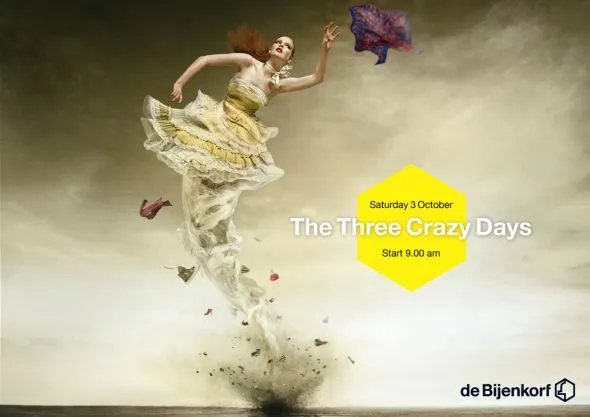
The elaborate tornado illustration of this ad is pretty, but it looks like there was not much time left to think of a good place for the punch line and the dates of the event. Eyes and brains do not like reading text over fluctuating backgrounds.

Via Ads of the World.

·Design

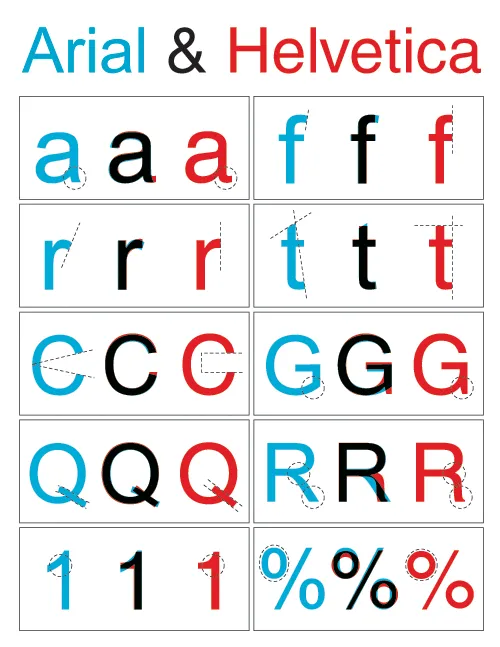
Why does Helvetica look so great on a Mac and so poor on a PC?

I like the clean Helvetica font in print material. I like the Helvetica font in presentations designed on a Mac. Somehow, the PC version does not appeal. The answer is: it’s not Helvetica. To save on royalties, Microsoft included the look-alike Arial with its Office software suite. The fonts look similar, but there are subtle differences. And they make all the difference.

Image designed by the ragbag, found via Swiss Miss.

I have not solved the problem myself. I think none of my clients have Helvetica installed on their PCs, and despite workarounds, I hesitate to create font issues with my presentations.

·Design

Reduce font size to increase readability

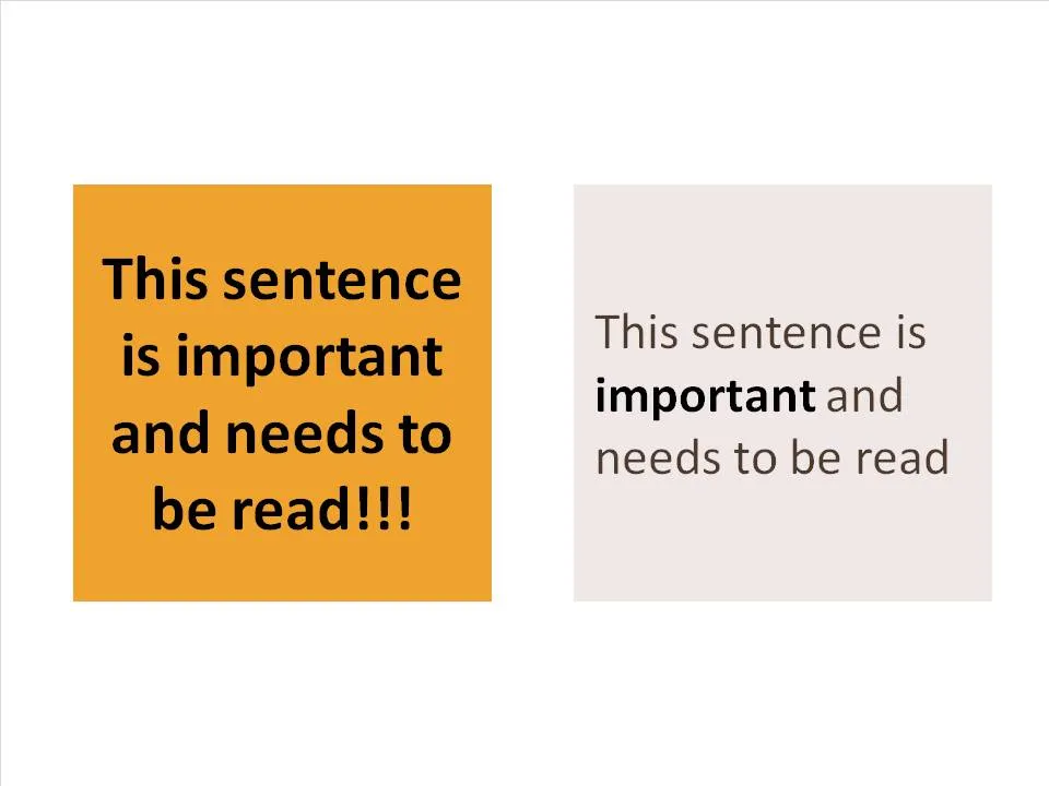
A follow-up on yesterday’s post about avoiding bold fonts whenever you can. Sometimes, reducing font sizes can actually help you increase the readability of a point. See the example below.

Why is it easier to read the box on the right? (At least I find it easier to read)

  • There is (empty) white space around the text, drawing my attention to the sentence that now sticks out. On the left side, the sentence blends into the very loud background noise of the slide. The text now looks like a coherent piece of information that can be interpreted by the brain in one snapshot, as opposed to the left side where we need to read out each word left to right, top to bottom to see what’s written there.
  • The proportion of the text block is more rectangular, close to the 16:9 aspect ratio of a wide screen TV, a shape that is more natural for the brain to absorb information
  • Removing the bold font except for one word makes the whole typography more calm and easier to read
  • Taking out screaming exclamation marks and left-aligning the paragraph improves readability further

Less is more.