SlideMagic Blog

Frequent updates about all things presentations since 2008. Subscribe to never miss a post.

RSS
all posts

Category Typography

·Design

Bold fonts as a last resort

Typography designers design a bold variety of a font as if it were a completely new type face. There is no magic computer algorithm that turns a regular font into a bold one. From scratch, designers need to make the call about balance and readability all over again.

I think bold fonts do not look as good as regular ones. They are often bulky and lacking elegance. Italics/bold fonts are usually even worse.

What to do as a presentation designer? Design your slide without bold fonts initially, and only add bold as a last resort. Your first tool of emphasis should be to increase the size of the font/

  • To highlight a single word, rather than inflating a whole sentence
  • To give more contrast to text written over an image as a background
  • To highlight a label in 10pt font or smaller in a complex diagram such as an IT system architecture

(Not) surprisingly, I find that regular slide titles look better than bold ones. Adjust your template if you can.

Somewhat related, a post on color as a last resort.
·Advertising

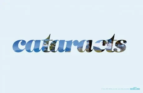
Filling charaters with an image (redux)

This ad (via Ads of the World) reminded me of an earlier post showing that you can also achieve this effect in PowerPoint (2007). It only works with huge, huge characters. The ones I used in my original post are actually not big enough.

·Animations

Beautiful motion graphics: "Did you know 4.0" video by Xplane

This video by Xplane (link to their blog with details) is making the rounds on the Internet. (Watch it in the original format on YouTube as blogger cuts off the right side of the wide screen video)

It’s a beautiful example of kinetic type or motion graphics. Some comments.

  • It is made with software available to everyone, the source files are here.
  • There are some interesting visualization concepts, for example pie chart overlays abour 2:30 minutes into the video (thank you Steven Levy for pointing this out)
  • Quotes are great to get one number across. Still I believe that comparing two numbers is not very powerful in 2 consecutive quotes. Rather the good old bar chart does a better job.
  • The real artistic power in this presentation is the subtle use of informal cartoon drawing techniques, I style that I like.
·Advertising

Hyphenation and line wrapping - do it manually

When you use very little words on a slide, the position of the them becomes crucial. I always correct the automatic line wrapping manually.

  • Make sure that key noun-verb combinations are placed together in one line
  • Adjust the text (using different words) to make sure that there are no big empty white spaces in a line because of long words that did not fit in (I rarely use hyphens)
  • Re-order “sentences” according to their length

Either the designers of this ad wanted to make something that is hard to read on purpose, or this is a mistake.

Via Ads of the World.

·Design

Cool - font designed by following car movements

iQ font - When driving becomes writing / Full making of.

An unusual approach to font design. You can download the font here. Via Swissmiss. If you are into design, you should follow her blog.

·Design

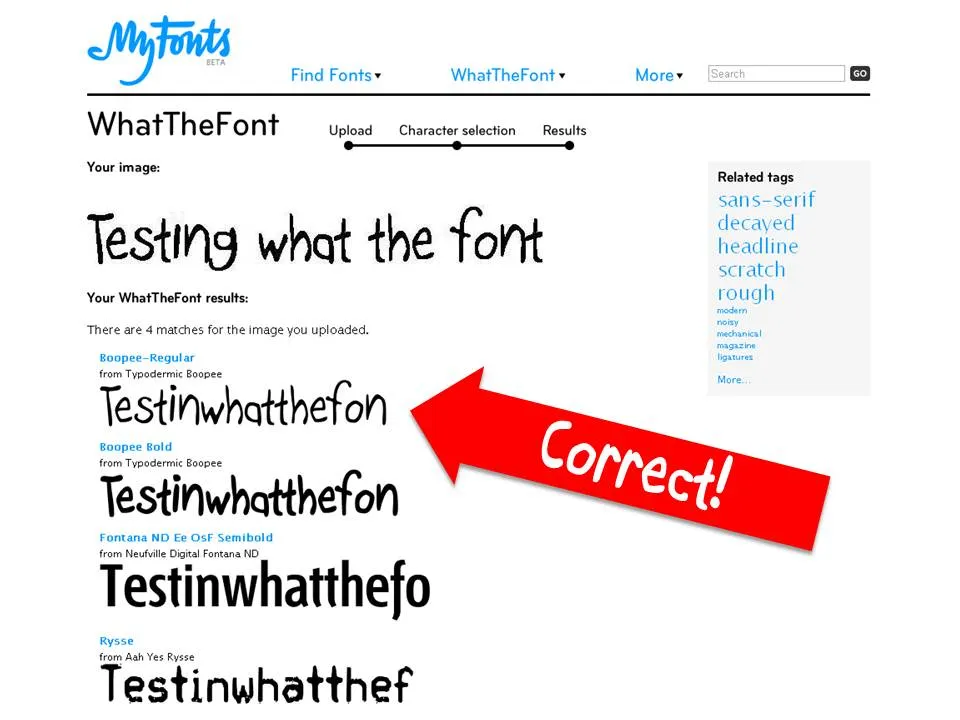
WTF - What The Font

I am not sure whether this is new, but I only came across this tool recenlty. You provide What The Font with an image of a text sample and it gives you suggestions what font might have been used.

·Design

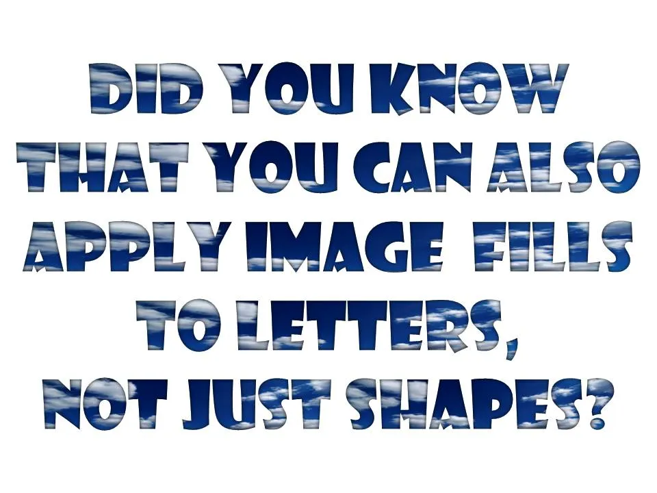
Filling PowerPoint letters with an image background

A neat trick. Select your text, go to “format” and select “text fill”. The font I used in the example below is “Showcard Gothic”.

·Design

Graphical inspiration via RSS feeds (and hard-to-read-typography)

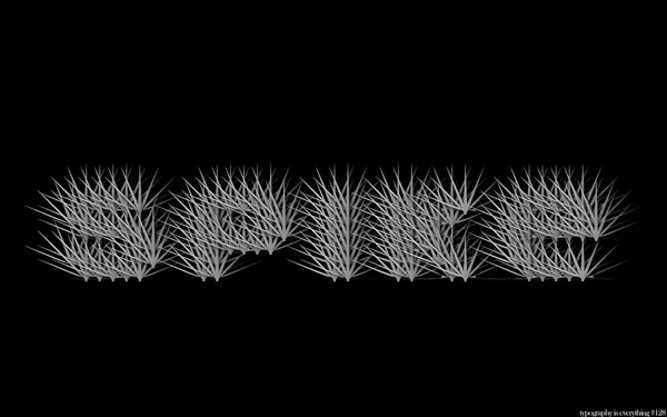
There are many great creative web sites that you can add to your feed reader for a daily dose of graphical design inspiration, far away from the PowerPoint slide editing screen. One example is Behance showing projects in typography, graphics design, illustration, photography, and other design disciplines.

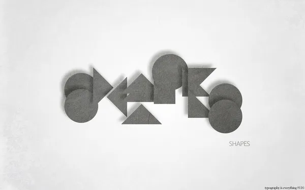
Today, “hard to read typography” by Simon Page is one of the items featured on the front page. Here is one example from the collection that is actually relatively readable.

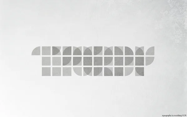
A bit harder to read:

What’s written here? Is “shapes” a helpful hint?

·Design

Font information in a book's small print

Most books mention the fonts used in the small print on one of its first pages (together with the publisher info, ISBN, etc.). This a great way to discover new fonts, because a full book sample is so much better than a few characters of sample type on a computer screen. Children’s books are my biggest source of inspiration.

·Design

Typography basics: readability, legibility, and impact

I am reading an article in Layers Magazine with a good summary about the basics of typography:

  • Readability: how easy is it to read a long block of text
  • Legibility: how easy is it to recognize short bursts of text instantly
  • Impact: what emotional reaction does a type face provoke

I often use all caps in PowerPoint. It was interesting to read that all caps forces the brain to read the word letter by letter before it can be recognized, while with regular type a word gets identified instantly.