

Typographic color is the apparent level of black (or color) that appears to you when looking at a block of text.
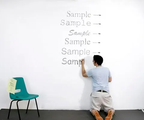
Matt Robinson engineered an interesting experiment to test it. Take low-cost, transparent ball points, use them to write the same text in different fonts on a a wall, and see how much ink is left in them afterwards. A quantification of typographic color use (and/or) waste of ink.
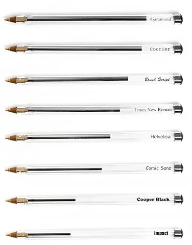
Courier comes out really environmentally friendly in this test. It might be true in terms of ink, but this is definitely not the case of you measure the amount of paper used.
I am a bit late to discover this via Ministry of Type.