SlideMagic Blog

Frequent updates about all things presentations since 2008. Subscribe to never miss a post.

RSS
all posts

Category Typography

·Design

Angry Birds fonts in PowerPoint!

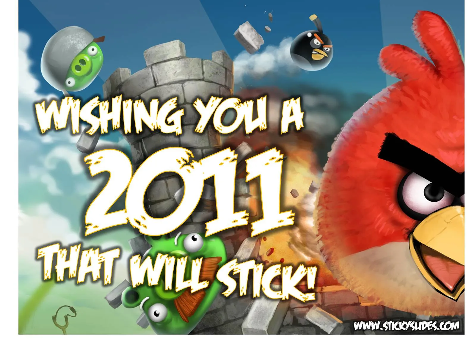
Here is the post to close 2010 and wish you all the best for 2011: Angry Birds fonts in PowerPoint.

  1. Close PowerPoint
  2. Install the Feast of Flesh BB font on your computer (link here)
  3. Open PowerPoint
  4. Type a text, and set the font as Feast of Flesh
  5. Increase the size
  6. Select the text, and click “format”
  7. Pick a nice yellow in “text outline”, set the weight to 1pt
  8. Staying in “format”, select “text effects”
  9. Select “glow”
  10. Select “more glow options”
  11. Pick the black one

And you are done!
·Design

Watch those bold fonts

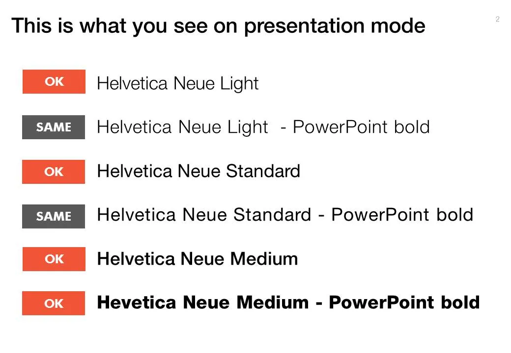
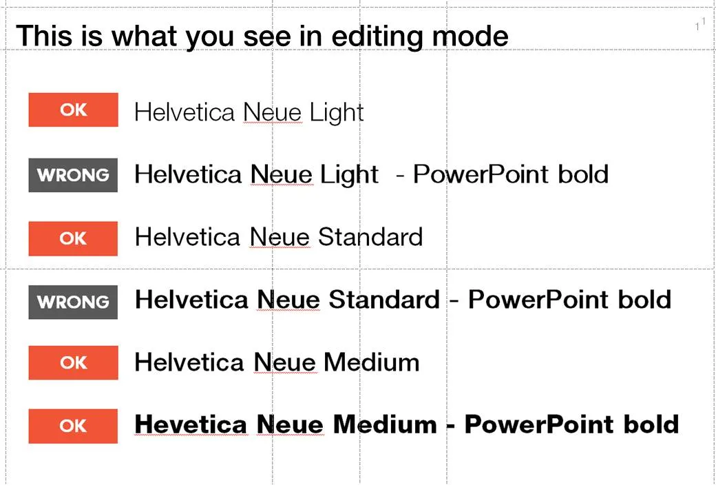
When PowerPoint does not have the right bold or italic font variation installed, it tries to emulate the real thing. For example in the case of bold, it plots slightly overlapping version of the same letter next to each other to make the characters look heavier.

But when you install the correct fonts they get put in slightly random places. Look at the editing screen below (click on the images to see a larger picture). You can see where things go wrong as PowerPoint tries to fill in the missing gaps. Strangely enough in presentation mode, it displays these fonts as regular type.

Secondly it takes some tweaking to get the right font you want:

  • A bold version of standard Helvetica Neue is the medium variation that I have installed
  • To get the heavy variation (which I also bought) I need to take the medium variation and have PowerPoint set it to bold.

Fonts remain mysterious.

·Data visualization

Setting default fonts for PowerPoint data charts

When you insert a data chart in PowerPoint, chances are that the font in which they pop up is the default Calibri. Why? Because you did not bother to change the fonts in “design” “fonts” “custom fonts”. Set the heading and body fonts to whatever you want it to be, and you save yourself a lot of time re-formating data charts.

·Images

Manually adjusting fonts

Sometimes it is necessary to adjust the characters in a sentence manually. Look at this image (with a deep quote) and see how letters line up vertically. Standard horizontal and vertical spacing in PowerPoint will not get you this effect. Put in the characters as individual text boxes and align them to get it just right…

Image via FFFFound

·Design

All caps and sentence caps are harder to read

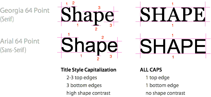
A very interesting analysis of why it is harder to read all caps text on UXMovement. All caps reduces the number of differentiators between words, and hence should only be used in short bites such as titles, logos or lables. I have been ranting about title caps as well before.

OK, sometimes I contradict myself, but all caps worked in this presentation with very few, short sentences.

·Design

Comic sans strikes back / has its say

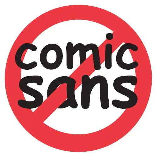
I have joined the legion of designers in criticizing the comic sans font (earlier post here). In this rant (strong language warning), comic sans strikes back at us, elitist Helvetica fans. Written by Mike Lacher, thank you Ellen Daehnick for suggesting it.

·Design

Re-post: keeping titles readable over busy images

A semi-transparent background shading greatly improves the readability of chart titles. See how to do it here.

·Design

The word "management"

These little annoyances in presentation design, the word “management” is one of them. You need it very often, it is relatively long, and it does not look good/readable when hyphenated. How many slides got a 2nd best design because of this word…

·Design

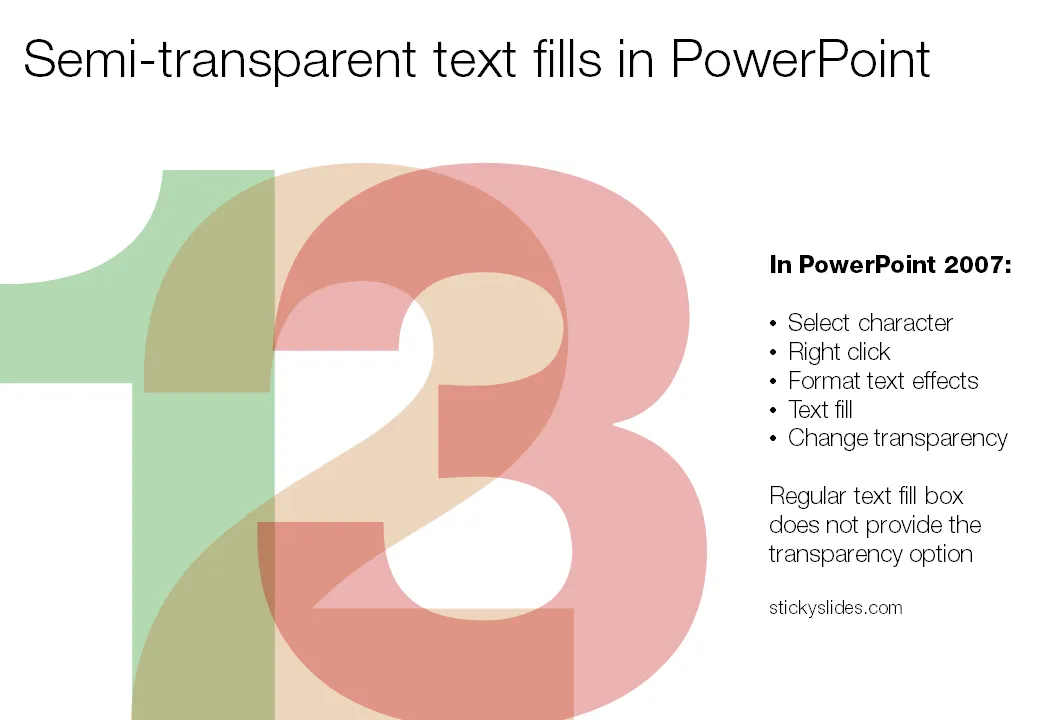
Semi-transparent text fills in PowerPoint

When you pick a color for a shape, PowerPoint gives you the option to set its transparency. However, when you select a color for your font, this dialog box does not appear. How to recreate this effect

in PowerPoint? Here is the work around (PowerPoint 2007).

  1. Select the text
  2. Right click
  3. Format text effects
  4. Text fill
  5. And now you can change the transparency!
·Design

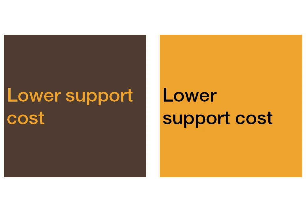
You are better at line wrapping than PowerPoint

When you starting using fewer and fewer words on a slide (keep up the good work!), line wrapping becomes more important. Make sure that words that should be connected, stay connected, and enter a manual SHIFT+ENTER if you need to deviate with the automatic option.