

Blog post

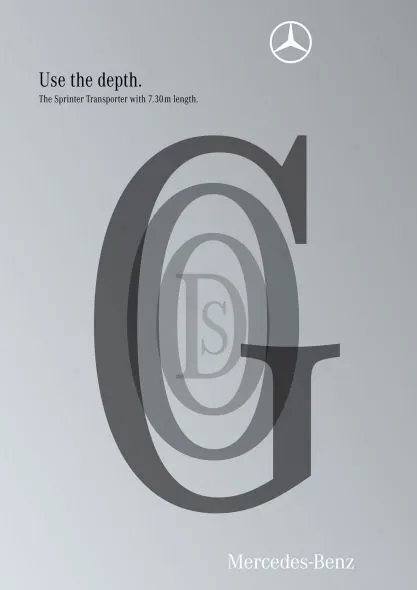
Here is a new way to look at 3D typography

December 12, 2009 · by Jan Schultink
← all posts

This ad uses 3D typography in a way that is obvious, but only after you have seen it. The letters are positioned and sized in such a way that it creates a sense of depth, semi-transparent fills add to the effect. Very well done. It works best for short words that have lots of “open” characters in it, for example “goods”. Via Ads of the World.
AdvertisingDesignPowerPointPresentation designPresentationTypography

About this blog

Notes on all things presentations — design, storytelling, and AI workflows.

Subscribe now to never miss a post.

RSS

About SlideMagic

A platform for business presentations.

A free student plan is available.