

I like the clean Helvetica font in print material. I like the Helvetica font in presentations designed on a Mac. Somehow, the PC version does not appeal. The answer is: it’s not Helvetica. To save on royalties, Microsoft included the look-alike Arial with its Office software suite. The fonts look similar, but there are subtle differences. And they make all the difference.
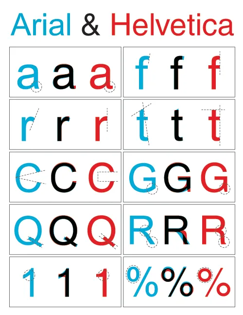
Image designed by the ragbag, found via Swiss Miss.
I have not solved the problem myself. I think none of my clients have Helvetica installed on their PCs, and despite workarounds, I hesitate to create font issues with my presentations.