SlideMagic Blog

Frequent updates about all things presentations since 2008. Subscribe to never miss a post.

RSS
all posts

Category Software

·Templates

Stress-testing a new corporate PowerPoint template

The PowerPoint template is usually an after-thought in a corporate brand image project. Business cards, letterheads, envelopes, are considered more important than the look & feel of almost any document that is exchanged among employees and external investors, clients, etc.

As a result, you will find the PowerPoint template guidelines at the back of the brand book, written in language that is aimed at a print designer, it uses non-standard fonts, and its programming was a copy paste from Adobe InDesign.

Here are some things you can do to stress-test a suggested PowerPoint template that is handed to you by your graphic design agency:

  • Click view, slide master, and see whether it contains dozens of layout slides that are leftovers from Microsoft’s default master, ask why you need them
  • Check the file size of an empty presentation, any huge image hiding in the master?
  • Copy past an old presentation into the new master, see what happens. How much time do your employees have to spend fixing things?
  • Try an empty text box and an empty shape: what are the standard colours, standard fonts? Do the bullet points look decent, or do they come in weird shapes and/or colours
  • Are there any random guidelines all over the slide that no one needs?
  • Open the presentation on your children’s computer, how does the template look? Especially the fonts
  • Create some bar and column charts. Are the colours and fonts correct?
  • Open the deck on a Mac and see what happens
  • Try writing a big headline, maybe one that runs over 2 lines, are any logos or other slide items getting in the way?
  • Same for a big rectangular table, can you fit it, or is there a logo or other graphic element sitting in the one of the corners that gets covered?
Continue reading →
·Delivery

The smartphone snap

People re-use slides for different audiences. And 10 years ago, you would still be able to skip a few slides quickly when they contain confidential information if - by accident - you forgot to delete the product roadmap that you used in last week’s Board meeting. (Or you forgot to mark them as “hidden”).

The smart phone with super high resolution cameras means that nothing is safe anymore. There is the accidental smartphone snap, but also the professional “slide harvesters” diligently recording every slide in your deck. An HD video just needs a millisecond to capture the slide that is being skipped.

Here are some other confidentiality pitfalls to watch out for:

  • Data that still sits in the underlying Excel sheets, even when you take the data labels of your chart
  • Hidden slides in presentation mode that are there for everyone to see when you send a PowerPoint file
  • Speaker notes
  • Collaborator comments
  • File names or URL names that can still persist in a document even after its is PDF-ed
  • Tiny footnotes that give away important information

Cover image by Ben White on Unsplash

·PowerPoint

Saying no to "send info to Microsoft"

I am a huge fan of the improvements Microsoft has been making to PowerPoint over the last few years, it now outshines Keynote.

One thing though, is bothering me: after every recent update it is very hard to say “no” to the question whether Microsoft can record every single one of your clicks to make the program even better. You can simply accept or learn more.

On a Mac, I managed to make the window go away by repeatedly clicking on the red cross in the top left corner of the pop-up window, hopefully that registered as a “no”.

·Software

Microsoft VBA versus Applescript

I am dusting of my coding skills that were pretty much put on hold in the early 1990s and have started to program macros to automate the mechanics of the template store: creating individual slides and thumbnails for PowerPoint and Keynote in different aspect ratios of these design.

Things in the Microsoft Office ecosystem run smoothly (“VBA”), for Mac, a lot less so. Applescript is a language that aims to automate pretty much everything you can do in Mac OS. It has been around for a very long time, but it is falling short.

At first sight, the language looks very friendly, almost human-like. And here is a problem: human language is ambiguous. It is incredibly hard to use it to program computers. When I look at example Applescript code, it looks very easy to adjust and re-use, but it is an incredibly pain to get it actually working and iron out the last bugs. Writing macro scripts will never be something that the average Apple user will do, so you might as well stick to a programming language that an engineer can work with.

The second problem is the what Applescript can actually do. As Apple put development of Mac OS on the back burner and gave priority to its iOS devices, the functional power of Applescript has been watered down. Old tutorials online show functionality that has been removed in later versions of Keynote.

Now, I am not saying that all esoteric features should be supported in a scripting language, but I am struggling to get the most obvious and basic one that anyone wants to use a Keynote script for: batch conversion of PowerPoint files into Keynote.

Continue reading →
·Images

Flying through

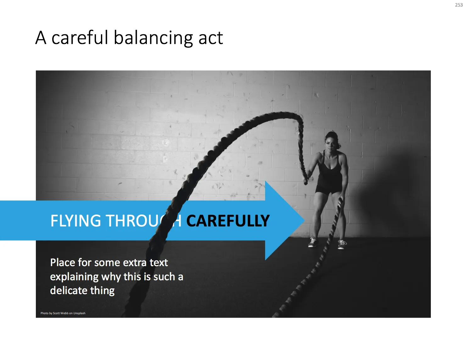
With a bit of Photoshop editing you can create an effect of a PowerPoint shape flying through some loop. I uploaded a new slide to the template store that uses this effect. Over the arrow, I positioned a second layer of the image, but just with a piece of rope with its background isolated. The arrow expanding outside the frame of the image (yes, I look those), adds to the motion feel in the slide.

Click the image to find the slide on the template store, subscribers can download it free of charge.

Cover image by Blake Wheeler on Unsplash

·Data visualization

Years in columns, which way?

In financial statements, the most recent financial period is put first, and next to it is the previous period for comparison: 2017 - 2016. To the frustration of some accountants and CFOs, I insist on putting the years the other way around: 2016 - 2017.

  • The eye is used to moving left to right when looking at time series data
  • It makes tables match line or column graphs that are in the presentation
  • It makes it easer to compare data across 3 years or more

I am not trying to change the reporting practices for financial statements. In the annual accounts, the current year is the most important one. It needs to be accurate and is usually shown with far more digits (precision) than I would use in a presentation. A comparison to last year’s numbers is almost an extra, not the main purpose of the page.

Every financial document has its own purpose and own audience: spreadsheets, financial statements and presentation decks. And among presentation decks you can distinguish between quick and dirty documents to discuss (early results), detailed financial information for the investor community, and more generic financial slides for a general company presentation. Different purpose, different slides.

If you want you can check out financial slides in PowerPoint in my template store. Subscribers can download them free of charge.

·Templates

Starting to use the store myself

Recently, I have started to use the template store myself for the few bespoke design projects I still do for long standing clients (SlideMagic gave me a really attractive rate :-)). My hard drive is filled with 1000s of slides and still it is difficult to find a nice clean layout to use as a basis for slide number 1001.

Up until a few weeks ago, I started every slide pretty much from scratch, I have gotten pretty fast in setting up yet another 4x5 table grid. But even I can’t beat search the store for “table” and re-download that slide again and hit the ground running.

I am continue to monitor which slides people decide to buy, and which slides are downloaded by subscribers. Many subscribers download a lot of slides right after they made the purchase, and then don’t return for a couple of weeks. Initial downloads include slides that you can only use in very specific situations, like these sheep. They hardly ever download the same slide 2x. There could be 2 possible explanations:

  • Less likely: after that $99 annual subscription, you better make sure you get what you paid for, maybe the store will stop running somehow before the 12 months are up.
  • More likely: we have built up the habit of mining through old decks, and recycling slides into a new presentation.

As a designer who now uses its own store, I would encourage you to think Netflix, iStock, Spotify: your slides will always be there, and search is there to help you find the slide you need at the moment (and nothing else). Change your design process:

Continue reading →
·PowerPoint

Improved search

Slowly, slowly, I am moving closer to the goal of creating a searchable slide bank bank that is actually useful. Here are the various steps that I have gone through:

  • Designing a slide template that looks good/professional AND blends in easily with existing corporate PowerPoint templates
  • Creating a “boxy” design language that is easy to manipulate and edit, even for non-designers
  • Cutting down the universe of slides to come to a collection of basic slides that can cover almost every possible common business concept that is out there
  • Anticipate the majority of possible search queries to find layouts for every possible angle
  • And now: find a smart grouping slides that creates a really smart way of suggesting related/similar slides

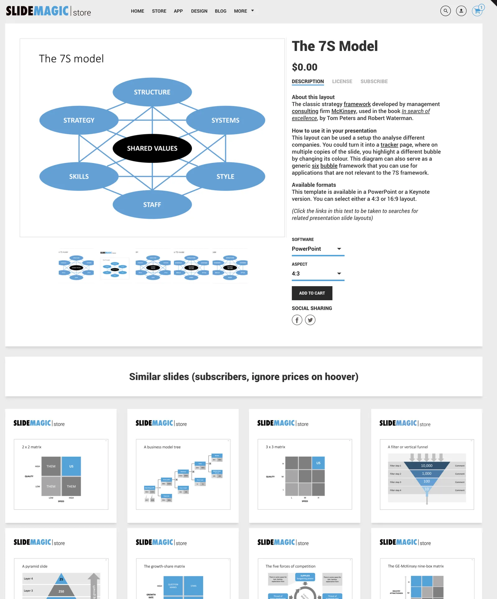
Below is an example of a product page in the store now:

Now that I have automated subscriptions, plus sorted out the search algorithms it is time to clear the last automation hurdle: VAT management globally for both consumer and enterprise customers (the EU has created a nightmare for small digital content stores as it is going after tech giants such as Apple). After that, all attention will be focussed on adding more slide content.

Cover image by Anthony Martino on Unsplash

·PowerPoint

How to format tables in PowerPoint

Tables can carry more data than a data chart and as a result can be less effective in a presentation. For some situations though, there is no point trying to avoid using a table in PowerPoint. For example, when investors want to see the quarterly numbers, they expect to see a table.

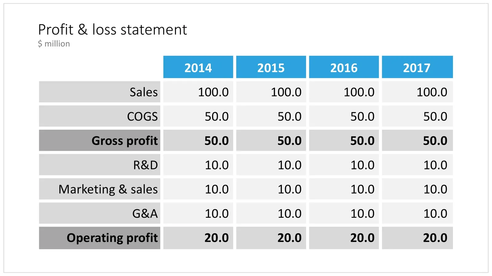
The way you format tables can make a huge difference in how your chart looks. When done well, a table can actually be an effective presentation slide. Have a look at the simple P&L table below.

 A PowerPoint table to present a P&L

A PowerPoint table to present a P&L

This might look like a super simple slide design (it is), but a lot of thought and little tweaks have gone into its design. Let’s take them one by one:

  • Colours have been adjusted to your own colour template, not the standard PowerPoint colours
  • Fonts have been matched to your current template (table can be stubborn sometimes and stick to Arial)
  • Instead of dark lines around boxes, I used lines that match the background colour, making cells a light colour of grey to stand out (or dark, black if you use that background)
  • Totals are bold, and a bit darker
  • The row labels are right aligned
  • The row labels are a bit darker than the cells
  • The data cells are right aligned
  • Numbers are rounded to the same amount of digits, so the dots line up
  • There are not too many digits in the table, enough to convey the data, but not too much to make it cluttered. If the numbers get too big, switch to thousands or millions.
  • There is a bit of inset in each cell, the text does not touch the edges
  • All the rows have the same height
  • All the data columns have the same width
  • The column headings are centered
  • The unit of measure is put at the top of the chart, not repeated inside the data values
  • The table covers the entire frame of the presentation template
  • Double check by hand/calculator: the numbers add up…
Continue reading →
·Concepts

PowerPoint vs Keynote in 2018

Over the past few days I converted all the slides in the SlideMagic store from PowerPoint 4:3 into PowerPoint 16:9, Keynote 4:3, and Keynote 16:9. That was quite a bit of conversion and uploading work… As a result I got an even better understanding of the differences between PowerPoint and Keynote. Here is the 2018 version of the comparison.

Overall both programs are excellent, as you would expect from software that has been around this long. Bugs have been ironed out, and both programs have “learned” from each other to get to a good workflow. So the differences are not that major.

Where PowerPoint is stronger

  • Workflow for advanced users. I can customise the top tool bar with the functions I use most (aligning, distributing, moving things to the back, etc. see my full list of toolbar short cuts here). Also in Keynote it can get confusing at high speed to change colours of text and shape fills, too many clicks, and too many opportunities to get it wrong. The interface looks elegant, but it slows you down.
  • Data chart editing is better in PowerPoint with the full power of Excel behind it
  • Stretching of (groups of) shapes is predictable in PowerPoint: you can distort aspect ratios. Keynote is more restricting and protects the novice designer with stretching images. But, it does the same for large groupings of objects, as soon as you have a few connectors inside, it is no longer possible to stretch complex diagrams across the page, without also increasing its height. This cost me a lot of time to clean up my flow chart template for example. I could not understand when Keynote decides it is OK to stretch, and when not.
  • Complex connector diagrams run more smoothly in PowerPoint. Keynote is “smarter” and helps you pick/decide/suggest possible connector lines between shapes, but because of that, it is harder to convince it to something you want against its own suggestion. In more complex diagrams this becomes a problem.
Continue reading →