

Over the past few days I converted all the slides in the SlideMagic store from PowerPoint 4:3 into PowerPoint 16:9, Keynote 4:3, and Keynote 16:9. That was quite a bit of conversion and uploading work… As a result I got an even better understanding of the differences between PowerPoint and Keynote. Here is the 2018 version of the comparison.
Overall both programs are excellent, as you would expect from software that has been around this long. Bugs have been ironed out, and both programs have “learned” from each other to get to a good workflow. So the differences are not that major.
Where PowerPoint is stronger
- Workflow for advanced users. I can customise the top tool bar with the functions I use most (aligning, distributing, moving things to the back, etc. see my full list of toolbar short cuts here). Also in Keynote it can get confusing at high speed to change colours of text and shape fills, too many clicks, and too many opportunities to get it wrong. The interface looks elegant, but it slows you down.
- Data chart editing is better in PowerPoint with the full power of Excel behind it
- Stretching of (groups of) shapes is predictable in PowerPoint: you can distort aspect ratios. Keynote is more restricting and protects the novice designer with stretching images. But, it does the same for large groupings of objects, as soon as you have a few connectors inside, it is no longer possible to stretch complex diagrams across the page, without also increasing its height. This cost me a lot of time to clean up my flow chart template for example. I could not understand when Keynote decides it is OK to stretch, and when not.
- Complex connector diagrams run more smoothly in PowerPoint. Keynote is “smarter” and helps you pick/decide/suggest possible connector lines between shapes, but because of that, it is harder to convince it to something you want against its own suggestion. In more complex diagrams this becomes a problem.
Where Keynote is stronger
- Cropping of images is more intuitive in Keynote
- For the first time I really worked with the file manager (duplicating instead of “save as”) and went into the version history of Keynote, no need to worry about saving, which was actually really convenient.
There are some charts which PowerPoint can make and Keynote not, I found out the hard way with my conversion effort:
- Slides that use 3D positioning of objects and text distortion
- Slides that use bevels and 3D lighting/shading. I am sure it is possible by carefully selecting the gradients, but there is no 1-click solution
Both of these are not crucial to presentation design. In fact, too much 3D fire power in the hand of the layman designer might not beneficial to the quality of the slides. Below are examples of charts from my template store which are not available in Keynote because I simply could not covert them. (Click the images to be taken to the template store).
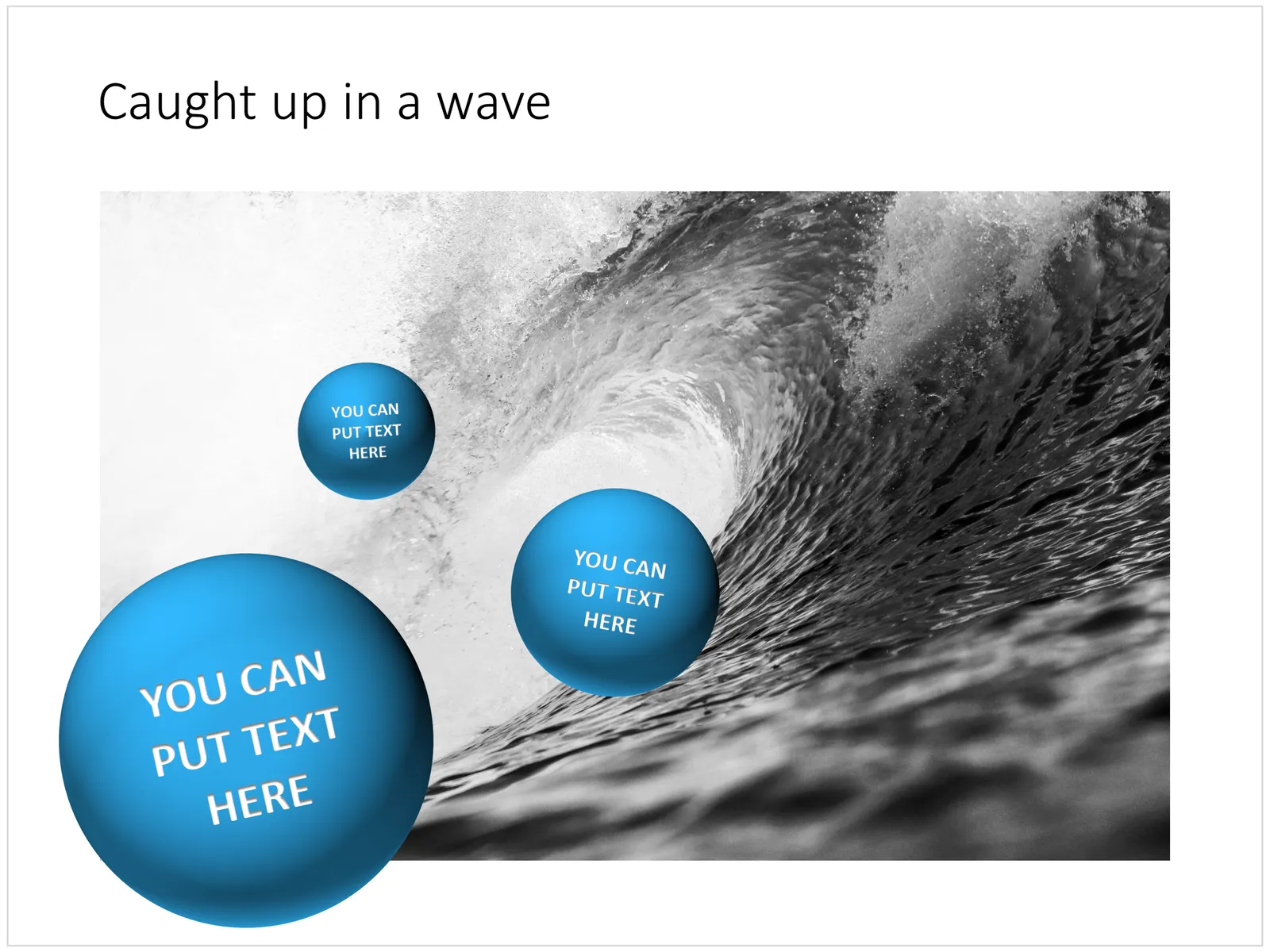
Balls bouncing on a big wave
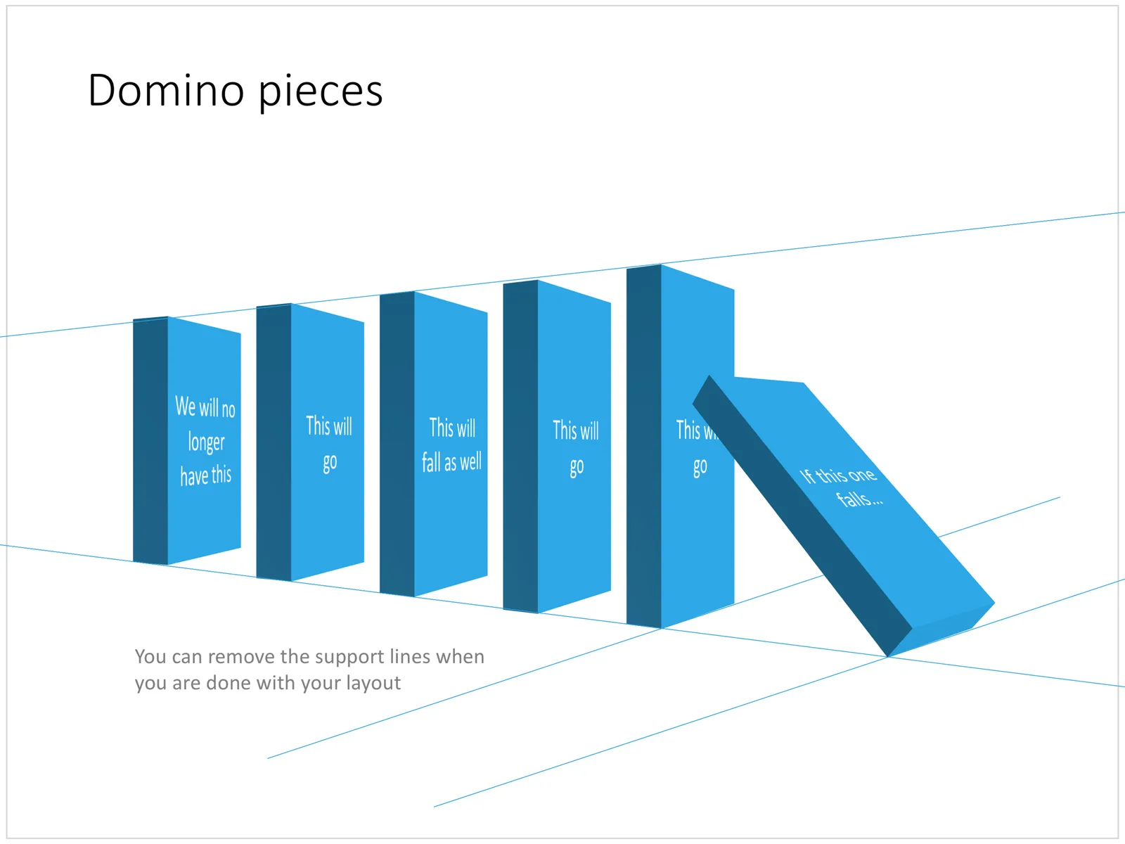
Domino pieces in PowerPoint
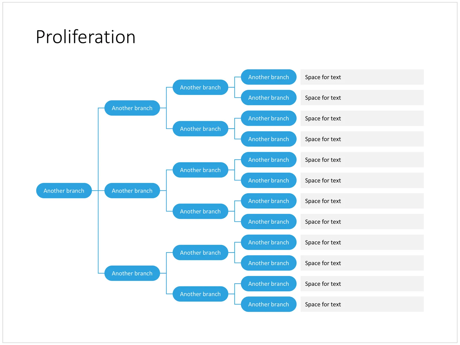
Proliferation of options
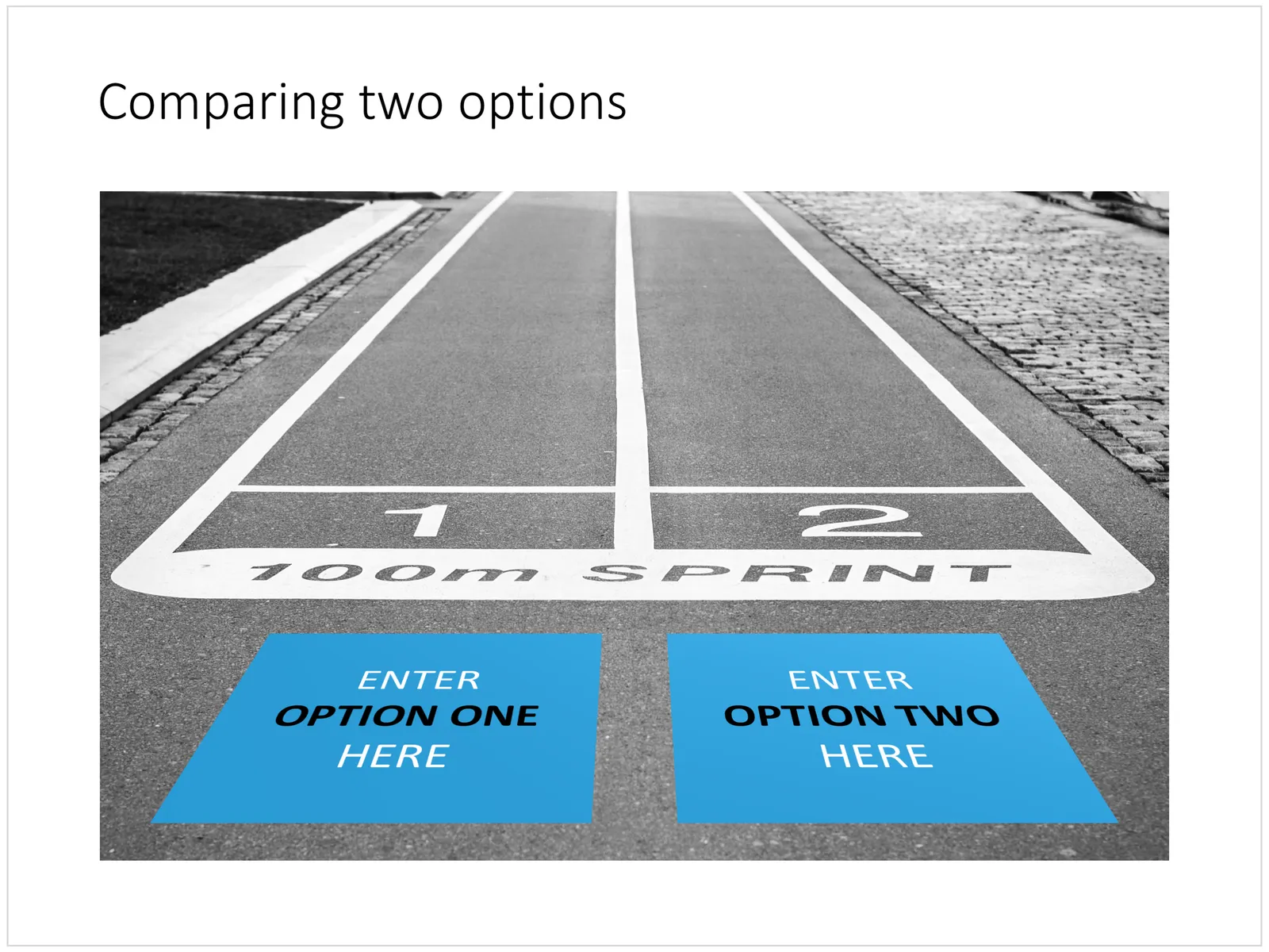
The start line: comparing two optionis
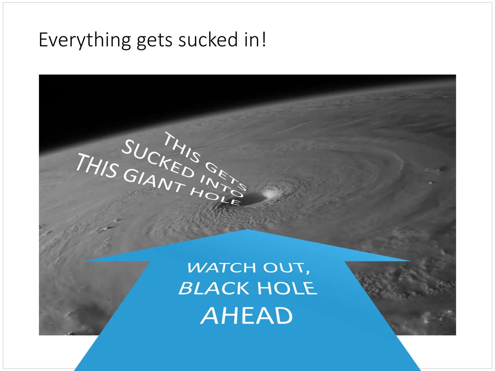
Black hole
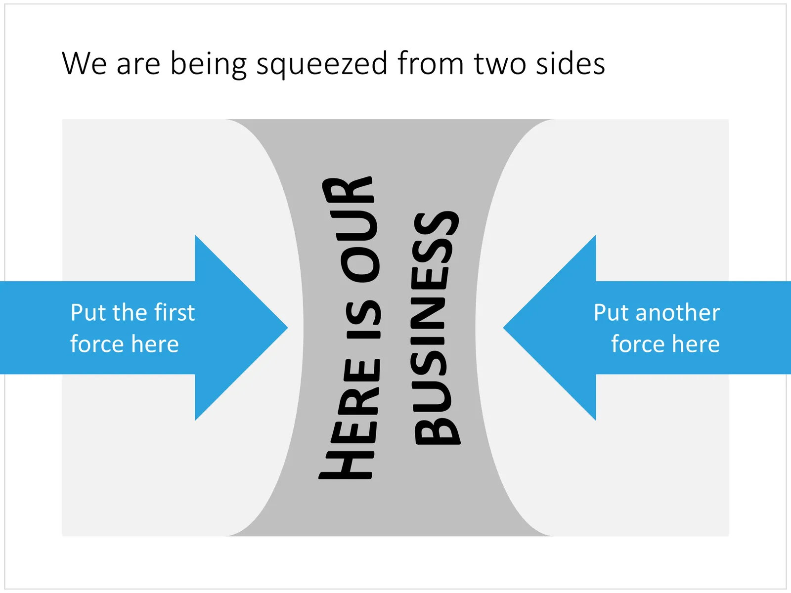
Squeezed
Cover image by Chris Sabor on Unsplash