SlideMagic Blog

Frequent updates about all things presentations since 2008. Subscribe to never miss a post.

RSS
all posts

Category Software

·Concepts

Concentric circles in PowerPoint

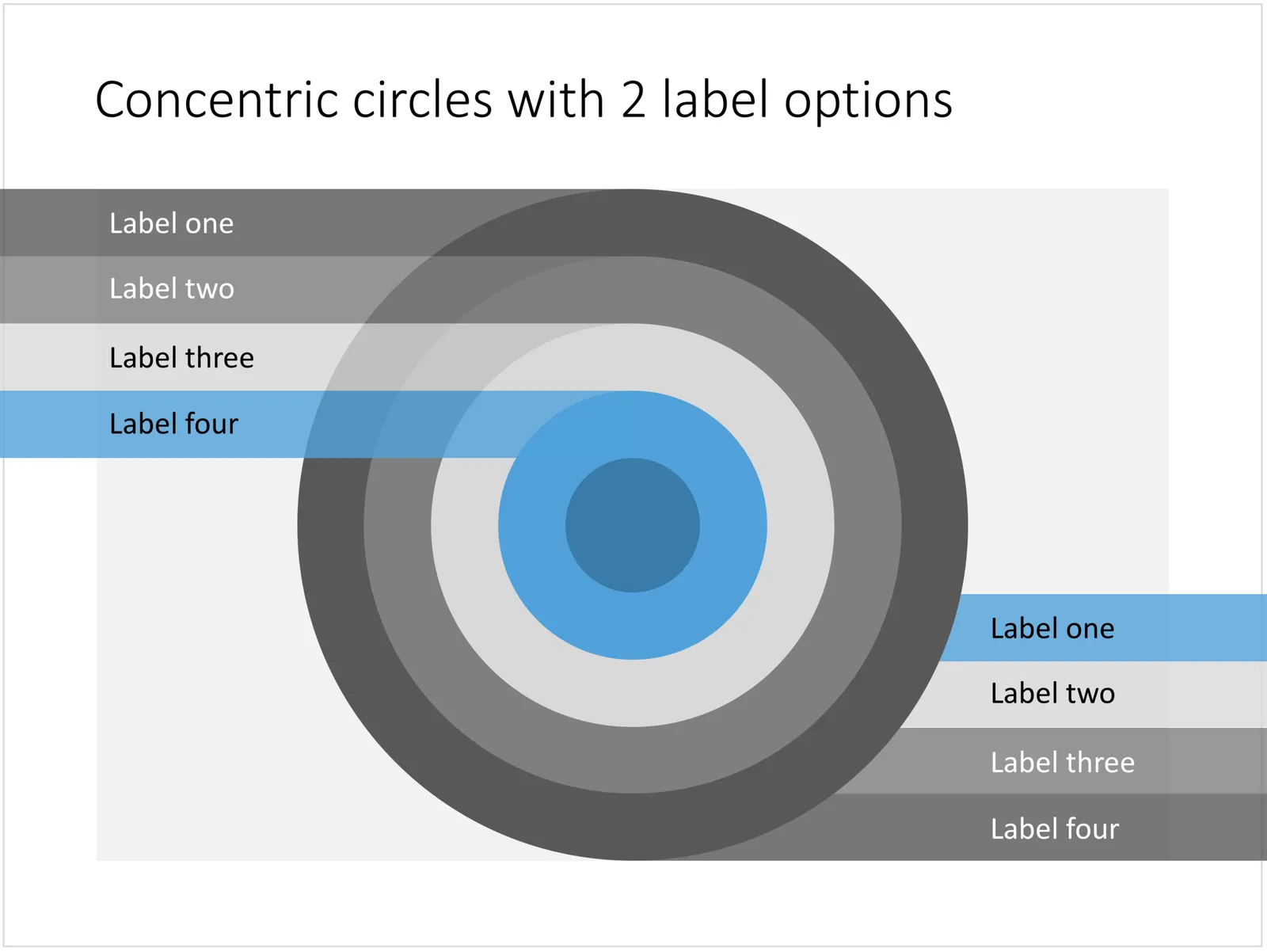
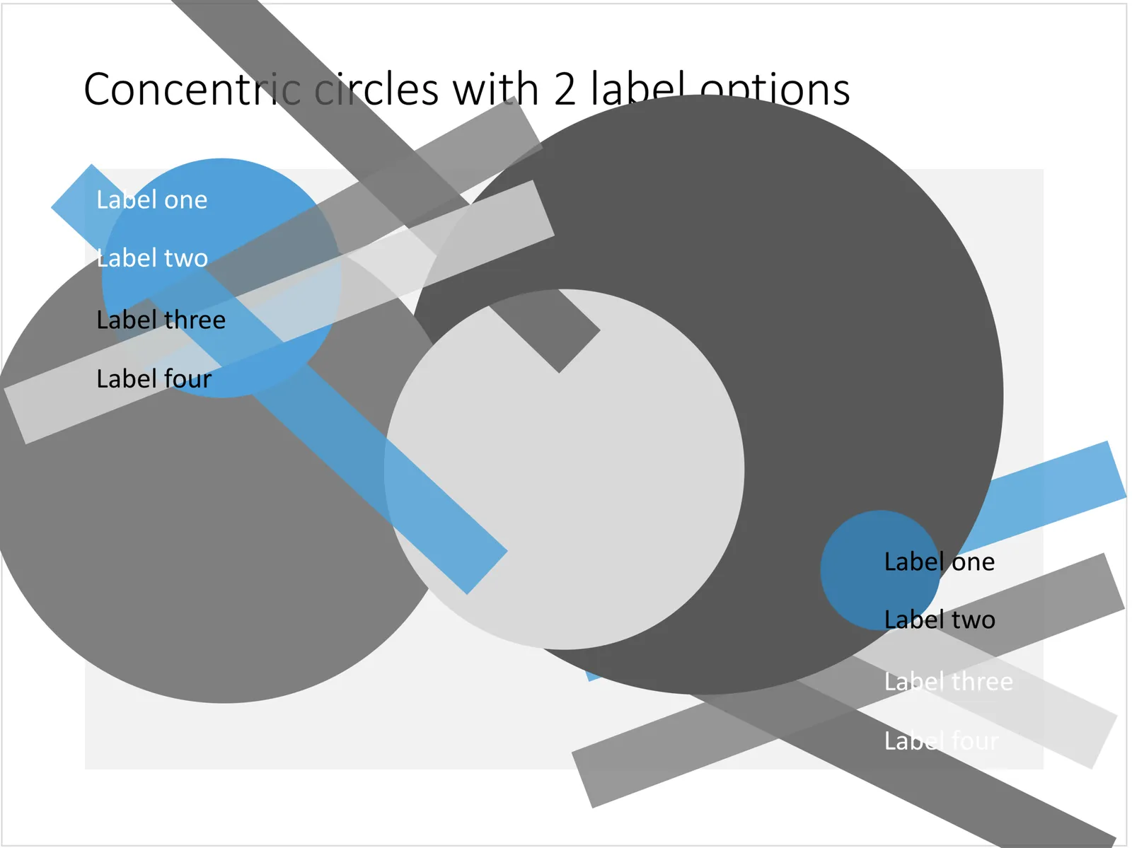
You can create very beautiful compositions by just using basic shapes and a few colours. Below is a presentation slide with concentric circles, and an image that shows how it is constructed. Feel free to borrow the design approach, or you can download the finished slide here.

This technique was often used by the Swiss graphics designers in the 1960s. You can use the slide concept below in a number of ways: show some sort of layering, show multiple layers of security or protection, show a whirl or rolling dynamic. You can take the labels of and just use the circles.

 Concentric circles in PowerPoint

Concentric circles in PowerPoint

 How to make concentric circles in PowerPoint

How to make concentric circles in PowerPoint

·Concepts

Bubble charts in PowerPoint and Keynote

Bubble charts are useful to present and analyse very large datasets. The standard template in PowerPoint and Keynote still needs some adjustment to make the chart useful. In thisbubble chart on the SlideMagic template store, I have tried to do the hard work for you.

This a reformatted version of the standard bubble chart that you will find in PowerPoint and Keynote, on top it has the layout of a 2x2 matrix. The bubble chart is useful when you want to compare a data series with 3 elements, across a large number of data points. Examples are countries, business units, regions, products, etc.

The first two elements will be plotted on a regular XY chart, the 3rd element is the size of the bubble. PowerPoint or Keynote do not support labelling of the bubble very well, which are put in manually.

A 2x2 matrix structure is put on top of the regular bubble chart, giving you 4 distinct quadrants to segment your bubbles in. In the current example, the quadrants have the same size, by putting the 2 axes right in the middle. To do so, you need to manage the ranges of the axes carefully. If this is not important to you, you can put the X and Y axes where they are relevant without worrying about this. Quadrants of unequal size will still look good.

I am working hard to make the store more useable. This layout is an example. There are 4 variants of the chart: PowerPoint, Keynote, both in 4:3 or 16:9. I tried to add all the right instructions about how to use the layout, and show many links to other relevant slides in the store. While working on your presentation, you can go back and forth between designs and get ideas on how to visualise the key messages of your presentation. Some layout suggestions, you might be able to create yourself, others you might already have bought and can re-use, or you can download a layout right away to add it to your library. SlideMagic will be a place that saves you time making your business presentations.

Continue reading →
·Concepts

Most templates now available for Apple Keynote

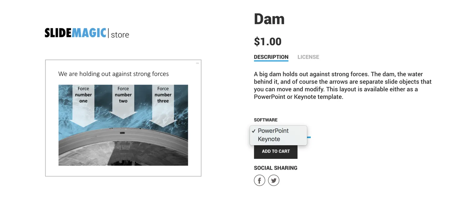
The template store now supports Apple Keynote, a drop down menu let’s you make a selection between your preferred presentation software. Not all templates could be converted, Keynote is missing the 3D shape rotation feature of PowerPoint that I used in some of the slides.

 The store now gives you the option to download templates either as a PowerPoint or Keynote file

The store now gives you the option to download templates either as a PowerPoint or Keynote file

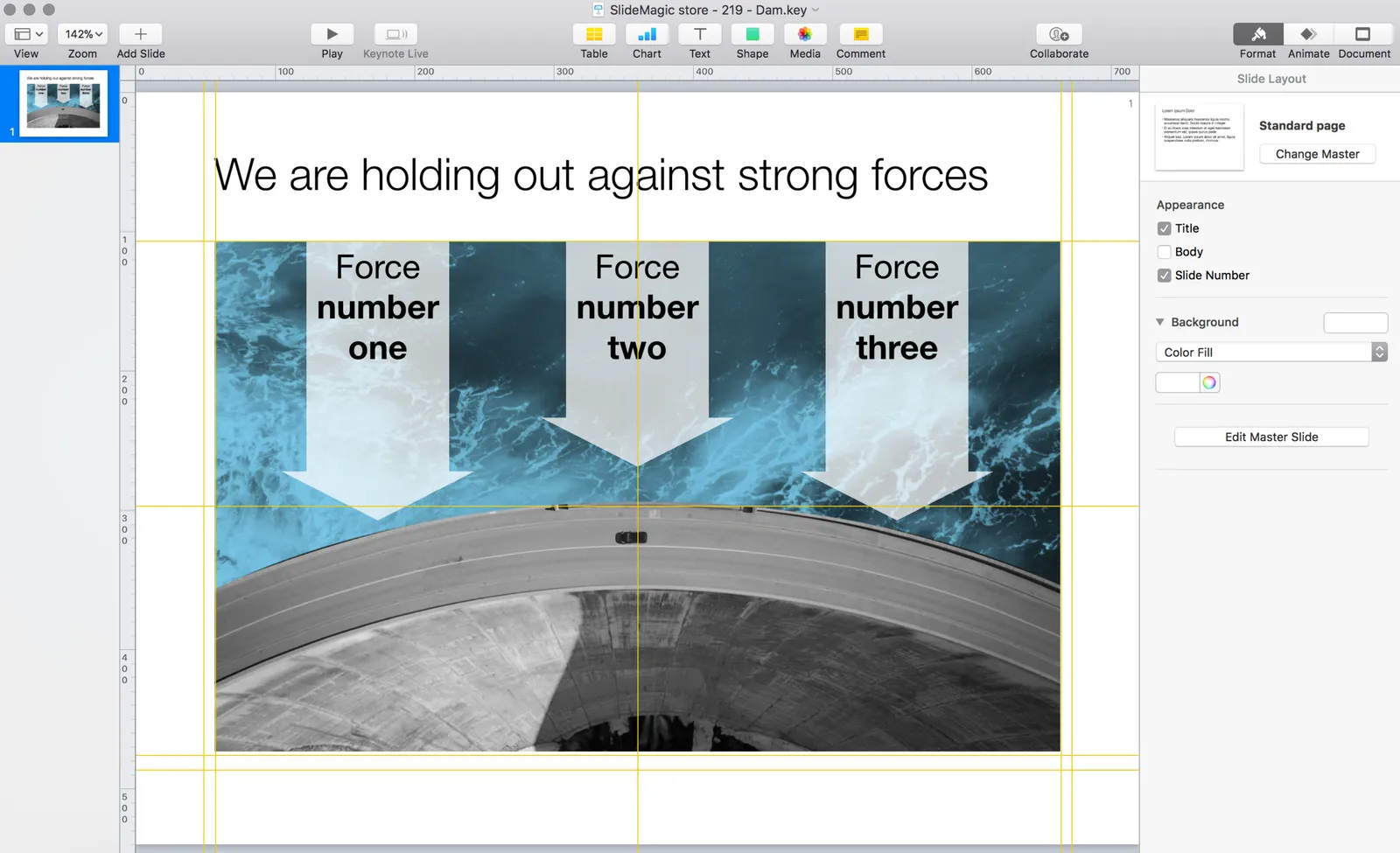
 Slides in Keynote look the same except for the font

Slides in Keynote look the same except for the font

The only adjustment I made was the font: switching it from PowerPoint’s default Calibri to Helvetica Neue for  Keynote. I am keen to keep the look and feel of the charts as “standard” as possible to make it easy to integrate the design in the corporate presentation templates that people are using.

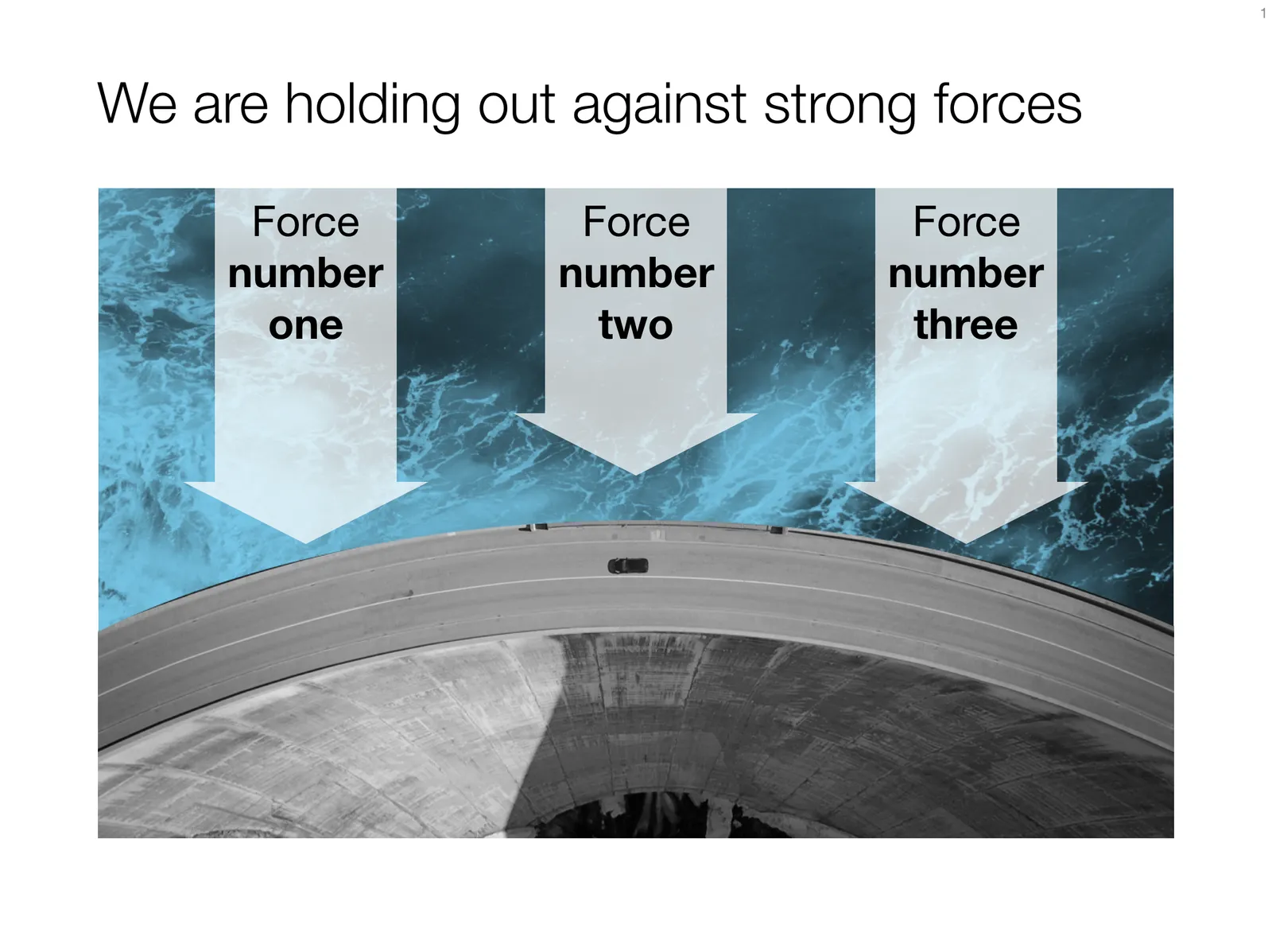
 Under pressure!

Under pressure!

The slide above is a layering of 2 images that visualizes a big dam that is under pressure from something. You can use it either to show that something is about to burst, or the opposite, that defenses are strong and holding out well. I love the massive architectural scale of these hydro power installations, especially when you can highlight it with this tiny car driving across it. You can download this dam template here.

Looking for other visual concepts that are similar? You can try and search the store for “forces”, “down”, or this search “downward” and see what slides come up. That is my longer-term vision: no more boring bullet point charts, and no more searching for “where is that slide that I made 2 years ago”, but rather have all the relevant designs ready at your finger tips. The search engine with design ideas is almost as important as the actual design itself.

Continue reading →
·Images

How to cut out shapes out of images in PowerPoint

PowerPoint can do Photoshop-like tricks. One of them: cutting shapes out of images. Here is how to do it:

  1. Drag your image on the slide
  2. Draw a shape on top of it (the freehand shape allows you to create a very precise shape)
  3. First select the image, then select the shape (shift click)
  4. Now select the Shape Format menu
  5. Click Merge Shapes
  6. Click Subtract

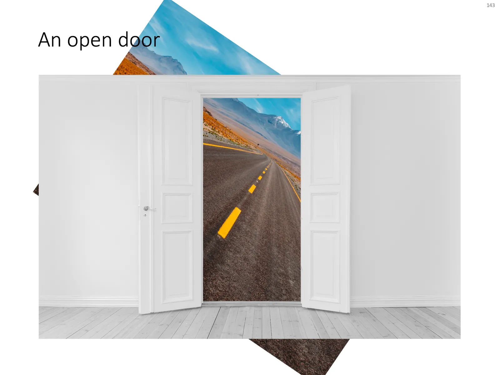
That’s it. Below is a slide from the template store that uses this technique (you can download the ready-made slide if you want)

 The final template slide

The final template slide

 The making of

The making of

Photo by Joanna Kosinska on Unsplash

·PowerPoint

How to export PowerPoint slides as high res images on a Mac

I am working with PowerPoint 2016 for Mac

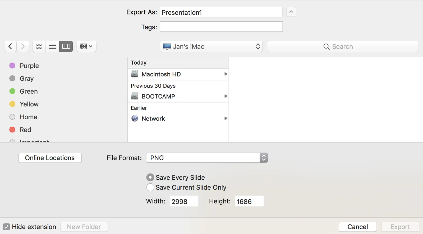
PowerPoint can export your presentation as a series of images. Go to file, export, select PNG, and you can select just one slide, or the entire presentation to be exported. In the latter scenario, images will be saved in a newly created directory.

Probably a left over from earlier PowerPoint versions, the resolution of these images has always been poor when using the standard settings. In previous versions of PowerPoint, you could somehow change DPI (dots per inch), but it did not affect the output. There are also ways to hack registry system variables (on a Windows machine, not a mac). The results have always been unpredictable.

In the most recent version of PowerPoint on mac, you are presentation with a menu in which you can enter the desired slide dimensions. This dialog behaves strangely when entering extreme values has height or width, flipping the orientation of the slides.

For some reason, I get decent pictures both in 4:3 and wide screen aspect ratios when setting the width to 2998, and the height is calculated to 1686. I have tried to understand why, but failed to do so far. It is probably not worth breaking your head over it, just use these numbers.

·Software

Windows is at par

Every couple of years I am installing a Windows machine on my Mac, either to check how SlideMagic looks on corporate computers, and now, because I need access to Microsoft Office development features that are not available on a Mac. I went through Windows 8, then Windows 7, and now Windows 10. This time, I am not using the Parallels virtual machine, which allows you to run Mac and Windows applications side-by-side. I always found it slow, cumbersome, and oh boy, if you double clicked the wrong file your virtual machine would boot up, start the Microsoft update process, etc.

I must say, the whole Windows experience is fantastic (I mainly use Chrome, and Microsoft Office). If you need to work a lot with the file manager, you still see some left overs from past designs, but speaking of design, the overall look & feel might actually be better than Mac OS X.

Most hardware for Windows are still low cost / ugly corporate laptops or machines for home use. But, the combination of Apple hardware and Windows is a pretty nice one. I think there is a market opportunity for a super beautiful, super powerful, Windows machine aimed at creatives / designers, priced above Apple.

·PowerPoint

My own clean PowerPoint template

PowerPoint templates get corrupted over time. It usually starts with a template that was designed by a print graphics designer as an after thought after designing the logo and the business cards: creating slide layouts without paying much attention to the technical issues of programming a template that can be (ab)used by thousands of employees. Then over, slowly but gradually, “foreign” templates infect the original until nothing is left of the original.

I go back to zero every time I design a new presentation. The file that I put up in the SlideMagic template store is pretty much the one I start every new presentation design project with. It is really simple. You can customise it with your own colours and you are good to go.

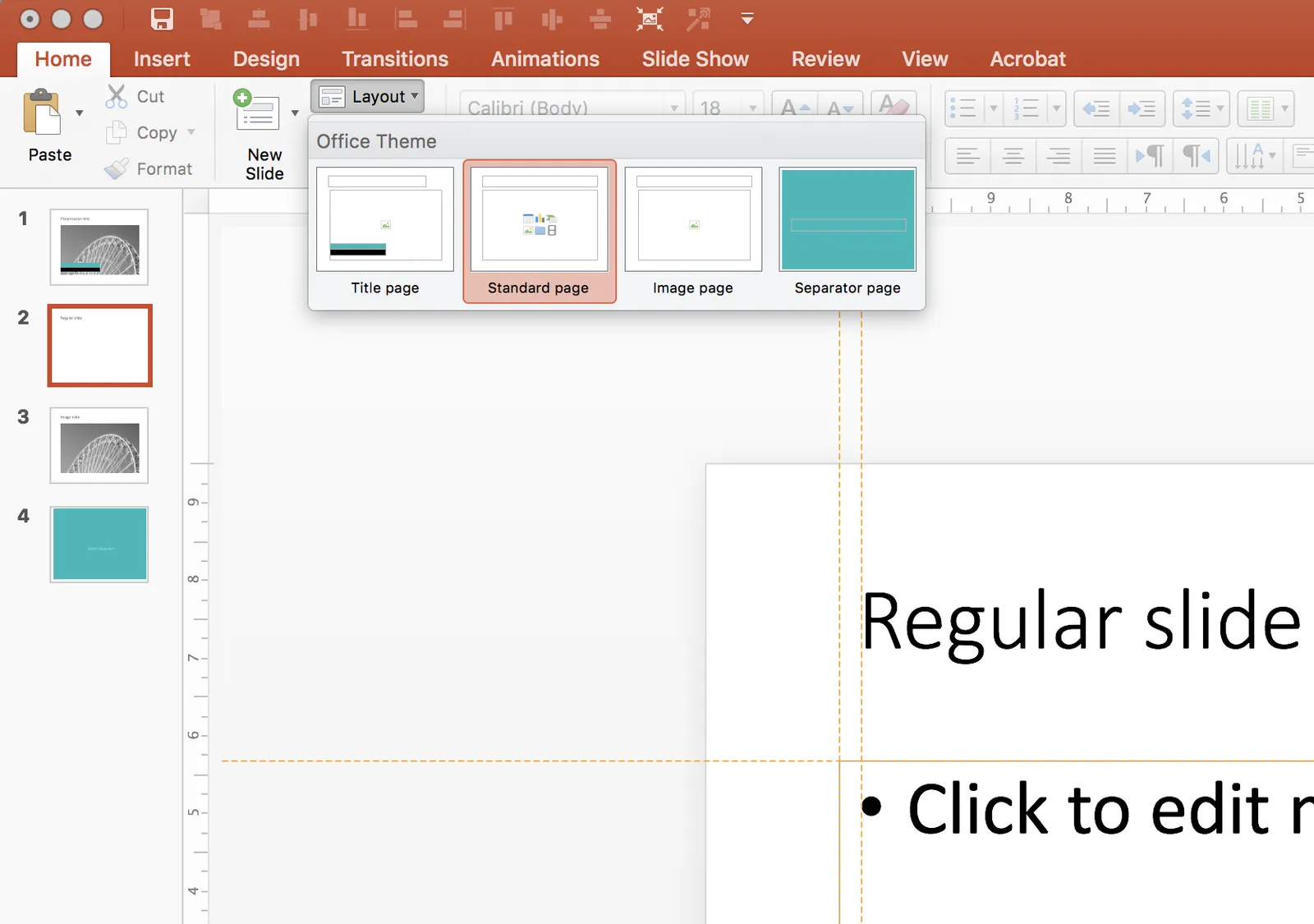
When creating a new slide, go to the “Layout” button in the top left of the menu to create a select a new slide layout.

·Software

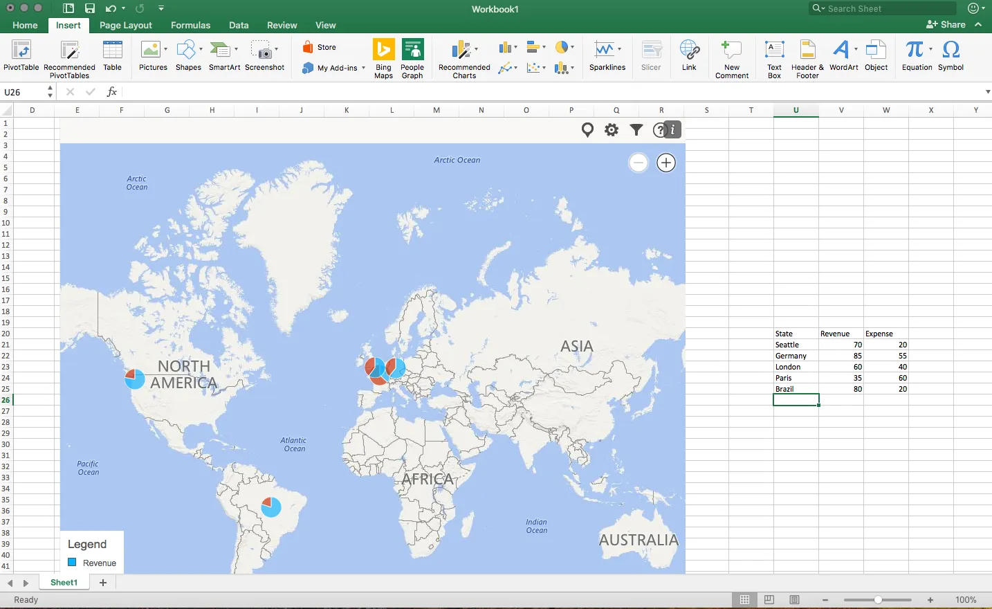
Maps in Excel

Microsoft has been adding some new features in Excel recently (I am using the Mac version). I am so used to working with the software that I rarely look at new feature additions, unless they are staring me in the face.

One of buttons that got my attention are Bing maps: you can now plot data on locations in a map. You enter a table with locations and a numeric value, and they get plotted in the appropriate location. The map zooms in and out. When you drag the map from Excel into PowerPoint, it becomes a static image of the last zoom level.

I think this is very useful as an analysis tool for for example a retailer who wants to visualise stock levels across its stores.

The implementation on a Mac is still a bit crude: it would be great if you could shade entire countries based on a value, conditional formatting. (I see that the Windows version is much more advanced).

Also, the graphical appearance of a Bing map is not designed with a presentation in mind. The map has lots of unnecessary clutter, and random geographical labels are displayed depending on zoom level, pretty much like the map you are staring at when the in-flight entertainment system is switched of just before your plane lands.

Hopefully the Mac version will be upgraded to the features of the Windows version soon.

·Layout

Slideuments and graphics designers

Many designers with excellent skills in web and/or print design somehow cannot deploy their talent very well in PowerPoint/business presentations. I have been thinking hard about why this could be.

The key challenge I think is the tight relationship with content and design. In print/web the design of a page does not really change that much if the content changes (it is still a block of text, an image, and an icon that fit in the same overall grid). In a business presentation, everything goes upside down when your competitor analysis needs to include 3 instead of 2 dimensions.

The second reason is - I think - that both people who write presentations and designers who polish them, stick to the conventional slide format: title across the top, list of bullets.

Now here is an interesting experiment for a 100% graphics designer who is not allowed or does not have the knowledge to touch any of the content (the classical print graphics designer situation). Assuming the presentation is a slideument (meant for reading rather than presenting).

Hand over the material in a word processor, as a long text file rather than a partly finished PowerPoint presentation. Now give the designer total freedom to present this material in any form she wants, even in any software she wants, using any page layout she wants.

Changes are you might get a pretty good lucking slideument by taking “PowerPoint” and its familiar layout out of the equation.

Image via WikiPedia

·PowerPoint

Making a transparent cube in PowerPoint

There is a 3D cube shape in PowerPoint, here is how you can make it transparent. The secret: rotate a copy of itself and paste them over each other.

Image via WikiPedia