SlideMagic Blog

Frequent updates about all things presentations since 2008. Subscribe to never miss a post.

RSS
all posts

Category Software

·Data visualization

Farewell to static charts? Um, no.

A quote from a Venture Beat post that paints a bright future for BI (Business Intelligence) dashboards:

Say farewell to static charts pasted onto presentation slides — the new standard is shareable data stories

I have heard it many times before. Your new BI system plugs into whatever data you have, you click and browse through the data, and automatically the most insightful slides and tables are generated, on the spot.

I think BI vendors are mixing up a few quite different activities:

  • Analysis is finding the problem and solving it, presenting is communicating the results and getting people to act.
  • Freely flowing in data, slicing, dicing, charting, is analysis. It is actually pretty hard to find what is going on in a business, especially with an overload of data available. This is definitely not something you do in front of a live audience.
  • Once you have identified the problem, and even found the solution, it is again pretty hard to craft that one chart that explains it all in less than 5 seconds. You need to take exactly the right data, cut it the right way, and highlight the right trend. Again, something that takes too much time to do live.

Where I see role for these type of dashboards, is after you did the hard work: you figured out what data is important, what statistics to track, what charts to show. Then, you can use the power of modern BI systems to pull together slides on the spot. You get instant updates about the state of the business today, or you can apply your methodology to other business units, other geographies and see what you can learn.

Continue reading →
·Software

Designing with phone cameras in mind

A large portion of conference audiences now diligently snaps a photo of every slide that the keynote speaker presents. Some implications:

  • You can no longer hide secrets by quickly going to the next slide. A high resolution camera got all those quarterly sales numbers in that nano second the slide was one. If you don’t want things to end up in the public domain, don’t put it on a slide, not even small. Yes, that might mean investing an extra half hour recreating that graph from the budget document.
  • The opposite is also true. Slides have a second use, pondering over them after the big presentation. This means you could add more content than you normally would do for an in-person presentation. One way to do that is to use an “explanation box”, like this feature in the SlideMagic presentation app. The main slide and the explanation are clearly separated.
  • You could take it even further by designing slides explicitly for the photo: for example, a calculation how you got to a certain number. Show it, say what it is, invite a picture, and move on.

 The SlideMagic presentation software has an explanation panel that you can slide in and out.

The SlideMagic presentation software has an explanation panel that you can slide in and out.

·Software

A matter of speed

A few years ago when I started thinking about about the SlideMagic project I though it was all about the design. Just find a way for people to make beautiful charts and it will be a big hit.

I am close to completing version 2.0 of the SlideMagic app, and am now in a position I have never been in before: I can design the actual user experience of someone creating slides click by click, being free fom common software design platforms, standards, and practices. And here is the real magic. I make dozens of user interface decisions a day, what colours get copied, what things get highlighted, how font sizes are set, what box is selected after you did an action. Hundreds of small decisions add up to a big experience. You cannot pinpoint why it works, but it does somehow. It is all a matter of incredible attention to detail.

The pitch of SlideMagic is changing. It will all be about the speed at which you can design a pretty decent looking slide.

(Don’t tell this secret to anyone).

Photo by toine Garnier on Unsplash

·Software

Feature preview: matching slide and user interface colours

In SlideMagic 2.0, I have pushed the use of colours in the application user interface further. The look and feel of the application will be the opposite of the slides you are working on:

  • If the slides have a dark background colour, the application will be light
  • The accent colour of the application will be the opposite colour on the colour wheel from the colour .you are using in your slides.

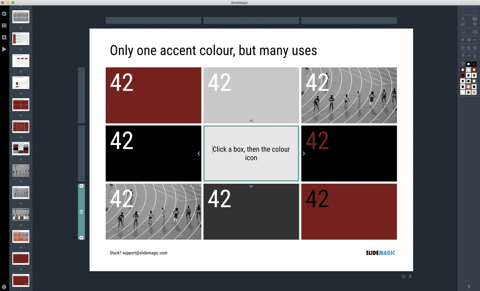
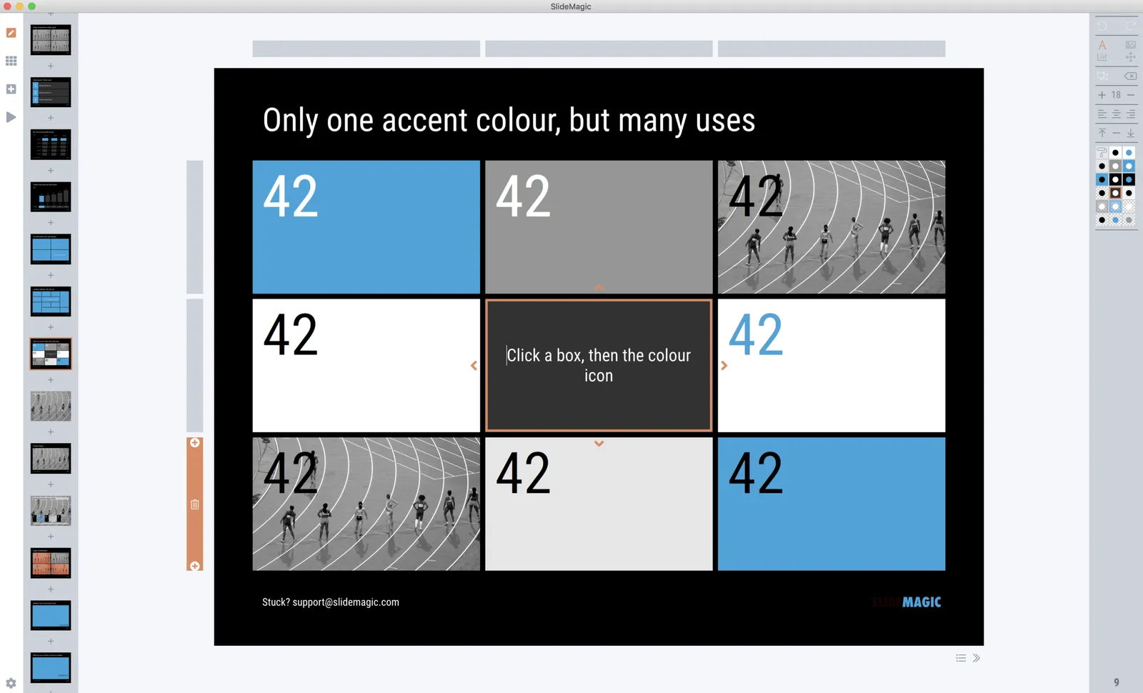
Here are some screen shots from the alpha version:

 Brown/red in the slides, green in the app

Brown/red in the slides, green in the app

 Switch the slide background to dark, the app turns light

Switch the slide background to dark, the app turns light

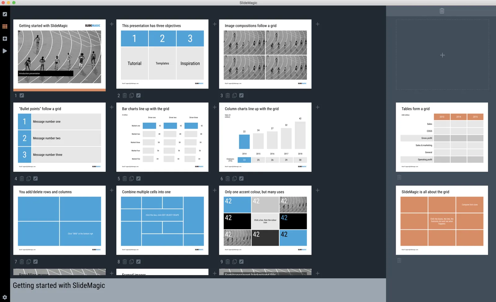
 Slides on the clipboard are in the template bank are presented in the opposite colour so you can differentiate easily between the slides that are already in your presentation, and the ones you could add.

Slides on the clipboard are in the template bank are presented in the opposite colour so you can differentiate easily between the slides that are already in your presentation, and the ones you could add.

·Software

A few screen shots

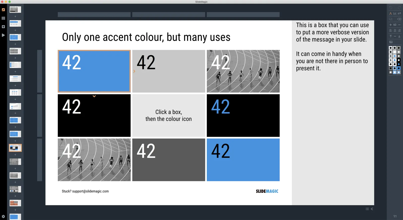
Below are two screens of SlideMagic 2.0, all work in progress (the careful viewer can spot the bugs). The new app will be how the first one should have been: slide design will be mostly the same, the UI will be a lot better to work with. (No, not April’s fool…)

·PowerPoint

PowerPoint on iPad review (2018)

Microsoft is on a roll, and now that I am turning temporarily into a developer, I appreciate them even more with very powerful code editors, and repeated decisions to open source their software (the entire Windows platform engine is going open source), and make other sensible decisions (moving to the Chromium browser rendering engine inside Edge).

The office apps are no exception, and I took some time to play around with PowerPoint on my new iPad.

The app looks and feels fantastic (I have something to aspire to), and all the basic design features work flawlessly. I find it easier to find my way around coming in “cold” then the keynote app for iPad. The small screen encourages you to design simpler slides, and spend less time adding stuff that is not essential to your story.

In 2018, things are still not perfect though. But most shortcomings are to blame on the iPad form factor, not Microsoft:

  • Presentation design is a creative process that needs space, a big screen, accurate placing of objects (fingers are less good here than a mouse). An iPad is just not a focussed design interface.
  • File management is still cumbersome on an iPad. Finding that deck from last week, opening a spreadsheet side by side, copying an image from the web browser, things that take a second on a computer are not intuitive on an iPad.
  • Because of the form factor Microsoft has cut down the features for PowerPoint on iPad. In itself, this is great (I am also focusing the features in my app), but, once the genie is out of the bottle, it is very hard to have the same application on different platforms with different feature sets, especially if you are working with collaborators on different devices. “Please create this bar chart”, is emailed to the analyst working on an iPad in the taxi who then discovers that data charts are not really supported. It also hard to create custom themes and colour schemes.

Continue reading →
·Software

Light or dark mode?

Applications with a dark background are fashionable now. I can still remember back at the end of the 1980s, when screens went the other way: light backgrounds with dark letters, even on green and amber monitors.

Research (lots of it done in the 1980s), suggests that light backgrounds are better. Light tightens the iris, and and a smaller iris can focus better. (Think squinting and pinhole cameras).

As I am coding away on my app, I need to think about this.

  • Again, not all user interfaces are the same. Dark mode can be useful when reading Twitter feeds late at night in bed with others sleeping, but this is not the context of presentation design.
  • We need to separate presenting and designing. Presenting on a big screen is better with a dark background, since the speaker does not get overpowered by this big wall of light. (Dark backgrounds will encourage people to dim the lights in the conference room though, encouraging sleep). In some industries, people sill print decks (banking), and a white background saves a lot of ink cartridges.
  • When it comes to user interfaces, I am again on the fence. Coding on a dark background is more convenient because it is easer to see subtle differences in text color (functions, variables, etc.).
  • Apps need to be more or less consistent. Switching back and forth between light and dark is tiring. If the everyone goes dark, I probably have to follow. (This was probably one of the main reasons for people to switch in the 1980s, switching back and forth from the screen to paper)
  • There is an opportunity to make a starker contrast between the design canvas and the software UI, making one light, the other dark
  • In 2018, dark applications give the impression of being “cool” and modern, which is what a new startup needs…
Continue reading →
·PowerPoint

Qwerty in software design

For a number of reasons, keyboards do not follow an alphabetical layout, including increasing typing speed by promoting the use of alternating hands, and/or preventing jams of hammers in mechanical type writers.

I feel that many of today’s presentation (and all other productivity) software is still in the ABC phase. Functions are grouped logically so you can more easily find them the first time around. Instead, they should be grouped in the way you actually use them:

  • How often are they required?
  • What features are typically used together?

The resulting user interface might not be logical, but will be very useful. Work in progress.

Photo by rawpixel on Unsplash

·Software

The state of productivity apps

The reviews of the new iPad Pro are coming in: ten years after introduction this tablet device has caught up in performance with the average laptop. Most reviewers come to a similar conclusion: yes, the device is powerful, but it does not let me do the things I want it to do to replace a laptop completely. The enthusiasm for mobile devices as work tools seems to dampen a bit. I must admit that I am going through a similar process, re-adjusting priorities for where I want to take the SlideMagic app next after V1.0, the web app.

I have not solved the problem yet, nobody has, but here are some observations that I am taking into account and thinking about:

  • There are different user segments, consumers, professionals, and even within professionals there are differences: a blogger or tech reviewer has different computing needs then an investment analyst or a web designer.
  • A single user segment has different uses for a device that can overlap between segments. Presenting for a big audience, making quick edits in the taxi, walking through a few pages over a coffee, focussed slide design, crazy/creative concept development, brainstorming.
  • User experience is incredibly important, and even the smallest glitches, delays, or inefficiencies can become annoyances quickly. (Web user interfaces still cannot match those of a properly designed native app).
  • Some things can be done better with touch, but the good old mouse pointer has its value too. Fingers can be clumsy.
  • It is very hard for people to get used to new interface concepts, part of the reason why the basics of PowerPoint are pretty much the same as they were 20 years ago. This is also true for touch interfaces, personally I did not bother to learn all the 3 finger swipes and other gestures on my phone, tablet, or laptop track pad. In the same I way I never learned the keyboard short cuts on a desktop beyond CTRL-C and CTRL-V.
  • Cloud-based collaboration is still messy and confusing,. Multiple people editing the same master document is often not helpful. It is often not clear what you shared with whom, what access permissions, is the file, is it the folder, etc.
Continue reading →
·Software

Microsoft, please beef up the PowerPoint web app API

There are 2 types of software approaches for writing add-ins for Microsoft Office applications: so called VSTOs, and web applications. VSTO is the older technology. It integrates deeply into Office and the Windows operating system, code is written in C#. This restriction to Windows is the reason that all PowerPoint plug ins and extensions run on Windows at the moment. The web application API is the newer approach, allowing you to code applications with standard Javascript/HTML.

This has huge advantages:

  • It runs on all platforms and devices, not just Windows.
  • Any coder who knows Javascript/HTML can hit the ground running with developing apps, a far bigger developer community than people who know their way around VSTO/C#.
  • It is a lot easier to integrate these Office web apps into existing web applications (such as SlideMagic).

I have a lot of ideas to extend PowerPoint beyond the current plugins that offer in-app access to stock photo sites but… PowerPoint is at the bottom of the priority list when it comes to API development at Microsoft. Excel, Outlook, and to a certain extend Word, get priority. Specifically, the ability to manipulate slide content is very limited (put text in the currently selected text block, or place an image somewhere on the page).

PowerPoint is the key communication tool that is used in corporates (not Word). PowerPoint is tricky to master (50% to blame on software, 50% to blame on the “eye for design” that not everyone has). Combine these 2 and it is the biggest opportunity for 3rd party developers to make a change to business communication, make a financial return for both developers and Microsoft, and make PowerPoint stand out over Apple Keynote.

Continue reading →