

Tables can carry more data than a data chart and as a result can be less effective in a presentation. For some situations though, there is no point trying to avoid using a table in PowerPoint. For example, when investors want to see the quarterly numbers, they expect to see a table.
The way you format tables can make a huge difference in how your chart looks. When done well, a table can actually be an effective presentation slide. Have a look at the simple P&L table below.
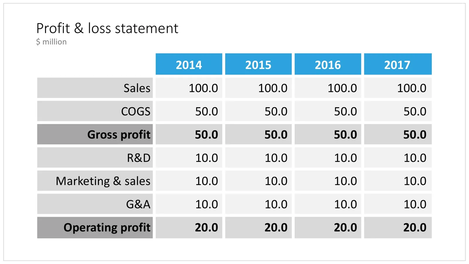
A PowerPoint table to present a P&L
This might look like a super simple slide design (it is), but a lot of thought and little tweaks have gone into its design. Let’s take them one by one:
- Colours have been adjusted to your own colour template, not the standard PowerPoint colours
- Fonts have been matched to your current template (table can be stubborn sometimes and stick to Arial)
- Instead of dark lines around boxes, I used lines that match the background colour, making cells a light colour of grey to stand out (or dark, black if you use that background)
- Totals are bold, and a bit darker
- The row labels are right aligned
- The row labels are a bit darker than the cells
- The data cells are right aligned
- Numbers are rounded to the same amount of digits, so the dots line up
- There are not too many digits in the table, enough to convey the data, but not too much to make it cluttered. If the numbers get too big, switch to thousands or millions.
- There is a bit of inset in each cell, the text does not touch the edges
- All the rows have the same height
- All the data columns have the same width
- The column headings are centered
- The unit of measure is put at the top of the chart, not repeated inside the data values
- The table covers the entire frame of the presentation template
- Double check by hand/calculator: the numbers add up…
Excel can be an excellent starting point for a table. Pull the data values you want to show with the correct rounding into a new worksheet (tables for presenting are different from tables for analysing). Think hard about what rows you want show, consolidating/combining values that do not add to the overall message of your slide. Then copy-paste the whole thing into PowerPoint where it will show up as an ugly table. Go through the steps above to clean things up. Alternatively, you can apply a lot of similar formatting already in Excel, making your spreadsheet tables good enough to put straight on the projector. This is handy when your numbers update frequently.
Feel free to copy the design, or download this table from the template store. You search for more slides with tables as well.