SlideMagic Blog

Frequent updates about all things presentations since 2008. Subscribe to never miss a post.

RSS
all posts

Category SlideMagic

·Templates

Soft launch of the SlideMagic template store

Many users of the SlideMagic presentation app ask for the slides that the app generates in PowerPoint format. In response, I have built a SlideMagic presentation slide template store. The basic store infrastructure is finished, but the amount of slides available is still small.

It was quite interesting to see how in 2017 it is possible for a designer to pull of a full-fledged digital content eCommerce store with downloads and payment processing in a matter of days. (OK, my computer science engineering degree came in handy a few times when I had to go deep into HTML to customise the store template in a few places). A few years ago I was toying with the same idea, but the required investment in technology would have been a lot higher.

The main shortcoming of PowerPoint templates vs my presentation design app also applies to my own template store: templates are hard to customise. Adding a row of boxes to an existing design and getting everything to line up properly requires a bit of design skill. It is a trade off you have to make. The app is free to use, and makes these adjustments really easy. Where possible I will add slide variants to accommodate the layman designer where possible.

There are thousands of presentation template stores on the Internet and I tried to make mine different. All stores try to hard: designs are too sophisticated, full supporting graphical clutter that makes slides hard to customise and hard to fit in to corporate templates. My slides are incredibly simple and should blend in nicely when pasted into another corporate colour scheme.

Continue reading →
·Software

Working in Google Slides

Recently, a client insisted on using Google Slides for our presentation design project, especially because of its good collaboration features. Instead of starting a presentation in PowerPoint, then converting it to Google Slides, I took the native approach, and created a presentation from the ground up in this application.

The design of Google’s office user interface has improved a lot over the years. Things look beautiful and work fast and snappy. Still, the Slides product is full of little issues that 1) slows down a pro-user like me, and 2) makes it harder for the layman designer to make good looking documents.

Because I invested my own hard-earned money in my presentation app SlideMagic, I feel a bit hesitant here to spoon feed a ready made upgrade suggestion list to a multi-billion dollar software developer with the world’s smartest programmers ready to implement them…

In 2017 - leaving minimalist SlideMagic aside - I think PowerPoint is again/still the best slide design software out there (also on Mac), better than Google, better than Apple Keynote. The main criterium here is not feature set, but workflow.

There have been many of these types of posts on my blog over the past 9 years, and I am sure there are many more to come as products continue to evolve.

·Images

Building image grids in PowerPoint

Making a grid of images in PowerPoint is tricky. Images never have a consistent aspect ratio, and when you place a lot of them on a page, the guide suggestions always snap in the wrong place somehow. Here is a survival guide.

  • Copy all your images inside the page and select them all
  • Right click and go in “format picture”
  • Tick the “size” icon, and click “size”
  • Hit “reset” to kill any aspect ratio distortion
  • Hit “lock aspect ratio”
  • Now select each image one by one, hit “crop”, hit “aspect ratio” and pick one
  • After this, select all the images again, and give them the same width with a numerical value
  • Position the images on your grid
  • Take each image in turn, select “crop” and move/zoom the image mask for the right composition

The above was a major consideration when designing the image grid system in my presentation app SlideMagic.

·Creativity

Trends in presentation and pitch design

I opened some old presentations on my hard drive and started thinking about how my work has evolved over the past years. Here are some observations:

  • Starting points of presentations (the briefing decks I see) have gotten a lot better. Garr Reynolds, Apple product launches, TED talks, etc. etc., and maybe most importantly a younger post-overhead project generation is joining the workforce, raising the bar in presentation design
  • The audience has evolved as well. People know the general drill of a startup pitch, the Internet or a smartphone is not as strange as it was in the early 2000s. People have the courage to cut a bad presentation short.
  • Back in 2003, I was probably one of the very presentation designers in the world, now there are thousands.
  • Given the above, my work is moving on a bit. While I still do the proper upgrading of the look & feel of a presentation, it is completely not the most important thing I do anymore. Actually, my graphics and visual concepts are getting simpler, and simpler, maybe even regressing to what I did a few years back.
  • Orchestrating the flow of a pitch is still important, but as pitches get shorter and shorter, and everyone has pretty much settled on a classical investment pitch are start to focus more and more and the pacing of the story. People skip over important things too quickly, while spending far too much time on the obvious, and finally sometimes they do not even touch on a very fundamental missing step in their arguments.
  • My favorite design work are the “puzzles”: diagrams that need to show very complex trade-offs, technology infrastructures, or relationships of multiple factors impacting each other. In the end, these diagrams look very simple, but they can take a relatively long time to construct, burning through endless amount of scrap paper in the process.
Continue reading →
·SlideMagic

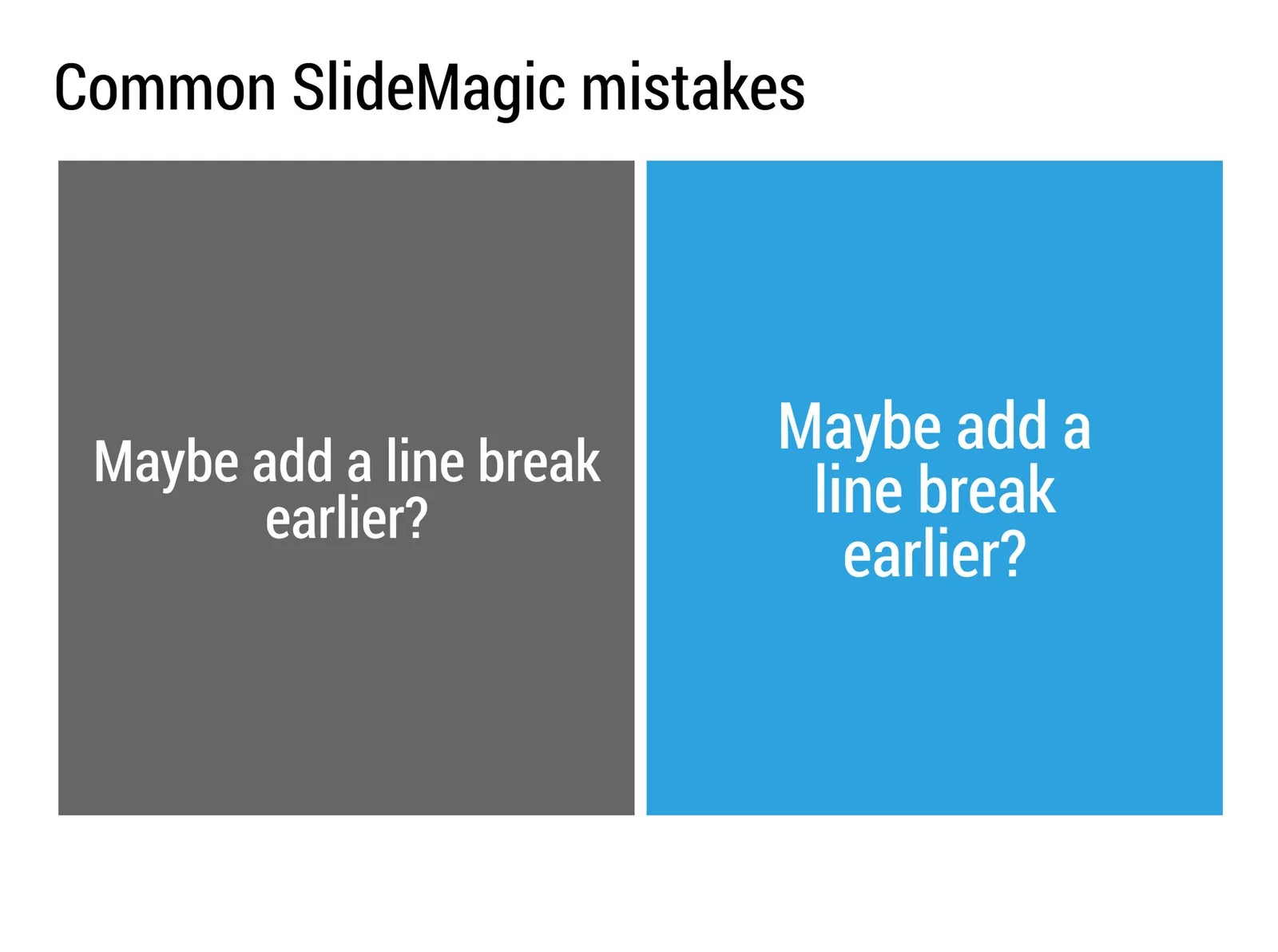
Common SlideMagic mistakes

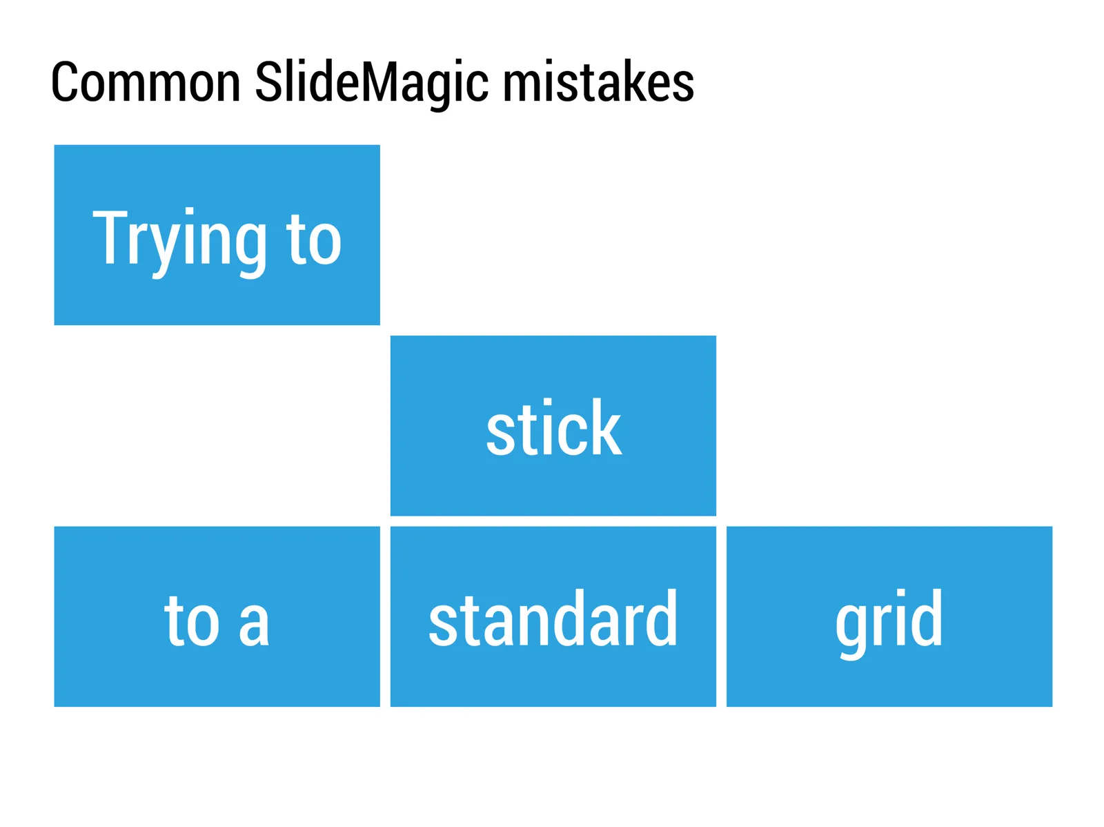
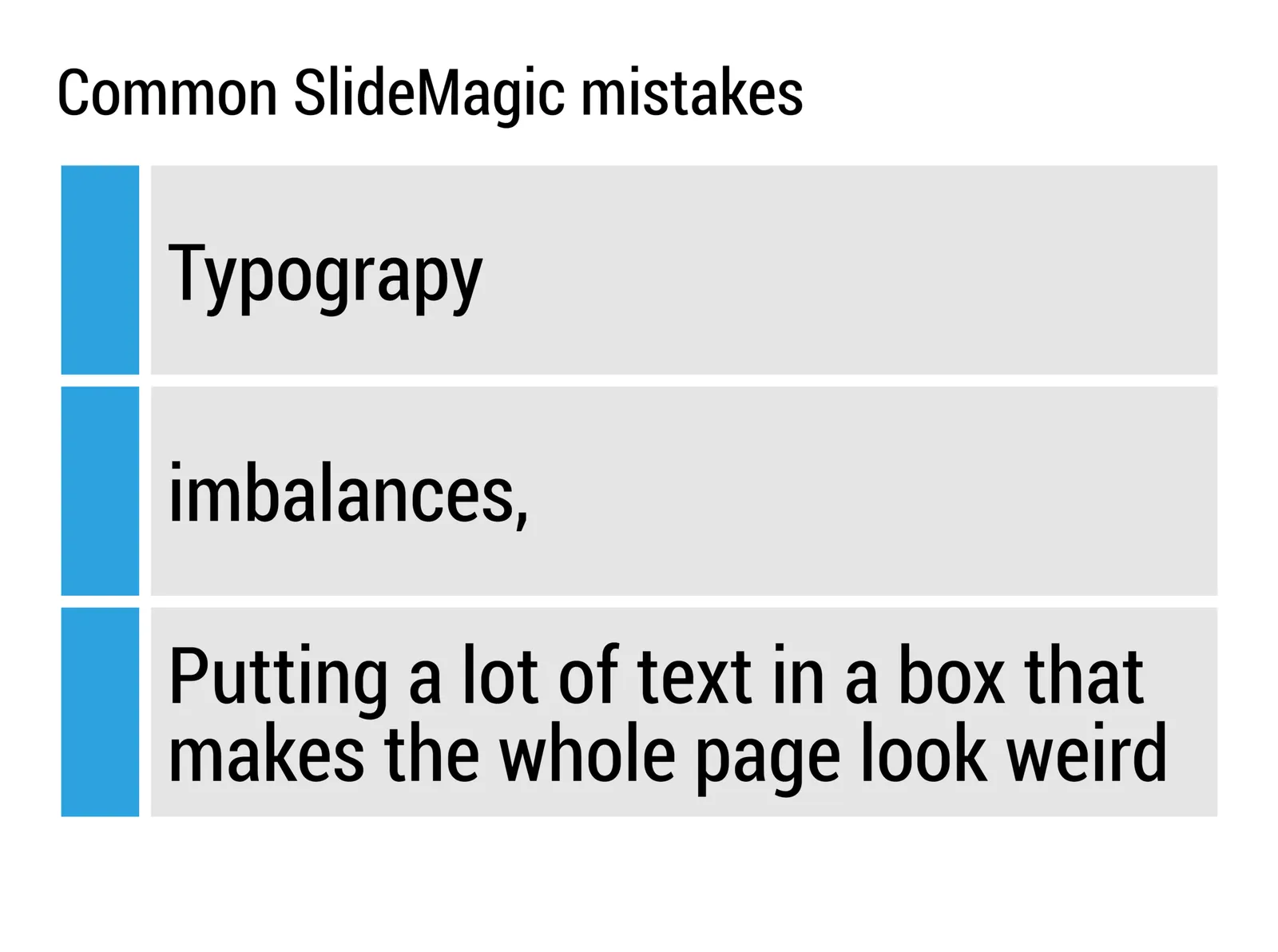
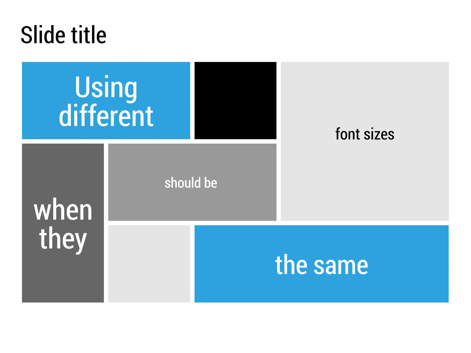
My presentation app SlideMagic will make life easier for every amateur designer. Still a few common mistakes sneak in that are hard to prevent with software. Most of them are related to the balance of typography on a page. Making sure that boxes contain roughly the same amount of text, and that signs are nicely balanced. See the examples below.

·SlideMagic

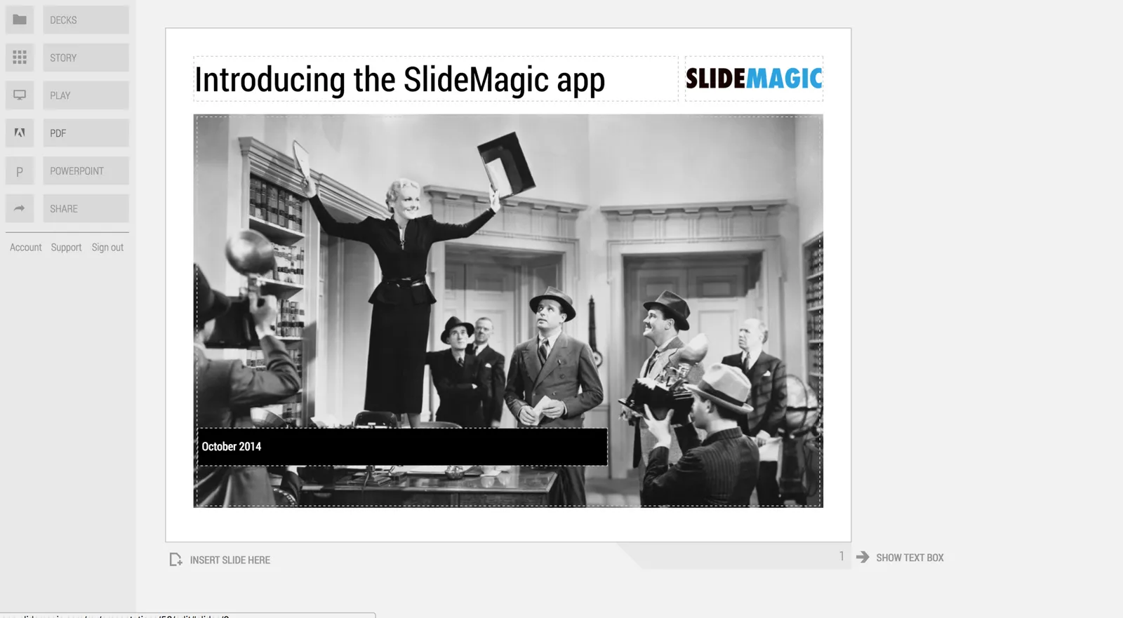
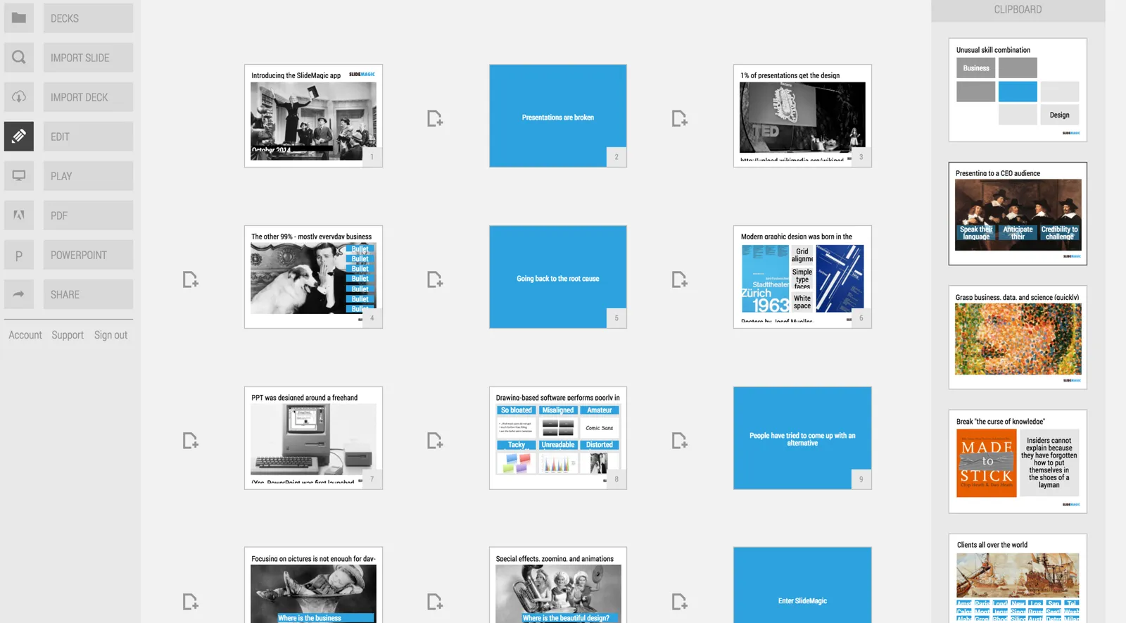
A new SlideMagic user interface

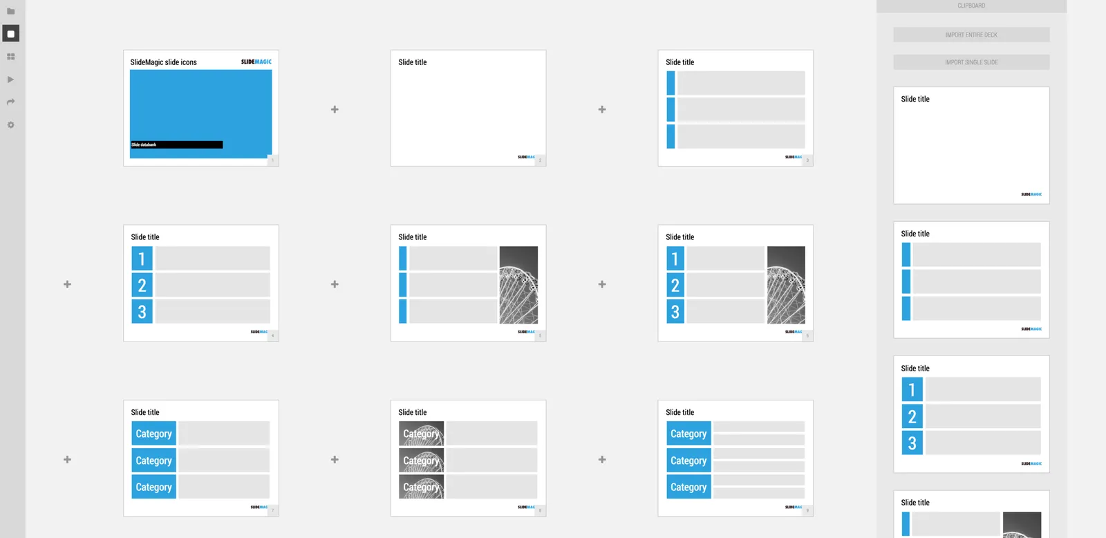
We just deployed a new, more minimalist user interface for presentation app SlideMagic. Have a look!. Some of the things that have changed over the past weeks:

  • Simpler menus: a very short set of tabs on the left side to help you switch between the application modes
  • A more intuitive approach to the slide clipboard where you can import single slides or entire decks
  • Smart insertion of rows and columns in the grid: new rows/columns will now copy color/layout settings from their neighbors

Let me know what you think.

·Culture

All the slide templates you will ever need

With my presentation app SlideMagic I aim to change the communication culture in corporates. People spend too much time preparing slides. They produce documents that are unattractive to look at, and spend far too much time falling asleep in conference rooms.

The solution: splitting the communication tools: Excel and PowerPoint for logging the analysis, and a new tool 100% focused at communicating an idea and getting to a decision. A super simple visual language does not allow you to get lost in crafting complicated slides, or worse - give up all together and just use bullet points on every chart.

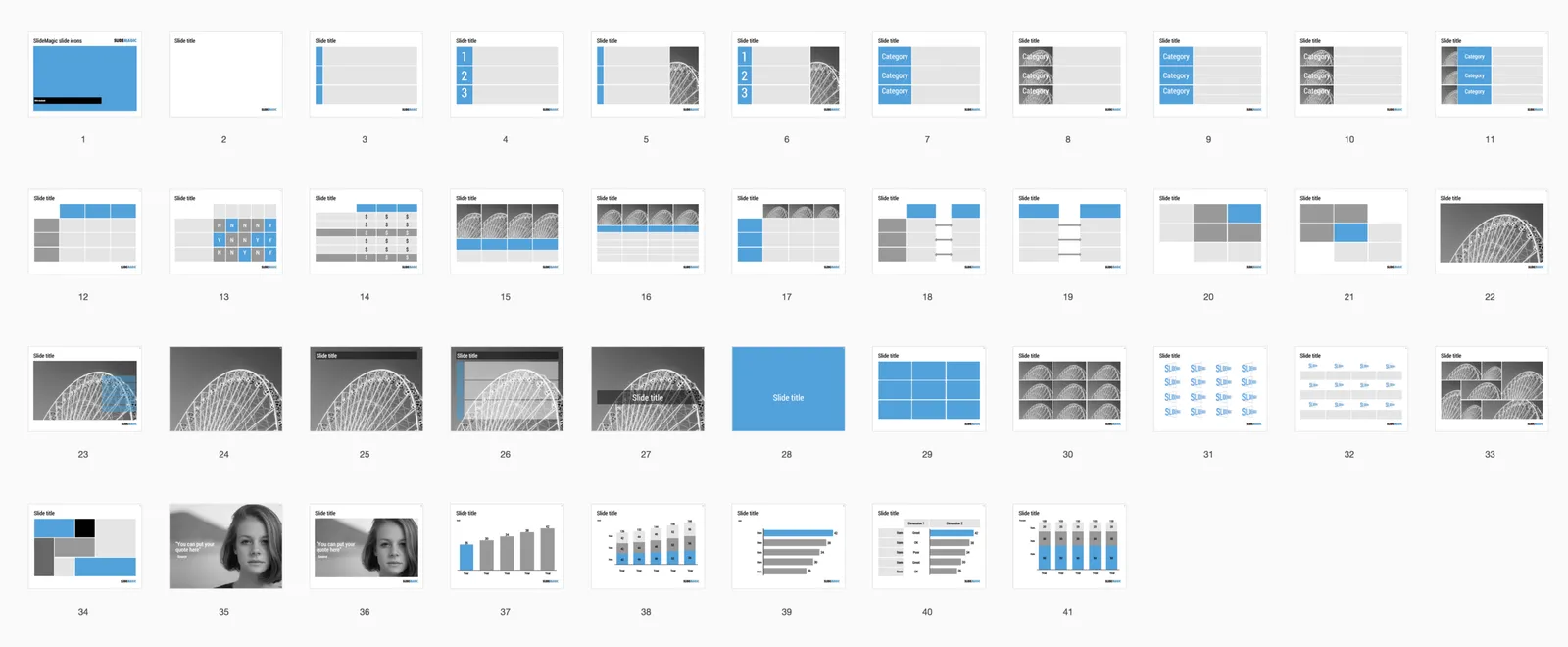
In a business presentation you need very few visual concepts:

  • Listing and organizing stuff (yes, the dreaded bullet points)
  • Comparing, contrasting, things
  • Showing growth, trends, forecasting
  • Showcasing things (products, people, clients)
  • Linking one thing to another, impact, cause/effect, from-to

When you hit “insert” in SlideMagic, you get presentation with this list of slide templates. In my opinion they can cover 99% of your business presentation needs. Think about what you want to do (listing, comparing, forecasting, showcasing, linking), pick a template and adjust row/column counts and you are done.

If you want, you clone this entire slide deck in your own SlideMagic account via this link. Let me know which concepts that I have left out you cannot live without. Maybe processes, timelines?

·SlideMagic

Smart row / column insertion

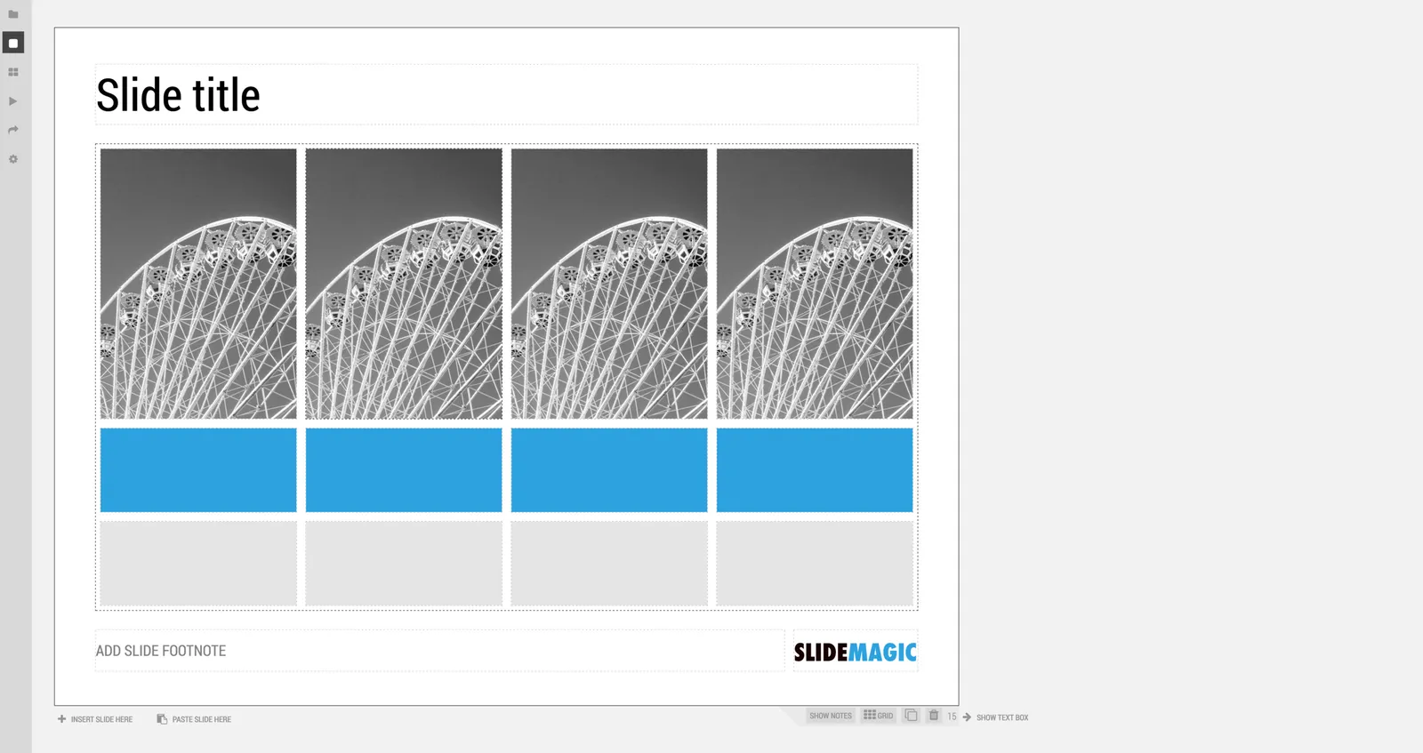
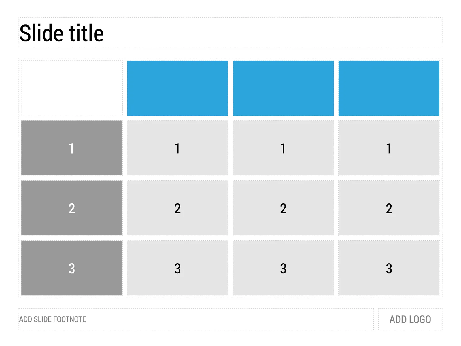
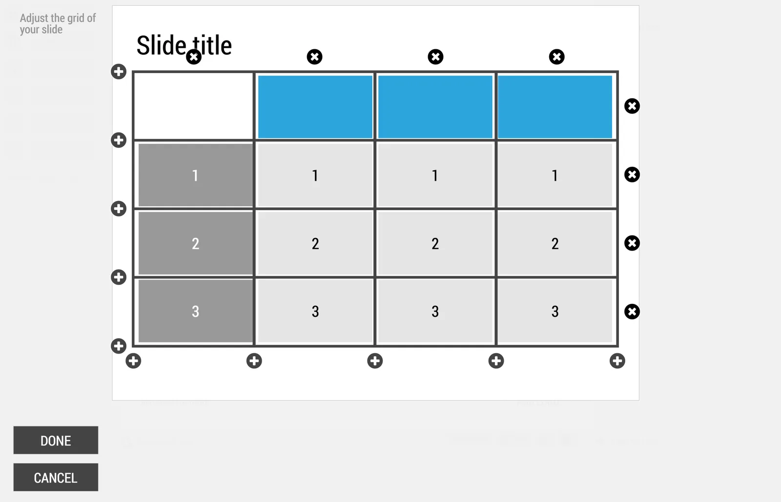
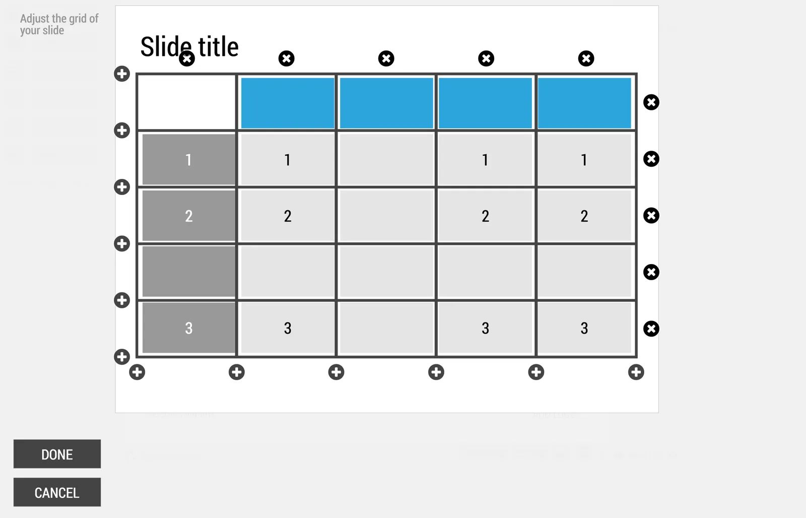
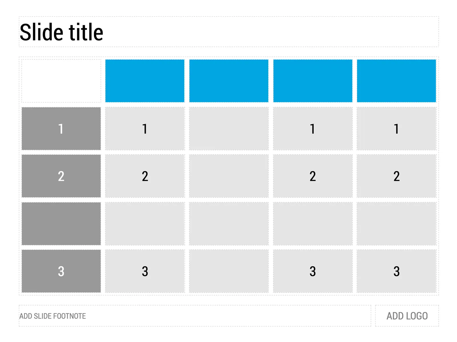
My presentation app SlideMagic is all about the grid. We have made some improvements to make the workflow (even) faster. Now, when you insert rows and or columns, it copies its design and structure from its neighbors. This will save you a lot of time in more complicated table layout with different background colors.

 1) Our starting point

1) Our starting point

 2) Open the grid editor

2) Open the grid editor

 3) Add a row and a column

3) Add a row and a column

 4) The result

4) The result

Image via WikiPedia

·SlideMagic

SlideMagic UI improvement

We put in a number of improvements to the user interface of my presentation design app SlideMagic.

Templates, regular decks, duplicating, importing, etc. was all a bit confusing. We made a number of improvements to make the workflow more intuitive.

  • The concept of “template” (as opposed to regular deck) was eliminated. Now every SlideMagic user will see a number of “featured decks” at the top of the regular decks menu which can form the inspiration of your own presentation.
  • In the story view (the slide sorter), the 2 clipboards (one for individual slides, one for full decks) were integrated into one. All slides you import will now appear here, together with the ones you copied from your current presentation.

The account, support, and logout links that used to sit at the bottom left of the screen have been moved up. These buttons caused issues on smaller screens, especially tablets. As a result, SlideMagic is now running pretty well on iPad. I am not a big believer in designing slides on a small screen/tablet, because you need a decent canvas to focus and be creative. But, it can be handy to have the option to make smaller edits on a mobile device and that is now going pretty well with SlideMagic.

Let me know if you have any more feedback on SlideMagic here in the comments or by sending a message to jan at slidemagic dot com.

·Software

Status reports in PPT

This Tweet caught my attention:

Yes “status reports” are a distinct category of presentations. Some sort of weekly, monthly, quarterly updates, that follow more or less the same template. A lot of time is spent (wasted) on creating these. In the short run, you can do a lot with workflow automation. For example create the entire presentation in Excel, which has the same drawing and charting capabilities that PowerPoint has. And yes in the end, SAAS dashboards might replace them all together, if, and that is a big if, the dashboard is designed well.

The “other” type of presentation, the one in which you pitch an idea, a budget, an investment, is here to stay. Each story is different, each pitch is different. Still, people spend too much time on PowerPoint to create them (hopefully my presentation design app SlideMagic will change that), but the creative process will not be automated anytime soon.

Image from Wikipedia