SlideMagic Blog

Frequent updates about all things presentations since 2008. Subscribe to never miss a post.

RSS
all posts

Category SlideMagic

·Software

PowerPoint Designer - first impressions

Microsoft has been adding a number of features to PowerPoint recently. One of them is Designer. In the Design tab of the ribbon, a new button appears on the right “Design Ideas”. Clicking it generates alternative layouts of your slides on the right side of your screen.

The layouts are pretty nice. Microsoft has “automated” the design of 2 types of slides:

  • Image collages, multiple photos get put in different suggested grids, with place for a title
  • Process bullet points that can be translated to horizontally spaced out sequences of equally sized shapes.

Both are useful. Layman designers usually have no idea how to crop a nice photo collage, and translating that bullet list into a horizontal sequence looks nice, especially on wide 16:9 screen.

But here comes the but.

  • The algorithm only works on these types of slides, so layman presentations will look inconsistent as same slides cannot be improved by the algorithm
  • And in case of the bullet transformation, PowerPoint needs to analyze the text with language processing, to decide that you are describing some kind of process. I had a hard time to trigger the algorithm, and in the end typed the exact same text as was used in Microsoft’s explanation web post.

Microsoft is on the right path, these suggested layouts look a lot nicer than the SmartArt objects. And, getting layman designers to use some sort of grid is the biggest possible improvement you can create in slide design.

But I think it will take some time before language interpretation will be so sophisticated that PowerPoint understands the meaning of a slide and can pull a suggested layout from its library. That’s one step above asking Siri to book a movie for you.

Continue reading →
·SlideMagic

SlideMagic just got more minimalist

We deployed a new version of my presentation app SlideMagic that eliminated the TEMPLATES menus. It makes things even simpler. Templates are now more integrated in the workflow

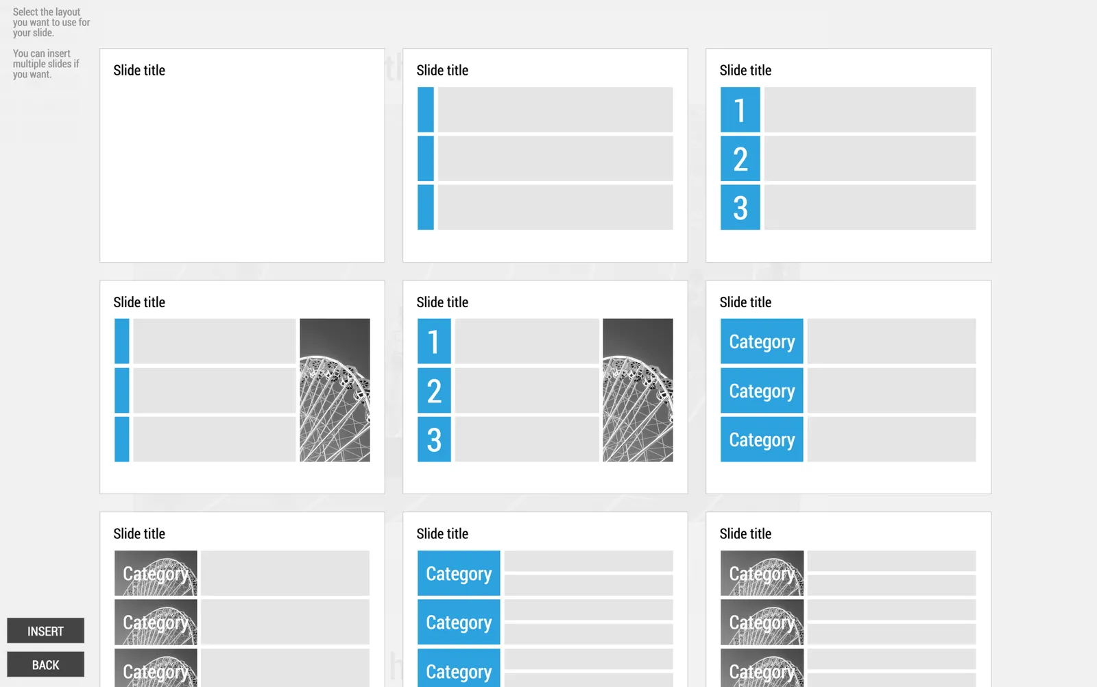
  • When you click INSERT SLIDE HERE, you get presented with a number of pre-designed layouts in addition to the 3x3 blank grid.
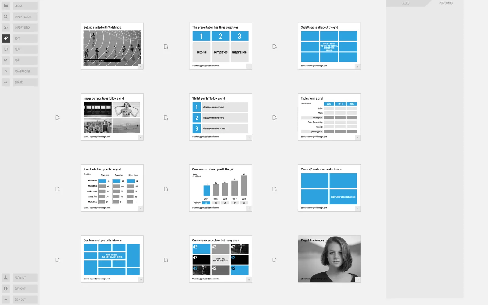
  • In your file browser (the DECKS menu), you have access to a number of featured presentations at the top of the page. These are example presentations designed by me that you can duplicate.
  • In the STORY mode, you can import individual slides or entire presentations (including featured presentations) into your own presentations

·SlideMagic

Using templates in SlideMagic

In little bursts of work I will be updating my presentation app SlideMagic over the coming weeks. I noticed that many users stick to the 9 box grid that is the default blank layout of a new slide. Yesterday we released a new insert routine. You now get presented with a number of slide layouts to choose from when inserting a new slide, without having to import and/or clone template slides.

Try it out and let me know what you think.

·PowerPoint

The latest cool presentation app

I saw this Tweet by Garr Reynolds (Presentation Zen):

I agree fully, and as the CEO of an aspiring presentation app (SlideMagic), I am not contradicting myself. SlideMagic is of course cool, but not because it adds spectacular features. It makes you design slides in a very strict grid so that your slides look good regardless of your design experience. Try it yourself.

·Layout

How do you do it?

A question I often get after a very simple make over of a slide. Answer:

  • Make boxes the same size
  • Line everything up in a grid
  • Cut excess filler words and passive verbs
  • Us one accent colour
  • Harmonize fonts
  • Reset image aspect ratios
  • Fit everything inside a frame with white space around it

“You make it sound so simple, but it is not.”. It actually is. If you struggle doing it in PowerPoint, use SlideMagic, my presentation app.

·SlideMagic

SlideMagic 2.0

I have been incredibly busy with client work over the past months, but over the summer, I plan to turn my attention back to SlideMagic, my presentation design app. Two ideas have started to form in my head:

  • A smart way to get you to select the right basic slide layout depending on the sort of message you want to deliver
  • A tool that helps you select and stitch a story flow together, depending on the type of story you want to deliver

Obviously I could also focus on making existing features better: a more accurate PowerPoint conversion, better rendering on iPads for example.

For beta users out there, what do you want to see? You can let me know via jan at slidemagic dot com.

·Software

The shortcomings of application windows

The main reason to design a new presentation app that is an alternative to PowerPoint (SlideMagic) is the flaw in the windows/mouse-based user interface design that has been with us since the end of the 1980s. Users can drag, move, place, distort, objects as they see fit. Inexperienced designers will get it wrong and put things in the wrong places.

Over my holiday, I have been listening to this Andreessen Horowitz podcast that discusses whether tablets are finally ready to eliminate the laptop:

Some other interesting points that came up:

  • “Where is my mouse?”, the mouse pointer is actually not the most logical computer input device. After 2 decades we have gotten used to it, but is not perfect. In the 1980s, engineers combined multi-tasking and windows as one user interface concept. They are different.
  • Arranging and resizing application windows as actually not that user friendly. Most of the time, you want 1, 2, maybe 3 applications open in a convenient grid. (Similar to placing objects on a slide).
  • One of the big shortcomings of tablets today is the ability to create presentation slides (making small edits is not a problem). Maybe it is time to expand SlideMagic to work with touch screens :-)

Image from WikiPedia

·Software

Podcast

I gave a short podcast interview for Oscar Santolalla’s blog “Time to shine”. I give my perspectives on business presentation design, and explain the philosophy behind my presentation app SlideMagic. You can listen to the podcast here.

Image from WikiPedia

·Story

Presentations are short cuts

Many of a company’s operational processes have become a lot more efficient over the past decades, partly with the help of automation and computers.

Above the factory floor, middle management of corporations gets more efficient as well. Computers take over routine tasks, and slide/dice data so it becomes easier to make decisions.

Human communication among decision makers is pretty inefficient. People are bad at formulating and selling their ideas. Presentations have helped though: they have replaced long-winded memos and forced people to get to the point faster. Visuals are easier to digest, and more importantly, it is faster to skip through useless pages of a presentation (PGDN, PGDN) than looking for “the meat” in a text document.

This realisation might help you with the design of your everyday presentations. It should look decent. It should get to the point. It should show interesting, unusual, unexpected facts and insights. You want to get to a decision, you are not aiming to publish a complete, scientific document.

Here is where my presentation app SlideMagic comes in, adding even more shortcuts to make corporate decision making more efficient, and less cumbersome, boring and time consuming.

Image from WikiPedia

·SlideMagic

The real competition

As a CEO you are paranoid with competitors who are doing things that are very similar to what you are trying to do. But that is usually not the competitive differentiation you need to emphasise in a sales presentation, especially if you are a tiny startup.

The real challenge will often be to get the client to break away from her current practice. Either a big established product, or maybe she is not investing at all in the sort of solutions you are trying to offer.

In my case as the CEO of presentation app SlideMagic, I could pitch it against other new and small presentation solutions that are out there in the market. But that is not the choice people need to make. I even would not consider PowerPoint to be my competitor for a feature-by-feature comparison. I am competing against the inefficient approach to presentation creation and delivery in corporations. And that is a real challenge :-)

Art: The Chess Players, by Thomas Eakins