

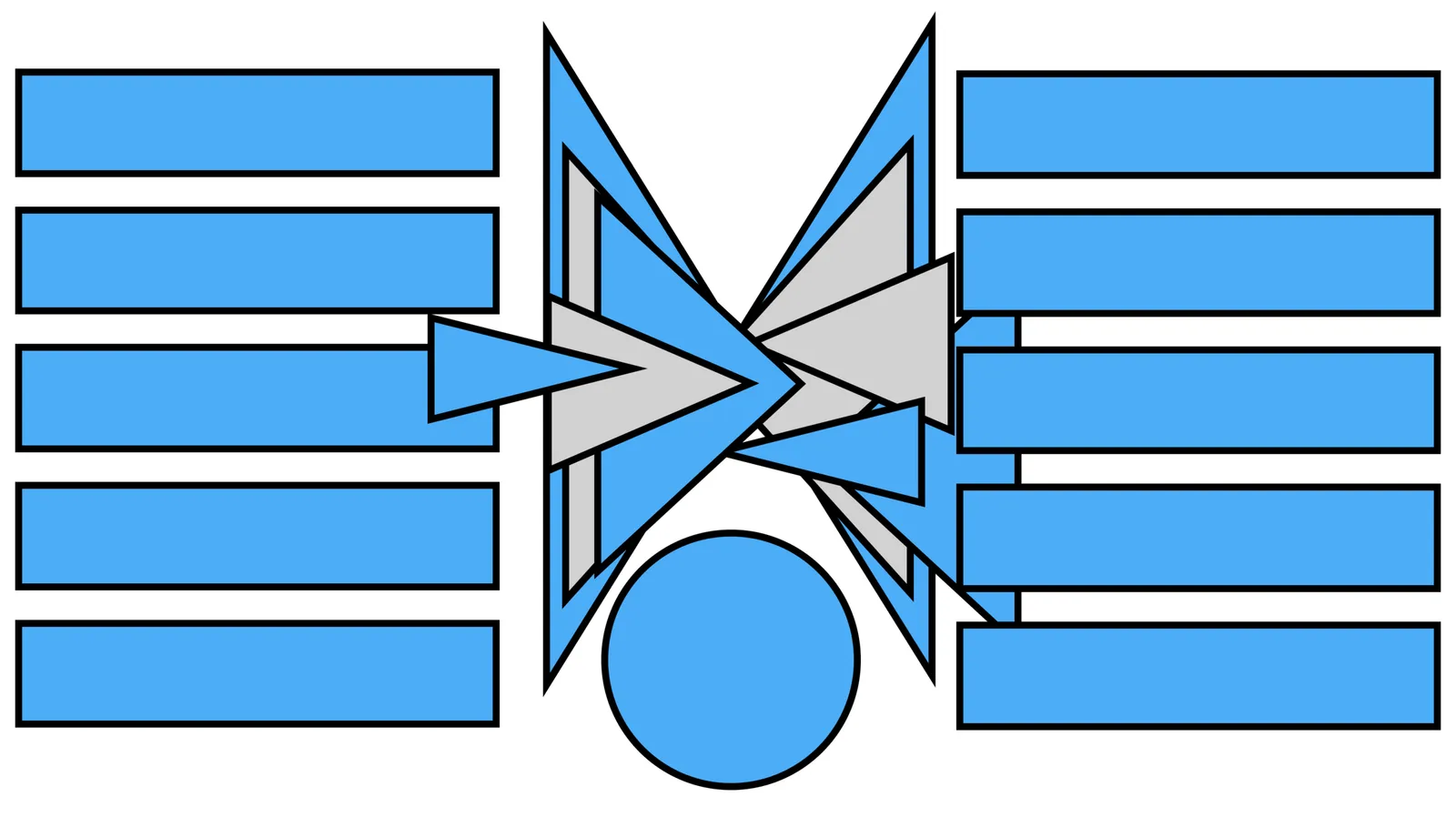
In the 2 images below you can see how to create a “fusion chart” where lots of stuff flows into something central. In the second image, I changed the color of the white triangles to grey and drew strong border lines so you can see what shapes are involved.

UPDATE: You can now download this slide concept from the SlideMagic store