SlideMagic Blog

Frequent updates about all things presentations since 2008. Subscribe to never miss a post.

RSS
all posts

Category SlideMagic

·Concepts

Concentric circles in PowerPoint

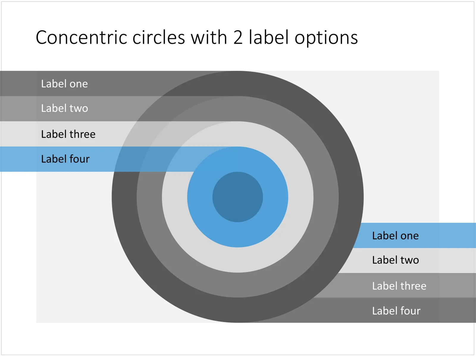
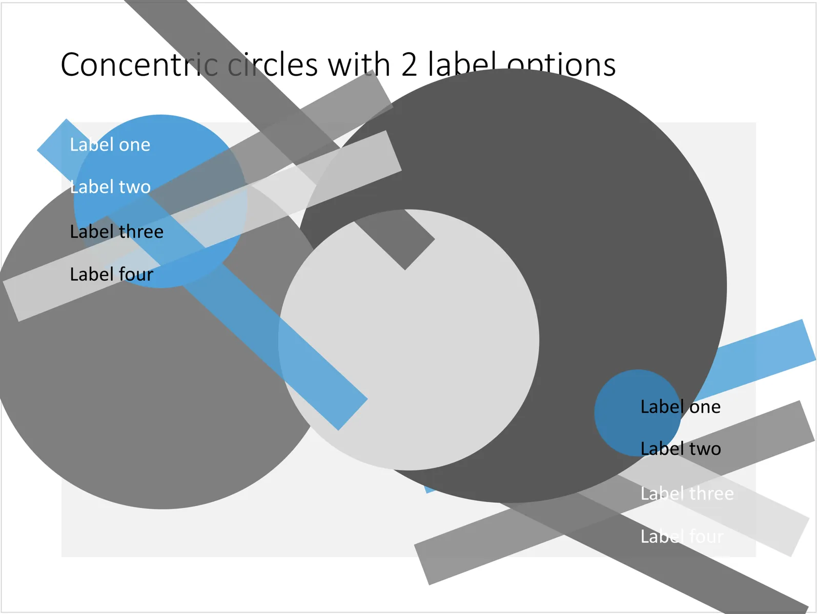
You can create very beautiful compositions by just using basic shapes and a few colours. Below is a presentation slide with concentric circles, and an image that shows how it is constructed. Feel free to borrow the design approach, or you can download the finished slide here.

This technique was often used by the Swiss graphics designers in the 1960s. You can use the slide concept below in a number of ways: show some sort of layering, show multiple layers of security or protection, show a whirl or rolling dynamic. You can take the labels of and just use the circles.

 Concentric circles in PowerPoint

Concentric circles in PowerPoint

 How to make concentric circles in PowerPoint

How to make concentric circles in PowerPoint

·PowerPoint

Quote slides in presentations

Quotes can add credibility to your presentation. If experts, celebrities, and/or customers agree with you, you must be right. But, not all quotes have equal weight. They have been overused in many PowerPoint decks. (Anyone can find a picture of a serious-looking person and get her to say what you want her to say in a few mouse clicks).

Here is a check list:

  • The person needs to be relevant and credible (third tier social media “experts” do not carry much weight)
  • The person needs to be identifiable (“Senior marketing executive at major high tech firm” can be anyone and is most likely you)
  • The quote needs to be interesting, cut the buzzwords and marketing language, cut the cliches (“Wow,  these guys really have a targeted value proposition that resonates with my medium-term return on investment objectives”)
  • The text needs to be long enough that it is specific, and short enough that it reads like a headline. A full page of verbatim will not come across
  • The quote needs to be relevant, a generic motivational quote might not help close that enterprise software contract.

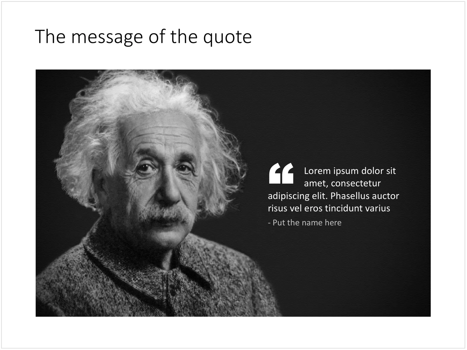
Quote slides are (and should be) pretty simple: a nice big image with a big text overlay. Still there are some things to watch out for. Below is a quote slide that I have added to the SlideMagic template store. Let’s go through the design process.

 A template for a quote slide

  • The image should have a calm background with enough “white” space for text. You don’t need to be a Photoshop guru to extend the background of an image in PowerPoint, it is easy to add a black or white box next to images. You can use the colour picker to match the precise colour, or use semi transparent overlays for the best effects
  • Make the quote symbol stand out. Regular quotes are too small, and the layout does not look good, as the quote pushes the start of the paragraph in. There are endless ways to do it and I settled on this one. One big quote at the beginning of the paragraph with a text indent. Take some time to find a quote in a good font. In the above slide, the text font is the Microsoft Office standard Calibri, but the quotes of this font don’t look that “fat”, I used Arial.
  • This slide is a framed image slide, which gives me the opportunity to add a big headline at the top of the slide with the main message (the headline can say “Customers are really happy”, the quote can say “With product [x], I no longer need to use a pencil”.
Continue reading →
·Concepts

Blue ocean strategy in a presentation

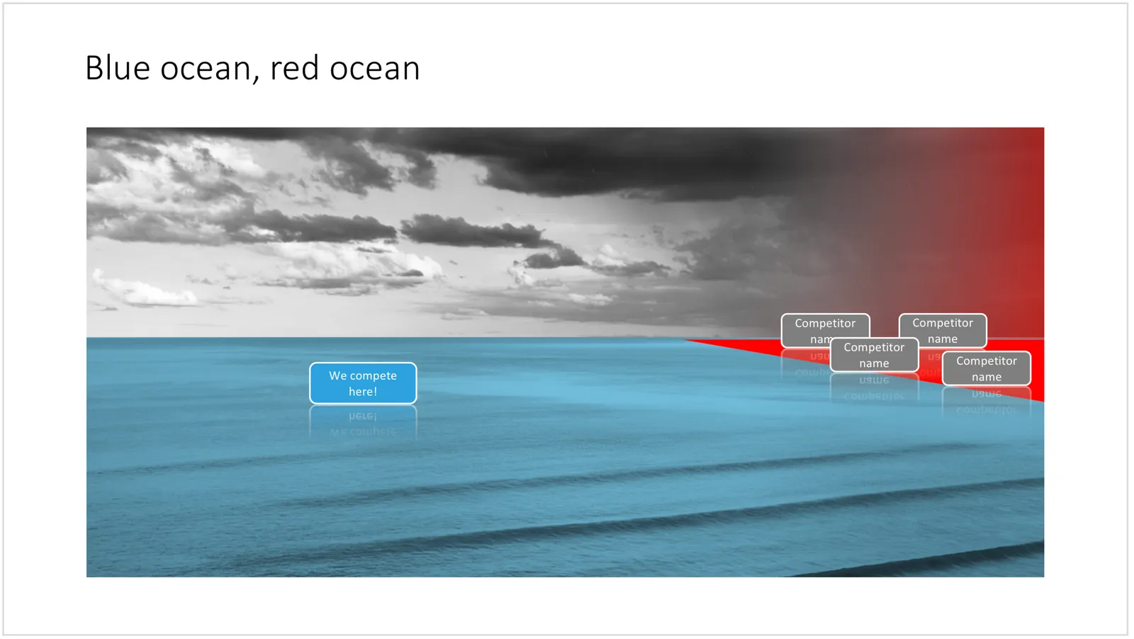
Most investor or sales presentation have some sort of slide about the competitive environment. (Here are earlier blog posts about how to present the competition). Usually, people use tables, or 2x2 / 3x3 matrices to show how they are different.

The chart below might a completely different take on the subject. The Blue Ocean strategy concept developed by INSEAD argues that is often better to define an entirely new market rather than battling with all the existing companies that go after well-established market segments. You can download the slide here.

 Visualise the competition using

Visualise the competition using “Blue Ocean Strategy” in a presentation

Cover image by Ishan @seefromthesky on Unsplash

·Concepts

Presentation layout for when you are stuck...

Sometimes the simplest slides can be the most effective ones. This slide layout shows a big arrow crashing into a wall to visualise your obstacle or roadblock. The wall image is framed, while the arrow is bleeding of the page, adding an extra movement effect.Edit to text in the arrow and/or on the wall to show your audience what it stuck. The text in the arrow will automatically tilt in the right 3D angle, and both the wall and arrow will colour in your primary accent colour. Please copy this slide into a presentation that uses your own corporate presentation colour theme.

I am gaining a lot of experience now in translating PowerPoint designs into Keynote. This chart is only available in PowerPoint and not in Keynote, because the latter cannot tilt objects in a 3D space. The same problem arises with charts that rely heavily on bevels or other 3D lighting effects, which is not obvious to do in Keynote.

Here you can find this wall layout in the SlideMagic store. Cover image by Chris Benson on Unsplash

·Concepts

Bubble charts in PowerPoint and Keynote

Bubble charts are useful to present and analyse very large datasets. The standard template in PowerPoint and Keynote still needs some adjustment to make the chart useful. In thisbubble chart on the SlideMagic template store, I have tried to do the hard work for you.

This a reformatted version of the standard bubble chart that you will find in PowerPoint and Keynote, on top it has the layout of a 2x2 matrix. The bubble chart is useful when you want to compare a data series with 3 elements, across a large number of data points. Examples are countries, business units, regions, products, etc.

The first two elements will be plotted on a regular XY chart, the 3rd element is the size of the bubble. PowerPoint or Keynote do not support labelling of the bubble very well, which are put in manually.

A 2x2 matrix structure is put on top of the regular bubble chart, giving you 4 distinct quadrants to segment your bubbles in. In the current example, the quadrants have the same size, by putting the 2 axes right in the middle. To do so, you need to manage the ranges of the axes carefully. If this is not important to you, you can put the X and Y axes where they are relevant without worrying about this. Quadrants of unequal size will still look good.

I am working hard to make the store more useable. This layout is an example. There are 4 variants of the chart: PowerPoint, Keynote, both in 4:3 or 16:9. I tried to add all the right instructions about how to use the layout, and show many links to other relevant slides in the store. While working on your presentation, you can go back and forth between designs and get ideas on how to visualise the key messages of your presentation. Some layout suggestions, you might be able to create yourself, others you might already have bought and can re-use, or you can download a layout right away to add it to your library. SlideMagic will be a place that saves you time making your business presentations.

Continue reading →
·Concepts

Most templates now available for Apple Keynote

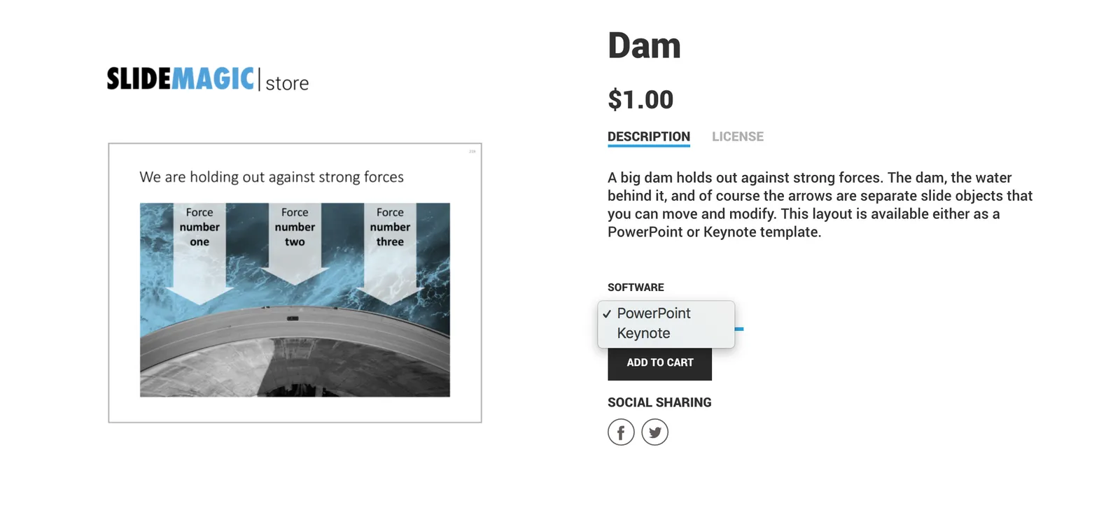
The template store now supports Apple Keynote, a drop down menu let’s you make a selection between your preferred presentation software. Not all templates could be converted, Keynote is missing the 3D shape rotation feature of PowerPoint that I used in some of the slides.

 The store now gives you the option to download templates either as a PowerPoint or Keynote file

The store now gives you the option to download templates either as a PowerPoint or Keynote file

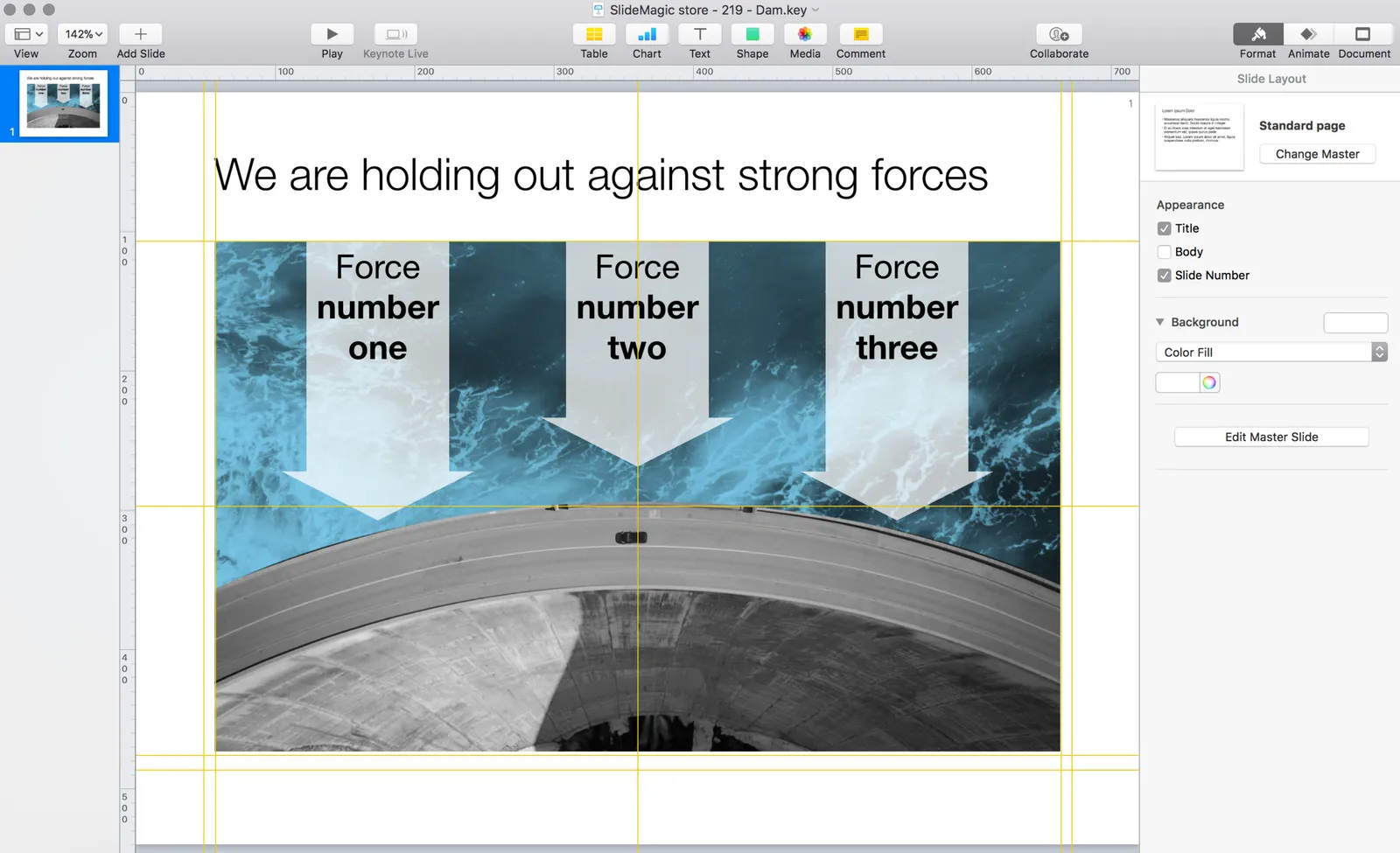
 Slides in Keynote look the same except for the font

Slides in Keynote look the same except for the font

The only adjustment I made was the font: switching it from PowerPoint’s default Calibri to Helvetica Neue for  Keynote. I am keen to keep the look and feel of the charts as “standard” as possible to make it easy to integrate the design in the corporate presentation templates that people are using.

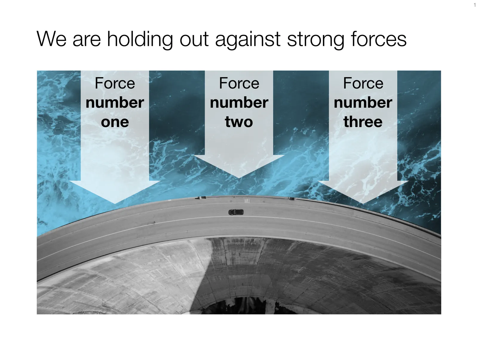
 Under pressure!

Under pressure!

The slide above is a layering of 2 images that visualizes a big dam that is under pressure from something. You can use it either to show that something is about to burst, or the opposite, that defenses are strong and holding out well. I love the massive architectural scale of these hydro power installations, especially when you can highlight it with this tiny car driving across it. You can download this dam template here.

Looking for other visual concepts that are similar? You can try and search the store for “forces”, “down”, or this search “downward” and see what slides come up. That is my longer-term vision: no more boring bullet point charts, and no more searching for “where is that slide that I made 2 years ago”, but rather have all the relevant designs ready at your finger tips. The search engine with design ideas is almost as important as the actual design itself.

Continue reading →
·PowerPoint

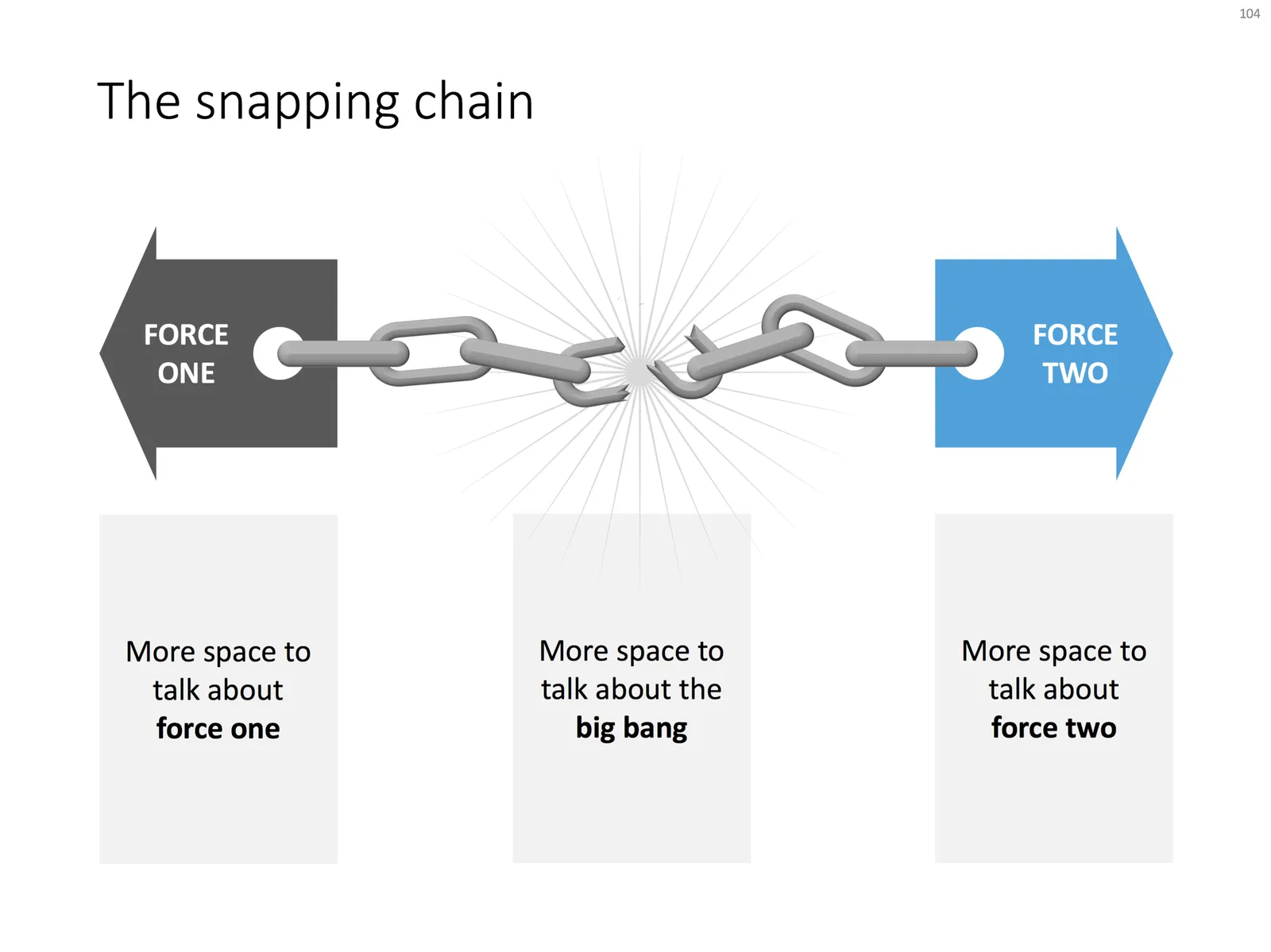
The snapping chain

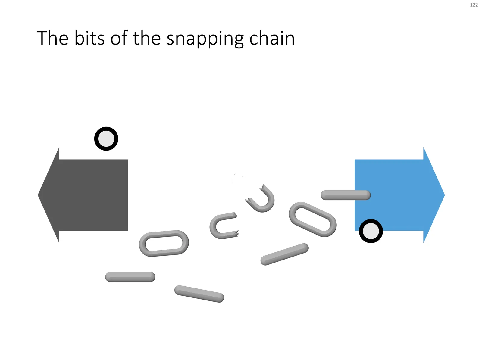
Business presentations usually rely on a few basic concepts. One of them is the snapping chain or rope, where 2 forces pulls something apart. One way to create this is with a stock image of a snapping rope or chain, but it can be hard to find one without an unhelpful 3D rotation, another approach is to create a chain from basic PowerPoint shapes.

Here is what I did

  • Take a rectangle with rounded corners
  • Increase the rounded corners until they become half circles (the small yellow dot in the shape)
  • Copy the shape, make it smaller
  • Centre the 2 shapes, subtract the smaller from the bigger
  • Apply some 3D bevel to to get the basic chain ring
  • The other chain ring is simply a rectangle with rounded corners.
  • Now, scribble a “saw” freehand shape.
  • Copy a chain ring, subtract the saw shape to get the broken ring
  • Copy this broken ring, and subtract it from another ring (to get the exact complement of the break lines)
  • Line everything up for the final composition.

You can follow these steps, or download the finished product from the template store.

Once you have your chain, “store it in a safe place”, there are endless ways you could use it in future slides: multiple chains, longer chains, chains that go all around the slide :-) Here is another possible composition from the SlideMagic archive

The resulting chart is not a master piece illustration, but its unpretentious simplicity can do a decent job in an everyday business presentation. People spent too much time dealing with presentation software, and the objective of SlideMagic (the app, the store) is to help you get business concepts on a decent slide quickly and move on with more important things in life (and business).

·Concepts

Popping out of the box

Unlike many designers, I actually like framing my slides, leaving white space around the edges. Stretching your picture all the way to the slide boundary looks nice on one page, but creates inconsistencies with more traditional data slides, and reduces the readability of slide titles.

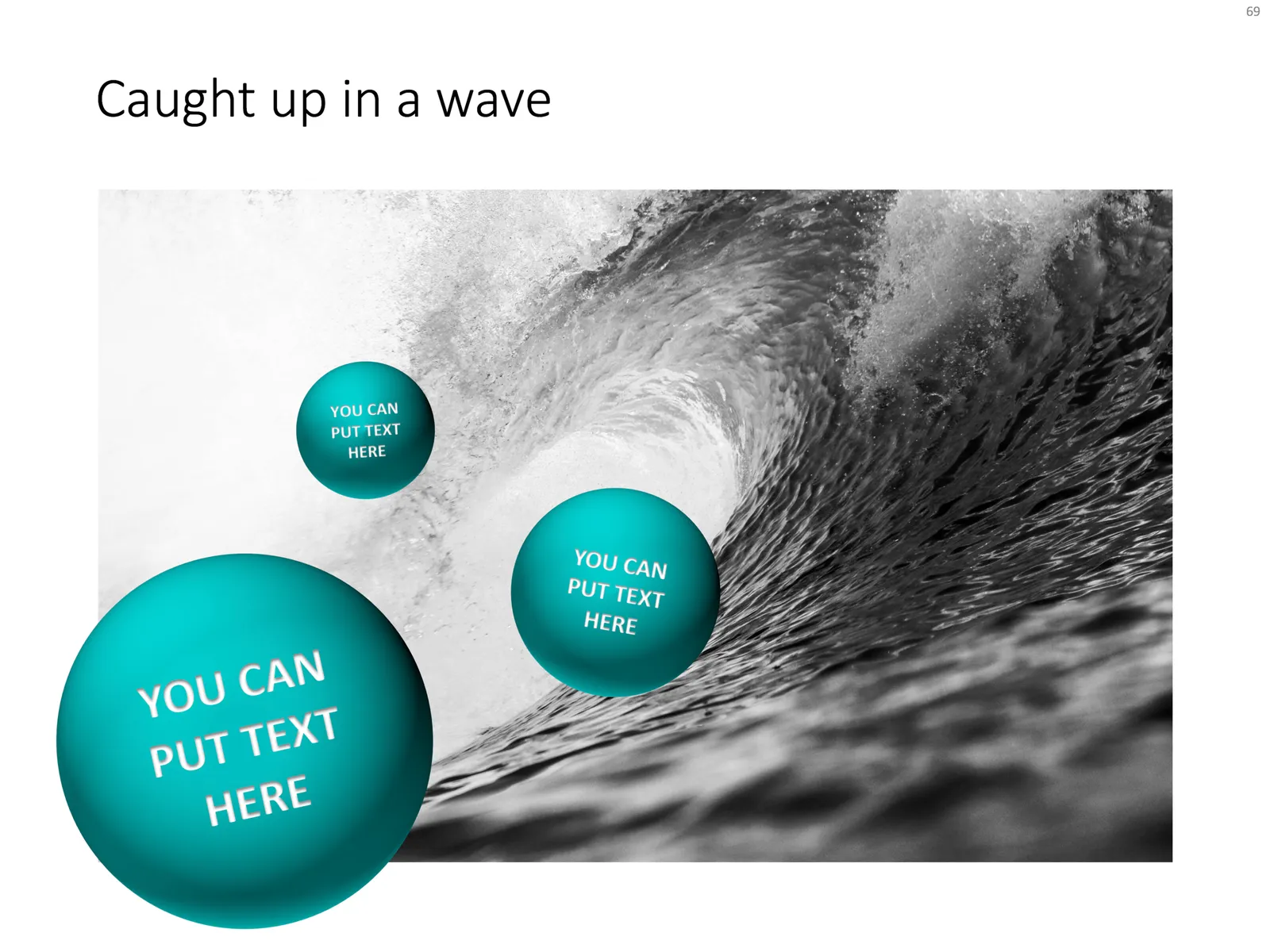
One advantage of the frame is that you can make things pop out, a trick that is often used in magazine design. See below an example I made using that approach.

Feel free to copy the design above, or buy it ready for you to use from the SlideMagic template store.

·Images

App demo slides

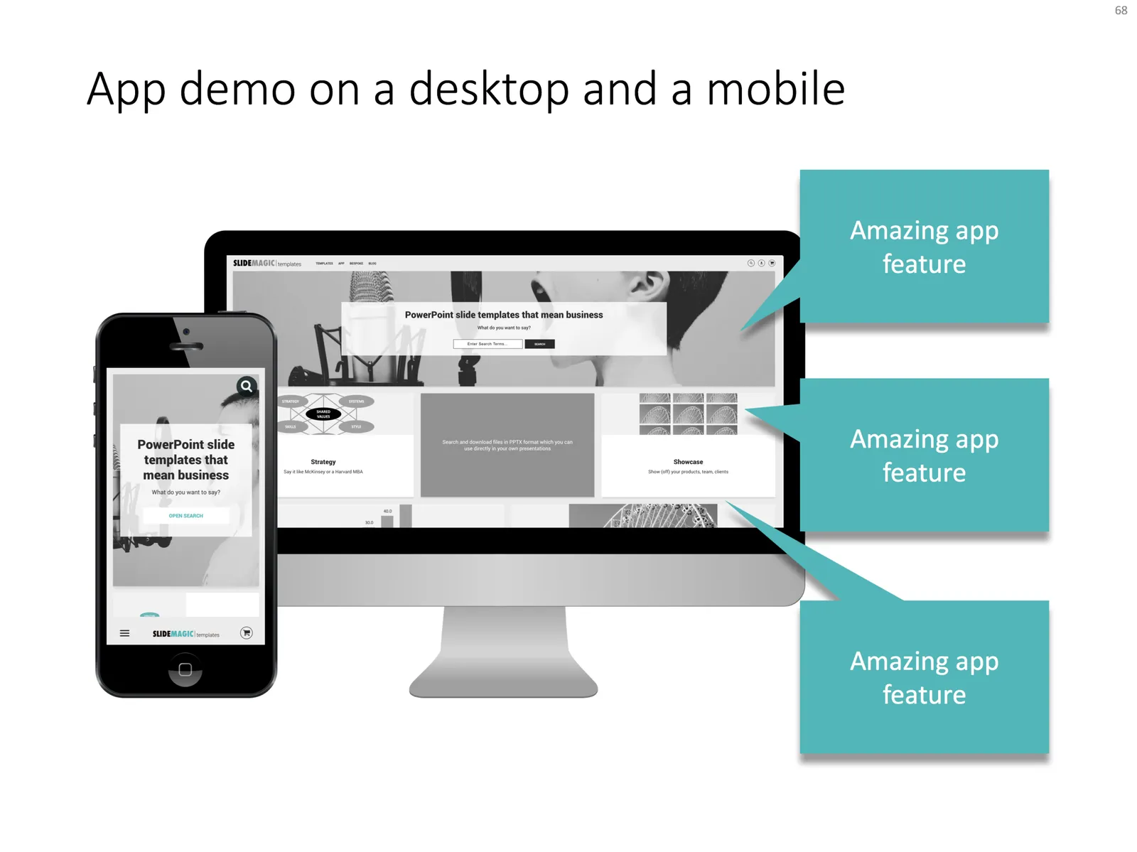
Doing a live app demo in a 20 minute pitch meeting is risky, the technology might go wrong, and probably more than half the time you spent in a 2 minute app demo could be things that are not really interesting: logging in etc.

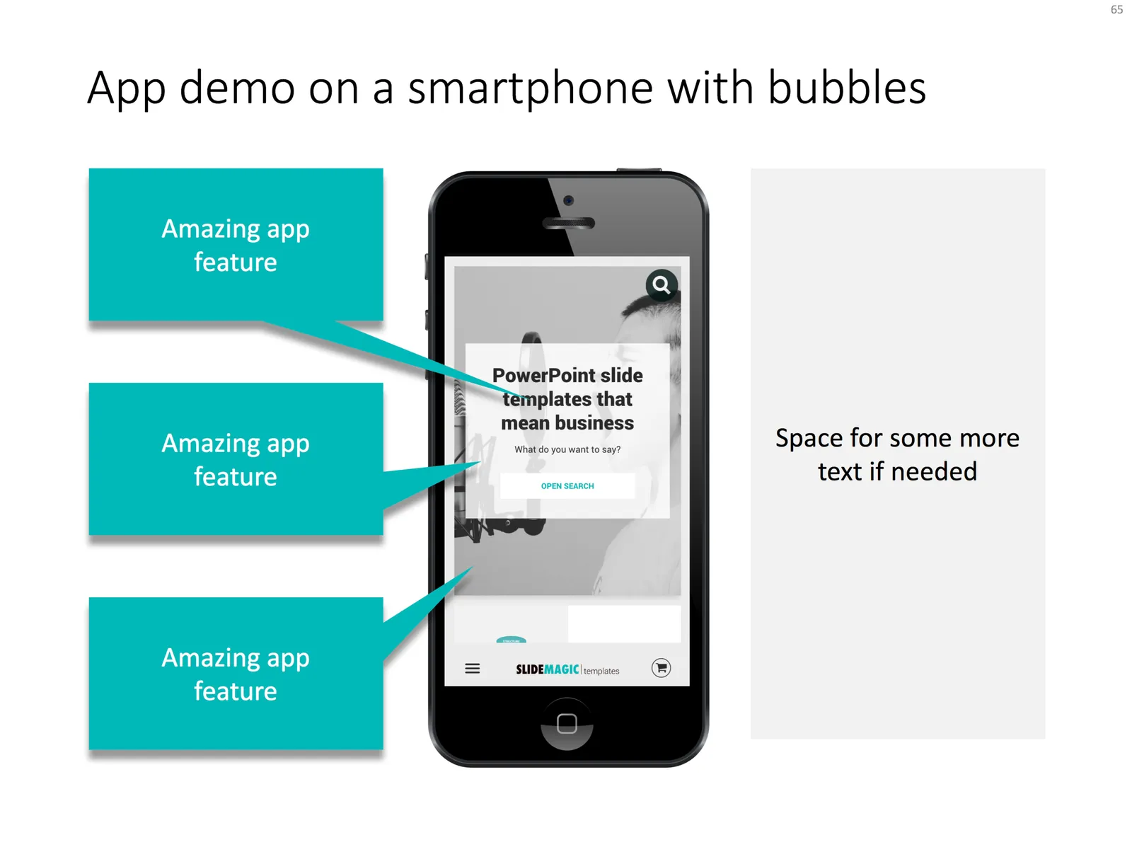
Instead, I usually prepare a series of screen shots with big explanation bubbles in my presentations. No technology risk, no loggin in, setups, and I can set the exact flow I want. The added benefit is that I can zoom into parts of the screen that are hard to do when showcasing the app live in an actual device.

Most of the time, I use page filling images to demo an app, to get as much screen real estate as possible. If I want to introduce the app in a general way, I use a background of a mobile phone or desktop to give the slide a more interesting context. As a result, the the screen itself will hardly be readable by the audience, and becomes a background image.

I added a few examples of app demo slide layouts to my template store.

·Templates

Focal point chart

A while ago, I discussed how to create a “focal point” slide, where a series of triangles can create the illusion of text boxes all disappearing in one big point. You can read the instructions how to create it in this blog post, but now you can also find them in the template store.

I am spending part of my daily time that I used to invest in blog posts, and increasing the library of my template store, I have an infinite amount of template ideas in my head, so there is still a lot of work for me cut out. Ultimately, the value of this store will be some sort of subscription, as a sign of support for me, in return for which you get unlimited access to all the designs. The combination of a powerful search engine and the largest library of useful charts on the net, I think the proposition of 1 second downloads will beat the alternative of manually copying my designs. Let’s see how it goes.