SlideMagic Blog

Frequent updates about all things presentations since 2008. Subscribe to never miss a post.

RSS
all posts

Category Shapes

·Design

Symmetrical shapes - hold shift while drawing

Symmetry should be avoided in slide layout. Symmetry in shapes on the other hand is beautiful. Hold-down shift while drawing to create a shape with equal hight and width, and in the “size ribbon” click the box to lock the aspect ratio.

·Design

Create your own buttons and lights on a metal skin in PowerPoint

Inspired by a post on slide:ology today linking to a set of newly released PowerPoint templates with examples of what graphical effects PowerPoint can produce, I decided to start posting some of my own favorites.

Many logos of Web 2.0 companies are examples of how not to use these graphics capabilities: add a “bevel”, “reflection” and “drop shadow” and the result must look good. In graphics design, most of the time, less means more.

But sometimes these effects can help. In my case a client needing to explain software functionality. We decided to go for the metal “HiFi component” look with buttons that can easily activate functions. (Click image for a larger picture)
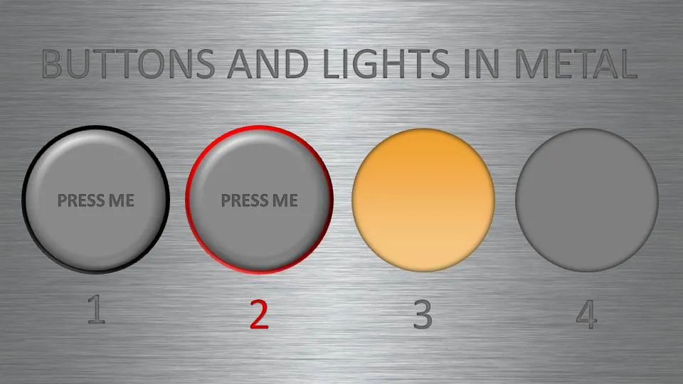
  • Metal skin: an image purchased from iStockPhoto
  • Metal text: a big font in a similar, but slightly darker color than the background with an interior shadow applied to it
  • Button 1 and 2: a circle with a heavy outline (red or black), a simple “bevel” applied to it, but in the tab “3D options” of the bevel functionality I increased the depth to 20.
  • Light 3 and 4: a circle without an outline, with an central interior shadow and a color gradient running from a full color to a slightly faded color.

Let me know in the comments if you are interested in the detailed instructions.

·3D

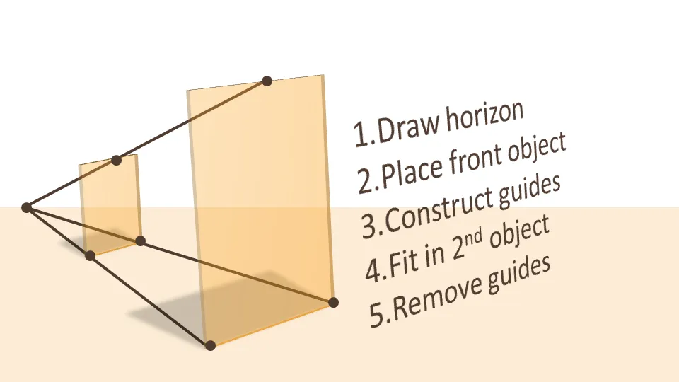
How to position 3D objects in PowerPoint slides

I am not a big fan of heavy 3D graphics in PowerPoint. Similar to animations, or 3D bar/column charts: the fact that PowerPoint enables you to do it, does not mean you have to use it.

  • It is tricky to get things to look realistic: PowerPoint is not a 3D design tool. A failed 3D chart looks very amateurish
  • 3D charts make it almost impossible to work with images. If given a choice, I would use an image rather than 3D objects. You can’t have them both.
  • 3D is hardly ever required to make a point: less is more in good PowerPoint design. Exceptions to this rule could be things emerging at the horizon, long-term outlooks, etc.
  • Text becomes harder to read

If you do want to use a 3D composition, use guide lines and an imaginative vanishing point to make sure your objects are aligned properly.

UPDATE: more on positioning text (with reflection) in 3D in PowerPoint in a folow up post to this one.

·Design

Using "paste as PNG" to wash out complex PowerPoint objects

Going a bit (only a bit) against the “Zen” presentation philosophy, I have argued before that overwhelmingly complex PowerPoint charts could be used in a large keynote presentation, if (big if) they are positioned well.

One way to use it is as follows:

  • Put up the overwhelmingly complex chart, message: “it’s complex, don’t even try to understand this now”
  • In a subsequent chart, wash out the original object
  • Start highlighting individual components for further explanation

You can use the “paste as PNG” function in PowerPoint to transfer any object (including complex groupings) into a picture and subject it to the regular picture manipulation tools available to you: resize (a pain for complex PowerPoint objects with text in them), crop, and of course re-color.

Recoloring the image with a very light overlay creates a wash out effect that you then can use as a background for subsequent highlights. I have tried to explain all this in the following SlideShare presentation (click on “screen” image at bottom right for full screen mode).

·Shapes

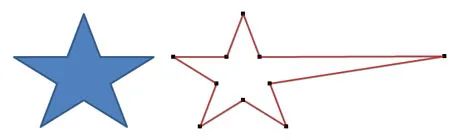
Turning PowerPoint shapes into freeform objects

More PowerPoint “how to’s” this weekend. (“how to’s” - apostrophe abuse alert) A reminder on the PowerPoint Ninja blog today on how to transform built-in PowerPoint shapes into free form objects. Read detailed instructions here.

Drawing free-hand is a challenge. In order to keep some control on where to move corners of the shape I recommend using a drawing grid with a wide spacing (PowerPoint 2007):

  1. Click the “Arrange” button in the home ribbon
  2. Click “Align”
  3. Click “Grid settings”
  4. Click “Snap objects to grid”
  5. Click “Display grid on screen”
  6. In “Spacing” choose a large value
·Investor presentation

Free Cisco network icon library for PowerPoint

When helping startups to pitch for VCs, I often need to include a slide with a technical architecture in a presentation. These diagrams are complex to make. Cisco makes life a little bit easier by putting its entire icon set as a free download online (link). They are ready to be copied directly into PowerPoint. The images are not that pretty, but they are functional. A smart move by Cisco, many potential clients will use these icons to design their network requirements before entering the vendor selection process P.S. Technical diagrams that use these type of icons often end up in a handout, or the appendix section of a presentation. I will post my thoughts about technical architectures that need to play a central role in a pitch presentation later.

·Layout

Who said that PowerPoint shapes always have to fit inside the canvas?

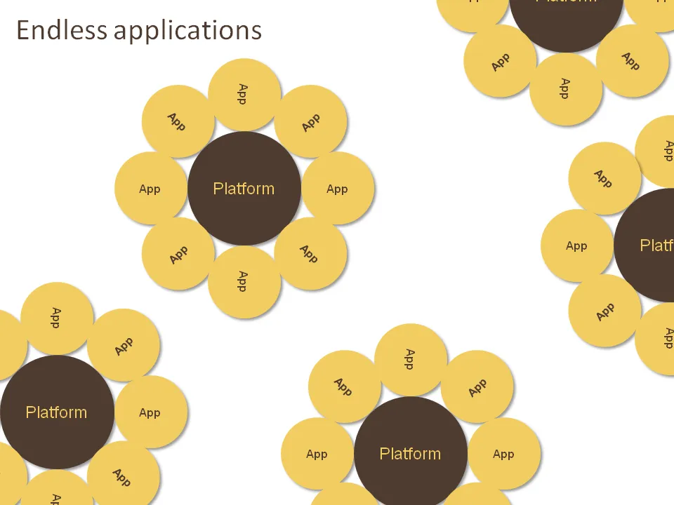
Like images, it can also look very nice to let PowerPoint shapes float off the page. Just position your object half off the canvas, PowerPoint will eliminate the content that’s not on it when in presentation mode.

The concept below was made for a company that has a technology platform that can be applied in an almost unlimited amount of applications. Yes, the chart was inspired by a field of sun flowers in southern France. Here is how to get all these circles lined up nicely.

·Shapes

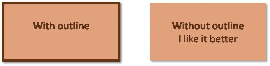
Avoid shape outlines if you can

I think PowerPoint shapes just look better without a dark line around them. A fill color that stands out from the background is enough. If you have to use a contrasting line, use either white or a dark shade of the fill of the shape rather than black.