

On today’s SlideShare front page is a nice presentation by Martin Pure:
Following on yesterday’s post on 3D objects, you can see that “something is wrong” with the alignment of the objects. The use of a reflection (a “Web 2.0” effect that I only use very rarely) implies a 3D setting.
You can apply the same guide lines thought to correct things. In addition, you can change the size of the font to emphasize the feel of a 3D environment.
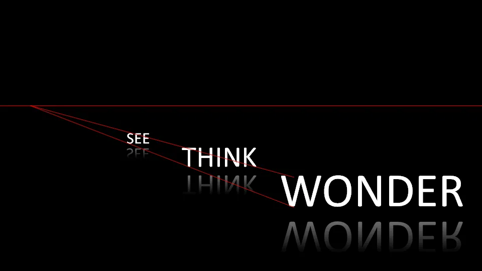
My comments were all about positioning of text. Do not misunderstand me, I like this presentation.
2 comments
A good example of what I'm talking about is at With the application of the right gradient, it can look like you have a surface that is receiving the same amount of light as the objects on the slide (your text).
1) it is very hard to re-create a realistic 3d composition (objects, lighting)
2) reflections are PowerPoint gimmicks that do not always add to the message of a chart
Having said that, many of the world's greatest painters have totally ignored the rules of realistic 3D proportions, so there might me a use for deviating from reality in presentations as well. I have not come across presentations that reach this ambition level though... :-)