

Not all presentation settings are the same. A “Presentation Zen” slide show with stunning images and the incidental word on a slide is great for a keynote, but might be a bit too much to discuss last quarter’s financial results. The 50 page deck with bullet point slides might be serve better as a printed business plan than the key communication tool for a 20 minute VC funding pitch. I have tried to describe 6 presentation scenarios and categorized them according to:
- Whether the presenter is present or not
- The amount of detail/data inside the document
Here we go (click image for bigger picture):
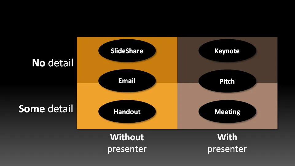
- The key note is the classical “Zen” presentation. Huge fonts, dark background, few words, large images.
- The pitch is similar to the key note, with the difference that it might be shorter, and does contain some more data to answer questions from the much smaller audience.
- The meeting presentation is probably done on a light background, and contains much more facts and details. Over-simplified slides with beautiful pictures do not work in the small conference room with people ready to go through raw material. McKinsey and other consulting firm’s presentation often fit in this box.
- The slideshare (or online) presentation is something relatively new. People see it typically in small windows, i.e., fonts should be big, pictures should be nice. The audience of this presentation is highly impatient, clicking rapidly to reach the end, and aboning your presentation if it is not interesting enough. No animations here.
- The email attachment is similar to the key note presentatation with an important difference that it needs to stand on its own, titles need to explain the messages in the charts. Some animation could be used here (sparingly though). Detail is less than the handout.
- The handout contains the full detail, the full text. It should be prepared on a white background (people will often print it) and use no animation (again, does not come out in print). For VC pitch situations, the good handout makes the business plan “brick” obsolete (hardly anyone reads these anyway).
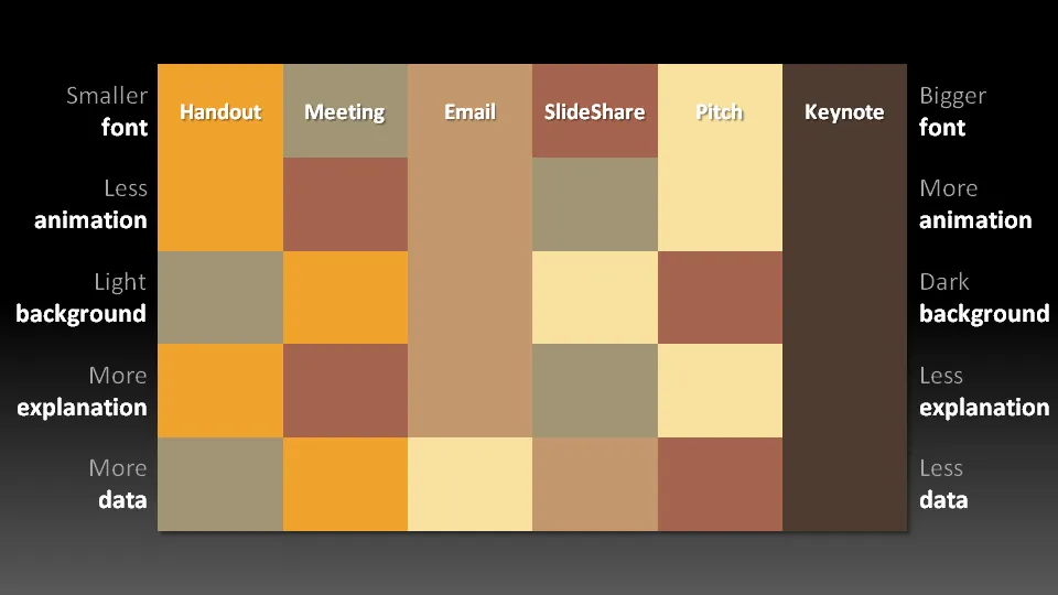
The following colorful diagram makes an attempt to visualize the above. A bit busy, the main message is that things are different in each scenario.
12 comments
and yes, it is Zen.
It would need a title or some explanation though since without a presenter or the text in a blog post an impatient audience might not get the point. Maybe...
When preparing for a presentation, it's advisable to make explicit considerations about its audience and its objectives and to select the best format. It's all driven by the amount of interaction you desire or that circumstances allow. In general, the more interaction you want, the less information you should cram into your slides. I've once seen a presenter use only three slides that were blown up on large panels. Members of the audience were invited to come up to the panels and add comments with a big felt pen. Very effective.
Kind regards,
Titus Tielens
The colors represent the presentation types in the top row of the matrix.
1. Dark backgound
2. No detail
3. Without presenter
Aha! Perfect for SlideShare.