

are great to show overlapping features. In practice however, it can be hard to position text in the circular shapes. I often use an adjusted version of the Venn diagram, one based on boxes. Boxes are easier to draw, and especially, you can make the center box (the most important one) really large.
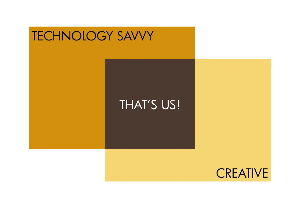
As you can see below, I did not rely on semi-transparent colors to create the overlap effect. Rather, I just drew the third box in, giving me complete flexibility to decide on colors. Again something that would be hard to do in a circle Venn diagram.
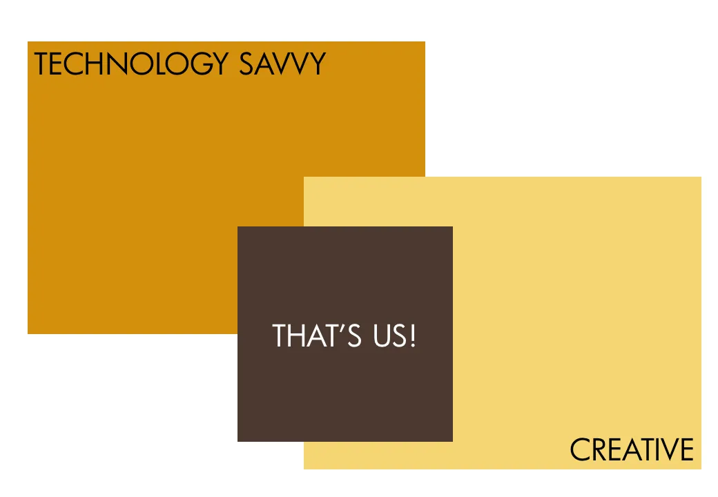
UPDATE February 2018: I have now added a number of Venn diagrams in PowerPoint to the SlideMagic store, including the rectangular ones that are described above.