SlideMagic Blog

Frequent updates about all things presentations since 2008. Subscribe to never miss a post.

RSS
all posts

Category Presentation

·Design

Is time the new paper?

I am just reading this accurate blog post on Apollo Ideas: break up bullet point slides into multiple pages that focus on one idea each. Many of my clients object to this technique. “That’s too many slides! I only have 25 minutes!” They are choosing the wrong metric; number of slides, kilos of printout, presentation file size, it does not matter. Time is the only relevant factor. When you have 25 minutes to present, you bring slide material that will not exceed 25 minutes. That could mean: 50 slides, 750 gram of handouts, 5 paper flip charts, or a 70MB file.

·Books

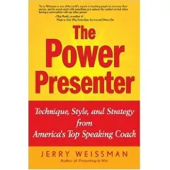
Book review - The Power Presenter

I just finished reading the book “The Power Presenter” by Jerry Weissman, a public speaking coach.

My main interest is in graphical slide design, so it is a bit unusual for me to be reviewing a book that is solely about delivery of speeches and presentations. Initially I found it a bit hard to get into the story of the book, but as I finished more and more chapters the entire plot of the book became clearer and by the time I read the last page I found that I learnt some real valuable lessons that will affect every presentation I will give in the future. The central objective of the book is to get rid of a presenter’s adrenaline rush when presenting: the instinctive debate of the body whether to fight or flight a stressful situation. Rather than prescribing a number of dogmatic “presentation rules”, Jerry suggests way to create a natural way to becoming a more confident speaker.

Central in his book is a concept called “ERA”:

  • Eye connect: “only speak to eyes”. Much more powerful than “don’t turn your back to the audience”, or “don’t muffle your voice”. It is a simple rule that everything you say, everything, should be said by looking a member of the audience straight in the eyes, waiting for eye contact, delivering the sentence, and then move on. No exception. Quite a challenge for a presenter, but it makes sense
  • Reach out with your hands and your body language to simulate the appearance of a hand shake
  • Animate, adding more drama and passion in the way you deliver your message

Continue reading →
·Design

When is enough enough?

Less is more. Resist the temptation to overdo slides. Like putting too much bass and treble in your HiFi system. Like a rich chocolate dessert. Like an oaked Chardonnay. Nice on first “attack”, but then it starts to overpower you.

It is a holiday here in Israel, people are relaxing on a beautiful spring day. A bit of humor: artists commenting on when they consider their art work finished.

Via Wooster Collective, a street art blog that is worth following. Things (language, images) sometimes get a little bit more rough over there than you will find here, but hey, it’s art and there are some interesting visuals being discussed. (See a previous street art post on this blog)

·Data visualization

A different approach to data visualization

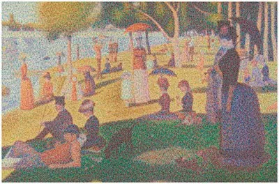
It is hard to get the magnitude of a huge number across on a slide. A $700bn bailout,how much is that? Photographer Chris Jordan takes a different approach. Repetitive patterns of miniaturized objects that form a bigger picture. Images have a political message, many of them try to put current “consumerism” into perspective.

The image below is inspired by Seurat’s “un dimanche après-midi à l’Île de la Grande Jatte”, and constructed from 106,000 softdrink cans.

Check out more of his images here. Via Village of Joy.

·Concepts

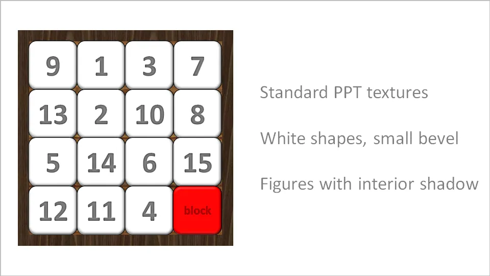
Stuck! - board games with simple PowerPoint shapes

The basic PowerPoint shapes and textures can be used to re-create realistic looking board games. Here is a concept I used for a client that needed to show how its potential customers are being hindered to move around their IT infrastructure freely.

·3D

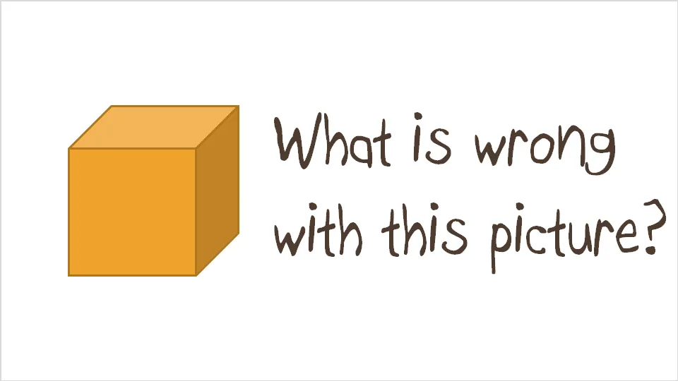
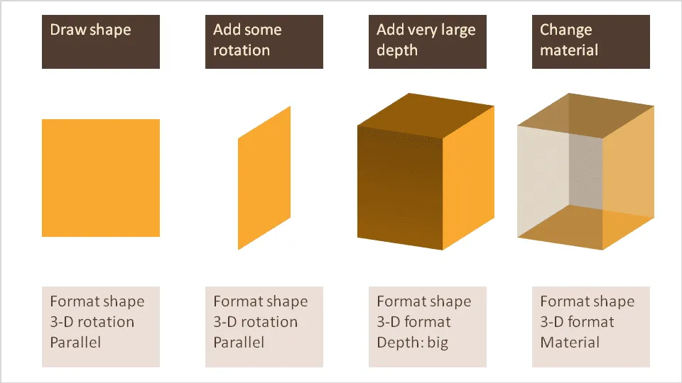
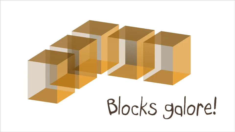
Drawing 3D boxes in PowerPoint

A while ago I discussed making translucent balls. Here is a similar trick for boxes that does not use the old PowerPoint shape with a simple cavalier perspective.

·Design

People get it - no need for SCREAMING emphasis

Sometimes you need to emphasize a very IMPORTANT !!! word in your slide (how to do underline in Blogger?).

Don’t use all the tools you can use. In dense text, use italic, in PowerPoint slides make it bold, or change the color of the word. People will get it.

·Advertising

Esthetics in everything you do

Another ad found on Ads of the World: Samsung wide-angle CCTV.

Very good Photoshop work. Still, the resulting image is not esthetically pleasing. My personal rule: never let an ugly chart or image enter my PowerPoint presentation, ever.

·Design

Design doubles newspaper circulation - presentation lessons

Newspapers are in trouble. This TED video highlights how clever design can do miracles to the circulation of a newspaper. (For details about the presenter, see the original TED post).

Insights (for me) that reach beyond the world of newspapers:

  • There is no reason why you cannot totally turn traditional visual design upside down. Many PowerPoint slides still resemble 1990s hand-written overhead projector transparencies
  • Technology enables small firms/individual designers without big budgets to out-design big established brand names. It is all about ideas and creativity now, technical execution is not a differentiator anymore
·Design

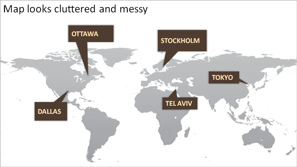
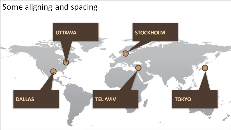
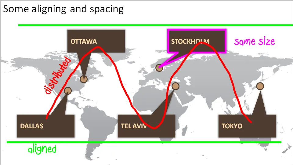
How to bring some order to a cluttered PowerPoint map

One of my clients is keen to show its new network of global support offices. Maps can look messy and random. Here are some simple things you can do to put things in order. We can not change the location of the planet’s cities, we have control over PowerPoint shapes…