SlideMagic Blog

Frequent updates about all things presentations since 2008. Subscribe to never miss a post.

RSS
all posts

Category Presentation

·Design

#PPT - let's try to create a presentation-focussed Tweet Deck channel

During a conference I discovered the power of a hash tag in Twitter. A constant flow of relevant updates around a topic or an event either in Twitter search or on Tweet Deck.

Let’s use something for presentation design-related Tweets: #PPT? Short, memorable, relevant?

·Concepts

Chart concept - signs with a little humor

High-quality pictures of signs are great raw material for a presentation. They stand out by themselves, people are used to take a moment to read them and they could add some humor to your story:

  • Typos, or unusual text as an ice breaker for your audience
  • A correct message that is put out of context in a funny way in your presentation

The downside, they are very hard to find, but with a bit of creativity you can re-create them either by using a blank sign from a stock photography site, use a generator like AddLetters, or - even better - creating one of your own using PowerPoint shapes.

Here is a diffrent take on the credit crunch found on Noisy Decent Graphics:

·Design

No need to put that huge "message arrow" on you slide

An excellent post on the “Tekst en Communicatie” blog by communication expert Louise Cornelis. It’s in Dutch, so I will translate.

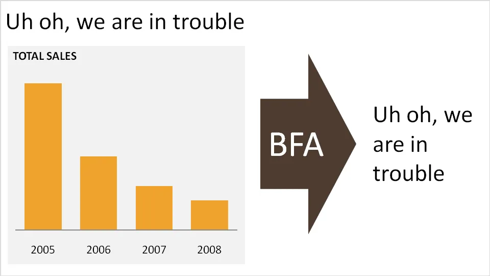
Louise discusses what she refers to as “the big f*cking arrow” or “BFA” (not all Dutch on her blog). A huge arrow in the middle of the slide, pointing at a block of text with the chart’s conclusion. Apparently “BFA” has become a well-known acronym among chart designers in The Netherlands.

Her (and my) recommendation: get rid of it and stick to a clear title headline.

·Data visualization

Visual power of many small repetitive data charts

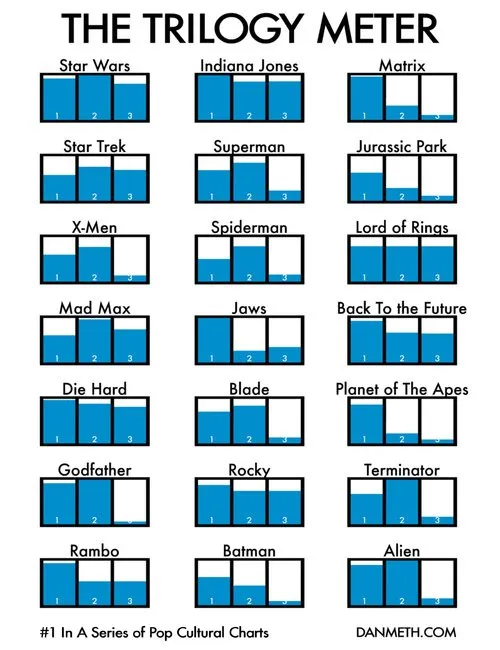
A nice set of bar charts showing Dan Meth’s excitement about episodes of movie trilogies.

Many, many, similar small data charts on one slide can create a powerful visual effect. It is possible to create Zen charts that contain lots of detail.

Via Randy Krum

·Colors

Google image search narrowed down by image color

An interesting find by the Google Operating System blog: using Google image search to find pictures with a certain color. It is not an official search option (yet), you need to adjust the Google URL manually:

Finding red birds:

  • Enter “bird” in Google image search
  • Add “&imgcolor=red” to the Google URL so it looks like this: http://images.google.com/images?q=bird&imgcolor=red,
  • Replace “red” with “blue”, “green”, “teal”, “purple”, “yellow”, “orange”, “pink”, “white”, “gray”, “black” and “brown” to get other colors

Still, watch out for possible copy right violations or poor image quality when using pictures taken from Google in your PowerPoint presentations.

Thank you Ashish for pointing this out to me.

·Design

It's hard to find that perfect visual analogy

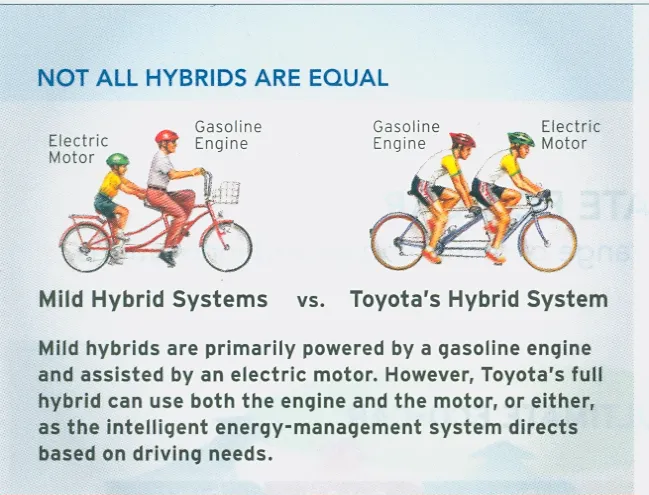
I came across this diagram in a print advertorial for Toyota hybrid cars (scanned it, could not find it online). Click on the image for a larger picture.

The diagram supports all the points in the text. Still:

  • The image looks a bit retro
  • You actually need to study it a bit to understand it
  • Race bikers can go fast, however they are by far not as powerful as a modern hybrid car…
  • The text below the image does not flow very well

In short, the image is probably good enough for an internal management presentation, but does not meet the bar for external advertising. It is hard to find that perfect image or illustration…

·Design

VC pitch resources updated

I added this presentation from Dave McClure to my list of useful links for pitching to VCs. It is an example of an unusual combination: poor graphics / great presentation. Usually poor graphics are made up for by a charismatic “live” presenter. In this case the presentation is great on its own as well.

How to Pitch a VC (aka Startup Viagra: How to Give a VC a Hard-On)

For those who haven’t seen my earlier posts about the topic, a repeat here:

·Advertising

Chart concept: can't see the forest for the trees

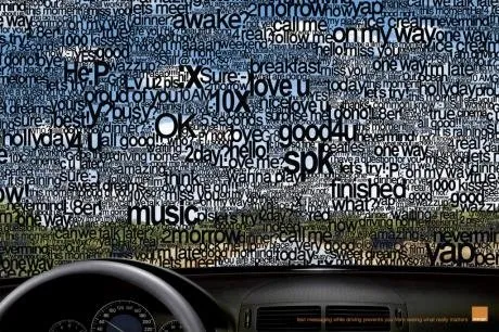
I often need to produce a chart that needs to say one’s inability to see the forest for the trees. This ad by Orange warning people against SMS-ing while driving makes the point nicely. Very labor-intensive to replicate in PowerPoint.

Via Ads of the World.

·Design

New pocket projector launched in the market

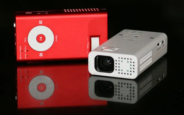
I have been following the developments in the market for pocket projectors. If they work, they have the potential to create a whole new setting in which to give presentations (conference auditorium, small meeting room, and now the white wall in the local coffee shop).

The (obvious) problem with the early devices was that they lacked power. Here is a new device that is a bit bigger/heavier, but promises to deliver more performance: the Beambox Evolution R-1.

Via engadget.

·Design

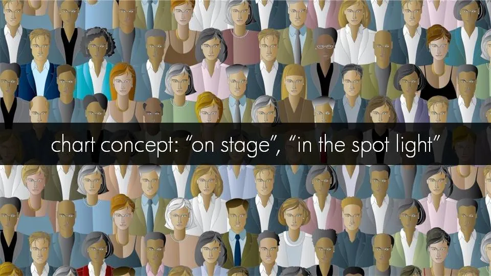
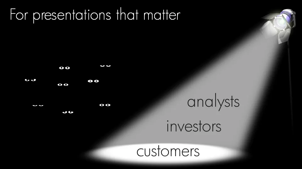
Chart concept: an audience staring at the audience

Putting your audience in the patient seat can be a powerful presentation technique. While upgrading my own introduction presentation, I started playing around with “eyeballs” that create an audience staring back at you.

Click on the images for a larger picture.