SlideMagic Blog

Frequent updates about all things presentations since 2008. Subscribe to never miss a post.

RSS
all posts

Category Presentation

·Concepts

They don't need to read it anyway

For some points you want to make in a presentation, it doesn’t really matter whether the audience can read the content or not. Example: “here is my long list of scientific publications”.
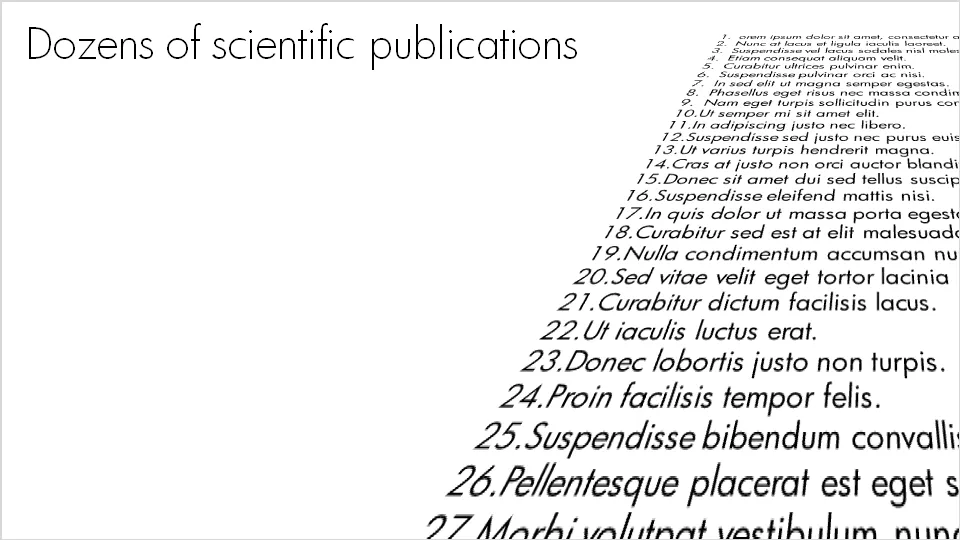
  • The text was simply “3-D rotated” in PowerPoint (make sure to set the perspective to the maximum 120 degrees).
  • I left the text (that nobody will read) “bleeding” off the page to leave room for white space around the title line (that should be read)
  • In my case I filled the text box with nice lorem ipsum, but these charts are most powerful when you use actual text (that nobody will read): my actual list of publications with ISBN numbers and publication dates for example
·Advertising

Everyone can draw - iconic graphics

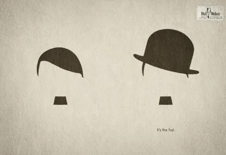
Look around you and see how powerful simple graphical shapes can be. The ad below is an example (text below Chaplin: “It’s the hat.”).

A larger image can be found here on Ads of the World.

·Design

Designers and developers sitting in a tree...

This presentation was uploaded to SlideShare yesterday. Simple colors. Beautiful fonts. No stock images. OK, some bullet points, but nicely formated. A great example of a presentation that can stand on its own, without the presenter being present.

Designers & Developers Sitting in a Tree (Web09)

More on picking the right presentation style for the right presentation occasion in a previous post.

·Data visualization

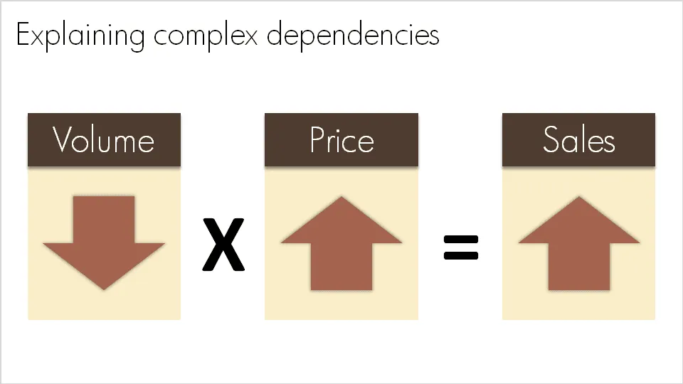
Basic equations to visualize complex dependencies

A question like “What happened to sales last year?” sometimes requires a complex answer. “Well, it is a bit complicated: volume went down, but then prices went up, but as a result sales were up”. A simplified mathematical equation can help you visualize this.

Sometime in the near future I will post here how to do a proper “sources of change” analysis.

·Design

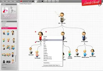
Lovely charts with Lovely Charts

Computer network diagrams are hard to make in PowerPoint. Finding the icons, positioning boxes, connecting them. The web application Lovely Charts might be a good solution. Also for flow diagrams, organization charts etc.

If you are in to designing network diagrams in PowerPoint, be sure to visit the Cisco icon library.

Via Armano

·Design

Meet Mr. Chicken and think about your PowerPoint template

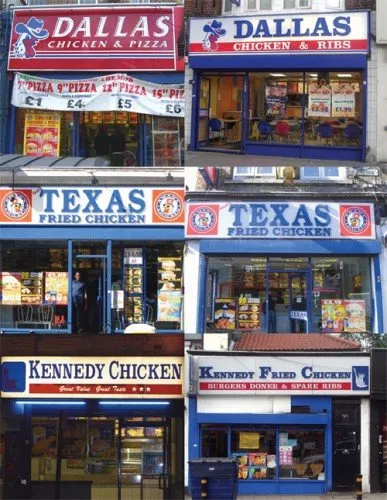
Amazing, there is one person who designed the “logos” and store fronts of almost 90% of all independent fried chicken outlets in the U.K. “Mr. Chicken” is interviewed here, there is even a book available on the phenomenon.

Amusing reading. However, it is not completely justified to pooh pooh these logo designs. Because they all look the same, they are actually pretty effective. If you find yourself in a U.K. high street looking for some fried chicken, you find one of these outlets in 2 seconds.

But, you do not want to be “Mr. Chicken” when it comes to your PowerPoint presentation. Get rid of the generic logo. Free up the screen real estate that is consumed by heavy banners with empty slogans. Instead, let people see the “what you have in store” with great content in your slides, all in a nice and consistent color scheme.

Via Noisy Decent Graphics.

·Design

Godin on VC pitches: "imminent success" around the corner

Seth Godin writes in his latest post about the importance of showing your imminent breakthrough:

If it’s a foregone conclusion that you’re going to break out, that all systems are go, then only an idiot wouldn’t jump on board.

It didn’t happen yet, but it is about to happen. Useful advice for people writing VC pitches.

·Data visualization

Summary chart with 3 completely different data ranges

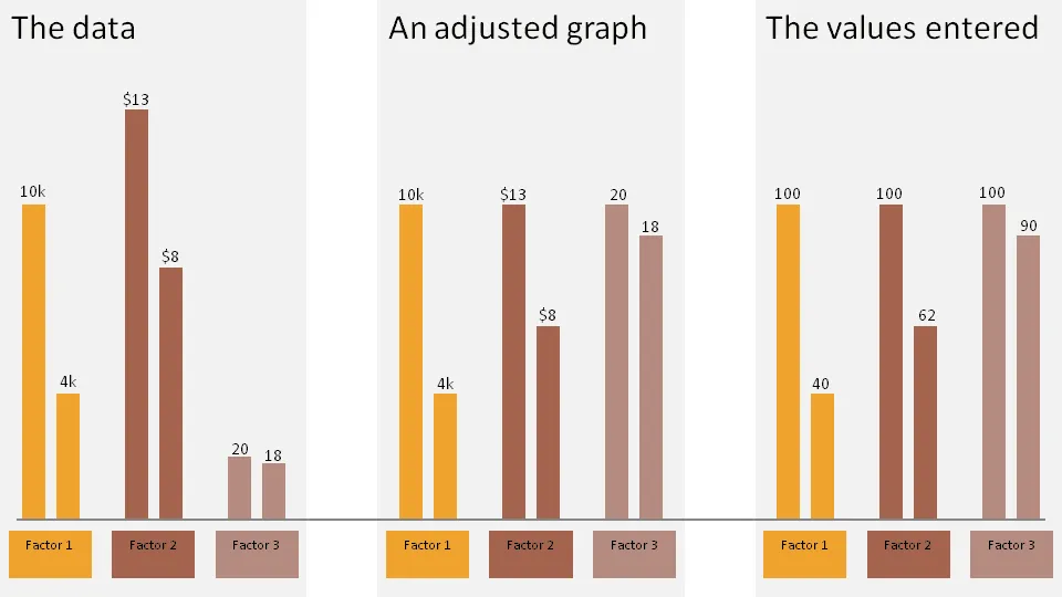
Sometimes you want to show 3 data sets in one chart with very different data ranges, for example:

  • 1,000s of customers
  • $ sticker price per unit
  • Number of products bought per customer

One solution:

  • Set the column of the first data point of each series to 100
  • Calculate the 2nd value relative to the 100
  • Manually paste data labels with the correct factors

The chart below gives an example:

  1. The first chart contains the unadjusted data
  2. The second chart shows the adjusted version
  3. The third charts shows the values I have entered in the PPT columns

Click on the example image below for a larger image.

·Design

The joys of ALT ENTER

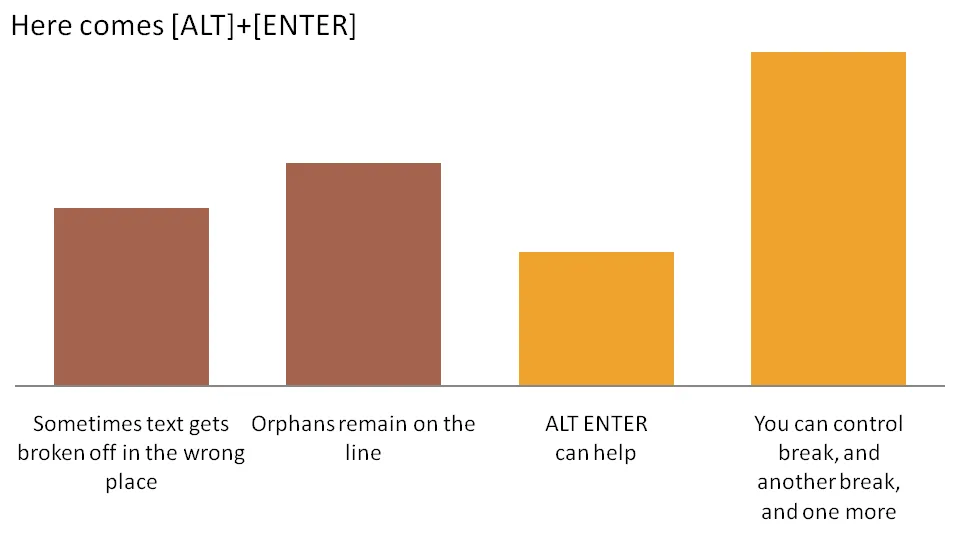
Pressing ALT ENTER in an Excel cell creates a soft page break, pushing the text down a line without “closing” the cell edit. You can use it to control line breaks in axis lables.

The other solution is to omit automated axis labels all together and put in your own standard PowerPoint text boxes under the bars in the chart.

·Design

Do good stuff

I am continuing to post some “lighter” material during this holiday week here in Israel. Gary Vaynerchuk shares my passion for (great) wine. Here is an entertaining 2 minute video encouraging you to go off and do great things. Watch how he builds his point up and pauses before he gives his recommendation how to stand out in the noise of social media. [Spoiler alert]. Writing “do great stuff” on a PowerPoint slide would not have created the same impact as this video.