SlideMagic Blog

Frequent updates about all things presentations since 2008. Subscribe to never miss a post.

RSS
all posts

Category Presentation

·Design

Looming and blurring

Somehow, this big bulldozer looks scarier after a treatment with PowerPoint 2010’s blur filter. If you do not have PowerPoint 2010 installed, you can find it in Photoshop as well. The second advantage is that a blurred image is more friendly to put text on.

·Design

Review: Slideboxx, a PowerPoint search engine

I have been testing Slideboxx over the past day (Windows-only). Slideboxx is a tool that crawls all PowerPoint files on your computer (it counted more than 5,000 on mine…) and stores visual thumbnails and keywords of all the slides in a searchable database. You type in a keyword, you get instantly served icons of matching slides with options to refine your search, find similar slides, and even “frankenstein” (what?) a new presentation from old slides.

First of all, there is a real need for a tool like this. The legacy Windows filing system based on file names and application icons is useless for visual files such as PowerPoint slides. I am now using Gmail to track down presentations (“where is that file I sent to [x] a month ago?”) because a date, a keyword, and a person is a better clue to what I am looking for than a location on a hard disk.

There are more companies developing professional solutions to dig through data stored in enterprise networks, not just PowerPoint, but including spreadsheets, PDFs, databases, etc. BA Insight is one for example.

Back to Slideboxx. The software is easy to install, the interface is nice and clean, and the program is very powerful to dig up long-forgotten slides.

For someone with a lot of slides who makes presentations for one company, or related to one subject area, the tool makes a lot of sense, and could actually be a significant time saver.

For my 5,000+ files the search results are sometimes a bit too broad, I would love to have an option to narrow searches actually by a folder on a hard disk. Another approach would be to add generic presentation tags to all slides in a presentation. For example the company name on the front page of the deck, the name of the presenter, the subject of the presentation, the items of the agenda, each of these are relevant to all the slides in a presentation, while they might not be written down explicitly on each slide.


Continue reading →
·Design

The art of writing diplomatic cables

In a background article on the leaked diplomatic cable archive, the NYT today discusses the “Ambassador’s Cable Drafting Tips” by Richard E. Hoagland, the U.S. ambassador to Kazakhstan. From the article:

  • Pay attention to the first 5 words, they need to catch the reader’s attention, they are the only thing diplomats see in the electronic cable queue
  • Avoid flabby writing (see this too often in diplomacy)
  • Incorporate story telling
  • But: cute writing is never acceptable, only for toddlers, not for professionals…

Now someone needs to leak these cable drafting tips so we can all learn from it…

·Design

Story in flat images

Some images contain an entire story. While it is hard to match the effect of this photo in an everyday presentation, you should at least try to use cinematic effects in composition: suggest movement, create tension of something that is about to happen, but has not yet. The man who is about to open the door creates a much stronger visual, than the image 5 seconds later of him escaping the women’s dressing room.

The original ad can be found here on Ads of the World. (By the way an example of an image that is grey, but not really grey)

·Data visualization

Why do Google map's labels seem so readable?

An interesting post on the 41Lattitude blog with a very detailed analysis of why the labels on maps by Google are so much more readable than those on maps by Yahoo! and Microsoft Bing.

·Design

The final fixes

The final version of most business presentations is created when the person-with-the-pen hits “save” after the wording is agreed in a slide-by-slide meeting.

If you are the person-with-the-pen, why not wait for everyone to leave the room and go over each slide one more time, but now focus on the visual fixes. Align boxes, sort out the fonts, round up those decimals and hit “save” again.

Twenty minutes of work with great impact. It might not be a big deal, but the brain is distracted/bothered by small layout errors in a slide. Like the urge most people have to straighten that curtain, “it’s been bothering me all evening”.

·Design

Free the world of trackers

Many business presentations are loaded with tracker elements:

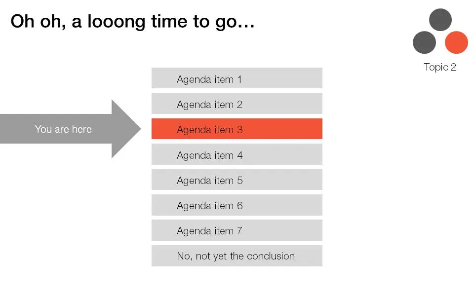
  • An agenda page with a highlighted bar that moves as we go from section to section
  • A miniature version of a framework in the top right corner of a slide with a changing color highlight to remind people what we are talking about.

I find trackers great for big documents: it allows fast browsing if you need to refer back to material. In (shorter) presentations I try to avoid them:

  • If you need trackers to keep people hooked to your story, your story is probably very boring. Maybe you can try to change the story?
  • These top-right symbols add clutter to the slide design
  • A big tracker agenda can come across daunting for an audience: “oh no, 5 sections before we get to the conclusion, let’s check email on the Blackberry…”

I am all in favor of structure, just let it come natural via your story, without having to “rub it in”. One elegant solution is the full page separator slide like the ones I used in the IDU Biometrics presentation. They can contain a few words about what comes next e.g., “technology”, or better you can write a question that wakes up the audience and makes them curious to find out more what’s next: “why is this such a great biometric?”.

·Design

Designing a minimalist Twitter page

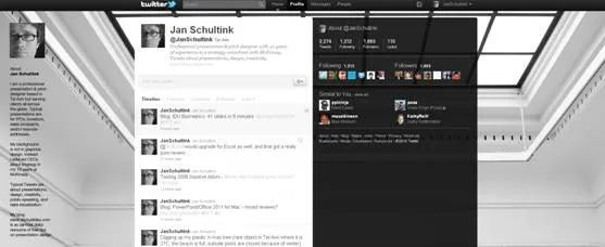
I gave my Twitter page an overhaul. Designing a Twitter page is tricky:

  1. On small screens the side bar on the left gets eliminated
  2. A twitter stream is a cacophony of links, icons, avatars, buttons

Here is the approach I took:

  1. Minimize the use of distracting colors that only add to the chaos of avatars and links
  2. Use a background image that gives a sense of open space, with a light source from the top, and minimal visual distractions
  3. Invert the colors of the right side bar: really dark semitransparent background, with a white font (it will look a bit weird in the Twitter style editor). I find it very hard to get any color to look good here, because the semi-transparent setting will make any of your choices look pale.
  4. The same is true for links, I struggle to find good link colors and as a result set them light grey. Most Twitter links are shortened URLs that people do not need to read anyway. The alternative would have been to pick a very bright one with high contrast, but that would only add to the cacophony of the page.

What do you think?

·Concepts

Back to simple

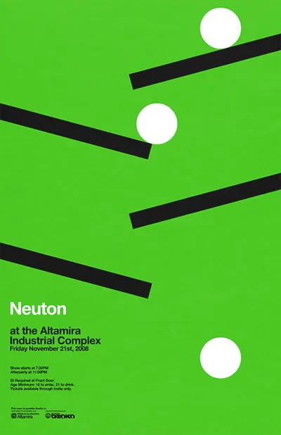
There are just so many advantages to making slides with very simple shapes:

  • It focuses on what you want to say only
  • They are easy and quick to make
  • They look highly professional without a degree in graphics design and/or the full suit of Adobe software
  • It easy to create a sense of motion
  • There are no issues with images/illustrations that do not fit your color template

An example is this poster by Network Osaka (actually must better than a concept designed by me a year ago):

·Animations

IDU Biometrics: 41 slides in 6 minutes

One of my presentations in the public domain. This time the setup was the global finals of the 2010 Global Security Challenge in London. Startups that had won the regional semifinals were granted 6 minutes to pitch their company in the field of IT security to a jury. I designed the presentation for IDU Biometrics within the following constraints:

  • 6 minutes, no second more
  • An audience that understands IT security, but has no idea what so ever about the company the moment the 6 minutes start, we begin at level 0
  • A very tight startup budget: all designed in basic PowerPoint without sophisticated effects and/or illustrations, one file that forms the basis for the company presentation, a looping presentation inside the company booth at the exhibition that was held in the same venue, a video for online viewing, and a good introduction for a broader presentation for fund raising from venture capitalists.

Here is the video version of the presentation: