SlideMagic Blog

Frequent updates about all things presentations since 2008. Subscribe to never miss a post.

RSS
all posts

Category Presentation

·Design

Watch those bold fonts

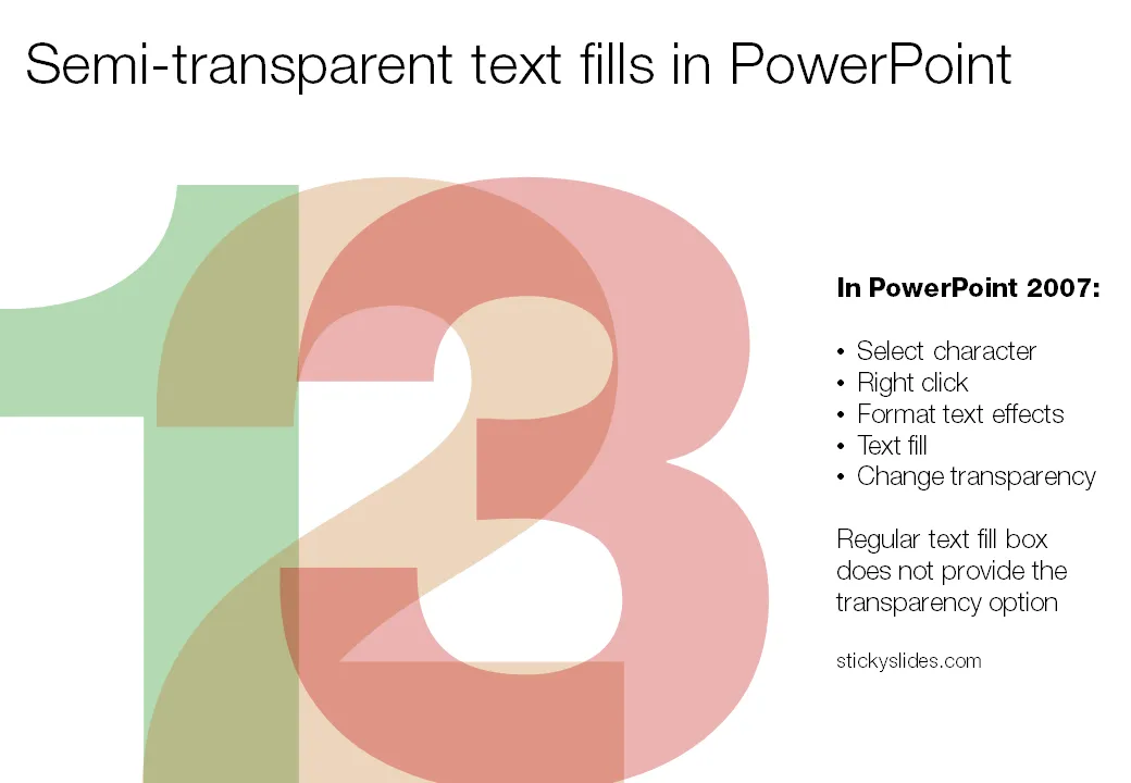
When PowerPoint does not have the right bold or italic font variation installed, it tries to emulate the real thing. For example in the case of bold, it plots slightly overlapping version of the same letter next to each other to make the characters look heavier.

But when you install the correct fonts they get put in slightly random places. Look at the editing screen below (click on the images to see a larger picture). You can see where things go wrong as PowerPoint tries to fill in the missing gaps. Strangely enough in presentation mode, it displays these fonts as regular type.
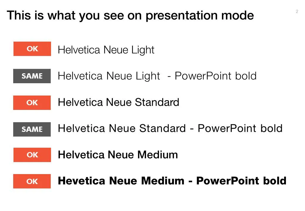
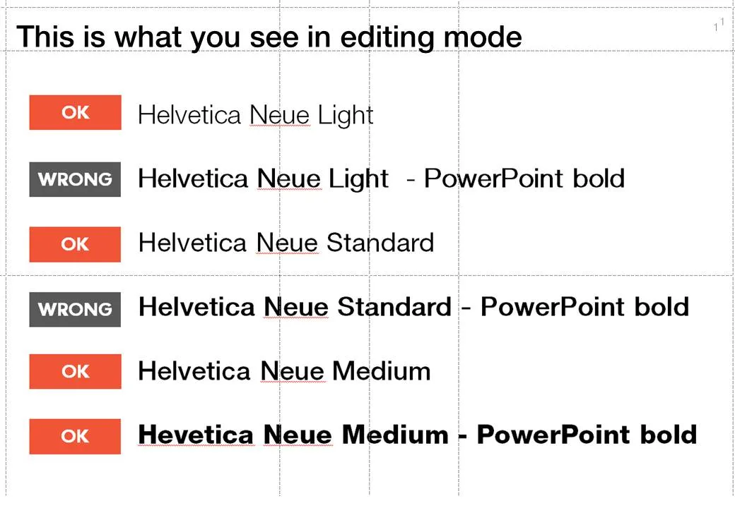
Secondly it takes some tweaking to get the right font you want:

  • A bold version of standard Helvetica Neue is the medium variation that I have installed
  • To get the heavy variation (which I also bought) I need to take the medium variation and have PowerPoint set it to bold.

Fonts remain mysterious.
·Design

Going analogue with mechanical pencils

Most of my charts start with a pencil sketch. I burn literally through piles of paper when designing a presentation (a good use of those 1-sided print outs you do not need anymore). So what are my favorite pencils?

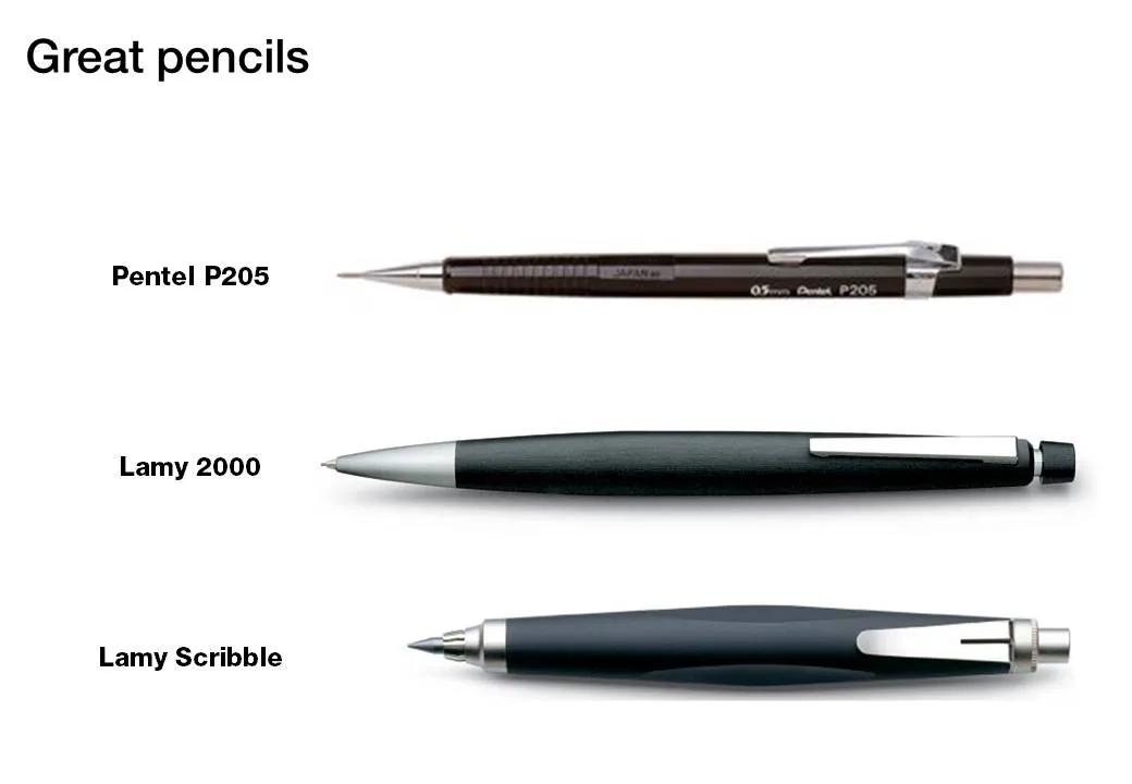
When I started at McKinsey, the Pentel P205 was my initial favorite. Per pencil, it is actually very cheap. That was exactly the problem, people considered it cheap enough to borrow it all the time. I kept on buying new ones.

I experimented with various much more expensive pencils only to discover that these are actually pieces of jewelry rather than sketching instruments. Beautiful to look at, but not very useful. Check out the site of Joon Pens in New York to see some examples.

Recently I discovered Lamy pencils as the perfect in-between. Two pencils are my favorite. First there is the classic Lamy 2000. Designed at the end of the sixties, and still in production pretty much unchanged. A beautiful minimalist look, very light and a nice, almost wood-like feel. People say that over time the mat finish will wear off at those spots where you hold the pencil though.

I use a 0.7mm pencil for regular writing. But when it comes to sketching a wider pencil is much better. The Lamy Scribble comes in a version with a 3.15mm fill. It has a very nice grip and is beautiful to let your creativity go.

(All links to Amazon are affiliate links).

·Design

My top 10: most popular posts of the year

·Design

Happy holidays

Here is a picture taken from my window on December 23, you see that winter has not really arrived in Tel Aviv yet. A wonderful holiday to all of you.

·Design

The about slide

Many presentations start with the about slide. It is useful to give the audience some background about who you are, where you are from, when you were founded, and what your company does (more or less), that your company is financially stable and not about to go bankrupt. But don’t overdo it:

  • There is no need to tell the entire story at the about page, tell it again in the presentation body, and summarize it again on the conclusion page
  • The audience needs to warm up before it is ready to receive your message (see my post from a few days ago)
  • The presentation should be about something that is interesting for the audience, and listening to you talking about yourself is probably not the best use of their time
·Books

U-turning on custom fonts

I used to recommend to stick to standard Windows fonts in order to avoid compatibility issues when presenting on other computers than your own. I am changing my mind, the risk of technical issues is still there, but the benefits of custom fonts is much greater.

Standard PC fonts (Times roman, Calibri, Arial, etc.) just do not look good. In dense body text, this is not such a big deal. But as PowerPoint slides get fewer and fewer text, their design start to look more like a poster with big headlines. And in posters, typography is a huge deal.

This post on the PowerPoint Ninja blog explains how to overcome compatibility issues by embedding your custom font inside the presentation. When you send it to someone else, she will see the correct font.

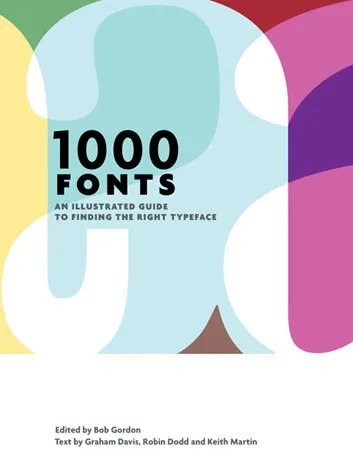
You can find your inspiration for fonts on one of the many fonts web sites, paying close attention to the small prints in books (they often mention which font was used) or through books like this one that I picked up in a Tel Aviv book store: 1000 Fonts (affiliate link).

·Books

Book review - Design Elements

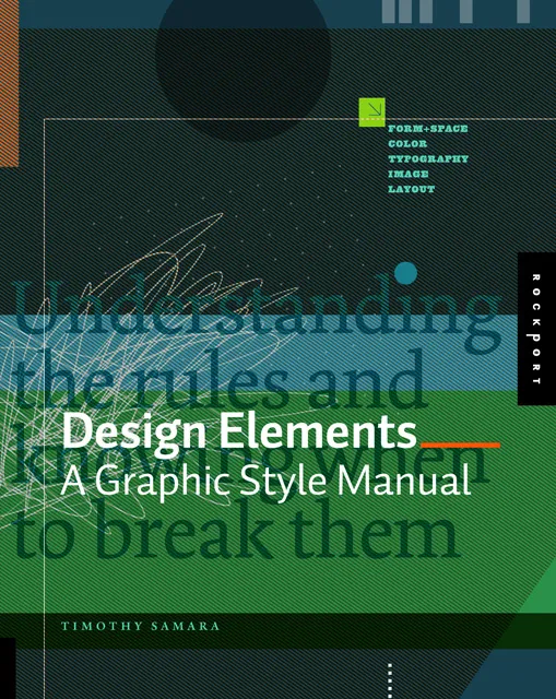
Recently, I have picked up a lot of books about graphics design and typography. Design Elements: A Graphic Style Manual (affiliate link) is a book that takes all the basic principles of graphics design one by one. It is built around 20 reminders for designers. Reminders and not rules, because designers have the opportunity to break them (see the cover of the book with 2 paragraphs of text put on top of each other).

Most books about graphics design use an incredibly complex language to describe visual concepts. This books is no exception. Rather than try to translate the text into concepts, I skimmed the prose and focused on the many beautiful illustrations, images, examples, and their explanations.

Things that I was reminded of (not as a graphics designer, but as a designer of business presentations in PowerPoint):

  • Think of which fonts you use (I am u-turning on earlier assertions that you should only use standard fonts in PowerPoint to avoid technology issues)
  • Pay attention to the style consistency across pages in a presentation beyond just colors. Other things to watch are placement of objects, style of images, the way images are displayed, etc.
  • Make sure your slide looks elegant, maybe even by reducing the font size somewhat and creating more white space around the slide. Margins do not have to be set at 0.4 inch all the time.
  • Use color carefully, instead of “which color of the scheme have I not yet used on this slide”-type thinking, think about the distribution of light and dark, ask yourself where color is needed, and then pick the one that supports the slide message best.
  • Try to incorporate rhythm in the design of a slide.
Continue reading →
·Design

That perfect opening sentence

You think hard about that perfect opening sentence that encapsulates it all: what the company is about, what you sell, what customer problem you solve, when you were founded. You write it down, change it, discuss it with your team, edit it, and memorize it by heart.

Then you use it for a live audience: all key messages stashed in just 10 seconds of beautiful prose. All your audience has to do is register this, and they can basically skip the presentation. All that has to be said, has been said.

But hey, it did not stick?

While you were uttering your first sentence, the audience was looking at the woman in the picture of your opening slide (I want a jacket like that), trying to figure our your accent (Canada?), wondering when the next coffee break would be (11:15 on the agenda, but we are behind schedule). In short, all but pay attention to that perfect sentence.

Gear up your story slowly and give the audience time to familiarize themselves.

Image credit Markus Bollingmo.

·Design

Lessons from the 2010 SlideShare presentation competiton

The winners are announced of the 2010 edition of the Slideshare World’s Best Presentation Contest. Here are the #1, #2, and #3. Congratulations to each designer:

SMOKE - The Convenient Truth

YOU SUCK AT POWERPOINT!

Social Media for Business

Some lessons we can learn from these presentations:

  • Dare to use fonts beyond the standard ones (but make sure that it does not create problems)
  • Select images with lots of white space
  • Match image style, image color, font, font color on the same page
  • Maintain a consistent graphical styles across slides
  • Look at the people-flat-on-the-ground sequence in the smoke presentation to see how you can achieve cinematic effects in PowerPoint

Remember, these presentations are made for SlideShare/online viewing. In other contexts the style used would be somewhat different.

·Design

You can do without that verbose business plan

Overhead: “We completed this extensive business plan for our startup 3 months ago. Check! It is a lot of work, but hey potential investors want it, so we churned it out.”

Here is what investors really want:

  1. A good visual presentation that helps them understand your business quickly
  2. A company that knows what it is doing, has a clear plan going forward
  3. More detailed data/information after 1. has been digested

None of these require a long, text-loaded document. Text is the worst way to deliver 1., the exciting investor presentation. And text is not the best vehicle to deliver 2. and 3.

There is a reason why management consulting reports are written in PowerPoint, in a style that is somewhere in between the Steve-Job-style-keynote and the densely written marketing text book.

  • Business issues/strategy can best be communicated/discussed using a visual language: it is about data, relationships, positioning, pros and cons, time lines. Diagrams (even poorly designed ones) do a much better job than a dense paragraph of text
  • Things change all the time, and text is hard to change. Swapping the flow of a story, adding a piece of information, updating the market shares. “We did this business plan in September, but it is already out of date (December).” A document in PowerPoint is easy to change and update.
  • PowerPoint document can be navigated quickly. It is easy to browse through sections, zoom in, zoom out.
  • It is very hard/time-consuming to get the exact wording of something right, especially to agree something among a group of people with different styles. In PowerPoint you cut words, leaving less room for lengthy editorial discussions
  • Most business documents are written in English, most people who write them are not native in this language. For a non-native speaker, it is hard to write a good proper long-hand text in 100% good English (native-speakers probably have spotted this in this blog). Most people can reach 80% correct English, and in PowerPoint you get away with it.
Continue reading →