

I gave my Twitter page an overhaul. Designing a Twitter page is tricky:
- On small screens the side bar on the left gets eliminated
- A twitter stream is a cacophony of links, icons, avatars, buttons
Here is the approach I took:
- Minimize the use of distracting colors that only add to the chaos of avatars and links
- Use a background image that gives a sense of open space, with a light source from the top, and minimal visual distractions
- Invert the colors of the right side bar: really dark semitransparent background, with a white font (it will look a bit weird in the Twitter style editor). I find it very hard to get any color to look good here, because the semi-transparent setting will make any of your choices look pale.
- The same is true for links, I struggle to find good link colors and as a result set them light grey. Most Twitter links are shortened URLs that people do not need to read anyway. The alternative would have been to pick a very bright one with high contrast, but that would only add to the cacophony of the page.
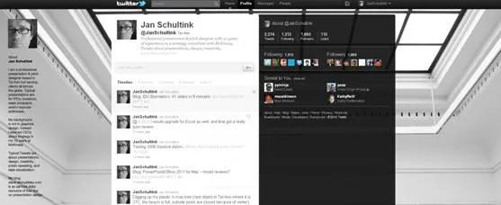
What do you think?
6 comments
As you've said, "1. On small screens the side bar on the left gets eliminated", - and it's also true that on medium screens the left gets partially obscured.
Do you have any thoughts on this eg standard device/resolution combinations to design for?
Brian
The slots and lines lead my eyes towards the edges of the page.
Perhaps a solid background in true minimalist form a la Leo Babauta's mnmlist blog?
No, I don't think the squeezing of the left bar can be avoided. It doesn't bother me that much. I made the text as narrow as I could.