SlideMagic Blog

Frequent updates about all things presentations since 2008. Subscribe to never miss a post.

RSS
all posts

Category Presentation

·Design

PowerPoint/Office 2011 for Mac - mixed reviews?

I considered upgrading my Mac Microsoft Office software (including PowerPoint) to the new Office 2011 release but hesitated after this review by David Pogue of the New York Times, and a few negative reviews on Amazon that seemed genuine. Have any of you tried it?

·Design

Dropbox' YCombinator fundraising application

This interesting file from 2007 made it to the top of Hacker News at some time during the day: the application of Dropbox for funding by YCombinator. The question/answer exchanges read like a high-paced due diligence interview by a potential investor. The answers are short and to the point, the questions are short and to the point. Learn from it and improve your own investor pitch.

·Concepts

So how many different types of slides are there?

I think there are 4 different type of visuals,  Have I forgotten any? (The images below are taken - out of their context - from previous posts on this blog)

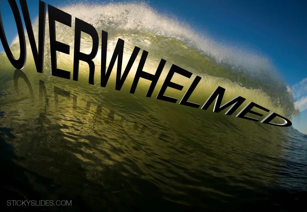
  1. Big picture, big emotion slide. A huge image of a squeezed orange “the competition is killing us!”, a big picture of an audience asleep “presentations are boring!”, swimmer dives in the pool “let’s go for it!” (lot’s of cliches here, but I have seen many good ones as well). These slides are an emotional shortcut, they unlock an idea/feeling that is already present in everyone’s brain quickly.

  1. Location port, a big image of a place, a street, a country, a customer. Pretty much like a movie director opening a film to bring us to a different time, a different place. An image of the interior of a messy store is much more powerful than a list of bullets: isles are not straight, labeling is unclear, lighting is poor.

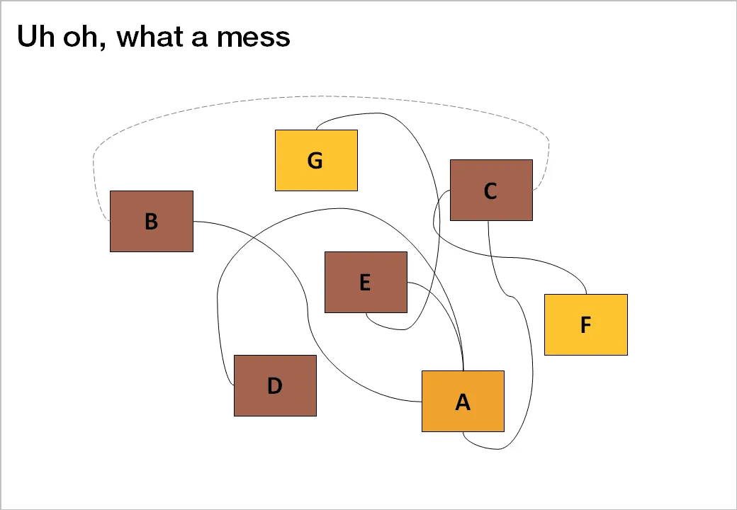
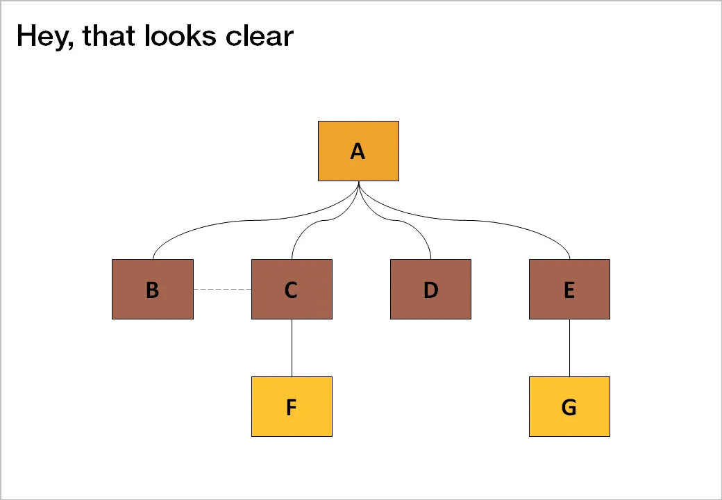
  1. Relationship slide. Shapes/boxes with text, arrows, to show how issues are related, impacting each other, are dependent on each other, sit in different places on the same map.

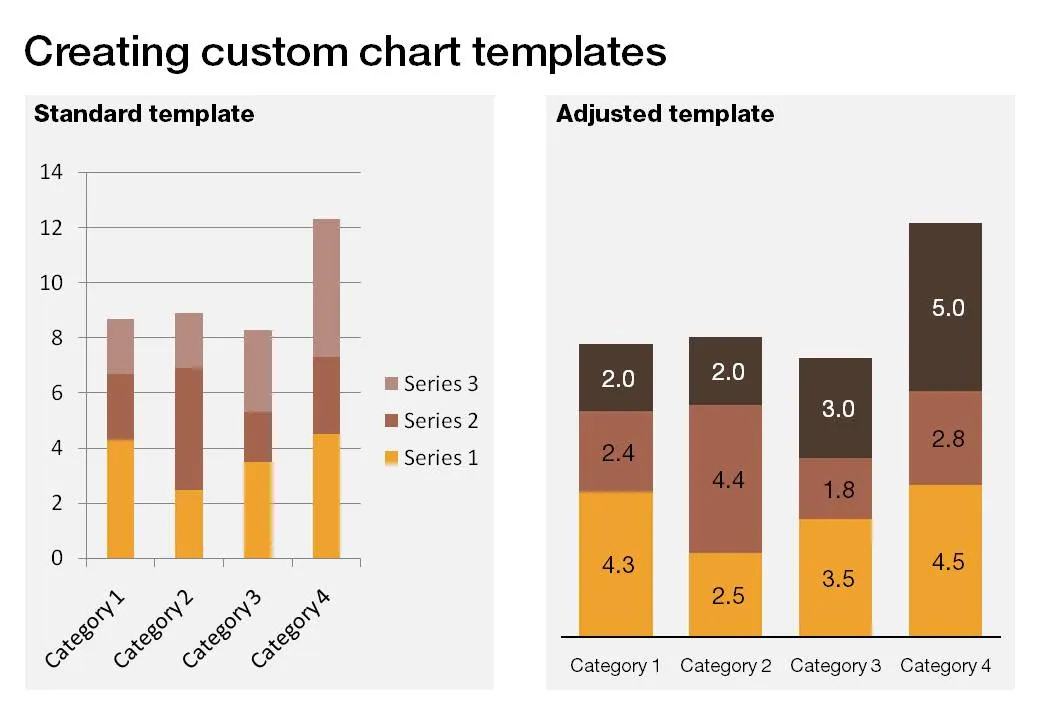
  1. Data chart showing us a trend, or comparing numbers.

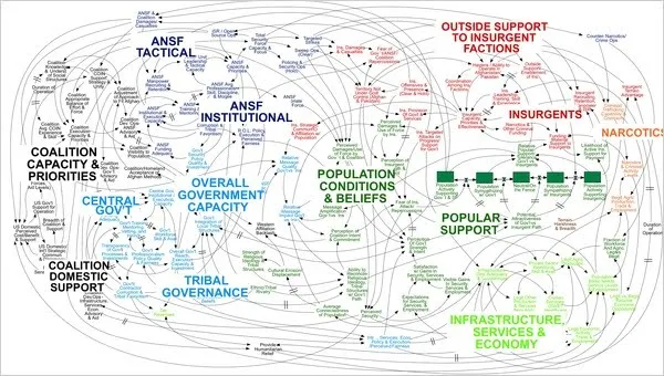
An incredibly dense relationship or data chart should actually be in the “location port” category, the U.S. army spaghetti chart is an example: it is not so much about understanding the chart in detail, rather the viewer understands immediately that “it’s complex” (earlier post).

Continue reading →
·Design

Image consistency

One of the things I find the most difficult in presentation design is to get a consistent look and feel across all slides in the deck. It is tempting to come up with the killer chart for each concept that you want to communicate. Each slide is great, but if you look at your slides in the slide sorter, nobody would guess they are taken from the same story.

So, we have to add one more constraint to the design process: consistency. Some visualization ideas might just not work given the overall context of the presentation, sorry.

In the design process, I always start with the most important slides that convey the heart of the message. Brainstorm, sketch these, and then freeze the look and feel of the entire presentation based on these few slides:

  • Fonts
  • Colors
  • Position of titles
  • Type of images (cartoon, nature, vintage, people, color)

Think of your presentation as a movie that runs in the background, it is set in a time, a place. You pick them all, but stay inside the world of your presentation.

Image credit: Copeau,

·Books

Book review - "Resonate"

Anyone interested in presentation design will have heard about or bought Nancy Duarte’s latest book: Resonate. I managed to read it over the weekend, here are my impressions.

While her previous book slide:ology was mostly about slide design, Resonate is about stories, stories that get your audience to change their perspective, and take action, do something, change something. It is actually the right order of learning how to become a good presentation designer: first acquire the skills to visualize a single concept in a chart, then focus on weaving those charts together to build a powerful story.

This is what I see happening around me. The current Slideshare presentation of the year competition shows that thousands of people have acquired the skill to make “stunning visuals” using images. But most story lines are still relatively simple: sequences of chars showing how big something is, or sequences of images that show emotions/feelings that we all recognize. Great movie directors or authors posses the art to take you along a more complex path  that will change you and the perspectives you have of the world. This is what Resonate is trying to get to.

Slide:ology is a reference book that I still use when designing slides, Resonate is different. It is a book with an idea, looking at the cover on the book shelf will remind you to check whether this is the best story line you could come up with

Large parts of the book are written using reverse engineering, analyzing great presentation and speeches and see why they had so much impact on their audiences. But on top of that, Nancy threw in her own presentation design experience, and embarked on a significant research effort in areas such as movie scrip writing and classic rhetoric. A few of the interesting points that were highlighted in the book (just random examples, not a MECE (what’s this?) summary of the book’s contents):


Continue reading →
·Data visualization

Sync those charts

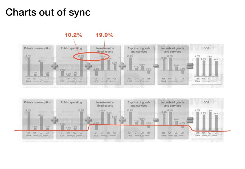
The idea behind the chart in the Haaretz newspaper is a good one: breaking the GDP growth up in its components (click the image for a bigger picture). The charts are not aligned very well:

  • The horizontal axis are not aligned
  • The scale of the vertical axis is different for each chart

·Design

iPhone business idea

I stumbled across these web sites recently. Poolga let’s you pick artistic wallpapers for your iPhone, Tseventy gives a collection of hand-picked photography that you can download to your iPhone. Strange that all images seem to be portrait though.

The iPhone opening screen is a waste of screen real estate. Why not have a new image everyday, a useful quote or an interesting stat, or a word of the day? We need a (presentation) designer and an iPhone app programmer to get together…

It reminds me a bit of the early 1990s when Internet-powered screen savers clogged up corporate networks (remember Pointcast?). Leaving network performance aside, it did not work for desktop screens because people are staring all day at these. The mobile screen in your pocket might just be suited though.

·Books

Book review - "Bibliographic"

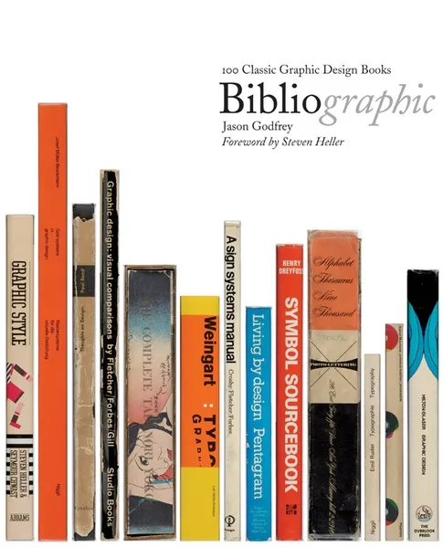
I stumbled on this book: Bibliographic: 100 Classic Graphic Design Books in a Tel Aviv book store the other day. The vast majority of recent books on graphics design are meant to be “eye candy”, sitting on coffee tables without being read in detail. What a joy it is therefore to go back to older titles.

This book lists 100 important books on graphics design and typography. Each book is discussed, put in its historical context, and highlighted with an image of the cover and  a few page spreads.

It is striking to see how only a few decades ago, graphics and type still looked so basic. But equally important is the realization how the current overdose of computer-generated images and decorations detracts from the basic purpose of a poster or a slide: convey a message. When people just had type and basic shapes as design tool, it forced them to make the most of them. I find myself in a similar situation, armed with PowerPoint, fonts, images but without the graphic artillery of sophisticated Adobe Illustrator designs. Looking some of the designs from the 30s or 60s convinces me that I can do without this back up.

Some books discussed in the book are still in print, and I have added a few to my wishlist:

Continue reading →
·Design

Simple shapes, powerful message

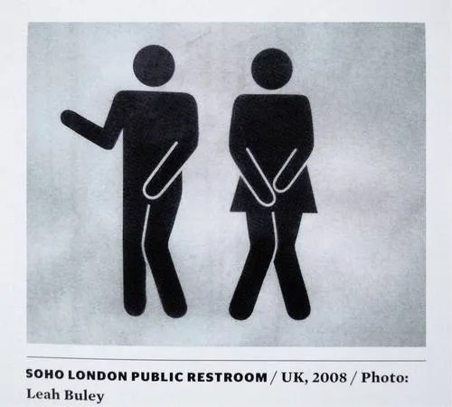
This image tells 2 things:

  1. Have the courage to deviate from standard visual cliches
  2. Simple shapes can still convey a powerful message

The image was added by Robin Benson and taken from this book:  Graphic Design, Referenced: A Visual Guide to the Language, Applications, and History of Graphic Design (affiliate link)

·Data visualization

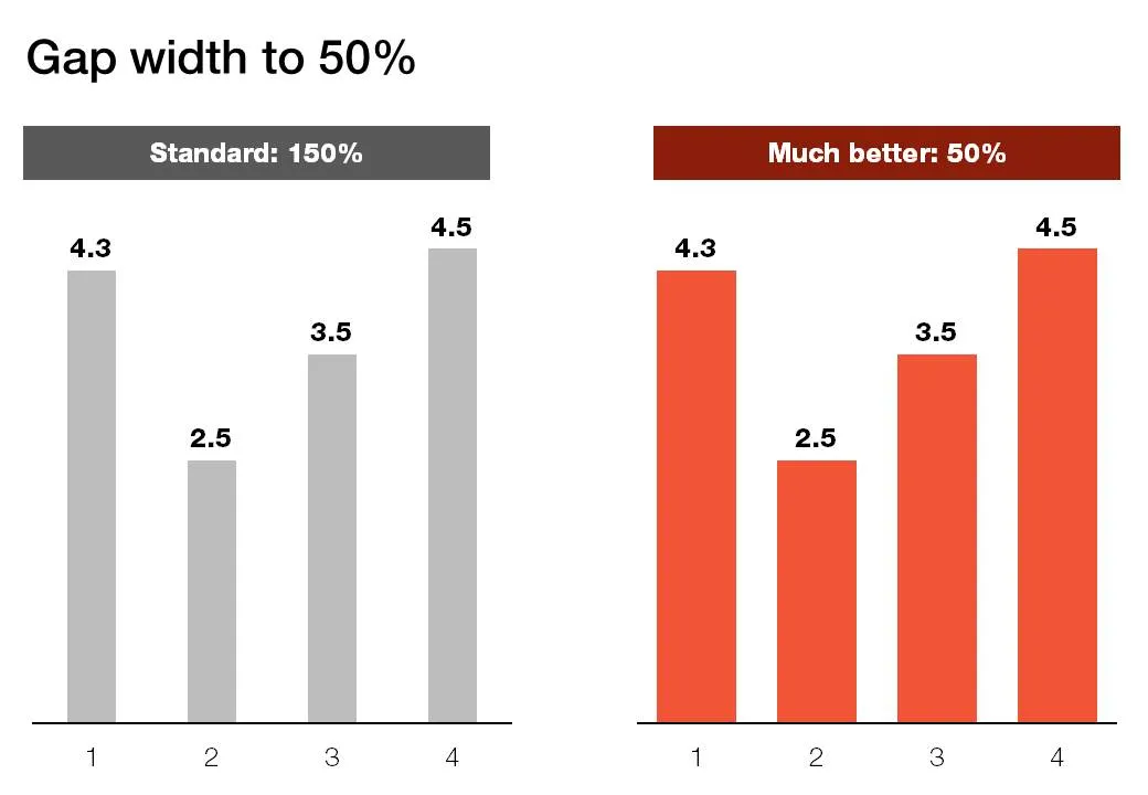
Gap width to 50%

Microsoft PowerPoint sets the standard gap width between columns or bars to 150%. Graphs look much better if you set it to 50%. Right click the columns/bars in your chart, select format data series and lower the gap width value.