SlideMagic Blog

Frequent updates about all things presentations since 2008. Subscribe to never miss a post.

RSS
all posts

Category Presentation

·Images

Projecting black

When a screen projector projects the color black, it projects nothing. Think about this when designing slides. If you have an image with an aspect ratio that is different from a regular slide (4:3, 16:9) and it is not possible to crop it without damaging its visual impact, make the bits of the slide that are not covered black instead of the default slide background color you are using. Once on screen, the black border will blend in with the area outside of the projection screen.

·Investor presentation

Investor presentation in HTML

Have a look at the DressRush investor presentation, an entire pitch deck written as a web site, in the public domain. Some of my observations.

I like publicly available investor pitches. It fits in the wave of increasing transparency in the startup funding market. (Check out Angel List). Startups can dramatically increase their access to potential investors by making part of their content public. The first stage of a fund raising round does not have to be the closed meeting room of the VCs that happen to be located in the same city as you are. Obviously you would not put your core IP, financials, or other sensitive strategic content in a public presentation. Another option would be to make the sensitive part of your investor pitch on your web site pass word protected.

I like these airy web sites. Lots of white space and information that you can scroll through freely, up and down. I actually first skim the whole site in a few seconds, then go back up to start reading in more detail. This is so much better than the nervous clicking on a small button in a SlideShare window (especially when people design slides that -click- break up -click- a sentence -click- in 5 -click- slides.

It is still tricky to design from this new medium though. The DressRush example uses beautiful muted colors (interrupted here and there by images and facebook logos) and takes an infographic approach to investor pitches. On certain pages it works, on others it does not. In whatever direction the technology develops, you still will need to eye of a good designer to get your investor pitch right, also in HTML.


Continue reading →
·PowerPoint

Clearing your mind

I am traveling back to Tel Aviv today, so no major presentation design insight today. Just a reminder though, that traveling can just clear your mind. Breaking away from routines is a great boost for creativity. Have a good weekend and speak to you next week.

·PowerPoint

The first 4 bullets

I presented at an investor relations conference the other day and a buy-side analyst made some comments about what it was in a presentation or document that gets him to read further: the first four bullets need to catch his attention.

So, does this mean that your first slide should have 4 powerful bullet points on it?

Not necessarily. What the analyst said was that he wanted to get excited about an investment opportunity in about 1 minute. Given that most corporate presentations are a collection of bullet points, he translated that 1 minute into a number of bullets. However, that same minute can also contain a highly visual slide sequence that does a much better job pitching your idea.

Image by kcdsTM.

·Layout

Disguising bullets in boxes

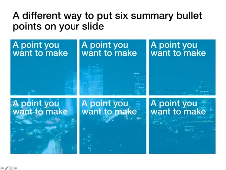
Fancy frameworks (pentagons, triangels) are bullet slides in disguise. Here is a concept that I recently used to put the 6 most important building blocks of a business on a slide. Keep the text really short.

·Design

A collection of sticky slides

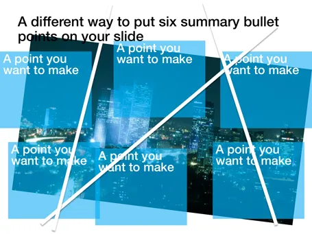
I have frankensteined (what?) together a slide deck of around 50 slides that were used in blog posts here on Sticky Slides over the past 2.5 years. All completely unrelated, and out of context but maybe good enough for some creative inspiration.

·Design

Dropbox beats YouSendIt / Google Docs / Office Live

PowerPoint designers are struggling with big file sizes that consume storage and make it hard to email documents. I have discussed solutions such as YouSendIt and Google Docs before (here). Recently, I switched to Dropbox:

  • Seamless integration with all my devices (desktop, laptop, mobile phone, tablet)
  • Seamless integration with these devices’ operating system (you do not notice it is there)
  • Two solutions in one: 1) sharing big files 2) always access to your own files
  • Nice extra 3) a service that keeps history of your files so you can roll back a version in case a file got corrupted or you made a horrible design mistake.
  • Minimalist design interface

The Dropbox pitch to venture capitalists from 2007 pretty much still holds.

YouSendIt requires sign in all the time, and all the advertising and branding does not look very professional. Google Docs is still hard to integrate with Microsoft Office. Office Live does not integrate fully with the Windows operating system. It also suffers from feature overload: I do not always want to create a full virtual team room with calenders and contact lists, just sharing files is enough.

If you sign up with this link for your free 2GB account, you get 250MB of bonus space (disclosure: and I get another 500MB). You see, they know how to market as well. The regular link is here.

The last word probably has not been said about this subject, I wonder whether the conclusion still will be the same in January 2012.

·Design

A tool for exporting PPT images

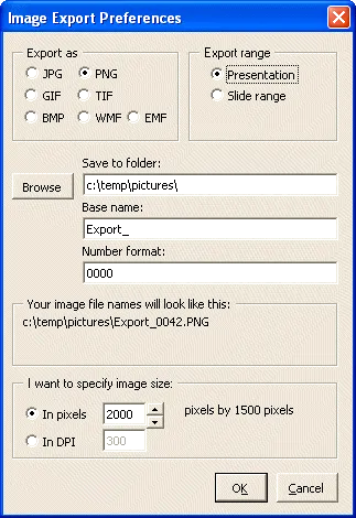
I find it easier to create visuals in PowerPoint than Adobe software. However, the image export functions in PowerPoint are not very sophisticated. It is hard to set resultion/DPI, choose format, set the exact image size, and/or control the naming of the exported files.

PPT ImageExport does all of this. The software creates an add-in in your ribbon. This is not a very sophisticated piece of software, but it has proven very useful for the design of my new company web site. A full license costs $30.

·Design

Angry Birds fonts in PowerPoint!

Here is the post to close 2010 and wish you all the best for 2011: Angry Birds fonts in PowerPoint.

  1. Close PowerPoint
  2. Install the Feast of Flesh BB font on your computer (link here)
  3. Open PowerPoint
  4. Type a text, and set the font as Feast of Flesh
  5. Increase the size
  6. Select the text, and click “format”
  7. Pick a nice yellow in “text outline”, set the weight to 1pt
  8. Staying in “format”, select “text effects”
  9. Select “glow”
  10. Select “more glow options”
  11. Pick the black one

And you are done!

·Data visualization

More than 400,000 work days lost with Angry Birds - every day

There is a stunning statistic in this interview with the developer of Angry Brids by Hilz Fuld: More than 200 million minutes every day is spent on playing Angry Birds. This sounds like a lot, but it is still hard to put the figure in perspective.

  • Wow that’s big: 200 million minutes equals to around 400,000 full time working days. Now that’s sounds like a lot.
  • Maybe not that big yet: if around 75% of the world population has access to some form of TV and spends 3 hours watching it, you get a far bigger number than 200 million minutes

Statistics need to be put in some form of context. Pick the one that is most useful in your presentation.