SlideMagic Blog

Frequent updates about all things presentations since 2008. Subscribe to never miss a post.

RSS
all posts

Category Presentation

·Delivery

The learning pyramid

I came across this image the other day, showing retention rates of students by delivery form. A lecture is the worst, teaching others is the best. I am not sure about the accuracy of the exact percentages, but there is something to the overall hierarchy presented here. And presentations are definitely somewhere high up there.
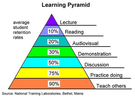
But we can learn from this pyramid to make our presentations better.

  1. Audiovisual: This will not be a shocking new insight: use visual material in your presentation, avoid text
  2. Demonstration: Keep things highly practical, use case examples that people can relate to
  3. Discussion: Easy to do in a small setting, but harder for large audiences. In sales presentations for example, this would mean improvising your entire sales pitch on the client specific situation.

How could you get to teaching others in a presentation?
·Design

Look serious

It is difficult for a startup to sell to a big company. Even if your solution is really innovative, large companies prefer to work with financially stable, large companies.

The look and feel of your sales presentation can add to that nervousness in the under belly of a big-corporate purchasing officer. Looks to avoid:

  1. Amateurish layouts with childish colours and water cooler fonts such as Comic Sans.
  2. Overly cute, touchy feely, retro look and feel, especially when selling in a male-dominated corporate culture (sorry).

Now we all know that the a slick visual deck full of stories and very little text will do great in these meetings (option 3), but, there is one surprising other option (4): the big corporate, lots of bullet points, serious, boring slide deck. Purely from a look and feel perspective, you will fit right in with all the other technology vendors, unlike option 1 or 2.

If you cannot pull off option 3, option 4 is still preferred over option 1 or 2.

·Keynote

Flattening a story

Business school books and consulting reports have a clear hierarchical structure. This is great for reading a document: you can skip what you do not need, and go right into then detail when you do need it more explanation.

In short stories, hierarchy can be boring, you sound like you are given a university lecture. I often flatten that hierarchy, making the presentation more sequential. Out go the slides with the 3-5 setup bullet points, and instead I just let the story flow. If I have to, I bring back the structure at the end of the presentation to sum things up.

This works great for 20 minute presentations, for marathon presentation days we might have to revert back to the business school rigour though. But there is a reason why marathon presentation sessions are so stimulating for the brain…

·Colors

Too much colour (2)

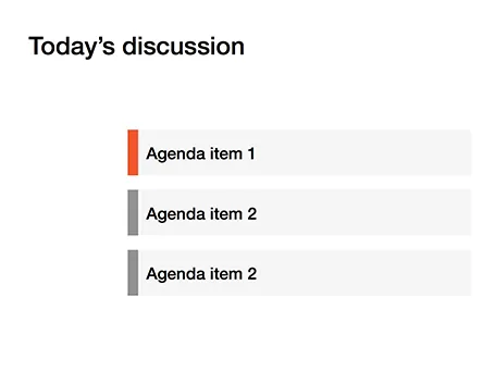
Following frequent requests after my previous post, I have included a picture here that shows the concept of the narrow coloured bar replacing a fully coloured slide object.

·Colors

Too much color

Colours brighten up your slides and are a great way to group related items together: USA is green, Europe is blue, Asia is purple for example.

But applying bold colours to big text boxes makes your slides too busy and nervous. Instead, keep those text boxes light grey and add a very narrow colour box attached to it at the left side, almost like a fat line.

·Keynote

Use that style guide

If your company logo was designed by a professional designer chances are that somewhere in the bottom drawer of the marketing department you can find a complete graphical style guide that goes with it. Usually, it gets only used for commissioning other design work (brochures, web sites, etc.), and hardly any PowerPoint user knows of its existence.

Ask for a copy and use it to inspire your presentation design. See what colours the designer recommends, there might be more than present in the logo. See how pages are laid out. See what fonts and font colours are used. Lots of inspiration.

And yes, the section for the PowerPoint presentations in these style guides is usually pretty bad. Professional designers are not used to working in PowerPoint (an inferior product in their minds). Beautiful design work gets reduced to Arial, heavy top banners and watermarks. So, use the design inspiration of the first pages of the style guide to create your own PowerPoint template that fits it. Hopefully the marketing communications department lets you get away with it.

·Layout

Hide to emphasize

One way to draw attention to a specific object on your slide is to apply all of these at the same time: pink colour, bold, italics, underline, big drop shadow, fat circle around it (also pink), big arrow pointing at it. Maybe it will stand out of the clutter on the rest of your slide.

The other way: hide everything else around it. Semi-transparent white shapes are great to dim items on your slide.

·Keynote

Design process killers

Here are creative design killers that are common in many big corporate offices.

  • Constant interruption by phone, walk-ins, or your boss who cannot find that slide deck you created last week. Open plan office layouts are especially difficult to work in. After an interruption it can take some time to get back in the flow. A 10 second call can equal 30 minutes in lost time.
  • Meeting schedules that fragment an entire day so you do not have time to start any major piece of design work (manager versus maker schedule).
  • Feedback and input from colleagues who have not taken sufficient time to digest what you actually created. Things get read over quickly, not internalized, and people provide some high level comments that do not build on the work you already did.
  • People start working on the presentation of the story, when the actual story is still not clear. At the last minute a whole slide deck needs to be re-written to support a different conclusion.
  • Long work hours turn employees into robots with little energy for creativity inside them. Work has become a process to try to empty the in-tray, rather than produce beautiful presentations.
  • Multiple authors try to write the overall storyline, each with their own structure and style.
  • Throughout a project, team members usually develop a common language where one simple concept can depict a very complicated issue. For the insiders, writing the name of the concept on a slide makes it all clear, the outsider, has no idea. The result: pages and pages of hollow inside jargon. (The curse of knowledge)
Continue reading →
·Delivery

Common pitfalls in IPO presentations

I was asked to mention common pitfalls in IPO presentations the other day. Here are some of my thoughts in random order

  • Using an internal strategy deck as the basis for your presentation, rather than starting from scratch. Internal presentations are targeted at insiders, IPO presentations are meant for people who do not suffer from the Curse of Knowledge.
  • Talking management speak, full of buzzwords. Institutional investors are sifting through investor pitches and data all day long, they are trained to cut out the noise. If you provide a lot of noise and padding, they automatically think there is no real substance to talk about.
  • Over-structuring, repeating, repeating again. In a short investor pitch tell a story, do not try to get investors to remember key facts by drilling it in their heads.
  • A generic investment thesis. Very high-level bullet points that could apply to just about any company: growth, profitability, etc. Diluting the core of what is special about your company with many, many other positives that are valid, but not that important. Like in marketing: too many benefits, no benefits.
  • Avoiding the elephant in the room. institutional investors probably are pretty well informed about your company, and the key questions they have (often shared with journalists and bloggers) are pretty clear. Your presentation should address those, maybe not explicitly (here are our weaknesses), but implicitly. These questions are the only thing that people are worried about.
  • Avoid the long-term growth options. There are legal restrictions to what extent management can provide business forecasts in an IPO filing, but that does not mean that you cannot educate investors on how you can think about valuing your business. Give a framework on what value components could be there for the long-term.
  • Focus only on the company, not on trends in broader society. Sometimes the key driver behind the success of a company is a fundamental shift on how people are operating, how things are changing in the world. Your IPO is an opportunity for an investor to invest in that trend. If that is the main driver, discuss it.
  • Confusing financial data. A 30 minute pitch is not enough time to go over the financial data in full detail. Still, there is no reason why you should confuse things instead. Give a good overall picture of the components of your company. Show how the revenue model is working. Show how the cost structure works.
  • Forget the front line. Management talks about a company in terms of top line revenue, overall market share, but the real action is in the front lines. Give customer case examples, they are often a much more powerful illustration of the attractiveness of a business than top line figures.
  • Recording your presentation in front of a camera, without an audience. Unless you are a professional TV host, people find it difficult to look natural in front of a camera. Invite a small audience when you are video-ing your tape. If that is not possible, maybe tape some images of people on some chairs in the studio/conference room so you can imagine talking to the people who are listening/watching you later.
·Concepts

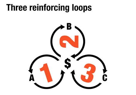
Reinforcing loops

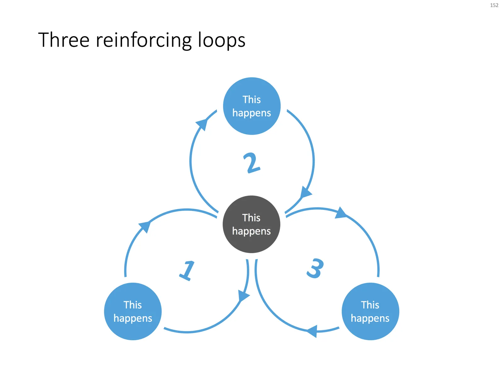
At McKinsey, we used to call this Business Dynamics, mapping reinforcing and opposing forces using arrows. The concept is borrowed from systems theory in mathematics and physics. These circles can make a great chart to show the main growth drivers behind your business.

The notorious US army spaghetti chart is a more complicated execution of the same principle. Contrary to many critical review, I actually liked it as a visualization of the incredibly complex situation over there.

UPDATE: There is now a PowerPoint slide template with 3 reinforcing loops available in the template store.