Reminder: my webinar tomorrow
Just a reminder that I will be hosting a webinar as part of Ellen Finkelstein’s Outstanding Presentation Workshop tomorrow. Details of the event are here.



Frequent updates about all things presentations since 2008. Subscribe to never miss a post.
Just a reminder that I will be hosting a webinar as part of Ellen Finkelstein’s Outstanding Presentation Workshop tomorrow. Details of the event are here.
Mission statements are supposed to be the ultimate piece of prose: in one sentence you have the entire essence of a company: what you stand for, what your values are, how you treat customers, everything. This is serious stuff. Making jokes about the mission statement is often considered committing sacrilege.
Mission statements often feature on page 2 of a corporate presentation, right after the title slide. Here you are: our company in one sentence.

It takes time to develop a good mission statement. Projects to craft one can take weeks. The entire organization needs to be involved. Words need to be adjusted. Values need to be discussed.
And that is exactly the problem for an external audience. They miss the context of the 3-week project. They miss the background of the debate. They have no idea about that offsite where you discussed your company’s values. For someone who reads the mission statement for the first time, it is well, just another sentence with familiar sounding words.
The ultimate example of the Curse of Knowledge.
When I pooh pooh mission statements in presentations I did not mean to make fun about the values of your company. I think mission statements are valuable. Slide 2 of your presentation is just not the right place for them.
More and more applications will be a platform to deliver presentations, which means more and more applications need to do the following things:
Adobe Acrobat does not have preview mode, and does not respond to an Apple remote. Apple Preview only seems to have slide shows with automated page transitions. OK, Preview might not be intended for running presentations, but Adobe at least should build in features that make Acrobat a good alternative to PowerPoint and Keynote for presenting slides.
Tablet devices would be another category. It is easy now to hook up an iPad to an HD screen. Again, presenting slides should be thought of as a required application.
A dark or light background for your presentation slides? Dark backgrounds work better for very large stages, where a big bright screen takes away the attention from the speaker. In smaller meeting rooms, a light background work better.
It is very inconvenient to edit and work with 2 masters of the same presentation, it is a lot of work and you always end up with inconsistencies. Presentations with a dark background give less flexibility to work with colors, and are harder to print (there are still audiences that do this, especially when presenting to institutional investors).
So as a result, I recommend sticking to a light background for most business presentations, unless you have a very specific, high-profile event that merits the design of a custom slide deck.
PowerPoint has become such a core element of corporate culture that it features often in Dilbert comic strips. These one is from yesterday for example:
Image no longer availableThe full archive of Dilbert is now searchable by keyword, and you can license images for use in your presentations just like a stock photo site. For example, this search shows a whole lot more Dilbert comics on PowerPoint.
If you are reading this blog, you are probably already part of the tribe of people that want to change the way the world present ideas to each other. The problem is how to convert the other 99% of your co-workers. I see two routes.
Robust PowerPoint templates. Leaving aside the discussion of what is a beautiful PowerPoint template, and what is not (you know my preference for the white page), and assume that the design has been agreed. Usually, people stop here, but there is important programming work to do afterwards. Setting the fonts and the colors to the right default, removing the standard bullet point opening framework from the slide master, etc. This is a computer programming, not a design job that should make the PowerPoint template “idiot-proof”. This is the technical route.
Low-risk events. It is hard to experiment with a new way of presenting in a high-stakes external presentation (i.e, your next earnings announcement). Instead, pick an internal presentation. Maybe the annual sales conference? Have an employee who is converted to the tribe give his presentation in a new and unusual way. Give unusual restrictions for the slide decks to be used in the internal conference: instead of telling people not to exceed 5 slides, tell them that they are not allowed to use bullet points in their deck. As people get exposed to a different way of presentation, the confidence might be getting stronger for the next generation of people to join your tribe, and bit by bit, take the new presentation culture to external presentations as well.
The new web site of the Acumen Fund is a great example of how presentation and web design is blending. Gone are the navigation menus, environmental statements, and other wasted screen real estate. Instead, the site is a vertical series of visuals that equally could have gone into a presentation.
I often recommend this web site design approach to early-stage start ups. Once you have designed your investor presentation deck, you can simplify slides, take out the confidential ones (financials, pipeline, IP) and you have the ingredients for a great, simple web site, that shows potential investors clicking through to your URL a message that is consistent with your pitch.
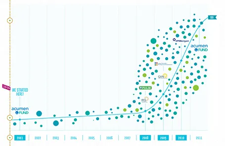
By the way, Acumen is doing some great work to tackle poverty. If you are interested, join the community here to find out more.
PowerPoint files with images can get very large. As soon as a file exceeds 10MB, it becomes difficult to collaborate on it via email. This probably one of the main reasons office collaboration will ultimately go into the cloud, but before that time arrives we need to deal with the current situation.
You can find the standard compression options in the format menu after you have clicked an image. Sometimes, more brutal force is required though. Somehow, if you right click an image in PowerPoint, save it is a JPG, delete it, and then copy paste it back in, the files size has shrunk a lot.
In the heat of CTRL-C, CTRL-V work, PowerPoint sometimes puts in images as bitmaps or PNG files that take up a lot of space. This trick trims them down again.
Be aware that compressing files hurts the quality of the images. So if this is a presentation destined for a huge screen at an important conference, keep the original photos somewhere in a safe place in order to be able to re-construct the full size version once you have agreed on the final document with your team.
Big market disruption, check. Experienced team, check. Company traction, check. Trimmed down the investor pitch deck to 10 minutes, check.
But you forgot one thing: the sales pitch. Yes, this is an investor presentation and not a sales presentation, but still, every pitch to an investor should include an example pitch to a potential customer. The investor needs to get a feel that a customer will actually buy your product. The sales story on the slides is important, but even more important than that: they way you present the slides as a salesman.
With an elegant font such as Helvetica Neue Medium, breaking a short sentence in one-word lines can create a beautiful effect. Here an example of a poster by Dutch designer Ben Bos
See how he reduced the space between the lines (looks better with bigger fonts), and did not use capitalization to create a more harmonious composition. I would have left a bit more white space under the text though.

For those who are interested, the poster reminds students to order their school books before the summer holiday. Via
.