

With an elegant font such as Helvetica Neue Medium, breaking a short sentence in one-word lines can create a beautiful effect. Here an example of a poster by Dutch designer Ben Bos
See how he reduced the space between the lines (looks better with bigger fonts), and did not use capitalization to create a more harmonious composition. I would have left a bit more white space under the text though.
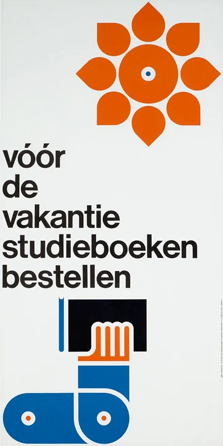
For those who are interested, the poster reminds students to order their school books before the summer holiday. Via
.