SlideMagic Blog

Frequent updates about all things presentations since 2008. Subscribe to never miss a post.

RSS
all posts

Category Presentation design

·Art

Every sentence should matter

I recently made the switch back to literary fiction after it took me around 25 years to overcome the bad memories of high school teachers forcing me to read this genre against my will.

Reading these books showed me just how empty corporate language is. Over the years I have developed a pretty high speed-read rate. Non-fiction books, annual reports, PowerPoint bullets can all be digested in very limited time without missing a beat of the content.

So, when I tried to apply this to literary fiction I was forced to back up. Every sentence actually matters. The world would be a much better place if corporate language stuck to this principle.
·Layout

Disguising bullets in boxes

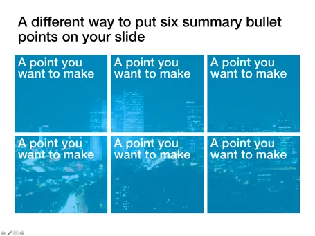
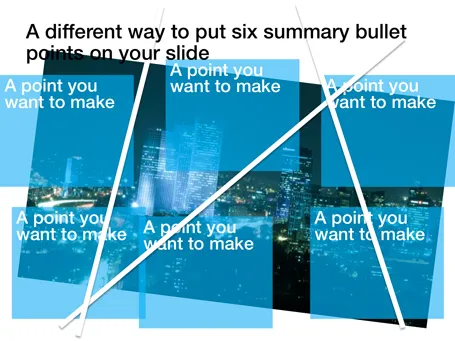
Fancy frameworks (pentagons, triangels) are bullet slides in disguise. Here is a concept that I recently used to put the 6 most important building blocks of a business on a slide. Keep the text really short.

·Investor presentation

What a potential investor really means when she requests a business plan

The traditional business plan used to be a 200 page Microsoft Word document. A large part of it was filled with fluffy market background information and more fluffy industry buzzwords, frameworks and mission statements. It was always out of date. Its primary purpose was to rest your hand on it and say: “We have a business plan”. Nobody would really read it.

In most startups, the business plan is replaced with a large PowerPoint slide deck that evolves rapidly over time. A selection of the slides in this document are upgraded to be used in standup presentations. The vast majority of them are dense appendix material.

Daniel Tenner wrote a good blog post about what it means when an investors asks whether you can email her a business plan. In short, after the initial pitch, the investor wants a document that can be emailed (forwarded to partners) that answers some fundamental questions about your venture. The content should be good, the content can be short, and you can afford to invest less in the design of the slides.

·Images

The usage context is enough

Many of today’s VC pitches are about some sort of mobile technology. It is very hard to find good images of people using modern phones at shop check outs (stock photographers: this is a business opportunity). I actually am not to concerned about showing the device. Giving a good feel for the usage occasion is much more important.

·PowerPoint

Asking the stupid question

In the middle of a design project, I decided to ask the client the fundamental question again: “So what is this about again?”. It was followed by a short silence in which I could imagine the eyes rolling at the other end of the phone line. The short and candid answer to the stupid question was actually very useful in the design process. It is OK to ask stupid questions. It is useful to have an outsider do it.

·Delivery

Your monitor device

Rock bands use massive monitor speakers to hear themselves play in a concert. When you run a virtual presentation, you need something similar. Slide transitions can be delayed especially when you use high res images. You are on the next page, but your audience is not.

To prevent this, log into your own webinar with a second computer, or even an iPad or internet-enabled smart phone to see what your audience is seeing. The really skillful presenter switches slides on his own computer but continues to talk about the slide that is still in front of the audience.

Image by Anirudh Koul

·Data visualization

Infographic overload

The blog Bitrebels posted a number of infographics that compare the salaries of self-employed people in the U.S. versus those the U.K. Without picking on this particular design, this graphic shows common mistakes that often apear in infographic illustrations.

  1. Round up the numbers to the nearest $ 000. The digits behind the comma do not add anything.
  2. Group data together, a standard bar chart showing the 2 numbers with their delta is much clearer.
  3. Pick a meaningful comparison unit. More than 3,000 hamburgers is not.

·PowerPoint

Speaking at one of the Outstanding Presentations webinars

For the second year in a row, Ellen Finkelstein is organizing her Outstanding Presentations workshop, a series of 7 weekly webinars by guest speakers. I will be one of them. Here is the line up of presenters:

  • September 7: Carmen Taran, co-founder of Rexi Media and author of Better Beginnings
  • September 14: Cliff Atkinson: author of the Beyond Bullet Points
  • September 28: Bruce Gabrielle: Author of Speaking PowerPoint: The New Language of Business
  • October 5: Me
  • October 12: Simon Morton: Founder of Eyeful Presentations
  • October 19: Andrew Dlugan: blogger at the Six Minutes blog
  • October 23: Ellen Finkelstein will be wrapping up

For your calendars: October 5, 14:00 EST

The sessions are free and will be recorded for later viewing. More information about the Outstanding Presentations webinars here. Please note that you still need to register if you want to view the recorded sessions.

·PowerPoint

Product presentations and product catalogues are not the same thing

“Let me talk you through our exciting products!” And up comes the agenda page: product 1, product 2, product 3, product 4. Uh oh. Your audience starts checking whether there is guest WiFi to check some emails on the phone…

Product catalogues are an exhaustive description of what you have on offer. They are about you, not about the customer.

How can you keep a product or sales presentation interesting and relevant? Start explaining the overall architecture of your product range (we have big ones, and small ones, we work in this segment and that segment). Then, think about the needs of the customer in front of you and narrow down the options dramatically. Spend a lot of time / slides on solutions that are relevant for your audience, and surpress the urge to be complete and cover everything.

·Data visualization

Data without context is meaningless (and boring)

The quarter is done, and here comes the day-long sales results presentation. Excel is pasted into PowerPoint, creating huge decks through which senior management has to sit through. Sales organizes by channel: small restaurants sales, growth; large restaurants sales, growth, supermarkets sales, growth. Marketing presents by brands: brand 1 sales, growth, brand 2 sales, growth.

If you are a marketing manager, looking at the Q3 sales and growth figures of a particular brand is really interesting. All the numbers of the previous quarters are more or less in your head. For the production manager though, going through these pages is mental torture, as she does not have the historical context readily available. (Read more about the Curse of Knowledge here)

The solution is the opposite of what I preach for bullet point charts: instead of breaking up slides into multiple pages, condense lots of data in 1 chart, but make it comparable. Put the quarter growth rates of all brands on a page and compare them. List the historical brand growth rates of the past 8 quarters on one page and see what is going on. There is no problem showing a massive amount of data on 1 slide, as long as it is about the same variable that is compared across different dimensions.