

I often have to explain the concept of “the curse of knowledge”: it is actually harder for an expert to explain something than a reasonably intelligent outsider (here is why presentation designers should be reasonably intelligent :-) ).
Dan and Chip Heath use a musical metaphor in their book “Made to Stick”:
- The presenter thinks of a musical piece and imagines the full symphony orchestra giving all it can
- He taps the tune with his fingers on the desk, it all makes perfect sense
- The audience sees/hears someone tapping…
For executives who are keen to load their slides with data for an external audience, I use the cockpit analogy. A pilot can interpret all the signals of all the instruments in a split second and understands the situation the plane is in. The novice needs a bit more time to digest the information…
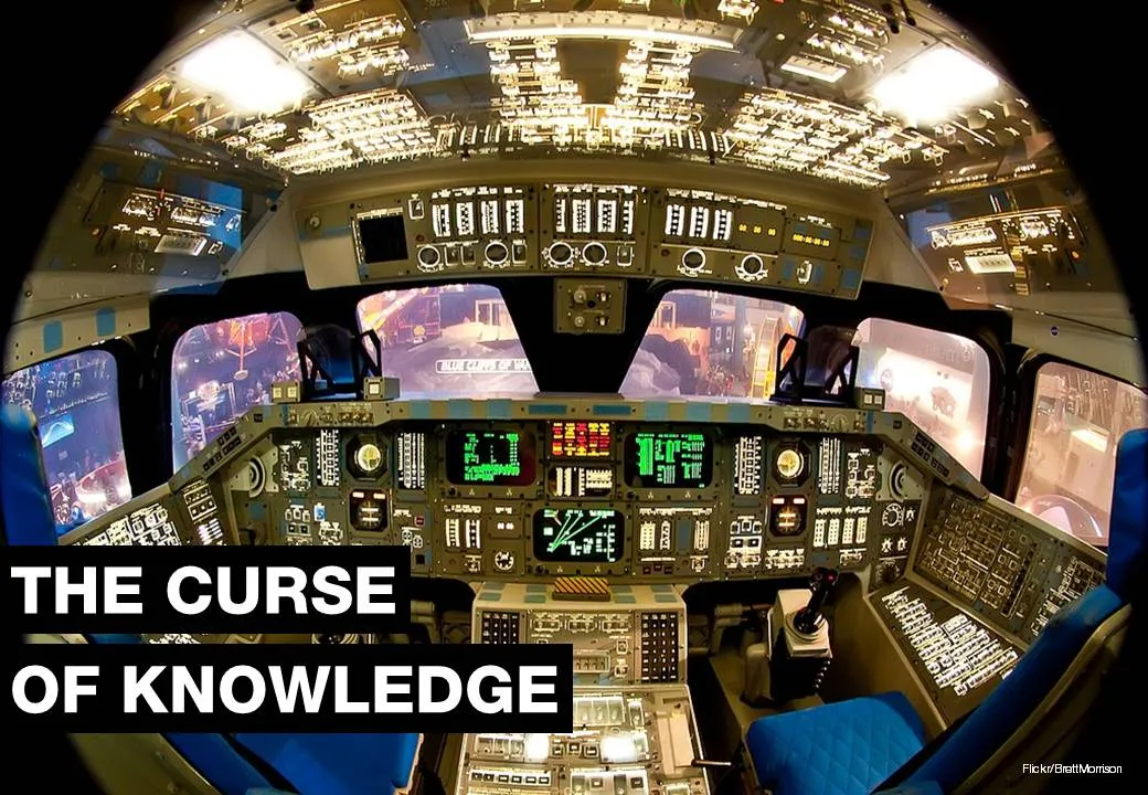
Thank you Brett Morrison for this beautiful picture of a Space Shuttle cockpit.
4 comments