SlideMagic Blog

Frequent updates about all things presentations since 2008. Subscribe to never miss a post.

RSS
all posts

Category Presentation design

·PowerPoint

Video in a webinar?

The big problem in webinars and web meetings is the upload bandwidth. If you are running the presentation live from your computer, then the speed at which attendees can download your high-res images, video, or animations is the speed of your upload connection which in most cases will not be much more than 1Mbps. Download speeds are much higher (I have gone up to 50Mbps recently).

 The solution for this would be to upload the bandwidth-heavy content beforehand to a server, and only use your live upload connection for the audiotrack. Some web meeting solutions such as SalesCrunch (disclosure, a client) allow you to upload presentations beforehand. But video does not work (yet). Do any of you know a solution or a workaround that allows me to use video in a live webinar?

P.S. An earlier post about how I use an iPad to log in as a participant to monitor what my audience is seeing during a webinar.
·Keynote

Videos in PowerPoint / Keynote

Here is the easy way to embed a video in PowerPoint or Keynote:

  1. Simply drag the file into your slide, done.
  2. Resize the video so that it fits neatly on the slide.
  3. Play the video until you hit the scene that you want to use as your place holder image. Hit pause.
  4. In PowerPoint: choose format movie, poster frame, current frame.
  5. In Keynote: select the movie, go to the inspector, hit the far right Quicktime icon and slide the poster frame slider to the desired location.

There are more advanced control features available, but these basics should do for most users.

·PowerPoint

Hard stats on effective meetings

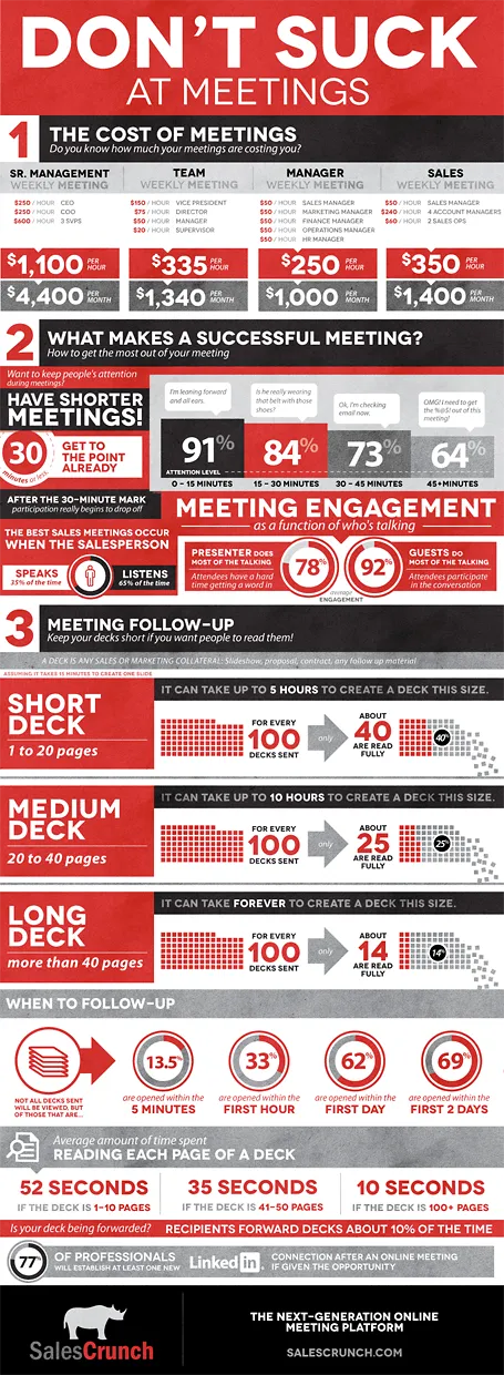
SalesCrunch (disclosure a client) is an online meeting platform that gives your real, hard statistics about how effective your meetings are: how many people pay attention, what % of your presentation is read, etc.

They analyzed the aggregate statistics of their entire client base and boiled the data down in an infographic. The key points will not surprise regular readers here: shorter meetings are better, shorter decks are better, and listening is better than doing all the talking. But for the first time, everything is backed up by hard data. Download the high-res version of the infographic here.

·PowerPoint

What is my client work?

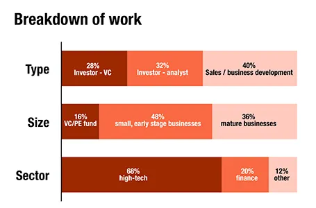
For a client proposal, I had to go back over the past 12 months and see what is the sort of work I do. Here is a breakdown in number of projects (can still be different from hours spent). The majority of my work is in investor and business development presentations for the high-tech industry (including biotech and medical devices).

·Investor presentation

So what do you do?

This tweet by Michael Arrington says it all: investors are human, take it slowly and answer the very first thing what is on their mind: what is it that you are actually doing. You might have been working on this startup for months now, an investor hears about it for the very first time. You suffer from the Curse of Knowledge, and remember, an audience who is guessing what you do in the back of the mind is not paying attention to all the other things you want to say.

Just read an entire investor presentation, twice, carefully. No idea what this company wants to build or sell.Maybe sensors. We’ll see. — Michael Arrington (@arrington) March 21, 2012

Michael tried reading the deck twice, most investors will not do that.

·Concepts

Trees!

Photographs with a strong perspective are always the most interesting ones to use in a presentation. See the example below. Strong lines leading to a bright spot that almost makes you squint. When adding PowerPoint objects make sure to align them properly with the flow of the image.

·Images

Everyone is a photographer

The wide-spread use of smartphones has given almost anyone a camera in their pocket, all the time. So it has become really easy to collect some great pictures for your company presentation, even at the last minute. You could take them yourself, or email a colleague in a remote office to go out on a photo shoot. The images you are likely to get are going to be far better than the shot of the corporate logo behind the reception desk.

  • A group shot of the team replacing high school year book mug shots of the management team
  • Your products on display in a store
  • People having coffee at the annual sales rep gathering
  • One of your (branded) trucks driving off full of product in the early morning
  • The 1 liter bottle filling line in full swing
  • A store front of your New Delhi shop
  • A downtown billboard with an ad for your company on it (not the ad itself)
  • A hazy shot of the rock concert you sponsored last year

Even if you cannot use all these images as slides in your deck,  these photos can make great backgrounds for separator pages that divide up the sections of your deck.

·Concepts

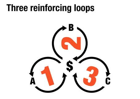
Reinforcing loops

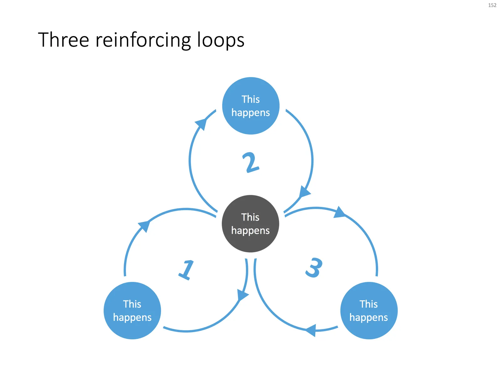
At McKinsey, we used to call this Business Dynamics, mapping reinforcing and opposing forces using arrows. The concept is borrowed from systems theory in mathematics and physics. These circles can make a great chart to show the main growth drivers behind your business.

The notorious US army spaghetti chart is a more complicated execution of the same principle. Contrary to many critical review, I actually liked it as a visualization of the incredibly complex situation over there.

UPDATE: There is now a PowerPoint slide template with 3 reinforcing loops available in the template store.

·Colors

PowerPoint for Mac color rendering

If you cannot get excited about color rendering in software, please skip this post.

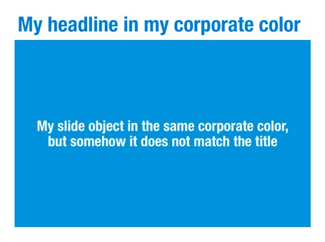
There is something weird in the color rendering of Microsoft PowerPoint 2011 for Mac. First, text and shapes get treated differently. If you make the text and the background the same color, the text will appear different. At first it looks like to be designed on purpose. But the adjusted color is actually a bit off on the hue spectrum, creating color clashes. See the example below.

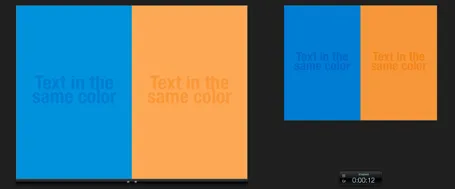
Maybe there is a problem inside the software though. Look at the screen shot below of a presentation in presenter mode. I copied 2 exactly the same slides and you can see that the preview of the second (identical) slide pulls the blue into same purple direction as the text in the previous example. There must be more than one color rendering engine inside PowerPoint.

PowerPoint 2010 for Windows does not suffer from this, and I hope that Microsoft will fix it in a subsequent update (even it was done on purpose). If I want my text to stand out on a background, I want to freedom to decide myself what colors to pick.

·Gadgets

Liberated from the email attachment

Clients that run conservative IT infrastructures (usually the larger enterprises) still have a cap of around 10MB on the size of an email attachment. As presentations contain more images, file sizes are getting increasingly larger. Over the past years I have been cropping and compressing to keep file sizes in check, but I think we have finally reached the time to get rid of the email attachment as the preferred way to send files across.

Solutions such as Dropbox provide a very convenient alternative to the email attachment, send a download link to a file, or sync a file both on your hard drive and the hard drive of your colleague.

Now that 10MB is no longer an issue, we can go to 100MB and beyond and this introduces incredible design freedom.

  1. Put images in at full HD resolution, keep the areas that you cropped out to change a slide design in the future, and have the option to produce very high-grade print material from your working document. There is no need anymore to do destructive compression to your source file. With new devices such as the new iPad with retina screen resolutions going to more than 2000 pixels this becomes essential. A 700 pixel image will look OK on a crappy VGA overhead projector, but will look fuzzy and unprofessional on a tablet
  2. Embed HD videos right into the presentation file. No more linking, saving files in the same directory and worrying about whether things work. Over the past months I have become convinced of the power of short 30 second videos in presentations. You could even start replacing background stills of a landscape with a looping video that show a gentle breeze going through the tree tops with some birds flying by.
Continue reading →