

SlideMagic Blog

Frequent updates about all things presentations since 2008. Subscribe to never miss a post.

RSS
all posts

Category Presentation design

·Delivery

iPad: Keynote tipping point?

I am continuing my research in mobile presentation platforms, with very useful input from you guys.

Until now, the Keynote versus PowerPoint battle has been a feature debate. While Keynote has some better features in some instances, they are unlikely to be enough to switch people over who just invested years in getting to grips with one user interface.

Mobile devices might change that.

There are two types of presentation decks. The everyday presentation is a PowerPoint file that is used in corporates to make business decisions; it is not really meant for presentation, rather it is a more visual substitute for a word processor. The second one is the key company pitch, sales, or fund raising presentation. You use it all the time. You perfect it all the time with small changes. You use it in different settings, mostly for audiences outside the company.

I would argue that by now, it is better to have that crucial presentation in Keynote than in PowerPoint. Why? Mobile devices, and the integration of PowerPoint with iPads is non-existent, while by now Keynote has pretty decent mobile apps.

Pulling out a laptop in a coffee shop to go through a deck is unnatural. Flipping on your iPad is not. An iPad could also be a powerful replacement of the PC + clicker combination that we use for conference room, or even on-stage presentations.

One scenario. You sitting at the reception of a venture capitalist waiting to be picked up. On your iPhone you click through your slides to do a final mental rehearsal. Ah, a typo, a quick fix. You walk into the conference room and one of the VC partners is late. Instead of an on-screen presentation you tell your story verbally, while pointing at a key chart on your iPad when necessary. The second VC partner walks into the room, and immediately you Airplay the presentation onto the conference room screen. You quickly repeat the main points you made by picking off a few slides from your iPad (because of presenter mode, the audience does not see you browsing through tiles) and finish the discussion with the detailed financials, and the use of the funds that you are trying to raise.
Continue reading →
·Investor presentation

Do not dilute your pitch

Usually, a pitch starts really great. When asked, out comes a short and to-the-point story about what you are about. Then we add more info on this, more info on that, until we have diluted our story so much that it sounds pretty much like any other company or fund in your market.

Use the fact that everyone in your industry is creating noise about why the market is so bit, how it is growing so fast. Trigger a recall of this information in the mind of your audience through simple charts. Focus the majority of the time and slides on that unusual story about why you are different than all the others.

Maybe it is good to record that very first pitch on video so you can go back to it in the middle of the design process. Part of the value of a professional presentation designer is sticking to the story that came across in the briefing.

·Gadgets

iPad, Prezi, and remotes

The iPad could be the ultimate device for presenting on-stage, solving many problems I have blogged about before:

  • It can create a dual-screen view: the presenter sees a different screen than the audience (timer, next slide coming up etc.). Now only PowerPoint and Keynote support this with dual monitors. The iPad can create it instantly for any application, including Adobe Reader, enabling presenting from PDFs
  • It can create a non-lineair presentation interface (like Prezi). On your iPad are all the slides in thumbnail view, and you can pick them on the spot without disturbing the audience screen.

There is a real jungle out there of iPhone/iPad presentation apps and none of them get it right. None of them have the thumbnail slide mode, and no one has found a good way to work around the iPad’s font limitations (images instead of text?).

This last point is essential if the iPhone/iPad moves from being a remote control directing a computer to becoming the device that powers the project itself.

Has anyone found the ideal iPad presentation app?

·Data visualization

Evidence versus detail

They may sound or look the same, but there is an important difference:

  • Detail is a pile of facts that bores the audience
  • Evidence is that critical (and sometimes detailed) fact that convinces an audience
·PowerPoint

The counter top presentation

I am currently designing a presentation that is supposed to run on an iPad that sales people take into busy, noisy small businesses to sell something to an owner who does not have time to listen to us.

Of course it has to be short. But we are pondering whether to go with lots-of-big-pictures-slides in 4 minutes, or a few condensed slides in 4 minutes. Big images are better to catch the attention of the owner, but constantly swiping through slides on an iPad might be awkward, and standing in the way of creating a human one-on-one interaction.

On balance, I think to go with the first, what do you think? Have you had experience with this?

·Gadgets

Trackpad only

A while ago I wrote this post comparing a Logitech Mouse, the Magic Mouse, and a track pad. Nine months later, I have switched complete to a track pad, which is not only much better for navigating the Mac Lion OSX, but I also find it highly accurate for drawing shapes and general slide design work.

The key thing that I had to learn was to move things around not by using the old PC method: click the track pad and hold it pressed down while moving your finger, but work with 2 fingers: one presses the track pad down, the other one moves the object. Once you get the hang of that, your movements are as precise as with a mouse.

My pile of obsolete hardware is getting bigger.

·Concepts

Rigorous deal selection

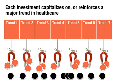
A U.S.-based healthcare-focussed venture capital fund only invests in a company if it pushes forward on of seven trends in healthcare. The page below tries to visualize that.

The point here is only about the rigorous selection, the trends themselves get explained on separate slides, and the portfolio companies get discussed somewhere else in the presentation. After the presentation, institutional investors should remember that the fund is very picky in investing their money, “remember that magnet slide?”

·Concepts

Endless permutations

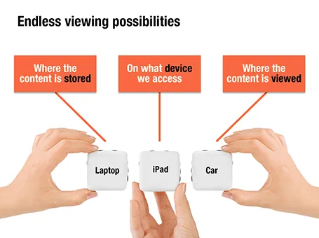
Here is a nice way to visualize an unlimited amount of possible combinations. The sanitized example below was designed for a client with a new digital media technology. You could create a similar concept with a suitcase combination lock, or maybe a slot machine.

·Animations

Uncover versus popup

I am not a big fan of animation, spectacular effects do not support a serious business message and documents with animations do not convert well to PDF for emailing.

Sometimes there is no escaping though, especially when you need to explain components of a complex system. The best way to do this is to add elements one-by-one through a series of clicks.

The usual way to do this is to use pop-up animations. However, these can be cumbersome to edit: you often forget one item in a group, and have to start all over again.

There is an alternative: cover the critical elements in your slide with boxes and remove the boxes one by one. Easier to edit. You can even make it more sophisticated by given the boxes a 10% transparency: the viewer sees sort of what is coming, but not completely. When you want to PDF and email a version of your document, you simply delete all the boxes which leaves the full diagram intact.

·PowerPoint

Links to full screen YouTube videos

The most reliable way to include video in your presentation is to include it in your presentation file. Dragging a video file into Keynote for example creates huge file sizes, but you eliminate the hassle of having to save files in the same location.

A less elegant option, but one that saves space, is to rely on live YouTube links for playback. Here is an approach to do this:

  1. Play the video (in the highest resolution possible) and pause it at the moment you want to use for the placeholder image.
  2. Take a screen shot and paste the image into your slide
  3. Draw a big triangle and place it in the middle of your still image as a play button
  4. Insert the hyperlink to the YouTube video inside the triangle and you are done.

In presentation mode, you can click your play button triangle with the mouse and your browser will open to play the video.

By default, the video will play in the standard YouTube view with all the screen clutter around it. Here is a way to get a link that triggers a full screen view of a YouTube video.

The standard format of a YouTube URL is this: http://www.youtube.com/watch?v=R55e-uHQna0. Here is the trick. Replace the watch?v= bit with this v/ to get this result: http://www.youtube.com/v/R55e-uHQna0. Make this the link your play back triangle points to.