

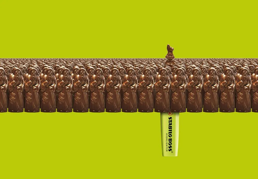
This ad on Ads of the World reminded me what a difference the angle at which an image is taken can make.The chocolate figures were repeated an almost infinite amount of time and stacked behind the front row. But to create the illusion of depth and infinity, the figures in the back stick just a tiny bit over the heads of the ones in the front row.
Think of this when picking your next image, especially roads or other concepts that need to show a long journey towards somewhere. The best images are those where the photographer was almost flat on the ground. Hopefully the photographer of this image (orangeacid on Flickr), managed to get up before the next train came by.
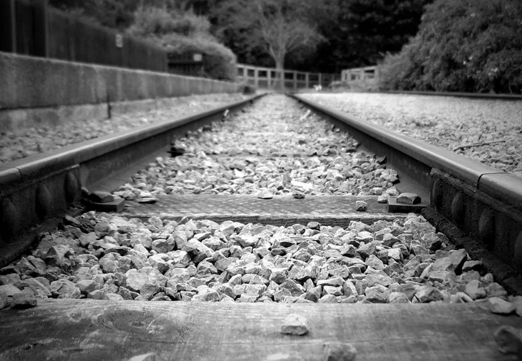
If you are interested: photographers refer to this effect as depth of field. If you look carefully at the image of the rail road, you see that the focus is narrow: the immediate front of the image is blurred, then follows a narrow strip of pin-sharp railroad beams, after which the rest of the image is blurred again.
Related: extreme use of depth of field to make images look like miniature toy scenes: tilt-shifting