SlideMagic Blog

Frequent updates about all things presentations since 2008. Subscribe to never miss a post.

RSS
all posts

Category Presentation design

·Animations

"Cover ups" as an alternative to build ups

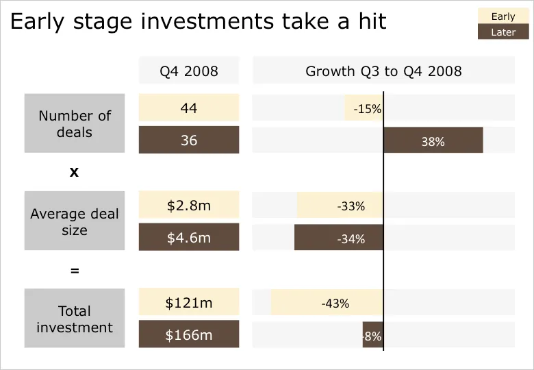
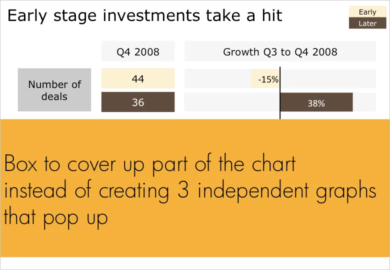
Sometimes you cannot avoid building up a busy data slide to take your audience through it step by step. In case of data-driven charts, it is tricky to create 3 independent graphs that are nicely aligned. I tend to create one big chart and use a white box to cover part of the information. Gradually I unveil more information by taking the white boxes off, instead of creating animations with new elements popping up.
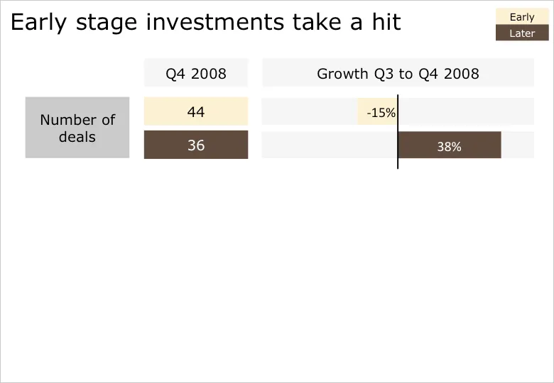
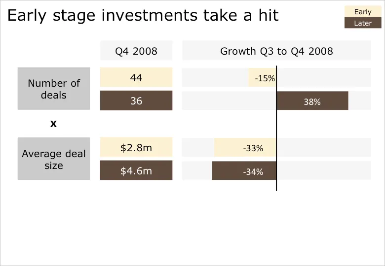
B.t.w. for those interested: the data above is the quarterly overview of VC investments in Israel, compiled in PwC’s Money Tree report for Q4 2008.

·Design

We used to have something like this at McKinsey

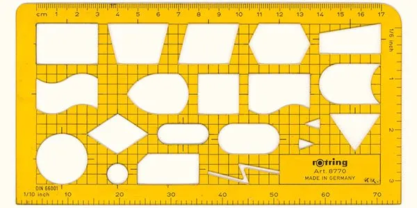
Information Aesthetics is talking about visualization nostalgia. Hey, we used to have a ruler like this at McKinsey. I will continue to look for one, or a picture. They were blue, had boxes for bar/column charts and pie diagrams, and a few triangles and arrows.

The bad thing is that all your charts sort of looked the same. The good news was that, because you were trained to use this ruler, you always tried to find a graphical way to present your information, hardly ever resorting to bullet points.

·Advertising

Filling shapes with pictures

This ad from Ads of the World sparked some ideas.

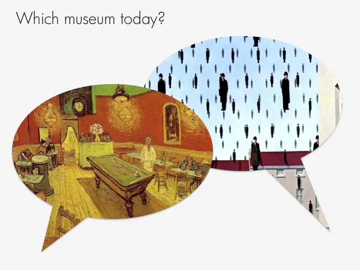
One, the image bubble with the contrasting thought is an interesting concept that can be used in PowerPoint charts.

Two, I am not using the ability to fill shapes with pictures enough. It’s easy. In format shape, go to fill, and choose texture or picture, and off you go. The effect is best used with irregular shapes (clouds, stars, etc.) rather than plain rectangles.

·Design

More proof that people do not absorb all visual information

It took me a while before I understood why this image is a huge Photoshop disaster. I will stay vague in order not to give it away. More evidence in favor of the “Zen-style” presentation.

From an earlier post on Photoshop Disasters.

·Design

Please help complete this Squidoo page for presenters

Squidoo is a tool developed by marketing guru Seth Godin that makes it easy to create overview web pages, a so called lens. I created one for presenters and need your help to complete it.

My aim is to create a useful collection of tools and resources for presenters. It would be impossible for me to maintain on my own. Instead, I am using the “Plex” technology that allows visitors to add links and vote them up or down.

Feel free to add, or vote up-down, blogs, books, gadgets, online tools, or suggest other categories that you want to see on the lens. The voting is less important here than the actual listing.

Revenues that the site generates (if you click through an Amazon link for example) are donated to charity.

Please visit the lens here on www.squidoo.com/stickyslides.

·Design

Don't let stock photo sites do the brain storming for you

Everyone now knows how to get their hands on beautiful images. The next challenge to make your presentation stand out is to pick the right ones. I prefer to do the chart concept brainstorming myself, rather than relying on a stock image search engine to do it for me. We completed the project. Typing in “success” for “finish” will give you a stream of highly predictable and often cheesy images. “Man in suit raising his arms in victorious joy”, “hiqh quality render of a character crossing the finish line”. You/the human brain can do better than that. Think of the concept you want to make, all the way to the end. Then, search a highly specific (stock) image that goes with it. Armstrong waiving his hand on the moon, a bunch of empty, used coffee cups on a desk.

And remember, the right visual concept does not always involve an image.

·Advertising

Chart concept: you can't see what's under the surface

I often have to use a visual concept of the “tip of the ice berg”, “things are different as they appear”. The picture of an actual ice berg is the obvious choice to use. The Titanic archetype is deeply engrained in our collective memory.

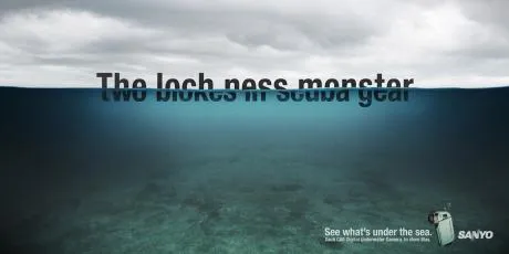
These Sanyo ads show how you can use typography to do the same thing. The first image replaces the image of an ice berg with the actual words, but it gets really interesting when removing the link to the ice berg all together and start using giant text cut in half. Big enough that you can actually read both sentences (sort of) easily.

Not very friendly to audience members with dyslexia though.

Via Ads of the World.

·Delivery

Switch off your parallel visual thinking - only rehearse out loud

You flick through the slides of your presentation on the way to the venue in the taxi. The slides look great, the story is perfectly clear.

Not anymore when you are on stage.

A live rehearsal is the only way to go. And not only to practice stance and eye contact (with the mirror in front of you).

You need to switch your brain from parallel to sequential processing. An image says more than a thousand words. If you look at your own slide it all fits together perfectly. That image, the diagram, those 2 words, the pressure of the 2 opposing arrows. For you (the slide designer), it triggers a complex set of thoughts in your brain.

The audience does not have any of this. You need to translate that complex mental picture into a sequence of thoughts and sentences that allow your audience to get that same insight.

The only way to do that is to “switch off” your parallel visual thinking and start listening to your own sequential stream of words.

·Art

Weekend reading: Rene Margritte paintings and Photoshop images

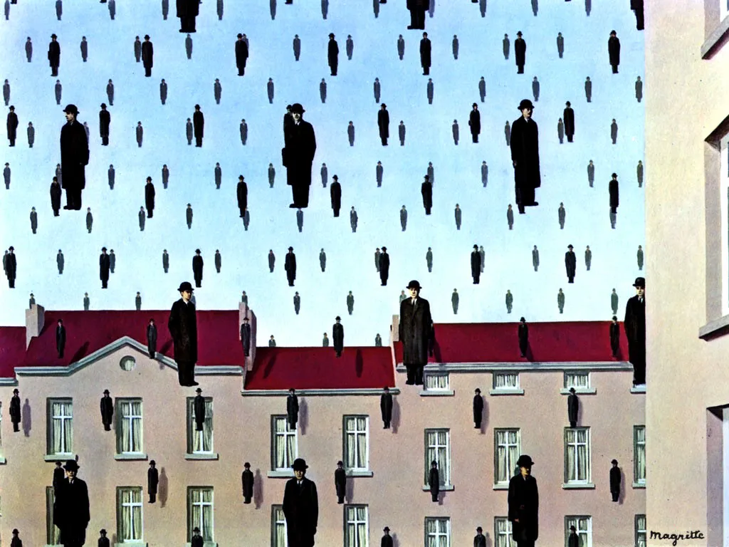
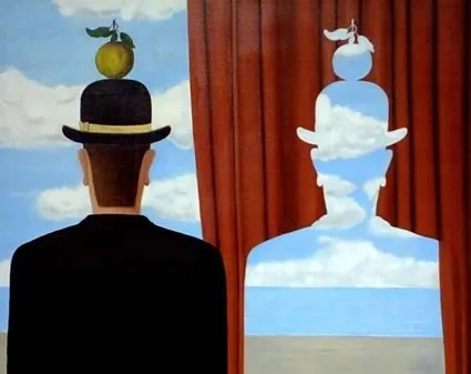
I am browsing through an old (1979) book, Magritte: Ideas and Images, about the life of the Belgian painter Rene Margrite this weekend. What if he could have used Photoshop? Repetition of graphical elements, cut outs, projections. He was ahead of his time.

·Design

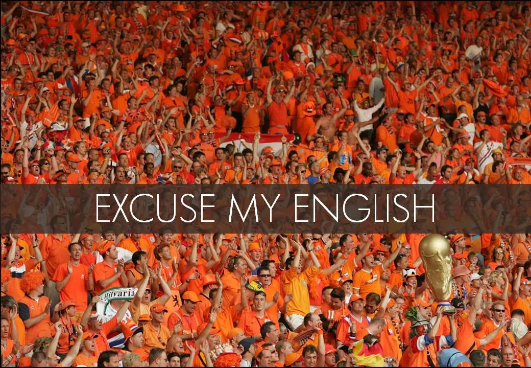
"Excuse my English" - slides that cannot stand on their own

I put the slides I used for a presentation on SlideShare despite that they actually do not stand on their own very well.

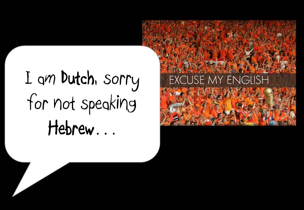
One piece of feedback I got is that I should not apologize for speaking poor English on the first slide. Rather as a presenter, you should radiate confidence. Makes perfect sense. This is actually not what the slide with the Dutch soccer supporters was meant to say… I was apologizing for not speaking Hebrew.

In this context, the mismatch was harmless and even funny. In other situations it might not be.

I enjoyed receiving so much positive feedback on the SlideShare slides. Thank you very much. The benefits of sharing the slides far outweigh the drawbacks in this case.