

Blog post

We used to have something like this at McKinsey

May 16, 2009 ยท by Jan Schultink
โ† all posts

Information Aesthetics is talking about visualization nostalgia. Hey, we used to have a ruler like this at McKinsey. I will continue to look for one, or a picture. They were blue, had boxes for bar/column charts and pie diagrams, and a few triangles and arrows.
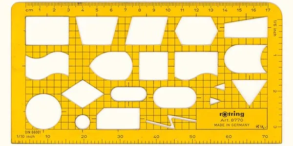
The bad thing is that all your charts sort of looked the same. The good news was that, because you were trained to use this ruler, you always tried to find a graphical way to present your information, hardly ever resorting to bullet points.

DesignMcKinseyPowerPointPresentation designPresentation

About this blog

Notes on all things presentations โ€” design, storytelling, and AI workflows.

Subscribe now to never miss a post.

RSS

About SlideMagic

A platform for business presentations.

A free student plan is available.

2 comments

Ellen2009-05-23 18:52:16
Oh, the nostalgia for that ruler - I remember it! Why can't I find one?
Rowan Manahan2009-05-16 09:24:00
Amazing! That ruler looks just like the drop down 'Basic Shapes' and 'Flowchart' menus in the Drawing toolbar of PowerPoint.