SlideMagic Blog

Frequent updates about all things presentations since 2008. Subscribe to never miss a post.

RSS
all posts

Category Presentation design

·Design

Slides from my guest lecture at the Technion

Last night, I gave a guest lecture to the Eclub of the Technion Institute in Haifa, Israel. We discussed presentation design in general, lessons for entrepreneurs wanting to pitch to venture capitalists for funding, and some PowerPoint makeover tricks.

The slides are a perfect example of visuals that cannot stand on their own (without the presenter being present). Having said that, here they are:

·Design

Keep your images real

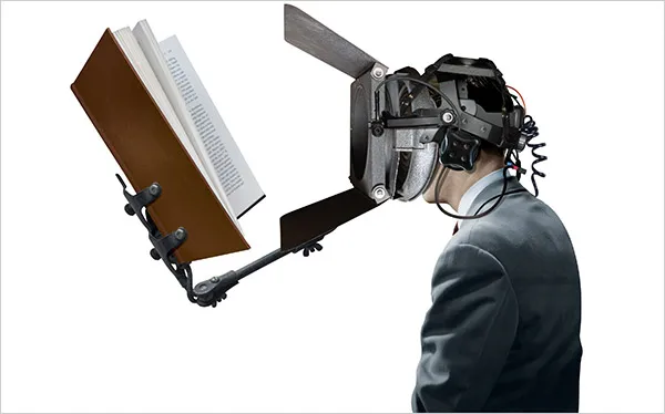
Today, Photoshop can do a lot, but it is still hard to make that perfect photo composition. Today, the New York Times used this image in an article about research to improve concentration.

Nice Photoshop work, but:

  • The composition is good, but not perfect. Either do something that is 100% real, or completely not real (i.e., a photo cartoon)
  • The image catches attention (“what is that scary device attached to this person’s head?”), but does not immediately create the link to concentration. A real image would have been better (5 builders NOT looking away from their work as a woman passes by for example).

Keep your images real.

·Design

[Israel-only] I will be speaking tomorrow May 6 at the Technion in Haifa

If you are around Haifa tomorrow evening you are welcome to join my talk to the Technion Entrepreneurs Club. The discussion will be about improving presentations in general, with a specific focus on VC pitches for startups. Tell the gate that you are here for the “entrepreneurs event”

Technion Industrial Engineering Building Room 216 Wednesday May 6 18:30 Directions can be found in the “about” section of this site.

·Design

2009: the year of stock image fatigue

Today I am writing a speech for a group of university students, so I had the luxury of being able to"go all the way" with creativity, not having to worry about whether visual concepts would be appropriate for the audience.

Eighty slides later, I got tired of many of the images I used and cut back on a lot of them.

  • Page after page of yet another stunningly beautiful image takes the attention away from the presenter and gives the audience the impression of reading a giant coffee table picture book
  • There is only so many funny or shocking images an audience can absorb. One “pie in the face” can be funny, one aggressive guy might be OK, but not ten slides like these. People don’t like to look at close-ups of spiders.
  • Metaphors get forced: “I knew he would use that squashed orange to show that we are being squeezed by the competition.”
  • Cost: 80 pages with a few trial images per page start to add up.

What you can do to overcome stock image fatigue:

  • (I passed level 0 already: cutting out the cheesy image)
  • Have the courage to go even more minimalistic: use a few words on a beautiful background color (experiment with light and elegant fonts, short words with are extremely large fonts)
  • Re-color stock images so they look more similar
  • Use images that are similar in style, for example just “retro” black & white shots throughout your presentation
  • Use real images from sources such as Flickr (check the license)
·Data visualization

Chart make-over example, sorry Skype

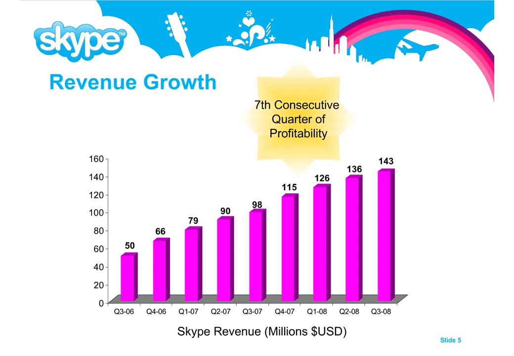
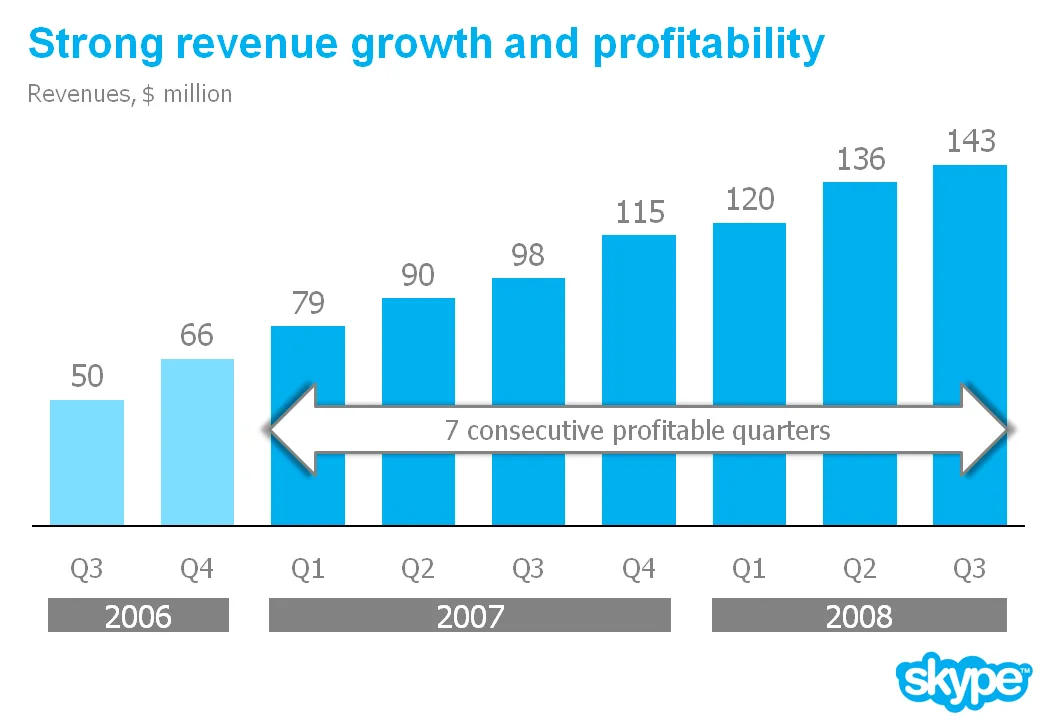
I am preparing a speech and needed a case example for a chart make over. Sorry to be picking on Skype again… A great color scheme plus a chart I discussed before. I have nothing against Skype, this is just for educational purposes.

Here is a list of changes:

  • Reduce the template to a logo at the bottom right of the page, eliminating all other distracting elements. I really like white space.
  • Rigorous application of the corporate colors and fonts.
  • Simple column chart without 3D
  • No need for a vertical axis if you use data labels
  • Re-wrote the headline
  • Replaced the yellow star to give the text more connection to the numbers (still it would have been better to show the actual profit numbers)
  • Smiling, I made a typo in the revenues of Q1 2008

The idea is to make the data as calm as possible. Also note that through consistent use of corporate colors there is no need for additional “house style” graphical elements on the pace. You can see from a mile’s distance that this is a Skype chart.

·Design

How to transfer fonts from a PC to a Mac

Fonts, PowerPoint and multiple computers do not mix. I have begun to go down the font slide: beautiful results but increasing complexity. Once you’re on it, there is no way back:

  1. First level, just use one popular font, let’s say Verdana (but it gets boring)
  2. Second level, group items together and “paste as PNG” back (but it is so hard to edit)
  3. Thid level, embed fonts with your PPT file

All was fine with level 3 untill I tried to use the PPT file on a Mac: disaster again. The “hardcore” solution:

For some reason, my Windows PC has far more fonts installed than my Mac. Font files are portable, they work on a PC and on a Mac. I simply copied all my PC font files and put them in a folder on my Mac desktop. If I need a font, I double click the relevant file, start PowerPoint over again and things are fixed.

Now where are these PC font files? Click “start”, “run”, type “%windir%\fonts” and they all show up. Select all, copy and paste them in a folder to be copied to the Mac. Done.


·Design

Learn from the Skype "how do we look guide"

A while ago I posted a fairly critical review of the abuse of the Skype PowerPoint template. The first sentence of my post however was: “Skype has a beautiful and very strong visual identity”.

Spot on. Browse through this document with guidelines for creating documents in the “Skype look”. You can learn from it even if you are not designing for Skype. Beautiful graphics. Nicely written to give you directions but leaving you enough creative room to make your own designs.

Skype- corporate identity_ how do we look

·Design

Gadget review: Logitech Presenter remote control

A remote control is an essential tool for any presenter. You do not have to go back to your computer all the time to look for the arrow keys to change the slide. This is especially important if you adopt a “Zen”-style presentation: lots and lots of images that change at a very high pace. I finally got one.

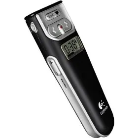
The Logitech 2.4 GHz Cordless Presenter does the job perfectly.

  1. Minimalist design, only the keys you really need: slide up/down, volume, screen “F5” and a button to black out the screen to talk to your audience without the distraction of slides.)
  2. The USB computer connection can be stored inside the device
  3. It has a stop watch to keep track of time
  4. It does (partly) work on the Mac (I run the latest Mac OS). Flipping through slides in both PowerPoint and Keynote, and changing volume is OK. The black screen and “F5” keys do not produce meaningful results (the opposite, they start inserting characters into your Keynote slides)

The device also has a built in laser pointer (although I am not a big fan of that nervously moving red dot on my slides).

·Design

Use images to tap into collective memory

You do not need to use data all the time to get a point across in your presentation. Sometimes a good image is enough to tap into our collective memory.

·Design

The outrageous SlideShare title page

In a big conference hall your title page should contain some useful information for the audience that is walking in (“Is this the right session?”). When designing for online presentations platforms (such as SlideShare), they need to grab the attention of the site visitor without patience. Pretty much like the posters you used to put up for your events near the coffee machine in university.

Here is my coffee machine poster for a lecture I will be giving at the Technion in Haifa, Israel next week. In case you are in the neighbourhood…