SlideMagic Blog

Frequent updates about all things presentations since 2008. Subscribe to never miss a post.

RSS
all posts

Category Presentation design

·Data visualization

As promised my solution to the NYT infographic

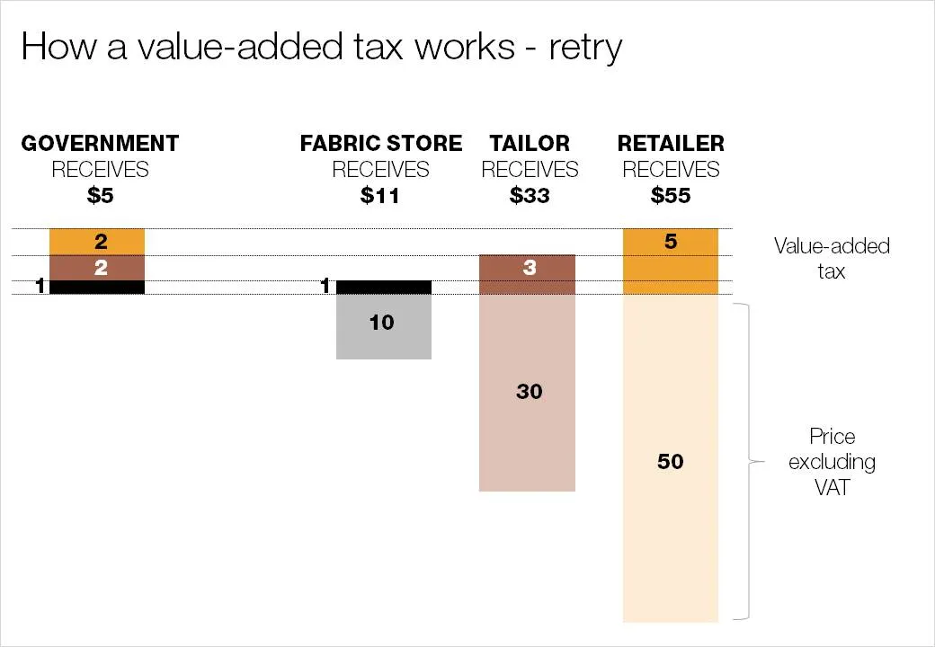
Here is my suggested solution to yesterday’s puzzle: improving the NYT’s infographic that explains how a value-added tax works. Let me know what you think and/or whether you have alternative suggestions. You can click on the image for a larger picture.

·Design

What matters now

Seth Godin is the master of spreading ideas, he just published a new ebook:

  1. He convinced more than 70 authors to write a page
  2. Got the collective work to look decent in a PDF
  3. Orchestrated dozens of blogs to discuss it
  4. (Encouraged bloggers like me to push it further in a second wave)

You can download it here, or see it on Scribd below. As you click through it, try to think about why you stopped on certain pages, while skipping others. A good lesson for designing presentations for online audiences. What do you think of page 78 by Dan Roam?

What Matters Now

·Data visualization

Puzzle for tomorrow: improving an NYT infographic

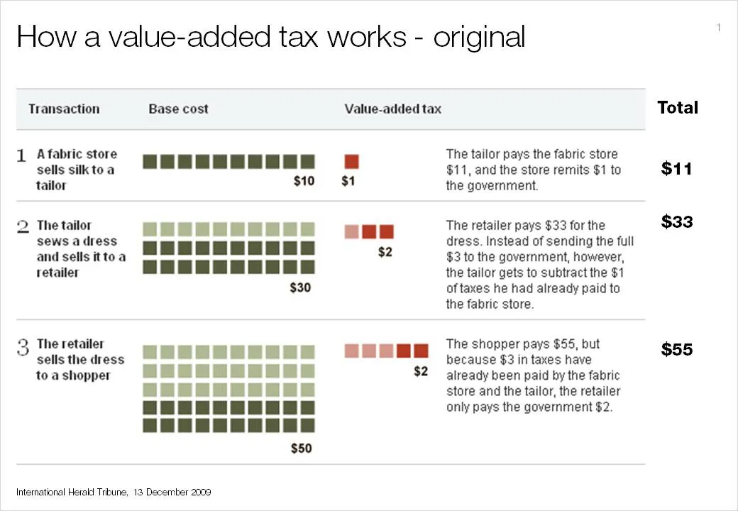
If you see it for the first time, value added tax is a bit tricky to explain. The NYT (equals the Herald Tribune) gave it a go in the infographic below. I am trying to do a better job and will post it in tomorrow’s blog post. I am actually not that happy with my result so far.

This is a heads up: give it a try yourself and we can compare notes tomorrow.

I had to modify the image on the NYT web site slightly and added the right column with totals that appeared in print, but was omitted in the online version of the graphic.

·Design

Creating depth of field on your slides

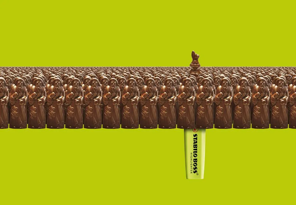
This ad on Ads of the World reminded me what a difference the angle at which an image is taken can make.The chocolate figures were repeated an almost infinite amount of time and stacked behind the front row. But to create the illusion of depth and infinity, the figures in the back stick just a tiny bit over the heads of the ones in the front row.

Think of this when picking your next image, especially roads or other concepts that need to show a long journey towards somewhere. The best images are those where the photographer was almost flat on the ground. Hopefully the photographer of this image (orangeacid on Flickr), managed to get up before the next train came by.

If you are interested: photographers refer to this effect as depth of field. If you look carefully at the image of the rail road, you see that the focus is narrow: the immediate front of the image is blurred, then follows a narrow strip of pin-sharp railroad beams, after which the rest of the image is blurred again.

Related: extreme use of depth of field to make images look like miniature toy scenes: tilt-shifting

·Advertising

Here is a new way to look at 3D typography

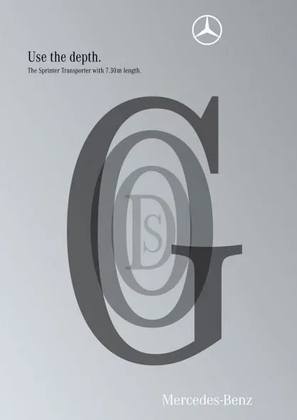
This ad uses 3D typography in a way that is obvious, but only after you have seen it. The letters are positioned and sized in such a way that it creates a sense of depth, semi-transparent fills add to the effect. Very well done. It works best for short words that have lots of “open” characters in it, for example “goods”. Via Ads of the World.

·Design

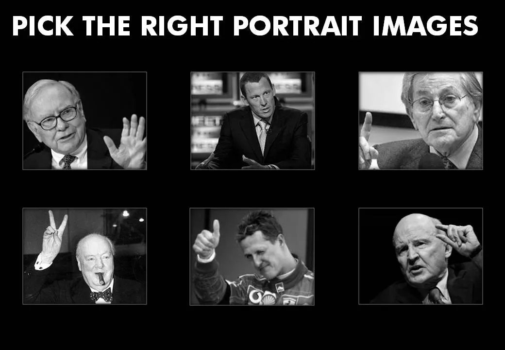
Picking the right portrait images

Images of celebrities are like corporate logos: recognizable from a long distance. When selecting images for your presentation, think of the following:

  • Re-size and crop the images in such a way that all of them have roughly the same scale, and that the eye line more or less lines up
  • Choose active pictures: people pointing, making a gesture
  • Have people look towards the center of the page
  • Harmonize the background (light or dark)
  • Harmonize the color, make them black and white if necessary

I stuck to most of these suggestions (not all) in the example slide below:

·Design

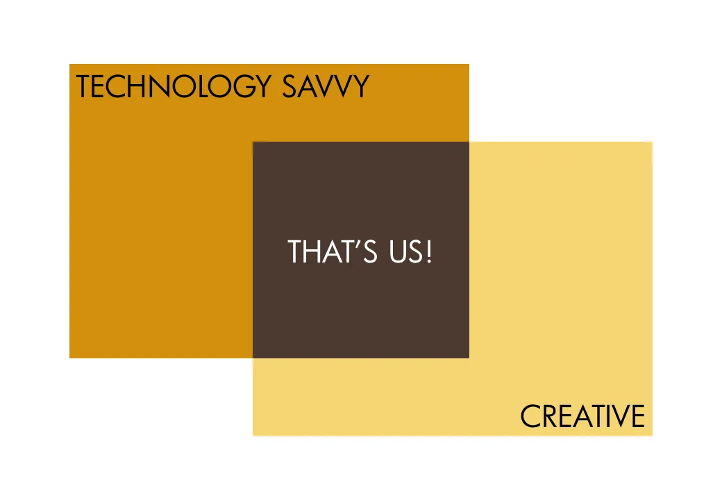
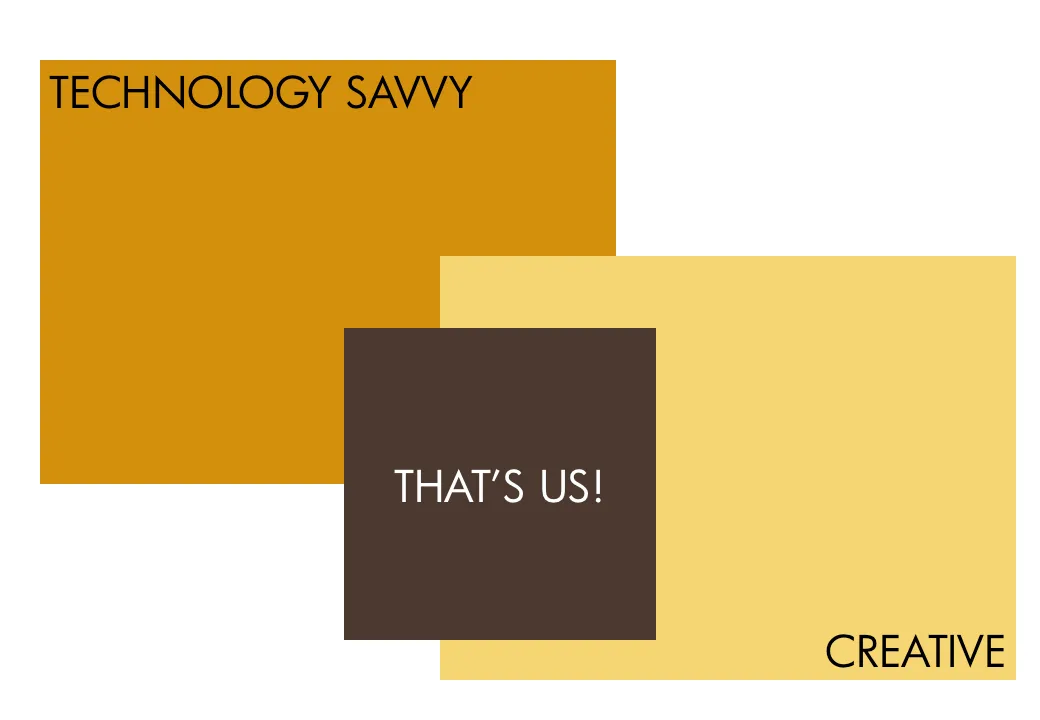
Chart concept - a variation on the Venn diagram

Venn diagrams

are great to show overlapping features. In practice however, it can be hard to position text in the circular shapes. I often use an adjusted version of the Venn diagram, one based on boxes. Boxes are easier to draw, and especially, you can make the center box (the most important one) really large.

As you can see below, I did not rely on semi-transparent colors to create the overlap effect. Rather, I just drew the third box in, giving me complete flexibility to decide on colors. Again something that would be hard to do in a circle Venn diagram.

UPDATE February 2018: I have now added a number of Venn diagrams in PowerPoint to the SlideMagic store, including the rectangular ones that are described above.

·Design

Testing a new introduction presentation

I am working on a new introduction presentation that should explain potential clients a little bit about my background, but most of all, convince them that an investment in a professionally designed presentation is worth their while.

I would welcome your thoughts, especially on the idea of using the part of the full width of the 16:9 format for an image subtitle.

·Art

Finding font inspiration in Bauhaus architecture

More presentation design and art today. I had a very clear policy on the use of fonts and typography:

Until now. I just finished a presentation:

  • Set in ALLCAPS
  • Using the Futura Bk font
  • 90% of the slides are set in bold (yes, ALLCAPS bold)

The Futura font family is to blame. The history of the font go back to the 1930s and its design is heavily influenced by the Bauhaus movement. Clean geometrical shapes, look at these o’s, almost perfectly round.

Maybe being located in Tel Aviv, a city that has one of the world’s most extensive collection of Bauhaus architecture, had something to do with it. The picture below is an example of a Bauhaus-style building in Tel Aviv, the “Bait ha’Onia” or “Ship house” on 56 Levandah Street, designed by architect Arieh Cohen and built in 1934-1935. To make the side track complete, if you are interested in Tel Aviv Bauhaus architecture, make sure to get your hands on this book (text both in French and in English).
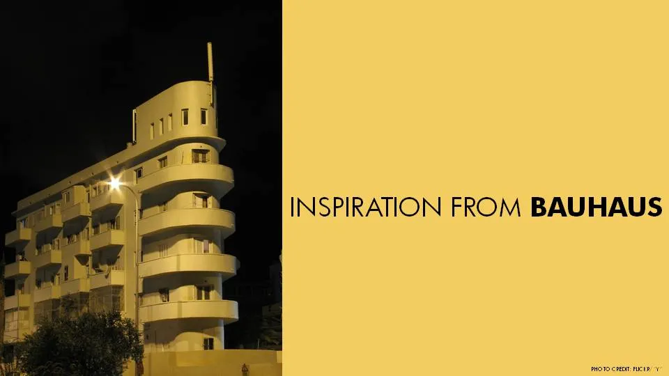
Back to presentation design. In particular I like two font variations of Futura. The Light version (Futura Lt) for thin, elegant, sentences in sentence case, and the Book version (Futura Bk) for all caps. The allcaps look especially impressive in fat bold (look at the font in the image). Obviously, some of my old font design principles still hold. Allcaps bold fonts should only be used in presentation that contain a few words per slide.


Continue reading →
·Design

McKinsey flashback: logic, rhetoric, and presentations

Recent tweets by Nancy Duarte about her reading up on classic rhetoric and a clean-out of my book shelf with old McKinsey training material triggered this post. How can we use the ancient rules of logic and rhetoric in our presentations? Some of my observations.

Logic is necessary but not enough to convince. The perfect logical argument often fails to make people believe your message with their heart. There are still many people that smoke despite this:

  1. Smoking causes cancer
  2. Cancer kills
  3. People do not like to die
  4. Therefore: stop smoking.

The Greek philosopher Aristotle was well aware of this. Logic and rhetoric are often confused to be the same thing. Actually, logic (logos) is one of three components of rhetoric. The other two 2 are ethos (credibility of the speaker) and pathos (emotional appeal to the audience).

Why is logic so popular among McKinsey consultants? A number of reasons:

  • Lack of time. There is an often overlooked difference between a problem solving structure and a solution presentation structure. Logic is a great tool to solve a problem: cut your issue up in pieces, find facts and other evidence to solve sub-problems, and finally build up the overall solution again from the component solutions. Management consultants often stop there and do not invest time to translate the problem solving structure into a compelling and convincing story to communicate the solution. It is not that they don’t want to, at 2AM before the final review meeting there is often simply no time left.
  • Like-minded people. Management consultants usually are very logic-driven people. It is logical work, that attracts logical people, who hire more logical minds. So, the language between management consultants among themselves is highly logical. Some people however have a totally different brain structure (clients of management consultants included).
  • Collaboration. A logical language and structuring technique is very well suited for people that need to work together but have never met each other before. Once you have learned the methodology, you can put a team of consultants from different countries together that can produce results almost immediately.
Continue reading →