

Blog post

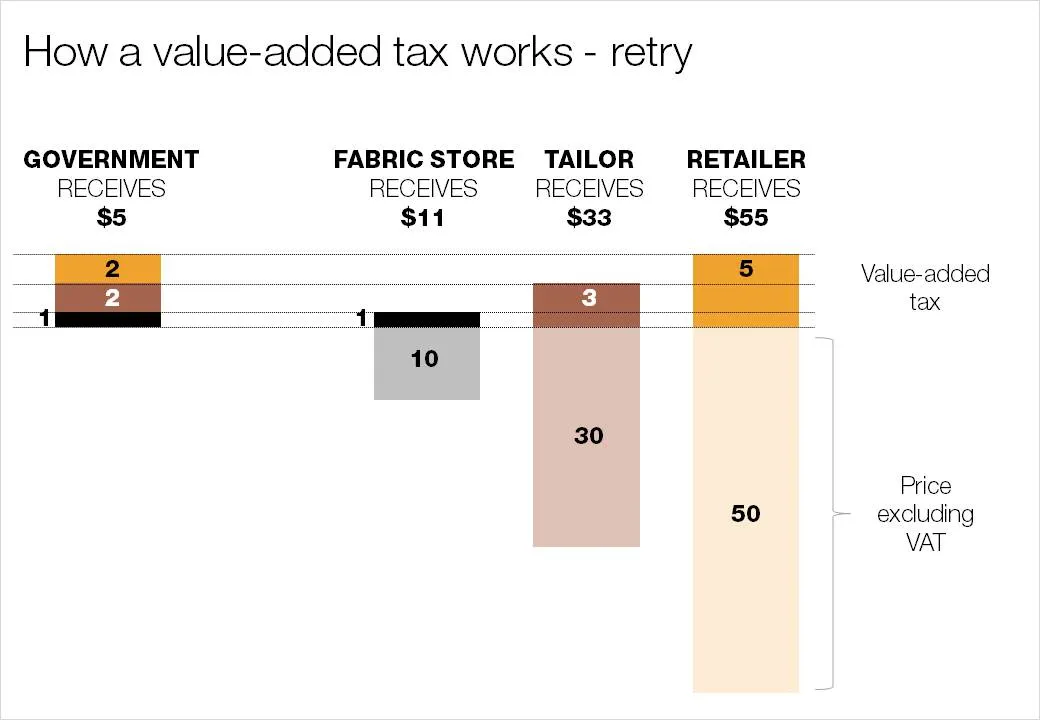
As promised my solution to the NYT infographic

December 15, 2009 · by Jan Schultink
← all posts

Here is my suggested solution to yesterday’s puzzle: improving the NYT’s infographic that explains how a value-added tax works. Let me know what you think and/or whether you have alternative suggestions. You can click on the image for a larger picture.
Data visualizationDesignPowerPointPresentation designPresentation

About this blog

Notes on all things presentations — design, storytelling, and AI workflows.

Subscribe now to never miss a post.

RSS

About SlideMagic

A platform for business presentations.

A free student plan is available.