

If you see it for the first time, value added tax is a bit tricky to explain. The NYT (equals the Herald Tribune) gave it a go in the infographic below. I am trying to do a better job and will post it in tomorrow’s blog post. I am actually not that happy with my result so far.
This is a heads up: give it a try yourself and we can compare notes tomorrow.
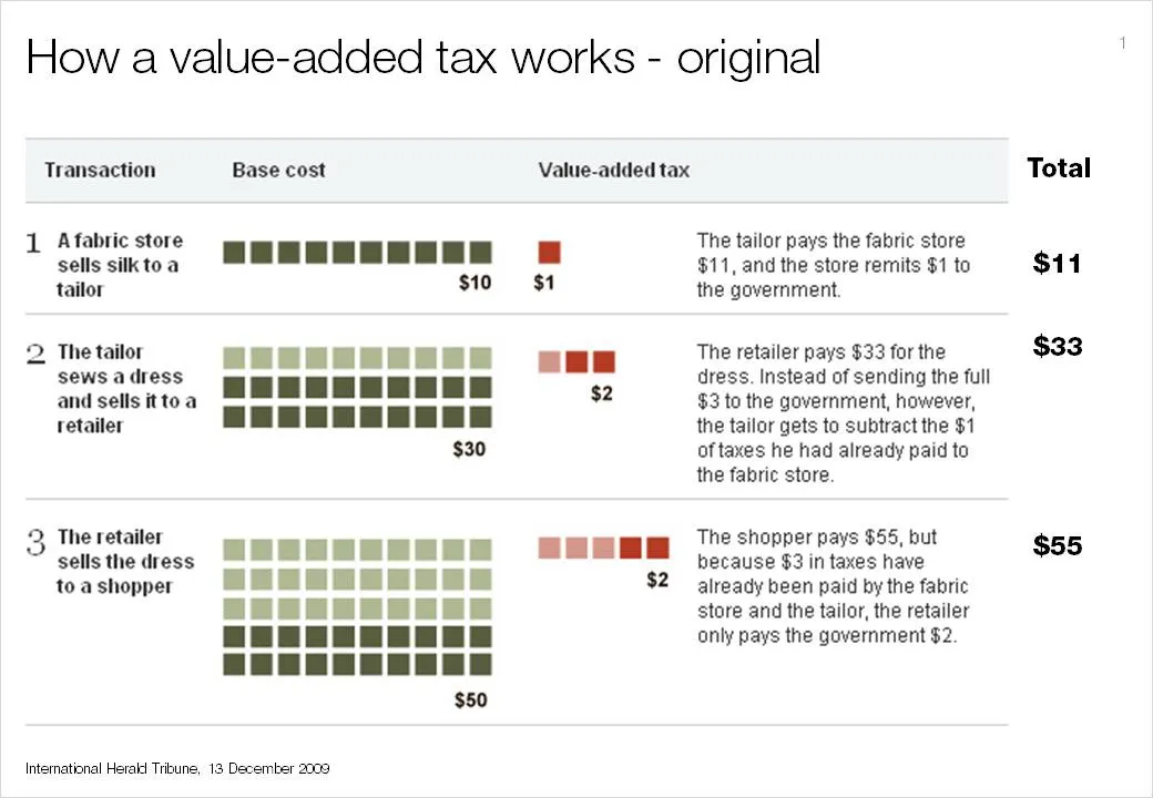
I had to modify the image on the NYT web site slightly and added the right column with totals that appeared in print, but was omitted in the online version of the graphic.