SlideMagic Blog

Frequent updates about all things presentations since 2008. Subscribe to never miss a post.

RSS
all posts

Category PowerPoint

·Art

Monet, poppies, and color rhythm

Nature and artists are still better at producing certain colors than computers. Look at the famous painting Poppies at Argenteuil by Monet. If you were the pick the blue green color and copy the RGB values into your PowerPoint presentation, the result would be dull. The rhythm of the brush strokes adds something.
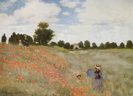
In spring, there are many flower fields like these in Israel. The green blue color is created by the contrast between the top and the bottom of the leaves: grey green and yellow green. The wind moving the leaves creates the color effect. In an earlier post I discussed a painting by Jan van Eyck with a similar effect of alternating and interacting colors.

This painting is also a great example of how to create movement in a static image. The horizon and the diagonal line between the two ladies set the composition. Look how the red flowers are blurry dots of paint without much detail, and how they get incredibly big close to the front. Flowers in the wind never sit still, but rather we watch them go round, leaving a much bigger impression than the space they actually occupy.

This painting has multiple levels of experience, an almost impossible feature to recreate in a PowerPoint slide, but a reminder about what visuals ultimately are: pieces of emotional input. First you see a landscape, then you see things moving in the wind, hear the wind whistling, feel that spring sensation when you venture out of your cold house into the sun and sense your skin warming up from the outside. The bright red, blue green contrast, plus the movements of the children running down the hill might just remind you that life is all about those simple pleasures and moments of beauty.

·PowerPoint

Minimalist design environments: Byword

Even more than visual design, writing text can easily be interrupted by clutter and screen distractions. Yesterday’s launch of iA Writer for Mac prompted me to have a look around for minimalist word processing tools. This review in The Next Web led me to Byword, which I am using right now to write this blog post.

It is a liberating experience, especially now that I do not have worry about the HTML formatting of my text that up until now destroyed all sense of lay out in my blog posts.

I am waiting for the day that a similar tool will appear for slide design as well, but I guess it will be a bigger challenge since visual design requires a much broader set of tools than simply writing text.

·Data visualization

Finding space for labels of small pie slices

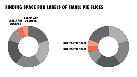
In pie diagrams, the small pieces always come in last, and end up close to the top of the pie chart. Adding readable labels becomes difficult as the horizontal space for them is small.

I find it better to rotate the pie chart in such a way that the smaller pieces get in a horizontal position, so you have space to write out the labels of them. The illustration shows an example.

·PowerPoint

A new way to use LEGO in your slides

Recently, I needed to find a good visualization of modularity in a presentation. Lego is a nice concept, but maybe a bit cliché. Not if you use this really cool LEGO design tool: LEGO Digital Designer. It is a full 3D design environment in which you can create any LEGO object you want, and even submit it to LEGO to buy a box with the pieces plus a build instruction. It comes with a large online library where people can upload and download designs.

Here is an example of the Empire State Building. You switch on an animation of how the building is built up as the bricks fly in from all directions. Great stuff.

If you are in to LEGO, here are some earlier posts about it. Christoph Niemann uses LEGO to model New York city. This ad visualizes the power of imagination that kids have, but grown ups seem to have lost.

·Colors

Color management in PowerPoint 2011 for Mac

Slowly I am working around some of the shortcomings that PowerPoint 2011 for Mac has in comparison to PowerPoint 2010 for Windows, and get to enjoy some of the advantages of the Mac platform. One of them is color management.

Built-in to a Mac is a powerful color management picker:

  • With a magnifying glass, you can copy the color of any element on screen and add it as a color to your palette. For example, you can take the colors from your corporate logo to create a matching PowerPoint color scheme. In Windows, I had to rely on other applications (Photoshop, Paint) to do this.
  • Your color palettes are stored across applications, so you set them in PowerPoint, they are available in Photoshop, Keynote, and any other applications you are using.

See this extensive post on robinwood.com on how to use the Mac color picking tool. Thank you Andrew Marritt for pointing me to this.

·Investor presentation

Jargon-free decks, even in medicine

I have now written a few pitch presentations in the healthcare sector. Medicine is complicated because professionals use incredibly difficult terminology (often derived from Latin) And the worst for a presentation designer: long words that are impossible to fit in boxes and shapes. A second factor adding to the complexity is the sheer breadth of knowledge required to understand things (doctors study for a long time before being allowed to practice).

The result of this: incomprehensible pitch decks that can only be understood by medical professionals or investors with some sort of medical degree.

In my designs, I try to get the best of both worlds: a presentation that is completely understandable to an outsider, and still credible to a medical professional.

  • Start the presentation with a very short 101 on the disease area that can be skipped by professionals. Medicine is complicated, but when you zoom in to one micro therapy area it is actually surprisingly simple. Especially for medical devices (biotech is harder).
  • Aim to write the presentation with zero professional terms. Usually I can get there with a few exceptions.

Medicine seems similar to the legal practice, where over the years, practitioners developed their own “secret language”. It is time to open this up, especially when doctors need to face the outside world to get their startup ideas funded.

·Investor presentation

Why don't we see more video pitches?

The more I think about it, the more I come to the conclusion that video pitches have a great future. Especially as an alternative to startup fund raising decks that now get emailed “cold” to potential investors. Why?

  • The world is moving to a minimalist presentation design style that makes it harder to understand decks without verbal explanation.
  • Somehow, I find audio tracks not very interesting to listen to. They take too long for a situation where you do not have direct interaction with the speaker. They just go on and on
  • Startup pitch competitions have shown me that it is possible to get across a lot in just a few minutes of presentation time. You just need to prepare. Videos are high profile, people will invest a lot of time in getting it right. The result will be a higher quality pitch than someone “winging it” in front of a live audience
  • A very important part of an investor pitch is the team. A video of the presenter gives already some clue about the CEO of the business.
  • You can make sure people will listen to your entire story. When you set expectations (watch this 5 minute video) and investors see the counter counting down I think it is highly likely that they will go through to the end. Much more likely than a slide deck: click, click, click, “bleep” from the Blackberry and they get distracted.

Other big applications could be job interviews, or university applications.

Continue reading →
·Books

Book review - The visual dictionary of typography

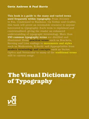
The Visual Dictionary of Typography (affiliate link) is a nice little book that explains 250 concepts in typography, each using a visual example. Dictionary is the wrong title, this is not a reference book, but rather something to browse through and explore. I stumbled on many terms that I have never heard of before. On the other hand, the book also contains some entries that are a bit forced: music for example.

Here are the entries for the letter V to give you an example of the contents:

  • Vector
  • Vernacular
  • Vertical alignment
  • Virgule

All in all a nice little book, I would get it in print rather than as an eBook.

·Delivery

[VIDEO] Here is live audience interaction for you

·PowerPoint

The presentation snowball

Sometimes it is a enough for a good slide deck to make a small difference in order to win the big prize. Take fund raising for example.

  • A good slide deck gives you a slightly higher probability of getting through the email screen
  • Better slides lift your confidence just a tiny bit when presenting
  • When your presentation is better, you get more meetings, you get to practice more, your story gets better, you get more meetings

Even a small difference can have a big impact.