

In pie diagrams, the small pieces always come in last, and end up close to the top of the pie chart. Adding readable labels becomes difficult as the horizontal space for them is small.
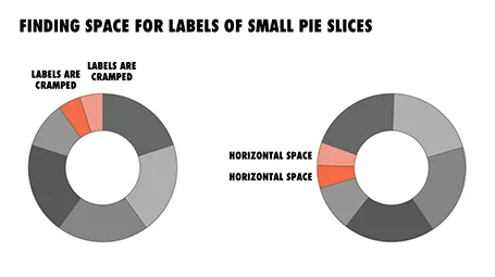
I find it better to rotate the pie chart in such a way that the smaller pieces get in a horizontal position, so you have space to write out the labels of them. The illustration shows an example.
4 comments
I once saw an application that offered "cake chart". I presumed, in my imagination, that they would nest pieces together making each piece as close to square as possible, using an algorithm something like Huffman Coding.
No such luck. They should have called their concept a "loaf chart".
B. Could you use a horizontal bar chart, which has the same amount of room for all of the labels?