1970s label font
The Impact label font by Tension Type can work great in a presentation design. It is open source, you can download it here at Dafont. It also comes in a white reverse version.



Frequent updates about all things presentations since 2008. Subscribe to never miss a post.
The Impact label font by Tension Type can work great in a presentation design. It is open source, you can download it here at Dafont. It also comes in a white reverse version.
Back at McKinsey in the 1990s we would write a long-hand sentence, or a “lead” at the top of every slide (similar in length to today’s 140-character Tweets. This sentence would give you the message of the chart and you could get the whole story by reading all the leads in a document, without looking at the exhibits below.
I am re-discovering the sentence recently.
Most slides with images work best when you scale up the photograph until it bleeds of the page.

Making the image a bit smaller leaves a distracting white border around your slides that does not look good when projected on a big screen.
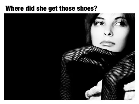
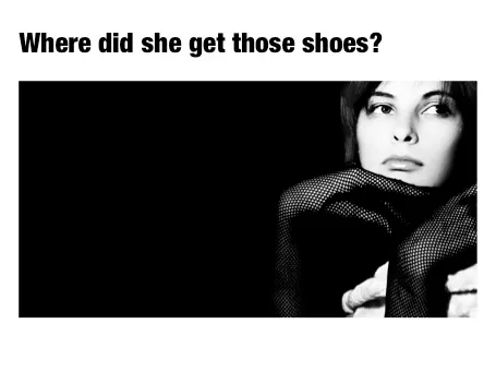
However, recently I started using a layout that is very often used in print advertising. An image which is more horizontally cut and more white space above and below the image. It is maybe not the best for large on-screen key note presentations, but it looks great for corporate decks that are discussed in a smaller setting.
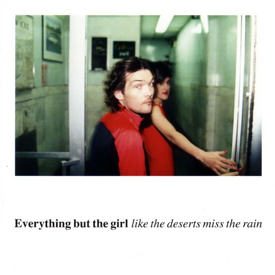
This layout is often used in CD covers, see Similar to this album cover of a 1990s hit by Everything but the girl:
Online presentation sharing services such as SlideShare allow you to upload an audio track alongside your slides. You need to make sure that the narrative is exactly in sync with the visuals.
I have seen (heard) examples where the audio presenter starts talking about data or concepts that are not present on the visual in front of you. As a result, the brain starts to wander off, looking for missing pieces of information on the slide.
When talking to a live audience in person, you can draw the attention from the visual back to you. An exact sync is less important, and it is easy to fit in a slide story. During a short web presentation with audio, your audience is using the narrative as an explanation of the slides. Make sure they are lined up.
Sometimes, when you are short in time, that might actually mean inserting a slide with some quick (very short) bullets (did I just write that?) or a short sentence to support your side story. Something like: “Case example: 22% cost savings”
We sit almost our entire day behind a screen, and most applications we run are an ugly collection of screen clutter. Clutter and distractions are creativity killers. Gmail is incredibly useful, but also incredibly ugly. Here is a partial solution, Ansel Santosa has designed minimalist Gmail a Chrome extension that let’s you switch off unwanted features.
Finally I spotted a newspaper ad of the store that I often drive by in the morning. A mix up of typography that hurts the eye. Here in Israel, many people might not notice since they are used to seeing a different character set all together.
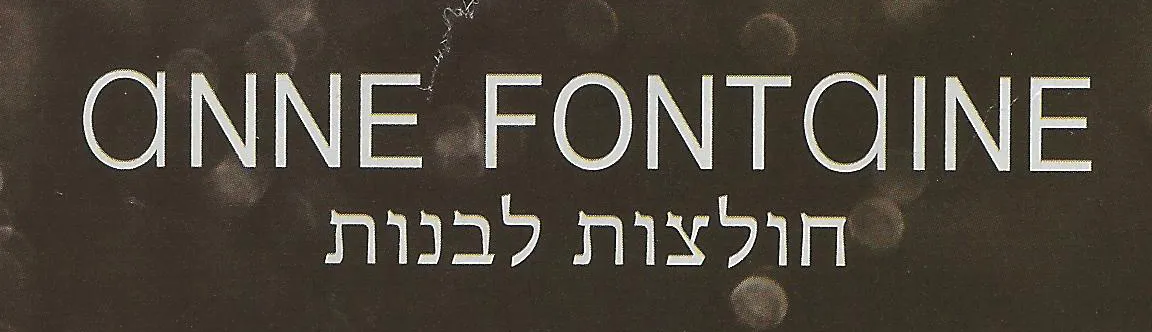
Update: this company actually operates stores all around the world, with the same logo…
You do not win over VCs by trying to prove your point by entering a debating contest (even if you are right). The two of you have to sit on a Board together. The VC needs to pick Board seats, the entrepreneur needs to pick battles.
Over the past year, things have gotten increasingly busy for me. Two weeks ago for example, I landed new clients in New York, Detroit, Los Angeles, Milan, and Calgary. Of course, not every week is like this, but still.
I would like to experiment whether it is possible to scale my business without investing in people on the payroll and fixed office infrastructure, working with people on a project-by-project basis. As I look around me and see other designers present themselves, I realize that each and every one has their own specific strengths. I would be great to use that talent and bundle it into a great client proposition.
To start, I would like to get a better idea who is out there. If you are interested, do not post in the comments, but you can contact met at jan [at] ideatransplant [dot] com, put “iamadesigner” in the headline so my gmail filter catches you and specify what your specific strengths are, maybe link to some examples of your work, and (only if you want) give me a sense of the sort of commercial terms you usually work on.
Maybe this is you (obviously not all of these need to apply):
Through a series of live bloggers and buffering live streams I managed to catch most of Apple’s keynote yesterday (you can now watch the Apple keynote video here). The presentation covered a lot and dot all is relevant for presentation design. Here are some points that struck me.
It was interesting to see how the whole presentation still worked well despite a reduced role of Steve Jobs. Good slide design, careful script writing, and practice-practice-practice turns everyone into a great presenter.
Last week I was presenting at a startup pitch competition at the Technion University in Haifa, Israel. After my talk, the contestants had 3 minute each to pitch their business idea. Some observations inspired by the evening, and not necessarily related to any of the contestants.