SlideMagic Blog

Frequent updates about all things presentations since 2008. Subscribe to never miss a post.

RSS
all posts

Category Layout

·Data visualization

Bar chart formatting

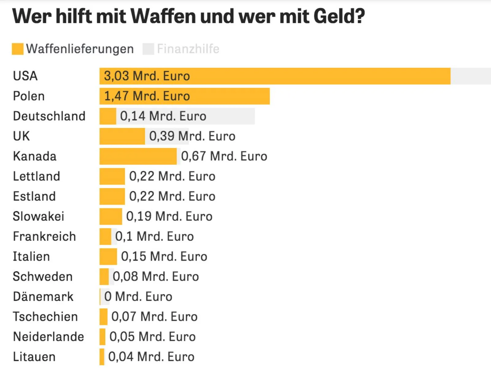
This chart can be improved in many ways (source), you can see it without understanding German…

  • No need to repeat “Mrd. Euro” (billions of Euros) at every data point, just put the unit at the top
  • The data labels of the second data series is missing, as is the total
  • The color of the 2nd data series is too light (probably to make the text readable)
  • I would right-align the row labels
·Layout

McKinsey chart make-over

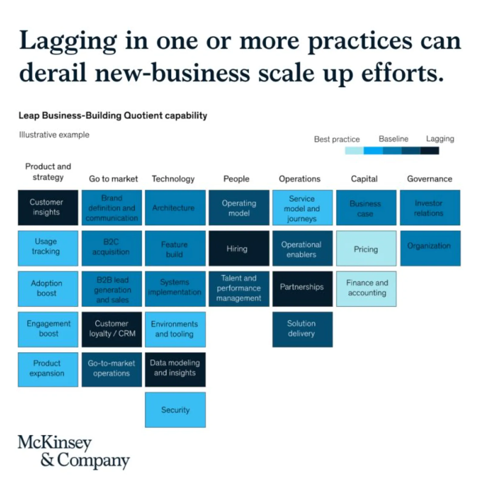
See the following McKinsey framework (background here):

The slide does not look bad, but there are a few things that I would change:

  • Flipping the columns and rows of the table, there are more columns than rows, I tend to put the axis with the most data in rows
  • Sorting the categories by number of boxes, to get a more visually pleasing line (McKinsey probably sorted the columns by importance)
  • Sorting the boxes within a category by color (and not by importance)
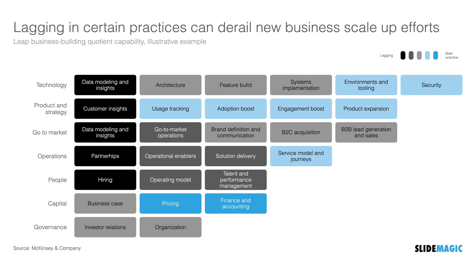
  • Fixing the color coding, the dark colour is actually the worst score.

Below is a quick makeover in SlideMagic, you can find this chart in the SlideMagic slide library for you to use.

·Images

Landscape photos

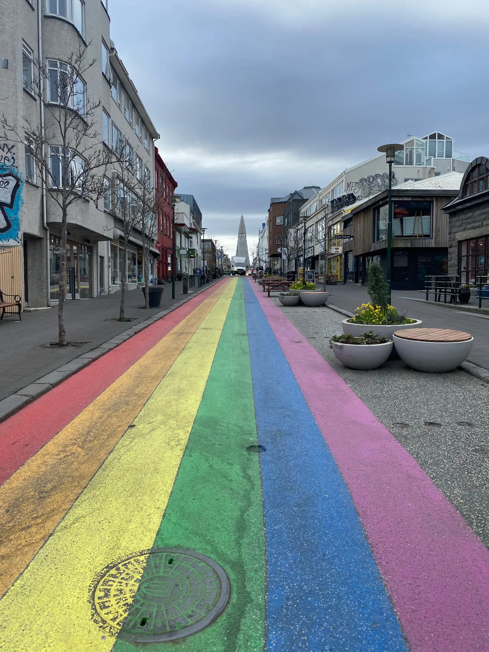
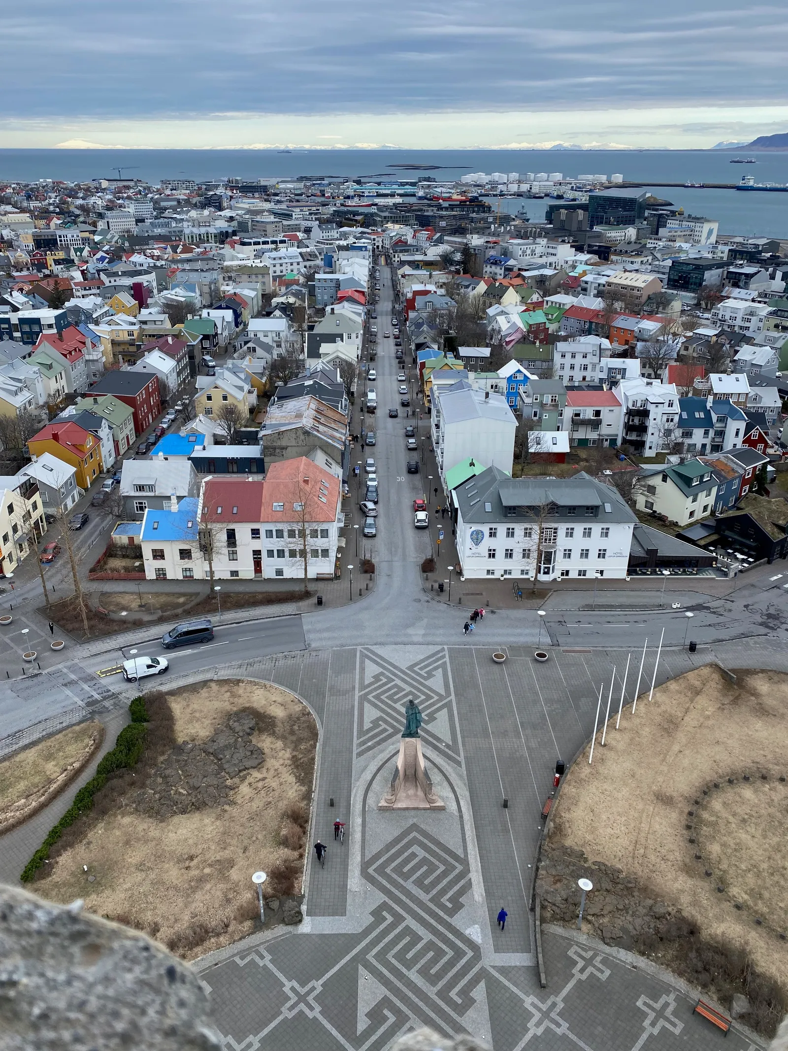
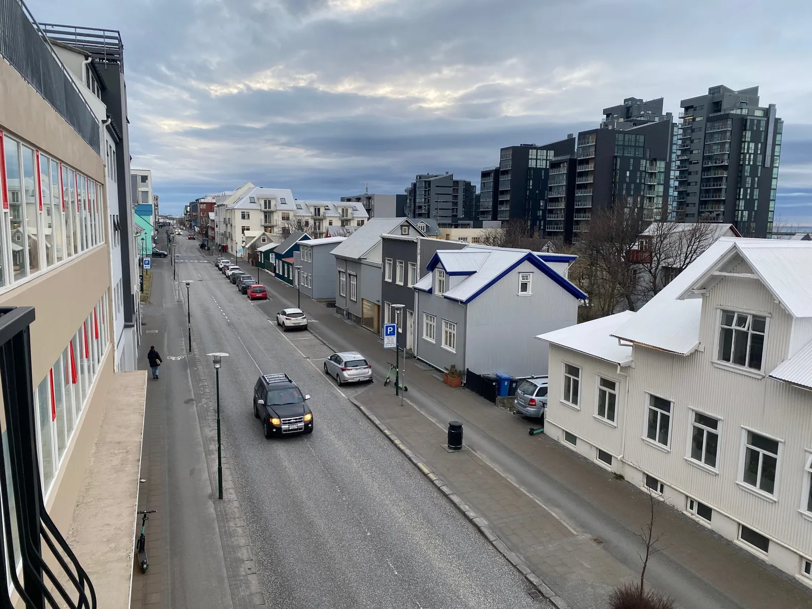
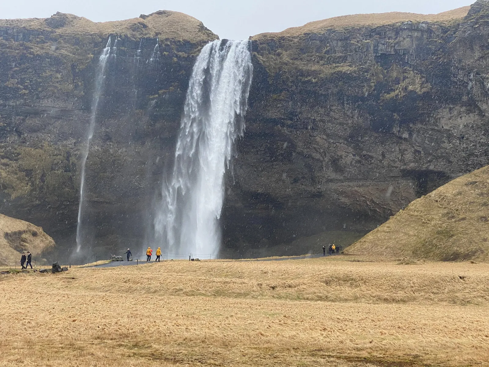
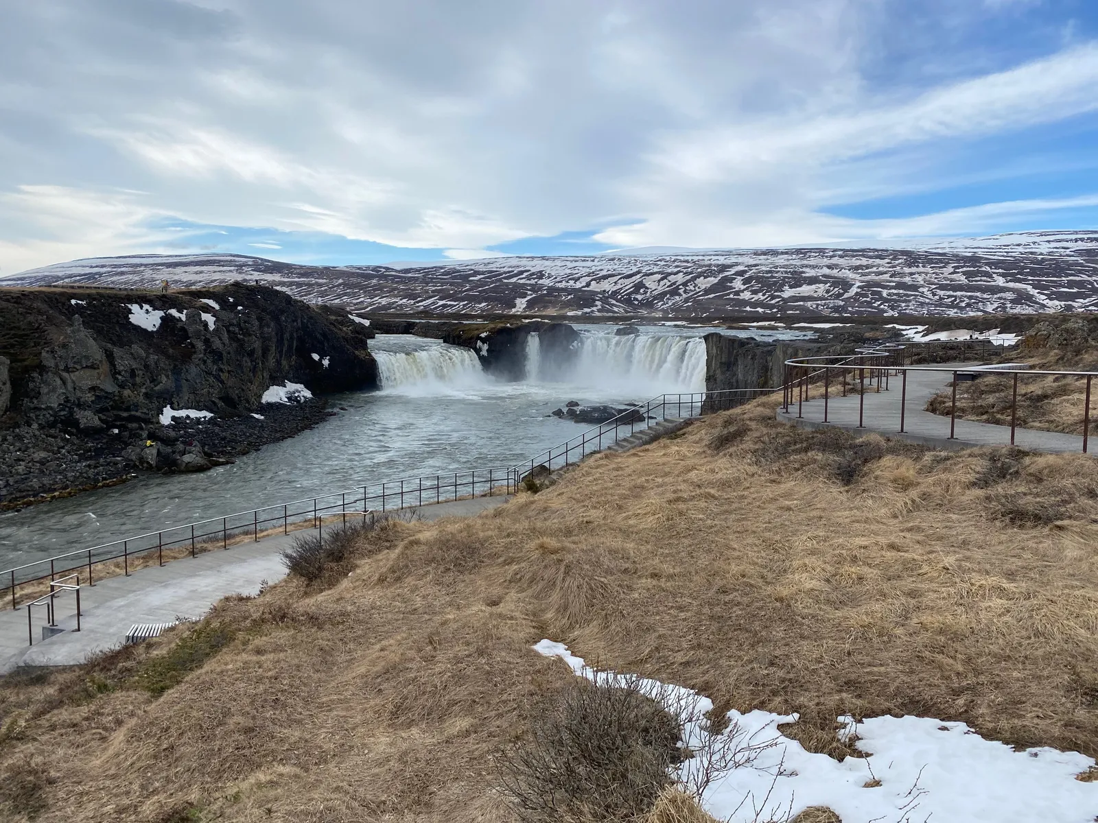
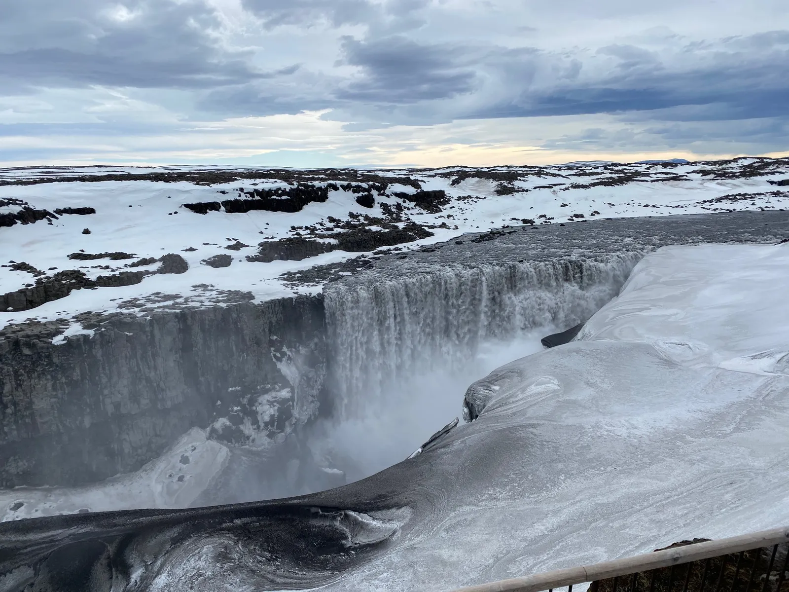
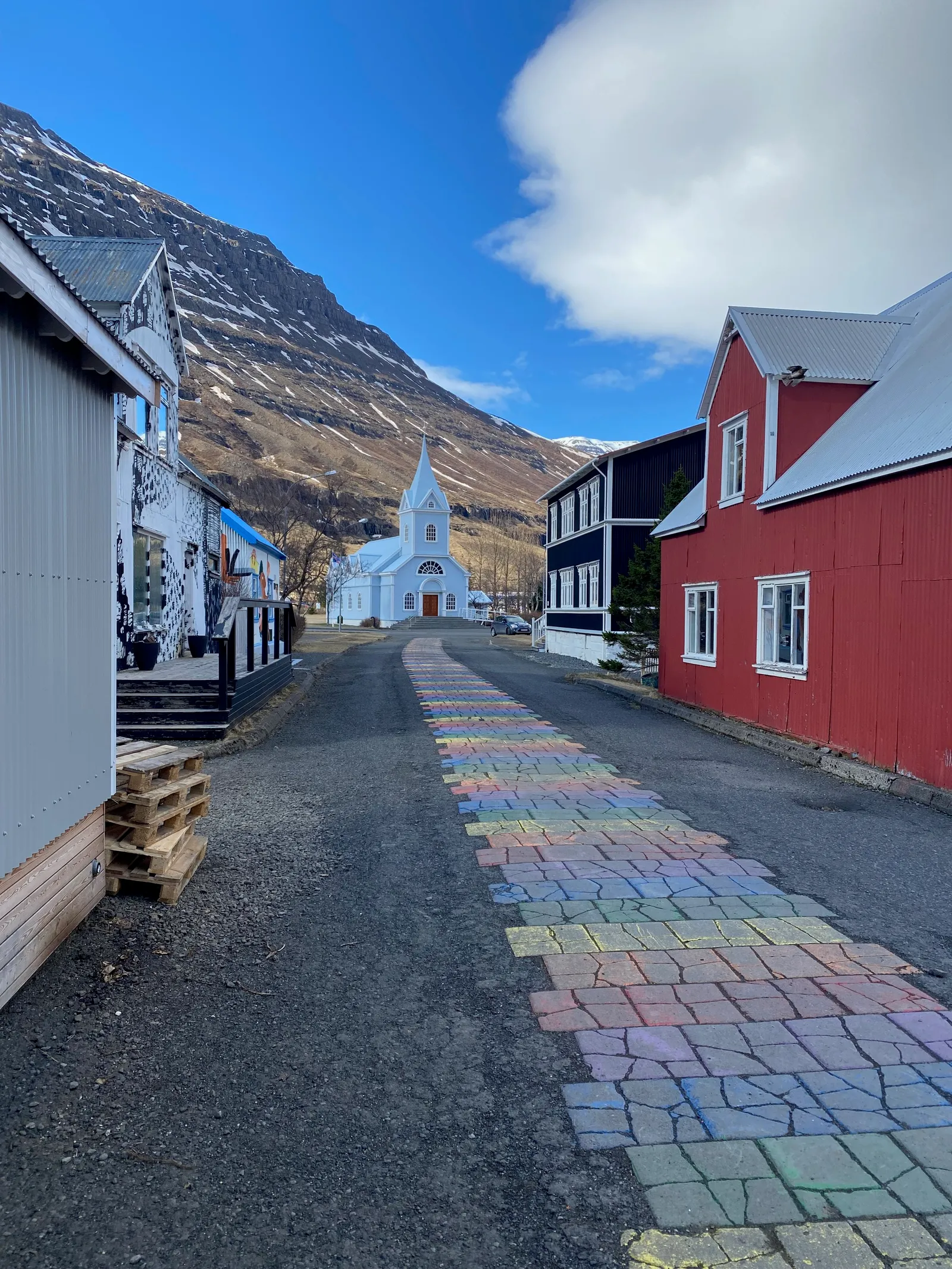
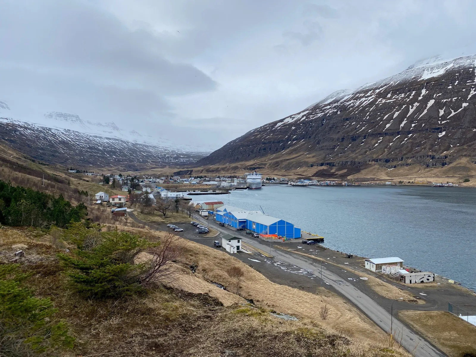
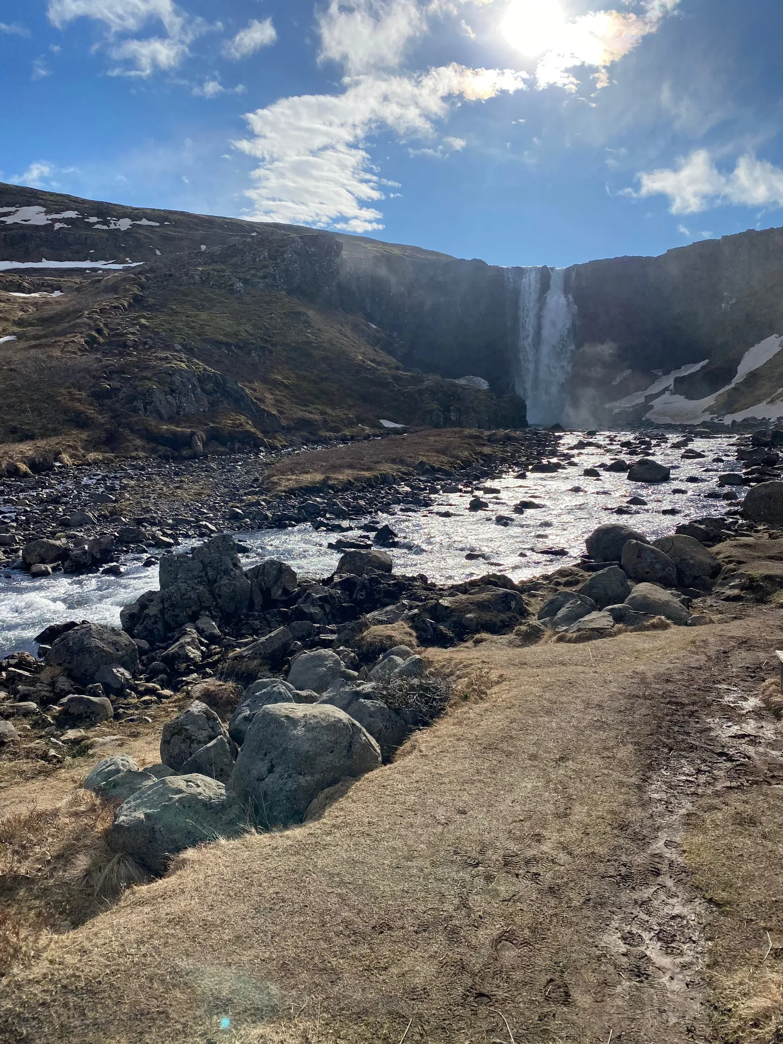
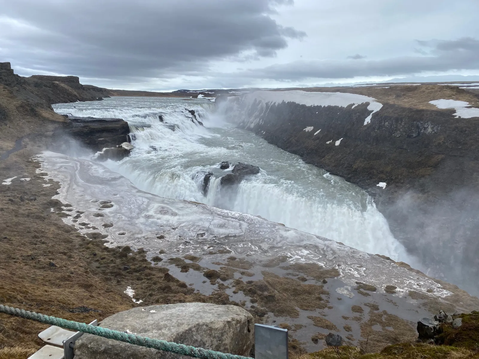
I just returned from a wonderful spring holiday in Iceland (this explains the silence on the blog here). Below is a quick subset of the images I took with my phone (the ones without family members).

These are the raw shots, without cropping or any colour/light adjustment. What is my approach to making these landscape shots:

  • I actually do not overthink my photographs: just snap to catch the moment
  • I hardly ever use the zoom function on my phone. If needed, I can always crop images later to get a zoom effect. Live zooming reduces the image quality and makes the image more sensitive to an unsteady hand / shaking.
  • I tend to look for lines (roads, rock formations, etc.) to force some sort of eye movement in the images
  • Where possible, I try to catch a small element in the foreground to create a sense of depth. (Often a family member taking the same photo, pictures of family taking pictures is one of my favorite themes)
  • Painters already discovered this, often the sky is one of the most interesting visual elements. Try dropping the horizon in one of your shots.
  • Most photos are taken at eye height. Create unexpected perspectives by lowering or lifting your camera
  • Pay attention to the sides of your image. Adding a tiny bit of a wall or other structure in your shot can make the image feel “closed” or “trapped”, leaving it out gives a much more open feel.
Continue reading →
·Layout

COVID isolation policy

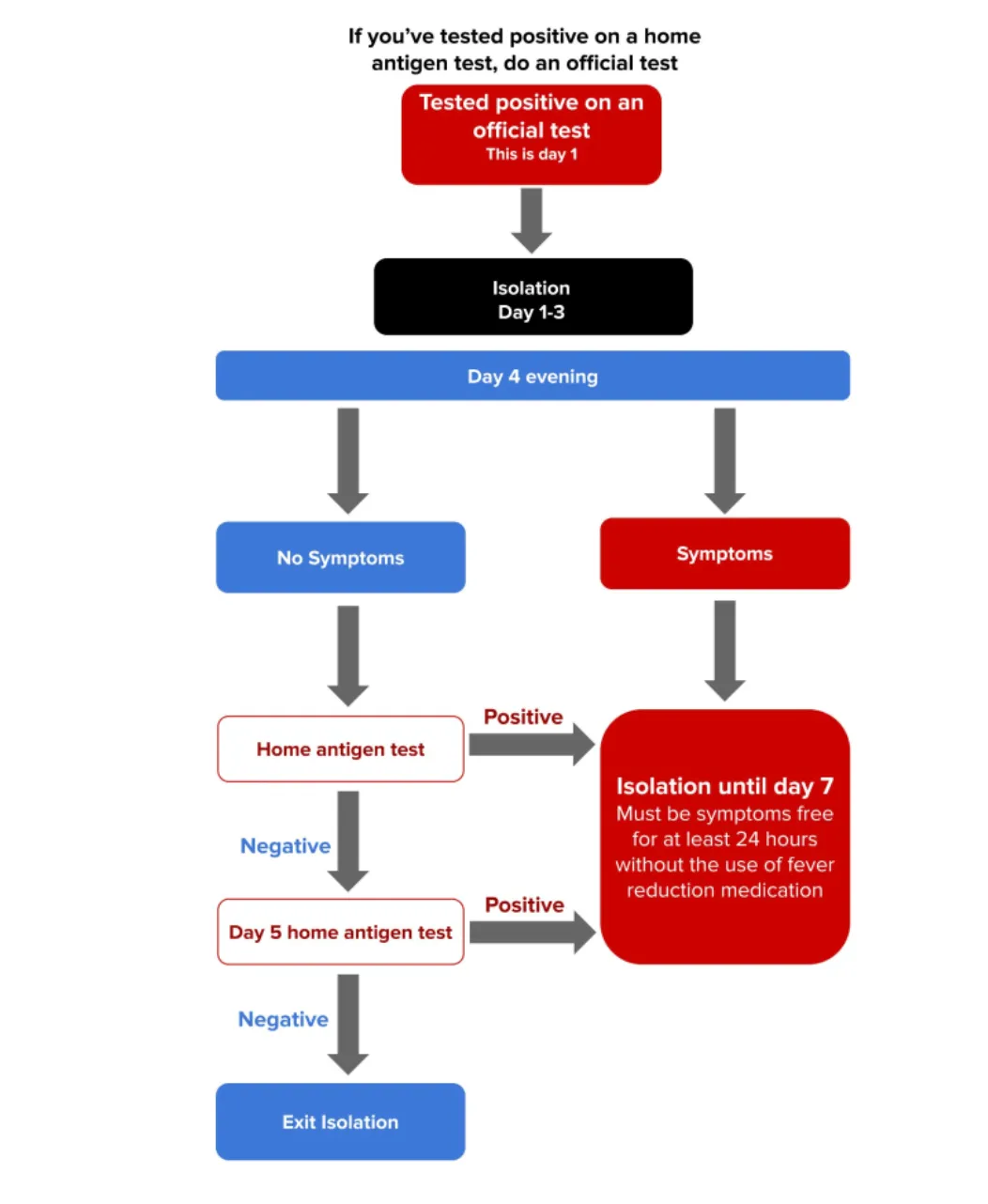
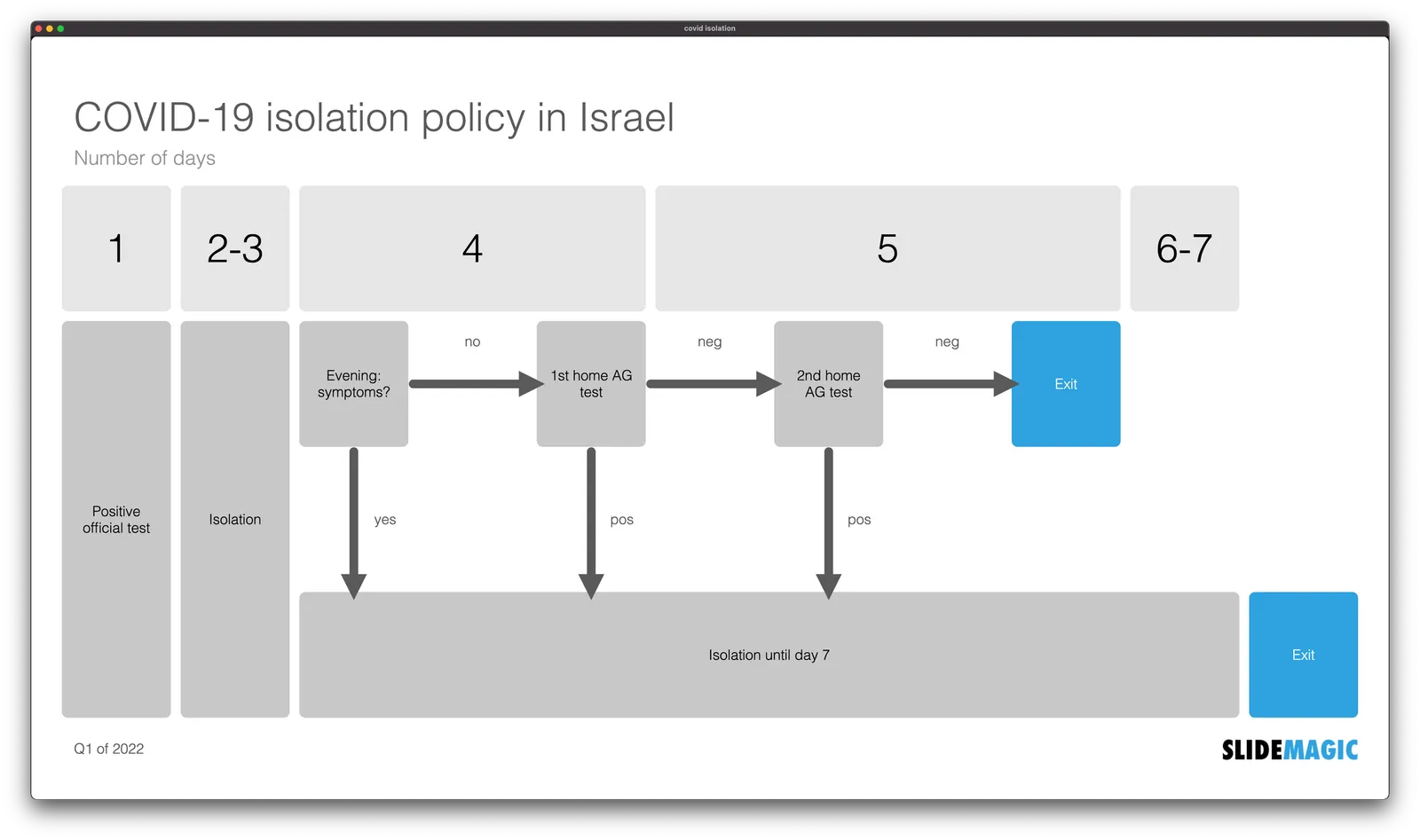
A quick re-make of a graphic with the Israeli COVID isolation policy, here is the original

Below is my version in SlideMagic. I tilted the diagram, to put more emphasis on the timeline. Search for ‘COVID’ in the SlideMagic template bank and the slide will show up for you to use, either exactly as is, or as the basis for another timeline chart.

·Layout

Super Venns

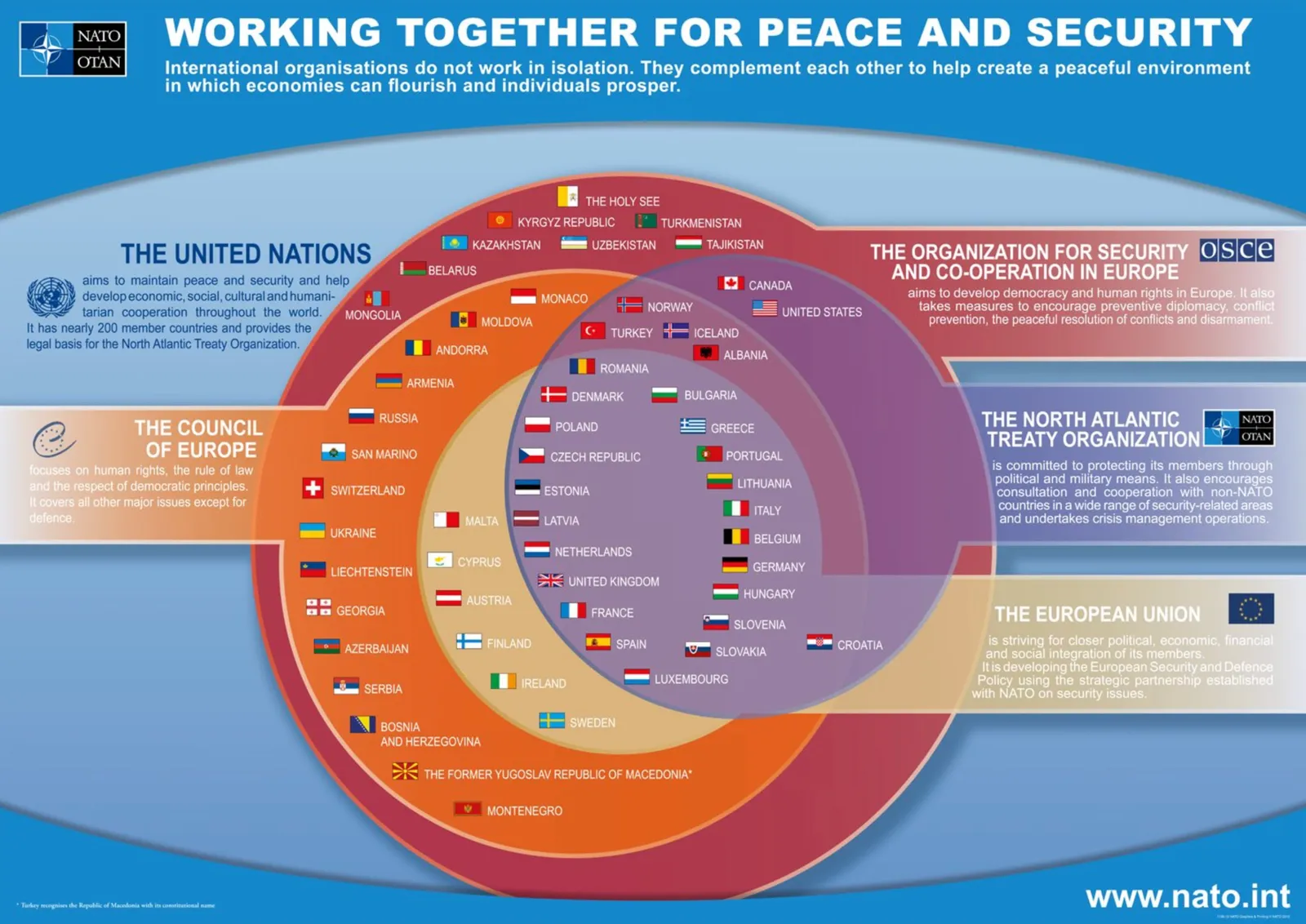
Below an attempt to show what countries belong to what organisation. (A bit outdated, the UK has left the EU). A good start with the groupings of the countries, and the circular layout of the flags. Also note that flags are displayed in their correct aspect ratios (Switzerland for example is square).

 Image found  here , probably by  Nato

Image found here , probably by Nato

What to do better?

  • Not a big fan of the gradients and shadows
  • I would put the Council of Europe label also on the right
  • It should be possible to get an even more harmonious and distributed layout by moving some flags, labels and circles around

The other approach to make this chart is to use a map and color code countries according to their memberships

·Layout

The graphical business card

The presentation’s look and feel says a lot about you… Here are some examples of look and feels that I encountered over the years.

  • “I don’t care” bullet point slides in the bare opening format of PowerPoint, but actually written in a smart way. Basically a text document from someone who focuses on building her business rather than making pretty slides.
  • That same bare format, but now with a presentation that clearly cost a lot of time and effort to make. A few randomly placed pictures and colorful shapes to add some spice.
  • The management consultant deck full of theoretical and irrelevant frameworks and buzz words
  • A super cutesy deck (curly graphics, pastel colours, quirky language) that pitches a company in a traditional engineering market
  • The corporate deck consistent of slides that were harvested from multiple presentations, in slightly different formats, and for which all the paragraphs and footnotes have been extensively edited, and signed off by the CEO (including placement of commas)
  • A super polished (and expensive to make) deck that looks like a 5 star hotel brochure that pitches a product that only exists in PowerPoint (the PowerPoint you are looking at).
  • A set of system architecture diagrams, or the clinical trial results data
  • A business plan template filled out literally, including slides and boxes that don’t really fit the product
  • Web site has the new logo and colours, deck still has the old one
  • Big and bold images, every slide has a visual analogy that sometimes is a bit stretched, no coherence between the slides
  • Logos, graphical elements, confidentiality disclaimers, slogans take more space on each slide than the content itself
·Layout

'Ponder' charts in the age of Zoom

Most presentation experts (me included) describe the ideal slide layout as something similar to what Steve Jobs used to use in his big product announcements. Super minimal.

This type of slide works in auditorium or conference room settings. People sit relatively far from the screen, and the slide is competing for attention with the physical speaker (gestures, eye contact). Glance at chart, understand it in 5 seconds, focus back on speaker. The speaker and the slide are probably about the same size for someone sitting in the back of a conference room.

In a video call , the setting is a bit different. The slide is “in your face” on the screen, and the presenter is usually a small “talking head” in the corner of the screen (if present at all). Maybe the slide can carry a bit more information than the words “1.5 billion installs”.

I am not arguing to bring back the dense bullet points. The audience can read them faster than you can present both in a live setting and in a video call. But a Zoom call does open the way for slides that carry more information. Breakdowns of financial data, matrices with competitors plot in them, pros and cons tables.

Consider building them up in multiple slides to slowly add detail to support your story.

Image credit

·Data visualization

De-cluttering axes

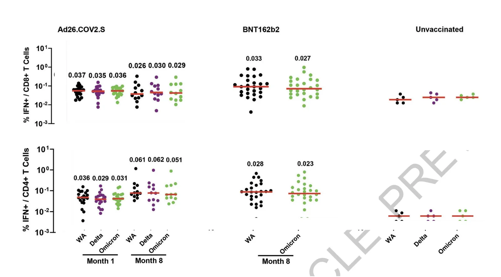
In scientific documents, there are chart making conventions that make sense, clearly labelled axes, titles, etc. etc. Use these charts in your article that you submit for publication in a prestigious paper. For an on-screen slide show however, you could deviate from this standard. Your objective is to communicate the findings as best as possible, referring to the paper for the details.

See the example below (source), lots of duplication in axis labels.

You can make the page a lot calmer be omitting some of these labels. I quickly cut and paste the elements in the image below. (This is not a makeover, just a super rough reshuffle to show you what I meant).

·Concepts

Understanding something tricky...

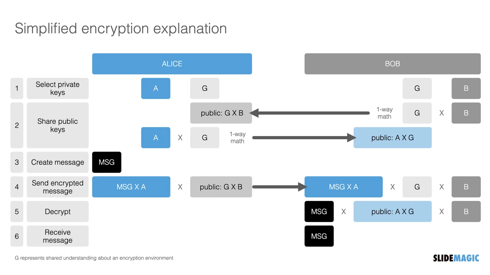
For another project, I had to get a better understanding of the blockchain and various encryption algorithms. This summary helped me a lot, how it is possible that a total “stranger” can verify the validity of a digital signature without sharing confidential information.

Still this explanation suffered from an issue with almost all explainers and technical presentations: certain critical steps that are blatantly obvious to the expert, but very hard to get for the novice get skipped over. The big online YouTube stars in education are masters in getting it right: anticipating what an audience is likely to struggle with.

Anyway, in the process, I added a chart to the SlideMagic library with the very basics of encryption:

Search for “encryption” in SlideMagic and it will show up as a slide template.

·Design

Furniture ads

Why does furniture always look great in ads? The beautiful castle or villa as its backdrop is only a small reason. The big visual trick is space: lots of it, not only square meters, but also very high ceilings.

Most houses and apartments are designed functionally, rooms with just enough space to put a sofa and chairs against the wall to sit a normal sized family with a few guests. If there is more floor space available, we tend to add rooms rather than giving the furniture more space to breathe.

The same is true for museums. Huge open spaces with big white, clutter-free walls. Paintings are made to look good in museums. Put that masterpiece (or a copy) on your kitchen wall, and it looks less impressive.

When making presentations, you are not constrained by white space, so add it freely.